I recently put the finishing touches to the GNOME 3.14 release notes, which means that the next GNOME release is getting pretty close now. I never cease to be excited by new GNOME releases, nor to be amazed by our community’s ability to discernibly improve the GNOME 3 user experience release on release. I’m definitely at the point where I want to be running 3.14 all the time – it’s obviously a lot better than the previous version.
You’ll have to wait for the release notes to get all the details about what’s in the new release. Nevertheless, I thought I’d give a sneak peek at some of my personal favourite features.
Often with new releases we focus on the big new features – obvious bits of new UI that do cool stuff. One of the interesting things about this release, though, is that many of the most significant changes are also the most subtle. There’s a lot of polish in 3.14, and it makes a big different to the overall user experience.
New Animations
https://youtube.com/watch?v=ZOiLFx_LQBM
It’s quite a while since Jakub first posted his motion mockups for the applications view. Since then we’ve been steadily and progressively iterating towards those mockups. With 3.14 we’ve finally got there, and it was worth the wait. The most noticeable effect is the new “swarm” animation, but also a lot of other subtle touches, such as when you browse application folders, or when you launch applications. We’ve also reworked the animations for when windows are opened and closed.
Animations might seem like unimportant window dressing, but it’s surprising how significant they can be for the user experience. They are the glue which binds the different parts of the UX together. By smoothing the transition between views, windows and applications, they make the entire experience feel responsive, fluid and more pleasurable to use. (And they actually make everything feel a lot faster, too. But don’t tell anyone.)
Google Images in Photos
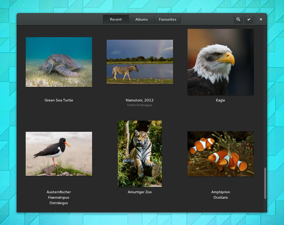
GNOME’s Photos app has been steadily maturing over the past couple of releases, and it is turning into the dependable core app that we want it to be. The big news for 3.14 is that Photos will now pick up your Google photos, so any images you’ve uploaded with Picasa, Android, or posted on Google+ will be immediately available there. This is obviously incredibly convenient for users of Google services, and I know I’m looking forward to being able to quickly browse my online photos from within GNOME 3.
Rewritten Adwaita
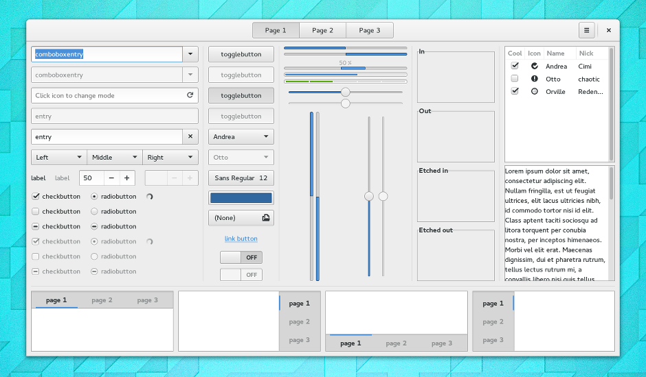
Jakub and Lapo have been tireless during the 3.14 cycle, and have completely rewritten Adwaita (the GNOME 3 GTK+ theme). This was a huge undertaking – around 8,000 lines of CSS have been reduced to about 3,300 lines of SASS. This was primarily intended to improve the maintainability of the theme. As such, there hasn’t been a dramatic change in the theme. What has happened, though, is that every aspect of the theme has been gone over with a fine-toothed comb.
There are some more noticeable changes. Progress bars have got thinner. Spinners look different (so much better). Switches are a bit different. However, the more exciting thing for me is that pretty much every part of the theme has changed in a subtle way. Everything feels crisper, sharper, and a bit lighter. There’s also a lot of subtle animations now (thanks to CSS animation support in GTK+), adding to the feeling of polish.
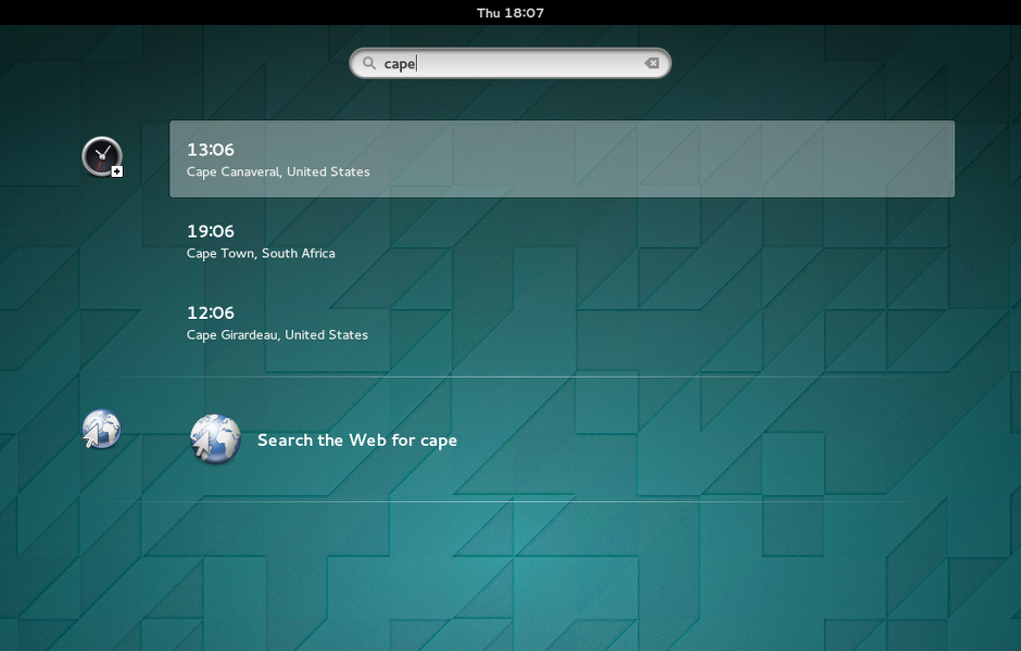
Search More Things
System search has been one of the most successful parts of GNOME 3, in my opinion. The number of applications that are feeding results to system search has continued to increase with 3.14, with two really useful new additions. The first is Clocks, which will return search results for world cities. Search is all you need to do to find the time in a place throughout the world.
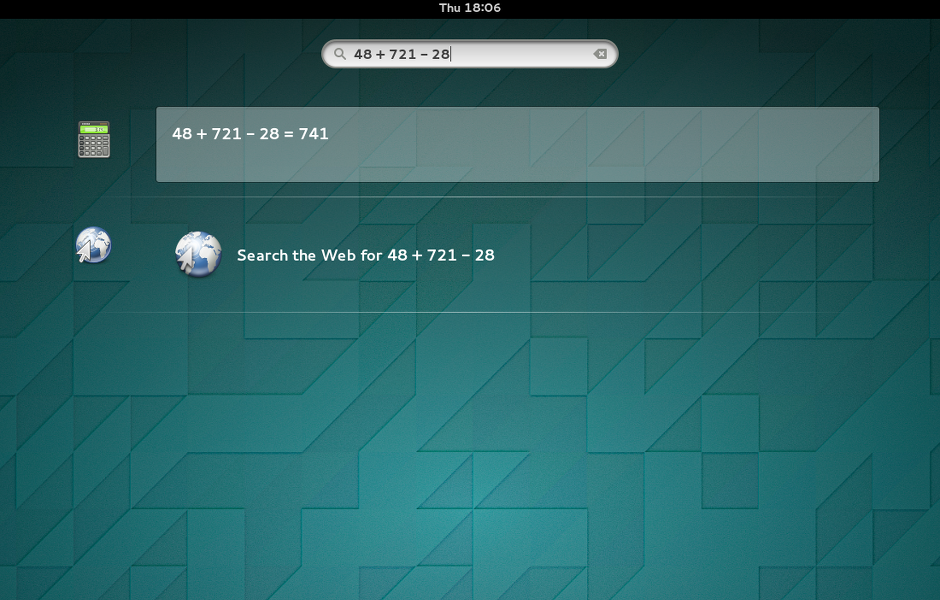
The second new search provider in 3.14 comes from the Calculator. As you might expect, this allows you to perform simple calculations straight from the search box. It’s pretty exciting to see system search in GNOME 3 become so versatile, and the great thing about it is that it’s always a single keystroke away.
Go Go GTK+ Inspector
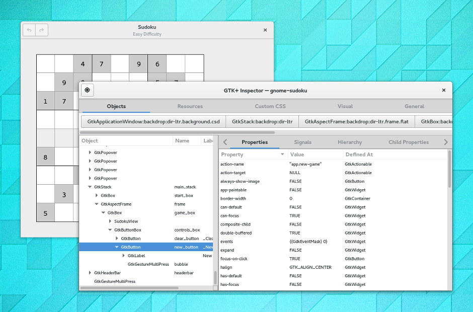
I don’t usually write about developer-focused features when I preview GNOME releases, but I can’t talk about 3.14 without mentioning GTK+ Inspector. If you work with GNOME technologies – as I do – this tool is something of a revelation. It’s amazing how quickly it becomes a core part of how you work. I’m already wondering how I ever lived without it.
The inspector isn’t just useful. It is also a lot of fun, and makes it easy to experiment. if you’re not a developer, or you don’t regularly work on GTK+ apps, I’d still recommend trying it out. Just hit Ctrl+Shift+I and have a play around.
Waiting Time
This is just a small selection of the features that are coming in the new release. To learn about everything else that’s coming, you’ll have to wait for the release notes. 3.14 should be out next week.
Everything looks really, really good guys. Excited to use 3.14 and very happy to see the whole Gnome 3 experience really coming together in such a beautiful and cohesive way.
Congratulations to everyone involved!
The software gets better and better with every release of Gnome 3.
Love you guyz, keep up the good work!
GTK+ Inspector and theSASS rewrite are some big wins!
This is all so exciting. For sure I won’t stand for waiting a final version of Fedora, because the want to try Gnome 3.14.
Totally according with the animations importance. It’s one of the first impressions of the desktop. And It’s the only thing than I miss of Gnome 2. Many thanks!
Great design! I didn’t realize that animations were going to be in GNOME 3.14. This really helps the user experience. Users will more easily relate the clicking of a button or icon to the action that it instantiates (because they can see it happen).
The calculator and clocks while typing in the activities is a killer feature for me. Great, thanks.
great work !! gnome becomes again my most favorite desktop !!
One comment to the animations. There’s a definitive delay from pressing the application-button until the application icons are laid out. It would be nice if it connected a bit more to the “window overview” animation-wise, so that it’s not first a fade out of “window overview”, and then a fairly long animation for laying out the icons. Perhaps they ought to tie together so that the windows fade out while the application icons flow out. Seems like that would bring a more fluid user experience. By connecting them the fairly long layout-of-application-icons animation wouldn’t be noticeable long.. and if it still is, then perhaps it could be shortened a bit.
Wow. Release it already! :P