Eew, just updated my Breezy box and was confronted with this unhappy sight when I tried to add a new applet to my panel:
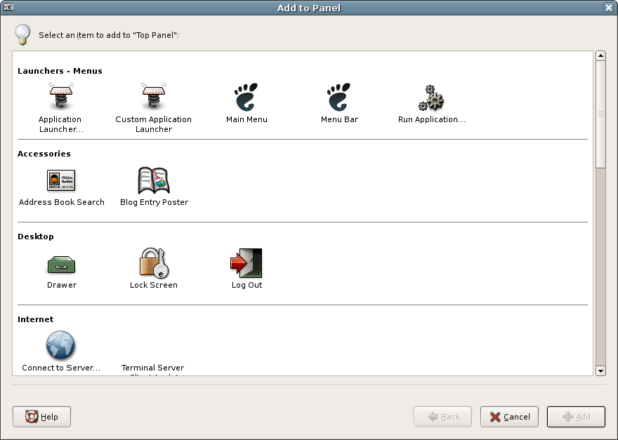
Don’t do it, I beg you 🙂 I presume it’s early work in progress, but it always seems so much harder to find what I’m looking for in these 2-D categorised list things (especially with no typeahead working yet). And just look how much space it’s wasting… by default, it doesn’t even fit on an 800×600 screen, and more than half the window is empty.
The idea isn’t that bad though, as the current applet list got no organisation at all, and it should get organized a little.
Keeping the current layout, using collapsable categories, might be a solution? Or is that anti-HIG? 😉
Ikke
http://www.eikke.com
Collapsable categories could maybe work… at least that’s one less dimension to visually scan every time you look for something. But tree views can be a bit of a pain to navigate for the uninitiated as well.
There may not even be a need for categories at all if our search mechanism is good enough… in the new Breezy dialog right now, there are 18 applets in the unhelpful “Miscellaneous” category anyway, and “Accessories”, “Utility” and “Widgets” are also rather information-free groupings. So you end up having to look through a lot of the categories for the applet you want anyway.
Anyway, I’m not necessarily claiming to have the answer, I’m just kind of hoping that this isn’t it 🙂
Well, the current applet list is still much better than… that. Would be nicer if Ubuntu did a real solution everyone could live with upstream first…
The current one is 10x better than this… just look at all that wasted space!
The categories serve no purpose whatsoever – what if an applet has more than one category, what if there is no category for an applet, what if a user would expect to find the applet in a different category than it is in?
At least a scrollable list of applets lets you do just that – scroll through all the possibles until you find what you need.
Does the applet selector already have typahead search? If anything that would be a worthy addition, not this garbled mess!
I concur. I think this steals some of the sexiness of the add an applet tool away. It also makes the eyes scan in multiple places at once which is bad.
By having a single listing, you can easily look alphabetically for your applet.
Trae
Hmm, “look alphabetically for your applet” only works if you already know what you are looking for …
@Jon: yes, the current selector has typeahead. I’m charitably assuming that it would at least be on the imminent TODO list for this version 🙂
The typeahead, unfortunately, is pretty useless- you have to know the first letter of the applet you are looking for for it to be useless. It would need to search the whole description of the applet for it to be useful. :/
Yeah, I never understood why the standard treeview search stuff doesn’t have an option for ‘search whole text’, either– we seem to have implemented it in the JDS version of Evolution (for searching through filter rules), and it’s really handy, but whether we ever tried to push it upstream I know not.
I haven’t used this update yet, but from the screenshot only, I like what I see. I’m a relatively new linux user, and half of the applets I either have no use for or no immediate idea what they do — the categories should help with that a bit. Invariably, the ones I want to add are at the bottom of the scroll list. And there are a couple I always mix up, like the menu bar and the main menu. Just seeing that they’re right at the top makes it easier for me to contemplate that making that inevitable mistake again, because I won’t have to scroll through 2/3 of the list to reach the other one again, in the meanwhile forgetting which I tried the first time.
Some form of grouping is nicer, for some reason I always tend to look for the applet listed at the bottom. The full list is too long to scroll especially since new applet keep being made. Being able to put this dialog in the background would be nice too.
@Joe: Actually GNOME should probably help you out more here in other ways… is it the case that your distro already comes with either the main menu or the menubar on the panel, but you’re not sure which? If so, one helfpul touch might be if the ‘Add to Panel’ dialog flagged whichever applets were already on your panel. Or if the applet icons were just more thumbnail-like.
(I’d also guess that having to add a menubar or menu applet with any sort of regularity is kind of a corner case though… why do you have to do this?)
@Calum: I use Ubuntu on a spare machine, and I “play” with it enough to break once in a while, requiring reinstall. But I also switch to a single toolbar, so that means removing one toolbar and then adding the right menu to the other. I like the idea of having active applets flagged, but what would also help is being able to drag an applet from one toolbar to another (that way I don’t really even have to know what it’s called at all).
I’ve looked at the new dialog in operation now, and I see what you mean about it being a little difficult to find things both vertically and horizontally. But I think the higher visual info density combined with category cues is a little better (for me) than scrolling through such a long list of icon/name/descriptions where only four or five are visible at a time. The empty space doesn’t bother me too much; you could view it as a cue that the category is changing with the next line of icons.
The *RIGHT* way of doing it is opening a window with those icons (like that screenshot) and allowing you to drag & drop them to the panels. Just my 2¢
I have to agree with the original blog statement: Two dimensional lists are very confusing.
@Joe: You can move applets from one panel to another, but you have to unlock them first (context menu) and then use the middle mouse button for dragging.
I also like the current layout much better, but some improvements would be nice. The idea to flag applets already on the panel is great, as is the idea to make the icons more like thumbnails. The stylistic icons are rarely very helpful to me when trying to remember the difference between window list and window selector. 🙂
And of course the search should be better. Notice that even KDE is using our current layout now, but they added a search box at the top which does a full-text search.
@Rob: Well, I agree it’s hard at first when you don’t know what you are looking for. However, the big icons and accompanying text allow you to easily ascertain what is what. And the next time you use the app, it is a breeze.
When you view it in the way the screenshot has, it will always be confusing and “messy” no matter how many times you look at it.
My first reaction, when I saw the screenshot was… ewwwww.
There are so many steps forward being taken in GNOME, I sincerely hope this isn’t a step backwards.
@Diego: drag and drop does work with the new window. I don’t find it very useful myself, though, because I’ve already right-clicked where I want the applet to appear anyway.
Calum, you neglected to mention the worst part — if you had scrolled down in your screenshot you’d see that more than half of the applets are currently listed as “Miscellaneous”. Two categories have only one entry, and three more only have two items. So not only does the grouping waste space, but it also doesn’t add a really usable level of categorization to the end user either.
@ryan: I did kind of mention this in my first comment (in reply to Ikke)… but you’re right, it’s so unhelpful that it’s worth mentioning again 🙂
I don’t find it terribly offensive. It seems to be just a case of bad categorization. Done nicely, it could be like Mac OS X’s control panel.
Incidentally I tried to drag tomboy to the panel where I wanted it but it inserted itself when I clicked (when I clicked down, not even on the release). So for me DnD didn’t work.
(Upon reflection, not terribly offensive means that I like it, tentatively.)
Well, as a long-time Mac user myself, I have to say I have the same issues with its system preferences window. Although in comparison, the Mac has far fewer items to scan through, and you can see them all at once, both of which help considerably. Even still, I sometimes find myself reading the label of every control panel in turn if I’m looking for one that I don’t use very often.
Calum might have been joking about “all the wasted space” but I think dead space can be a useful heuristic when it comes to evaluating a user interface design. (Mostly dead space indicates room to expand, add extra buttons later or something like that but other times it indicates a poorly planned layout.)
I don’t particularly like the current version but this proposed version is worse.
I didn’t think the even older method of just using menus was all that bad however the huge long list made things difficult to manage.
The current approach was developed while at the same time scaling back the number of applets. The only advantage of current approach was it encourage developers to keep the list short. It seems developers do not want to keep the list short and instead we have yet another approach.
I wish I had something more productive to add but I do not know either what really is the right answer for this.
I agree that the idea behined the proposed design is good(grouping common applets) but the implementation is a bit off. i’ve had a go at a mockup here: http://currentlyfabulous.com/blog2/index.php?itemid=16
@Alan: yes, white space is certainly a staple tool of the designer, and can greatly enhance a design. However, visual balance (spreading the “weight” around the window) is equally important as well, and with this sort of design it’s difficult to achieve that, because the contents of the window are dynamic (i.e. will change as you install or uninstall applets). And it’s always going to be weighted to towards the left hand side.
@Paul: interesting mockups, I find them a bit “busy” though. I’m not sure the categories really need their own icons, I think that just adds to the problem.
@Calum: yeah they do have a bit much going on. how about a combination of the two? the list of applets from the left mockup, with the filter tools of the right mockup(updated it).
i think that’d be a decent solution.
Huh, I believe the key sentence in the first blog entry was “I presume it’s early work in progress” : it was indeed.
Now that the project has reached a more advanced state, maybe it’s the right time to begin discussing about it 🙂
If you have and up-to-date Ubuntu Breezy, then you already have this new dialog. If not, here are a few captures, two of them showing the “update as you type” searchbar :
http://www.manucornet.net/GNOME/Current.png
http://www.manucornet.net/GNOME/Current_2.png
http://www.manucornet.net/GNOME/Current_3.png
So if you don’t like 2D, maybe the best is to type a few words in this very-1D-ish search bar 😉 About “wasting space”, huh, well, it seems this new dialog can fit more applets than the last one, within a smaller window. And by the way, it is now perfectly usable in 800×600.
@Manu: Yes, I very intentionally said right at the start that it was work in progress. I really didn’t expect to attract such a huge number of comments 🙂
I have updated Breezy, and yes, I agree the dialog is better in some respects… in particular the default size.
“Fitting in more applets” isn’t necessarily a solution to wasting space, though… the more you cram in, the harder you make the dialog to visually scan. My point was really that, with a categorised view, you lose control over the layout of the dialog content, since you can’t control how many applets are in each category, and it will vary from user to user anyway. This inevitably leads to some parts of the dialog having a lot of empty space, and other parts being full up. Thus you get a visual imbalance, which isn’t nice to look at.
And I do still have fundamental misgivings about what is essentially a three-dimensional visual search space (category, X, Y) rather than the one-dimensional list we have right now. It kind of works for Apple’s control panel, because they have a much smaller number of icons, and you can see all the categories and all the icons at the same time. But as soon as you add the need to scroll, much of the benefit is lost. Even Apple have added a search box to the control panel in OSX 10.4, which suggests they know that it wasn’t as easy to find things as they’d like.
The new search bar functionality is quite neat if you know the name of the applet you’re looking for. I do have some reservations about it, though: it looks a bit too much like a copy of the Apple control panel search, but without the functionality (the Apple one doesn’t just match on the name of the icons– in this case, it would search the applet descriptions too). Perhaps more importantly, GNOME already has standard ways of searching in containers, and in general I think we should try to improve those if they’re not suitable, rather than inventing completely new ones.
BTW, I think it’s great that you’ve responded positively to this whole discussion, and that you’re still working hard to improve the design 🙂
Just a few notes :
* The search bar does search the applets descriptions, as well as their categories. Give it a try 🙂
* Categorizing applets is a choice and it does involve things being changed : I don’t expect that 100% people will like it 🙂 And I agree that it makes the dialog less “immediately usable” because all the descriptions are not visible at once (I’m just assuming applets names are explicit enough for a first glance). But, with the new version, if you enlarge the window, you will actually end up seeing most of the applets, whereas when you enlarge the previous version, you just get larger blank horizontal lines (which is not ideal space occupation ^^).
* It is a fact that we have (much ?) more applets than Apple’s preferences items. Moreover, we actually don’t know what applets a given user will have installed. But I believe making this list 2D does partly solve the problem (in other words, 1D can’t be better). This is inevitably subjective ; I’m just trying to imagine what a lambda user would find user-friendly.
* Although it is not yet final, I have rethought the categories (the previous ones didn’t mean anything clear) : Launchers & Menus / Accessories / Desktop & Windows / System & Hardware / Utilities. The goal of this is to make more explicit category names, and to have 4 or 5 “middle-populated” categories, instead of 2 huge categories and 5 or 6 other little ones (reducing the “visual imbalance” you’re talking about). I’d love to hear feedback on this as well.
* About the search bar and improving existing tools, I totally agree with you. But modifying standard existing tools (like the ones included in GTK+) was not really an option for me : I had exactly 2 months (“Google’s Summer of Code Program”) to do several things on the panel (and the panel-addto is just part of it), so I needed to move quickly. Including learning GLib, GTK+ and GnomeCanvas from scratch. I would have loved working to improve GTK+ tools, but I would have needed to discuss with a lot of people, which is definitely the right way to produce stable, general and powerful tools. “Huh, hey GTK+ people, I’ve just learned two days ago what a ‘GtkWidget’ and a ‘GtkEntry’ was ; will you let me hack into your code ?” 🙂
* Finally, I am indeed looking forward to hearing more commentaries/suggestions, and indeed working hard to make things better 🙂