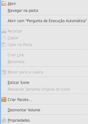
I was just wondering why do we show disabled menu items in a context-sensitive menu? In this case, showing disabled operations to the user doesn’t bring any useful information. For example, have a look at this context-sensitive menu for a mounted USB stick in the Nautilus desktop area (see bug 522739):

What’s the point of showing all those disabled items? If it’s a context-sensitive menu, it should show only actions that make sense it that context, right?
I see the point of having disabled menu items in a main menubar for the sake of bringing awereness of all available actions in an application. However, for context-sensitive menus, it just doesn’t make any sense. Am I missing something?
I disagree with this. The reason is that for me I want the menu to change as little as possible for each time I use it. This way I can (at least after using it a few times) know exactly where in the menu I need to click without reading every items text. For me, rearranging the menu items (like removing/hiding random items) would lead to me having to read all the items to find the correct one for each time. For people who DO read each item for each time perhaps this IS a good idea…
I do understand your comments, but I don’t agree with them.
If the menu keeps changing length dynamically (because an option is no longer shown, simply because it’s disasbled), people will not be able to remember and instictively use the correct distance to get to the option they want, and may end up hunting through a menu to find what they’re after. Perhaps that’s the reason people maintain options that can’t be used?
I think it might be something to do with a combination of the HIG guidelines and to do with accessibility. Something to make sure the menus don’t change from item to item so that the option can be found in the same spot all the time for accessibility….
Or I could be completely wrong. But the HIG and accessibility guides here might be a place to start looking for answers http://library.gnome.org/devel/guides
Imagine for a moment that you, I don’t know, didn’t know that you could create a link. In the above screenshot, that option is grayed out. So, you know that if you pull up the context menu on something, there will be the option to create a link. If that option isn’t displayed, how are you supposed to know that creating a link is an option at all. I think the discoverability aspect you mentioned about the main menu bar holds exactly the same for the context menu, especially since all of the “contexts” within a single application are likely to be very similar.
Maemo HIG has the requirement that selecting a disabled menu item shows a small popup explaining why it is not available. What do you think about GNOME adopting this idea?
@Mike, in the specific case of Nautilus, the menu has items that will never be enabled for mounted devices. The annoyance comes from that. I agree that too dynamic menu content wouldn’t be good as well.
@Ryan, @Peter, I kind of understand this a11y argument but mounted devices present a new menu item anyway (Umount volume) so the “uniform menu actions” argument doesn’t stand. Mounted devices are not the same type of element.
Thanks everyone for the good points.
> Am I missing something?
Programmers are lazy
I have to agree with both sides… Changing the way the menu looks each time is not an option.
But for stuff like USB-drives, HDD’s, Mount points, hard and soft links
and the Wastebasket/Trashcan/Papperskorgen there really shouldn’t be any grey stuff that you’ll never be able to do to it.
Yeah, I think you and Mårten Woxberg are right : special items are different, and seeing half the items greyed out should be a signal to identify an uncommon comportement. And it friendlier with small screen resolution users.
wow what a beautiful theme, what is it called?
A good compromise could be to skip disabled *groups*.
So the Cut&Paste entries in your screenshot will go away, but not the entry to reset the icon size.
I think disabled items give some useful feedback. They let you know what items are possible with a different selection.
Ie if you had selected 3 items then you might be able to assume that the disabled items are only available with a single selection. Likewise menu item status based on filetype.
+1
This could be resolved with a gconf key.
Marius Gedminas wrote:
> Maemo HIG has the requirement that selecting a disabled menu item shows
> a small popup explaining why it is not available. What do you think about
> GNOME adopting this idea?
I’d love to see that HIG online somewhere.
However, Maemo applications don’t seem to actually do this, at least not recently.
It’s the same for the scripts of Nautilus. Unfortunatly with Nautilus 2.22, Nautilus Actions is broken :(
http://bugzilla.gnome.org/show_bug.cgi?id=487019
Seems that context based menu item inclusions already partially exists, perhaps not intentionally. The context menu for a file verses a directory differ for me, with directories having the extra items of “Open in Terminal”, “Share Folder” and “Paste Into Folder.”
Bug 9185439679: I opened my CD folder, but I can’t paste into it because there is no Paste menu item! teh bug! it hurts my eyez!
The main problem of that contextual menu is that it contains too much options.