 A lot of ink has been spilled recently over the fact that nautilus is evolving into Files.
I’d like to present a few facts and thoughts about this, and explain why I am looking forward to the new nautilus.
Here are some examples of what I am looking forward to in nautilus 3.6:
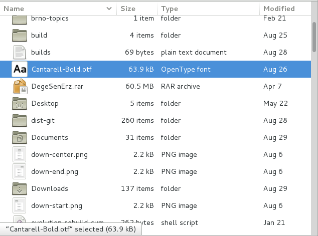
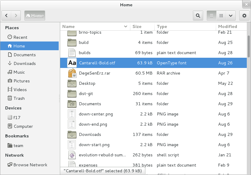
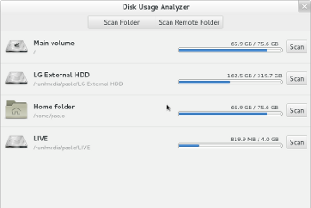
A more usable list view, which focuses on presenting important information in usable form:
 Well-working search, with file search results in the shell.
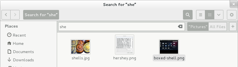 Nautilus search is improved in many ways: it is fast, you just type, like we do in the shell – which has worked out great. It is case insensitive, can search hidden files or directories, can work recursively, doesn’t only do prefix matching, can search metadata, has ranked results based on a weighting algorithm, can work on indexed and non-indexed directories.
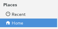
Recent files in the sidebar:
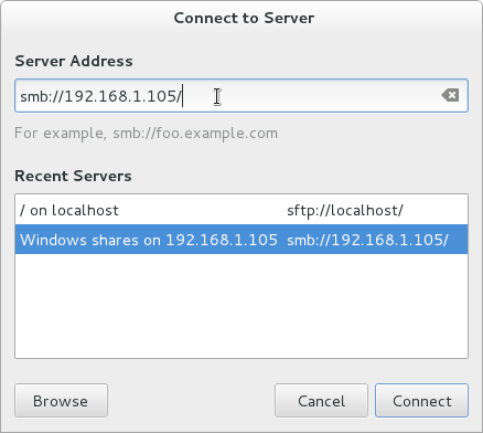
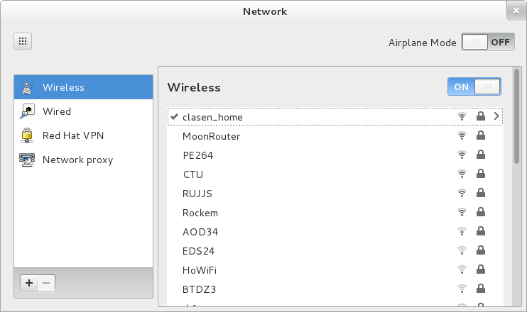
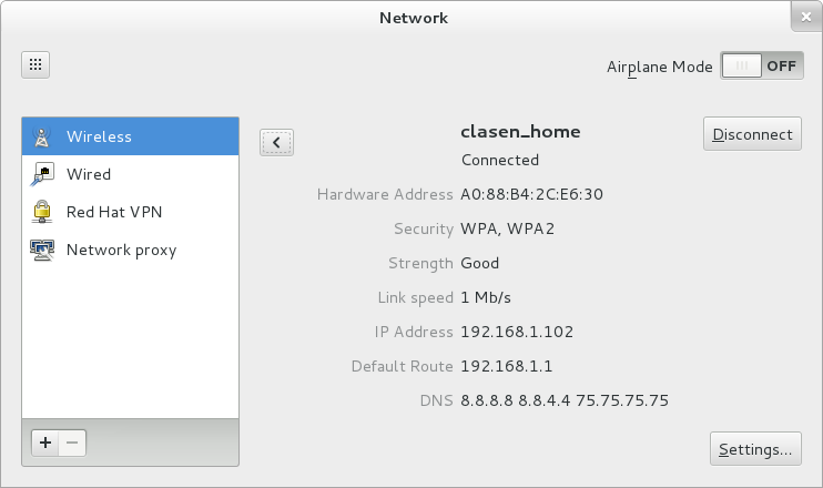
 Well-working remote browsing:
 A visual appearance that fits in with other GNOME 3 applications:
 But let’s look at how we got to this point, and think a bit about the history. Actually, nautilus has quite a long and involved history. The first commit in the git repository dates back to 1997. In early 2000, Eazel starts to appear in the history. Along the way, ambitious features appeared: zooming with level-of-detail, desktop handling, spatial mode, a vfs, remote browsing…
Many of these things have fallen by the wayside over the years, but they have left scars behind:
A complicated and hard-to-maintain code base: for example, nautilus had a utility library called eel in the early days, which was then broken out as a separate module. Later it was merged back in.
There’s still a stripped-down copy of GnomeCanvas inside nautilus, for handling the desktop drawing.
Remnants of past features showing up in odd places in the UI. For example, the view mode was remembered per-folder until recently. That made a lot of sense in the spatial paradigm, but not so much in browser mode.
Another example is the overlap between search and find.
Nautilus development has been somewhat stagnant; while GNOME 2 turned into GNOME 3, nautilus largely remained the same. But no more. During the 3.6 development cycle, nautilus has seen intensive development, and it is still ongoing.
This makes what has happened this cycle even more remarkable. Not only has there been plenty of new features, but there has also been a massive cleanup operation. Over 500 (!) bugs closed, some of them really old, like 45708 (filed in 2001) some of them crashers, like 668674, some of them hard-to-track-down regressions in other parts of the stack, like 680349.
 A lot of controversy has erupted about the fact that early parts of the roadmap removed some features. On some level, this is unavoidable: if you want to put a new coat of paint on a wall or your car, you also remove the old paint first, for best results. But if you read the roadmap in its entirety, you will find many feature additions on the list as well. Some of the removed features will come back in slightly different form, e.g. the split pane.
So give the new nautilus a chance and try it when 3.6 is released, and let us know what you think. We’ll be listening to your feedback, and there will be plenty of opportunity to make further changes in the future.
If it turns out after a test drive that the new nautilus is not right for you, keep in mind that nautilus is just an application. We think you’ll be happy with the new Nautilus, but if you aren’t, there are other file managers that you can try.


