I’ve not been very good about posting updates on this GNOME development cycle. I was busy with other things, and all of a sudden, we’re already at the beta – I’ve just released 3.9.90, which is the first beta release.
High time to show some of the nice new things that will come in GNOME 3.10.
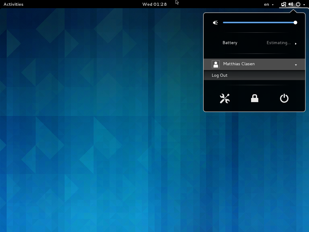 First, we have a new combined system status menu. This addresses a number of complaints about our previous system status area, such as the user name taking too much space on top bar, and privacy concerns about showing it prominently on the screen.
This screenshot does not really do the work justice, for a full impression, you should try it yourself or study the design.
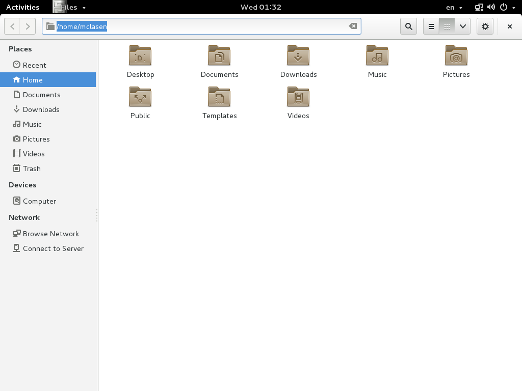 Next, many applications are using header bars instead of traditional titlebars.
Our previous approach of hiding titlebars on maximized windows had the problem that there was no obvious way to close maximized windows, and the titlebars were still using up vertical space on non-maximized windows. Header bars address both of these issues, and pave the way to the Wayland future by being rendered on the client side.
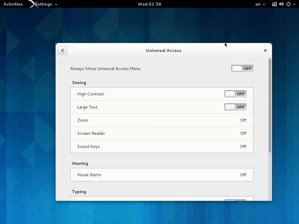 Somewhat unexpectedly, the control-center has seen quite a bit of work this cycle, too. There is a new Universal Access panel…
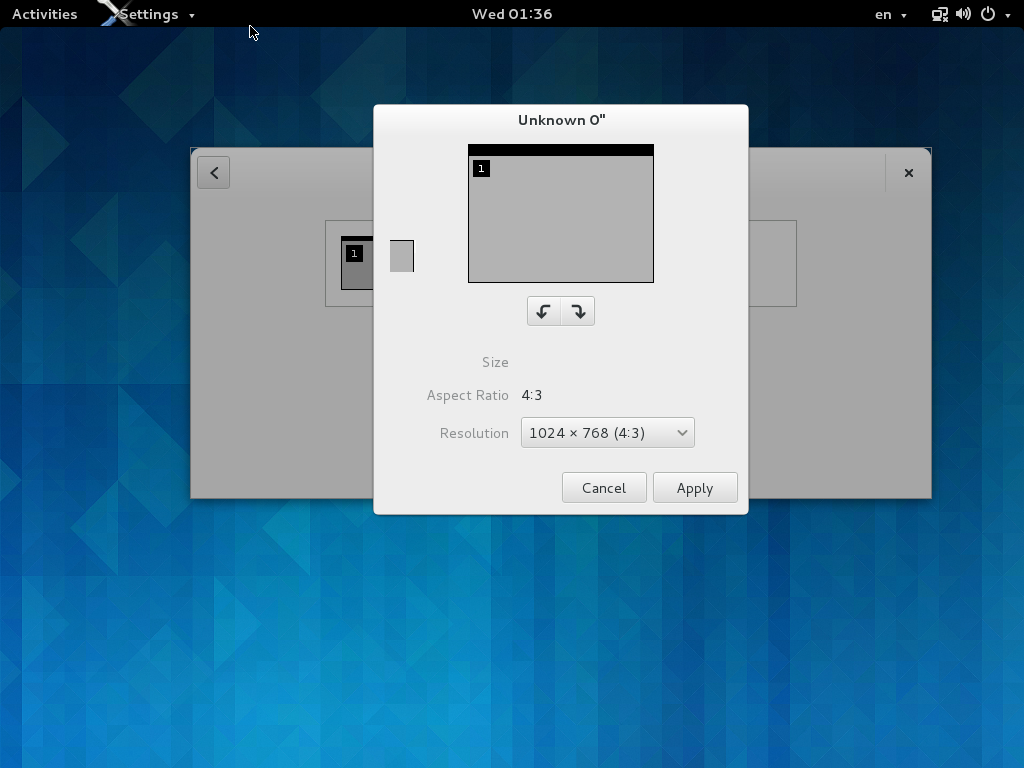 a new display panel…
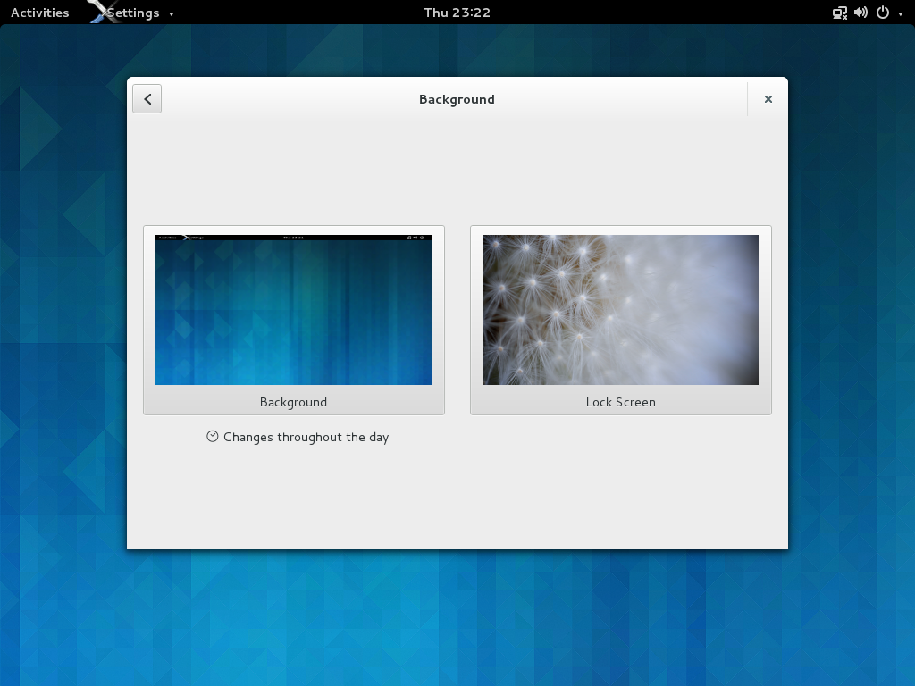 …the background panel lets you configure the lock screen image now…
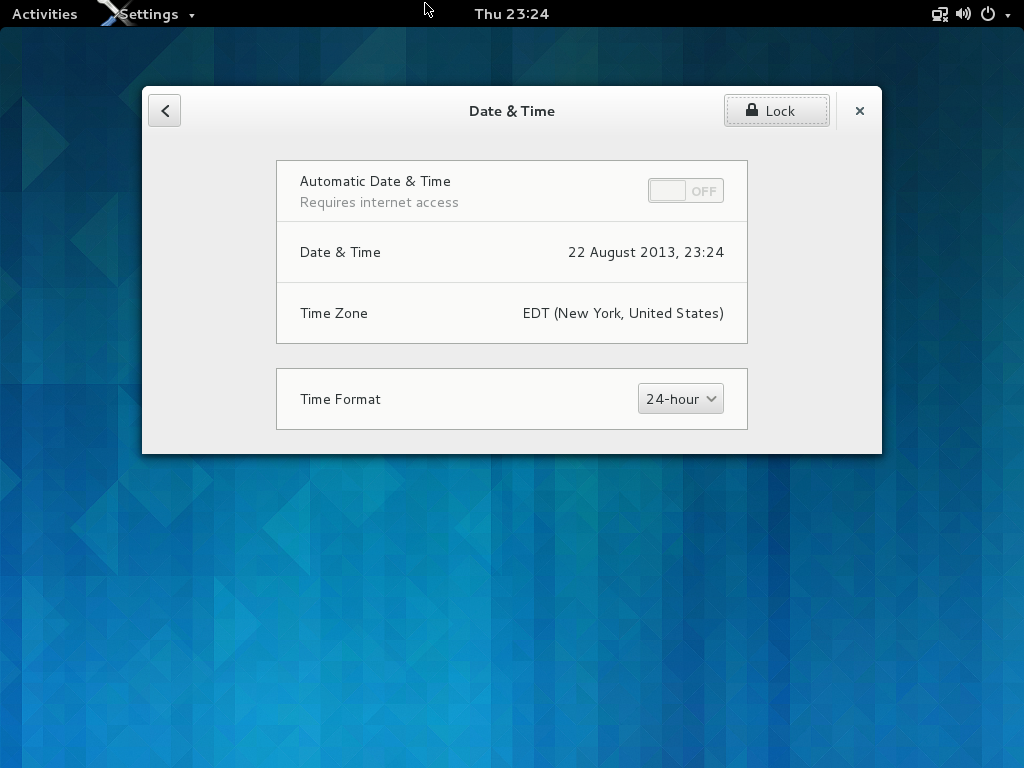 …and finally, there is a new Date & Time panel.
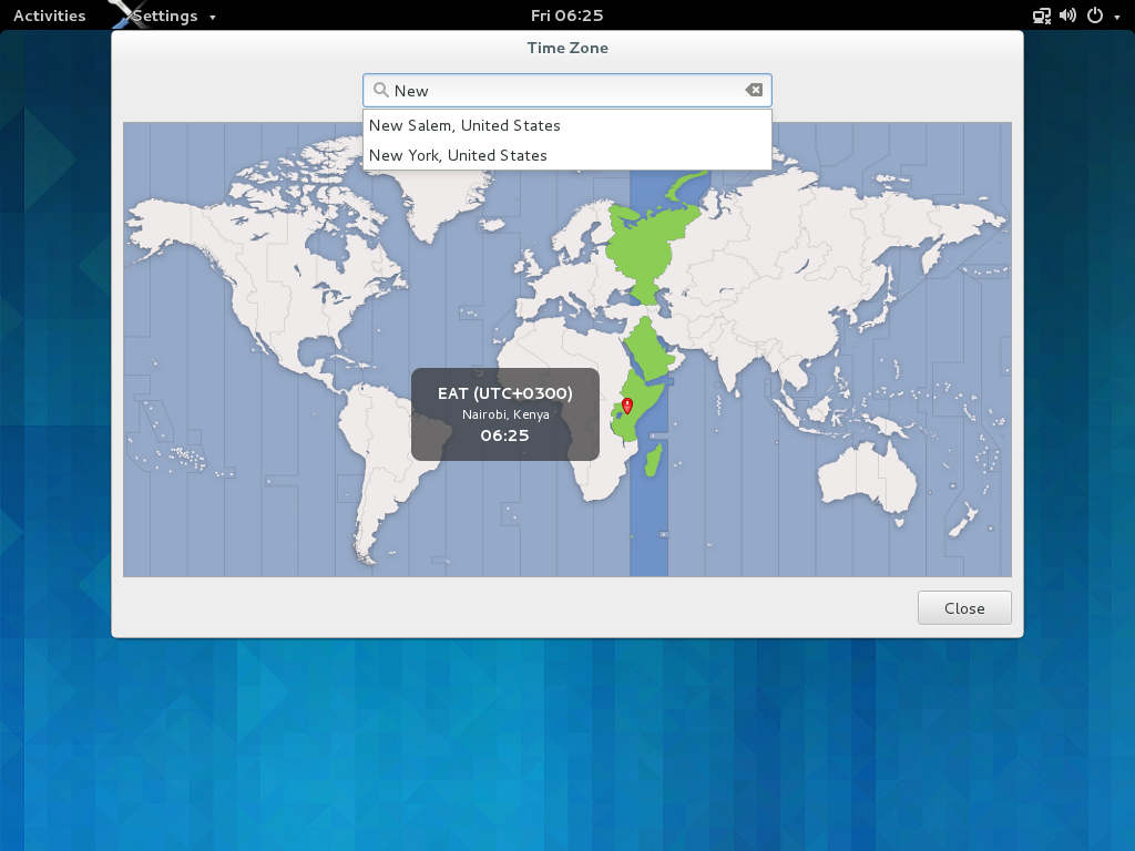 The map is still there, if you manually configure your timezone. I hope we can enable automatic detection for 3.10, so you won’t have to, anymore.
Speaking about maps, I should mention at least one new application:
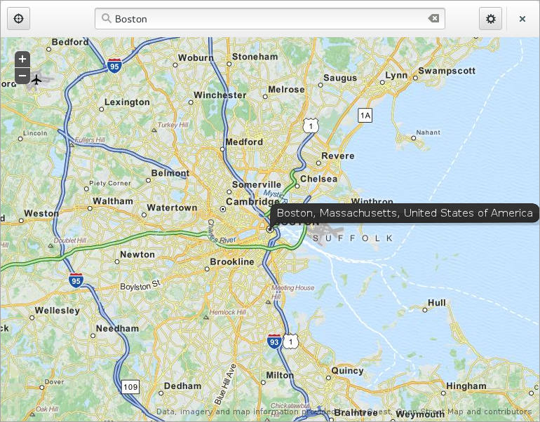 GNOME maps will be a preview in 3.10.
That’s it for now. There’s a lot more new to discover in GNOME 3.9.90, like a completely redesigned tweak tool, the note-taking application Bijiben, support for hi-dpi displays, etc.
If you find the right branches of mutter and cogl, you even use most of this under Wayland instead of X – our porting effort is making steady progress.
So, perhaps a silly question, but are those smooth, anti-aliased, clipped client-side corners rendering in Wayland or X11 in these screenshots? I ask because most of the apps I’ve seen use header bars so far have flat corners in X11, presumably due to some limitation. I also ask because if these shots are from within Wayland, I’m definitely intrigued to try it out.
I’m definitely impressed with how things are coming together for this release, and I’m looking forward to testing it out.
The last changes on the system status menu have really annoyed me: I can access to the sound parameters from there, I can’t understand how wifi works and when connected to the wired network it still says it’s disconnected. The rest of changes are ok.
It’s good that finally Nautilus gets a close button when maximized, so does the control center. I really like this new way of taking advantage of the top bar menu. But I hope this has been implemented in a way that other gtk application can easily use it. I must say that these type of changes should have been done in first place and not 3 or 4 years after GNOME Shell was first released.
Can’t wait for GNOME Maps!
The wired network icon is a known bug which will get fixed, if it hasn’t already.
As for the application header bars, that’s a standard GTK+ widget that anyone can use.
Nice progress.
Two things worry me which you could maybe clarify.
1. On my machine (and even on your Nautilus screenshot!) I see a broken network icon when I have my wired connection present (two computers with a little x). I’m not sure why it thinks my connection is broken as NM seems to be handling it fine (it is a USB adapter tho’). Even the design you linked to seems to suggest there is no icon intended for simply “having a network cable plugged in”. Is this really the case or have I simply missed something?
2. With the header bars, there seems to be inconsitency with the ability to place maximise and minimise buttons on window decorations. With the client side rendering is this now no longer configurable. On my theme here for example “normal” windows (such as gnome-terminal or firefox etc.) all have min+max+close buttons. But Nautilus now only has a close button despite being the kind of window that can be minimused and maximised etc. How is this handled now? Can it still be customised to taste or is double clicking the bar or dragging it now the only way to minimise and maximise with the mouse?
Thanks 🙂
The NM icon being wrong for wired connections is a known bug and is going to be fixed as soon as the new APIs we want land:
https://bugzilla.gnome.org/show_bug.cgi?id=704841
The designs look very nice, consistent and logical. Thanks for sharing!
Cool, especially the map app,
Great work guys… Amazing to see the evolution of Gnome going ahead so quickly…
Shouldn’t the lock screen background image dialog have a “same as desktop background image” checkbox?
My thoughts exactly, I was about to post that same question. It doesn’t make sense to choose twice if you don’t want different backgrounds. Probably just a minor oversight.
Other than that, thanks for all the hard work that’s being put into GNOME. I was really impressed how 3.8 is better then 3.6, looking forward to 3.10 =)
Great work man !
Any way we can get our hands on the background you’re using ?
Of course! Everything’s in the open:
https://git.gnome.org/browse/gnome-themes-standard/tree/themes/Adwaita/backgrounds
These are the new backgrounds for 3.10, they change during the day like the previous ones. You can get them directly from git:
https://git.gnome.org/browse/gnome-themes-standard/plain/themes/Adwaita/backgrounds/bright-day.jpg
https://git.gnome.org/browse/gnome-themes-standard/plain/themes/Adwaita/backgrounds/good-night.jpg
https://git.gnome.org/browse/gnome-themes-standard/plain/themes/Adwaita/backgrounds/morning.jpg
… or from the released tarball at http://ftp.gnome.org/pub/GNOME/core/3.9/3.9.90/sources/gnome-themes-standard-3.9.90.tar.xz
Awesome, tks for these updates, i´m really looking foward to the new gnome version on the next fedora, 3.8 is good but its not there yet, this seems like a great update!
Great, close buttons on the client side title bars. I don’t like that they don’t have the same look of the X server drawn window controls 🙁
That bug’s been fixed: they’re now identical.
What happens to header bars under other DEs? Will be turned off and the traditional title bar is used?
The new, combined system status menu still does not make sense. It is inconsistent with the rest of the status bar and very confusing to use. I like many of the changes in GNOME 3.10, but this is a severe usability regression for me.
Have you tried it, default? What do you mean when you say that it is inconsistent with the rest of the status bar?
If anybody is bored, there seem to be some work to in the wikipedia. While undoubtedly being ruled by some very capable people, it is for most the number one place to go for information.
http://en.wikipedia.org/wiki/Template:GNOME
http://en.wikipedia.org/wiki/Wikipedia:WikiProject_KDE
http://en.wikipedia.org/wiki/User:ScotXW
[WORDPRESS HASHCASH] The poster sent us ‘0 which is not a hashcash value.
Everything is really shaping up and getting coherent release after release! That plus tons of work for Wayland under the hood. The control center has really matured a lot.
I was a bit skeptical with the new system menu, because I do not like submenus, but it works nicely for my use (your average laptop + wifi, no bluetooth though). I was especially fond of the old NM wifi menu, but I do not change of network often, and since NM already remembers my preferred networks, so it’s fine.
Only the username entry with only the logout action (for my use case) feels a bit weird.
Ho, and I liked the previous radio/check buttons much more, but the desktop is getting so good I must nitpick 😉
Nice work!
Hey Stiph, what do you find weird about the logout action?
I only have one user on my laptop and the design seems to indicate the submenu should be shown “When there is more than one user”.
I understand there is the “Switch User” item in the submenu when there are multiple users, but the “Log Out” item feels a bit lonely in my case (just the submenu with my face and the Log Out action).
Maybe that’s intended for those who want the this action on single user system (I myself do not need it)?
Allan, I had the same system status as Matthias in the first screenshot because I had multiple gdm sessions (the regular gnome one and two valgrind ones). Keeping only one session hides the submenu with “Log Out”, which totally makes sense. Excellent work!
It does seem weird that you have to click on your name to get a submenu that allows you to log out. Are there other actions besides “log out” that could appear under the name submenu?
A (sub) menu with only one item in it looks odd. If there is just one item you could as well just show it instead of the indirection through the menu.
Filed https://bugzilla.gnome.org/show_bug.cgi?id=706737
It’s too hidden. But at least it’s included 🙂
I guess the suspend button is still missing… Is the Alt hack still working? It’s quite hard for my girlfriend to remember, but it’s still better than asking her to run “systemctl suspend”.
Is it still possible to use the mouse wheel to change the volume?
Yes.
I’m also interested in this. Scrolling over the sound icon is the most convenient way of changing the volume. It’s my only concern about combined system status menu.
Is there any way of changing the default volume step when scrolling over icon or using volume keys? When I search on the web it seems to be gone ( /apps/gnome_settings_daemon/volume_step). Starting with GNOME 3.8 it seems to have changed to 10% and for me it’s too much.
Also is there any plan to add screen brightness icon & slider? I often change brightness throughout the day and using mouse wheel would be handy here also.
About the brightness icon + slider, I have exactly that on my laptop under the volume one. That’s very useful. Previously I had to resort to the brightness extension which takes space for something I do not use that often.
Ho, I also found the password fields shows the last char for a brief moment, that’s clever.
+1 this is really important to me too.
In GNOME 3.8, we changed it so that we use the same smooth scrolling infrastructure as elsewhere — if you’re using a touchpad or smooth-scroll-capable mouse, the volume changes with how fast you scroll. Otherwise, we fall back to the exact same volume steps as before.
We won’t have a screen brightness indicator, but the screen brightness slider is implemented! It’s just that Matthias was on a VM, so it didn’t show up since there was no brightness to modify.
I have the same problem, when I use mouse wheel to change volume, it’s often either too quiet or too loud. I have to open the dialog and drag it, which it much slower.
I wouldn’t really like to have a more fine-grained step. Mouse wheel is really easy to scroll.
Are you using wayland on those screenshots? Do the header bars work on X11?
Thanks for the work & update!
The icons that make up the new combined system status feel uncomfortably tight together. A little more space between them would be nice.
It would be very nice if you’d share some info about Bijiben. Thanks!
I frequently watch movies on my laptop where the volume sometimes is too low and I have to go to sound settings to boost it beyond 100%. Looks like the combined menu will make this more difficult. Am I missing something?
That happens to me too.
Could it actually be a bug?
I have that same problem with “100%” being insufficient on my thinkpad, but haven’t bothered to bug report it — I probabably should. I don’t think the solution is to make it easier to get to the esoteric settings panel frequently; there should be some way to say “on this system, the normal slider should be boosted by 50%”. Ideally, of course, the sound system would recognize laptops with this issue and just make that the default behavior.
+1 here. I also need to go over 100% volume very often.
One possible solution is to use VLC instead of Totem (it allows to go above 100% inside the app), but you also need to disable flat-volumes in pulseaudio, otherwise it won’t work correctly.
Is Toggle Shade still available with header bars? I know this isn’t a UI priority, but it has been available via the Tweak Tool, and I find it a really handy way to work with the need to get windows temporarily out of the way instead of minimizing. (And it plays nicely with the overview mode, which is awesome.)
short answer is: no, it is not.
You might want to try convince people to add it back, semi-relevant bug: https://bugzilla.gnome.org/show_bug.cgi?id=706323
Will I still be able to show the name in the top corner and have all the controls separated from each other? This new method doesn’t look appealing to me.
How do you reach Sound Settings (for per-app volume, >100% volume, and similar) now?
Will gnome-maps support offline rendering/searching like Osmand does?
It is still a bug to have the application’s *menu* far from the application. The “header bar” may address the problem of wasted vertical space, by combining the ubiquitous toolbar with the close button, and vertical space is indeed a very big deal on small widescreen monitors (my 11″ MBA, for instance). But on my 21″ or 24″ monitor, moving *all the way* to the top to get to the menu is just a bother. And a bother that only the active app’s menu is even visible.
Also, what’s the deal for making the menu intentionally hard to read, by screwing up the left couple of characters with a washed out icon? That’s just ugly.
Gnome is getting better. Gnome 3 has some innovative features. And maybe by Gnome 3.28 it will be pretty darned good, at which time, of course, Gnome 4 will come along and screw up everything…
Hi, merging the system, sound and wifi menus definitely close the door to extend each of these menus because of the lack of room. Isn’t it?
3 questions:
* The window close X button seams out of content. Why not make it a normal button?
* Have it been considered to abandon the Apple-style on/off button, as it is impossible to tell which state it is in?
* Have it been considered to abandon the Apple-style scrollbar, as it is very hard to hit the few pixels it is made of? (And use Ubuntu-style)
I see a lot of work involved in gnome development, and we thank all developers for this. Is there a hope that some day the old gnome clocks feature, to show the weather on defined locations, will be back?
[WORDPRESS HASHCASH] The poster sent us ‘0 which is not a hashcash value.
I’m kind of afraid about the future. GNOME, you have made a best DE ever and now you are changing it – sometimes for better, sometimes for worse…
Notifications area was improved for example, but wallpaper changer is so crippled that I use Nautilus to change my wallpaper. (As of GNOME 3.6 there is no way to select my wallpaper from ~/Pictures/Wallpapers, also there is no preview of selected wallpaper, I have to click “Select”. Is it Windows XP or what? Usually I try out several wallpapers before selecting one, you made that too hard.) If file manager is better in selecting wallpapers than dedicated dialog for selecting wallpapers, it means there is something deeply wrong with this dialog. Now look at Ubuntu’s, elementary’s or Chrome OS’s wallpaper picker. These are OK. Yours needs to be
improvedchanged. (BTW OS X’s is usable, but it could be better too…)System status menu isn’t THAT bad, I mean I can live with it (just like users can live with Windows getting malware – they get pissed off, but they still like Windows). But old design was cleaner, a lot more beautiful and just easier to use. Few simple menus are more elegant than one big menu with everything in it (including multiple submenus). I
hatedislike submenus, especially in Shell’s dropdowns. They are so annoying and pain to use.Now, let me tell you something unrelated to what I said before… My friend is a superpower ultra-nerd Arch user. He can use Linux, a lot of DEs, apps, etc. cares about power users. My grandpa doesn’t even know how to change his background, recently he learned how to use tabs in Firefox. He can use Linux, a lot of DEs, apps, etc. cares about newbie users. My brother is a typical gamer, an average user not in terms of quantity, but knowledge. He can’t use Linux, no one cares about him. Of course this is greatly exaggerated, but do you get the point? Will he be able to bring minimise/maximize buttons back in exactly the order he wants (min, max, close; all on the right, I’ve just asked him) when header bars land? Will he be able to use apps with header bars normally if he chooses XFCE or KDE as his first DE? (He still uses Windows, he said for now he is too much used to it to change.)
Wayland support is awesome!
New maps application is alright too (though you could have just ran Google Maps or OpenStreet Maps in a Firefox/Chromium/Epiphany app-mode instance).
But these header bars really suck.
[WORDPRESS HASHCASH] The poster sent us ‘0 which is not a hashcash value.
I’d like to see “Install Updates and Shut Down” instead of (or in addition to) “Install Updates and Restart.” I don’t want to stop everything while I’m working and wait 5 minutes for updates to install; I want to do that when I’m DONE working, without having to wait around to shut down my computer when it’s over because it automatically comes back on. (I mean, if you really want to restart, why not just… press the power button?) Microsoft has this right!
This: has been bugging me since 3.0 original release. It looks so obviously wrong. Whyyyy
Is there a port for the xBSD’s yet?
More on gnome music please and how can I get it in Fedora 19?
That precious vertical space…
I think it is a design flaw to include those new client side “close”-buttons (and remove them from a title bar). It just breaks consitency and is of little use anyway:
There are those kinds of applications which could be used full size, like libre office or nautilus. If they are not used full screen (and this is the common case on large screens which are used widely today) window-handling buttons will be found on different places. Personally I like the minimize/maximize buttons as minimizing reduces desktop-clutter and always tweak them in. So some buttons will be found on the title bar, some within the application-space.
And then there are the kind of apps, which are not resizeable but those apps (take “system-settings” as an example – see screenshots) do not waste the vertical space at all, they only consume a small part of the screen anyway. In that case there is just no need for the client side close-buttons.
Last but not least: there are a lot of non-gnome applications and those apps will still have the window-close-button in the title bar and no such button within the application space. So the close-button will be found on different places, depending on what application you use.
Is vertical space really so precious? All strange kinds of efforts are done to reduce vertical space usage (see the very strange ubuntu-behaviour) but is it really necessary? Personally I do not think so.
When I first looked at gnome applications I mentioned the large gaps between list entries (e.g. in nautilus) compared to for example windows or apples “finder”. An equally sized gnome3-window would hold less entries then a compareable window in Windows or at a Mac. Maybe this is the right place to fine tune vertical space usage.
Nice! Come to Ubuntu 13.10!
Hi There,
Is there an Shortcut to open the Statusmenu? That would be amazing :).
Looks like some great changes are coming up in the next release. Great work, guys!
I strongly welcome the addition of a close button to maximized windows.
The status menu will be different but I think I can get used to it. I like that it saves space on the shell, leaving more room to extensions.
Any chance of another blog post that covers the changes to the applications? I’m especially curious as to what gnome-tweak-tool is like now.
it will be good if they add the extensions too.
In my opinion the changes made to status menu should really be reconsidered.
Bringing different, unrelated settings into one pop-up menu does not make sense and makes it harder to find the item you want to access as fast as now.
Also the new menu reduces quick access options such as opening the sound or network settings via the system panel. As other comments have already stated, this is really useful to change the sound behind 100% or change the per application volume – something you want to have quick access to.
Another issue is that the new design of the system menu contains to many different kinds of UI-elements (text, bars and big icons) – it is cluttered and noisy on the eyes.
Last but not least I think packing all those items into one menu is counterproductive as it is opposed to the way you use your computer – do one thing at a time.
Now there is still enough time left to come back to a system menu based on the one in Gnome 3.8, as Gnome 3.10 is not finally released yet.
A retraction I really would appreciate.
I cant use the Hotkeys in most applications, like Ctrl-C, Ctrl-V…
PS: I cant understand, is the majority of desktop users or mobily users?!