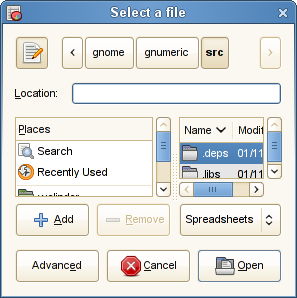
Whenever I update my OpenSuSE installation, the Gtk+ File Chooser Dialog get worse. This is how it looks for me on OpenSuSE 11.1 when used from Gnumeric. It looks more or less the same from Gedit and Mozilla.

I hope I am not breaking new ground when I claim that the purpose of the file chooser is to help the user choose a file. How is that going to happen when the area used for files is less than the size of one button?
I really hope other people are seeing something sane, but this is with a vanilla install, I think. (Note: I mention OpenSuSE 11.1 for reference, not as an assignment of blame.)