Sean has made his announcement, so I’ll take a little bit of time to explain what happened.
We (myself and assorted others) at OpenedHand have been working with OpenMoko for the best part of a year now. We have been porting applications such as Contacts and Dates and helping develop new applications and libraries such as the Dialer and libmokojournal (an interface to the journal component of iCal, via ECal in Evolution data server).
About three or four months ago we noticed there was growing concern within the OpenMoko community about the GUI design. We had already noted some of the issues that were being raised, so we had a meeting at OpenedHand and discussed all the various problems and design issues and came up with some possible solutions.
Problems:
 |
| Old style UI |
- The theme was over complicated and caused serious performance problems. We had already looked into various patches and workarounds, but it was still difficult to get good performance from it.
- The GUI design was not adapted for small screens with very high DPI. There was lots of padding and spacing between elements in the UI, which meant small hit target areas and an increased sense of clutter. There were also a lot of lines and borders which again meant the interface looked very cramped on a small screen.
- Most of the interface was not usable with a finger input method, it had to be used with a stylus. This was a particular problem because the Neo1973 does not have a stylus holder.
- The top and bottom panels were very small and not very effective. The footer was also redundant most of the time since very few applications used the “status” area.
- Scrolling was supposed to be implemented with a “scroll wheel”, but most users didn’t understand how this worked. Otherwise traditional scroll bars were used, which are often difficult to use on touch screens.
- The design for stylus applications was split into two panes, displayed on the screen at the same time with a toolbar through the middle. This meant that neither pane was very useful because it ended up being too small to fit on the screen once you included the on screen keyboard. The toolbar buttons were also small and it was unclear what they should apply to.
- Task management was difficult, as there was no way to switch between windows of a current application and there was no standard way of switching applications.
- The application framework was difficult to maintain and we often spent more time fixing the extra widgets rather than building our own applications.
Solutions:
 |
| New style UI |
One of our primary aims was to reduce the amount of extra widgets and framework built upon GTK+. Therefore, the theme design pulls on the strengths of GTK+ and the interface design can be implemented without using any custom widgets. This improves performance and cuts down on the amount of maintenance and bugs in the framework. We also worked on creating a set of guidelines, that would explain how developers should design and layout their applications in a consistent way.
- The theme was redesigned and made more suitable for the high DPI of the target screen. It was also made simpler which improves performance. There is also the possibility of using a custom GTK+ engine in the future to improve performance even further.
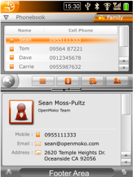
- Each application was split up into “pages” which represent a single interaction point such as browsing a list of contacts or dialing a number. This reduces the amount of information on the screen at once, providing a simpler and clearer interface.
- The toolbar was moved to the top of the screen and increased in size. This provides access to functions relevent to the current page
- A “switcher” was placed at the bottom of the screen that allows the user to switch to a different page. This is actually a standard GtkNotebook with the tabs displayed at the bottom.
- Scrolling would be possible by dragging a thumb or finger up and down the list. Chris has already mentioned his work on this.
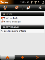
- A new Today application that would incorporate a central place to start and manage applications as well as giving the normal overview on missed calls, unread messages, etc. This is quickly accessible from a hardware button on the Neo1973.
Over the last two months, we have re-written the Contacts, Dialer and Today applications to fit the new design. We are also working on a new version of Dates.
So now all the applications should be reasonably accessible with either using a finger or a stylus. The conversion path for “desktop to phone” should be a lot simpler and it will be fairly easy for anyone with GTK+ knowledge to start developing applications that will look and feel like they belong in OpenMoko.
“The toolbar was moved to the top of the screen and increased in size. This provides access to functions relevent to the current page”
Maybe I don’t quite grasp the usage but:
In my mind, to access the toolbar at the top of the screen with your thumb you would have to strech it quite a lot, no? And also, while doing that, the rest of your hand would cover the screen and you would have to move your hand out of the way to see the results.
Maybe it would be better placed in the bottom of the screen, both for confort and for operation while watching the results as they appear on the screen. I don’t know how to do it nicely with the switcher already down there though.
I don’t have access to an openmoko to try it out, so, please enlighten me if I am wrong.
And keep up this GREAT project.
This is great news! I have always been interested in openmoko but thought the theme to be a little clutterish, this a definite improvement!
Keep up the great work!
Wow, this is a very welcome change. I have always liked the possibilities of openmoko and the neo1973, but never liked the default gui, a smell of failure. Now I smell victory. 🙂 You guys at OpenedHand are talented. Keep up the excellent work!
A big improvement, but you can still make it better.
My big two issues at this point:
– orange/black/white looks harsh; compare the iPhone’s more comforting blues/grays (though there are of course many other color combinations that look less harsh)
– I can’t tell quite what’s what: is “OpenMoko” a just header (and what does it mean)? is “03:24” clickable? are the icons in the corner clickable? Maybe I just need to learn a new visual vocabulary for OpenMoko, but it’s not at all obvious to me what’s a display, what’s a control, and what’s both
Great post, and great work!
It would be nice if posts like this showed up on the OpenMoko planet as well though – since you’re clearly pretty important to OpenMoko GUI development perhaps it could be arranged to get your blog on there as well?
Simply Better
Does this mean that I’ll soon be able to order an openmoko and make a phone call from something other than the command line? 🙂
Its a lot better than the old design.
congrats. And the contrast in the colors of the design is very good.
I agree on Kens 2 issues though – harsh colors and its not easy to see what is clickable.
For me it looks like the OpenMoko bar in the design is a titlebar, but I think my dad would think its a button, because its has the looks of a wide button.
Regarding the colors, I have the understanding that the theme is dark because that make’s the display use less power. My opinion would be too keep the dark theme but do something with the orange color.
Would love to see a prebuilt binary based on this build as I do not have the skills to make one myself