There’s nothing quite like the moment you finally crack a programming problem you’ve been working on for hours or even days.
So what is the problem I have been trying to solve that has kept me up so late at night? See if you can tell for yourself. It may not look like much once you spot it, but it has had me scratching my head for so long I just had to share it with everyone.
I hope I can squeeze it in for the next version of GNOME. After all, it’s an issue that has been present since the very earliest versions of GNOME 2.
Before:

After:
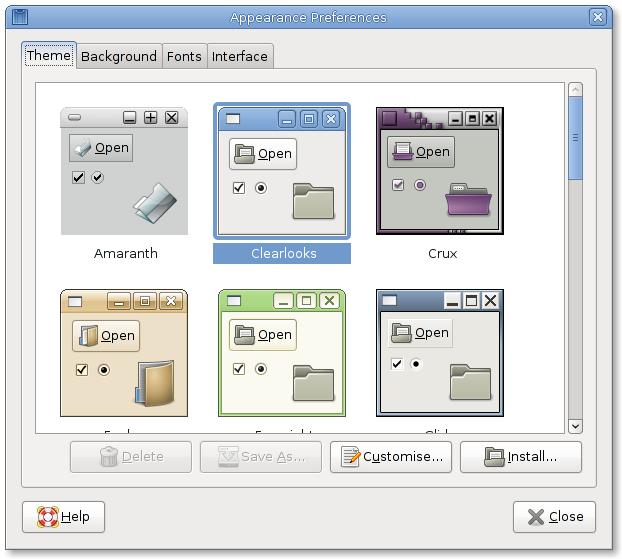
I see what you did there.
🙂
Title bars are not the same no ?
gamma has changed or brightness no ? And fonts seems smoother
Am I right 🙂 ?
cheers,
MBdC
The corners?
I had to actually download the images and switch between them quickly to spot it …
Nice work,
Shape mask applied for the previews. Nice one, I think I opened the bug about this on Bugsy!
That took me ages to see 🙂
(it’s all these little bits of polish mulitplied together that make apps seem professional; and very often the opposite is true)
Now that I see it… very very nice going.
That is just pure lovely.
You rock!
Sweet. That always irritated me.
That’s a definitely a nice fix, but IMO this dialog really needs some Cairo love.
The border coloring of selected theme is rounded, but the selection color should fill the whole space around the preview image.. and also the selection around the theme name(text) is squared, which doesn’t fit well into the picture.
I believe this could be made much nicer with some proper Cairo drawing.
Keep up the good work.
Yeah, the fix is sweet but the selection is still obviously broken-looking. But onwards and upwards.
– Chris
The gap between the selection and the preview is deliberate. Without it, it is difficult to tell where the preview ends and the selection starts and it ends up just looking even messier.
That’s as may be, but at the very least the selection should cover both text and image, rather than having a rounded border around the image, then a gap, and then a separate selection for the text.
– Chris
Saw it right away. Sweet attention to detail, Thomas! Thumbs up!
It took me some time to see that, but i’ve seen it before and thought about it (that it would be nice to have it fixed). 😀
Thanks!
Ahh, very nice! took ages to figured it out
All those years of Highlights for Children in my younger days has finally paid off.