I’ve mostly been working on non-ui related components for OpenMoko recently (working on the package management system, opkg and it’s associated packagekit backend), which gave me a chance to step back from the GUI applications and take a look at some of the areas that could be improved. I posted some of my thoughts on the openmoko-devel mailing list (thread here) and got some quite interesting and encouraging responses.
So, I set to work building some patches. Here are some screenshots of progress:

Phone numbers and contact photos in the address book contact list

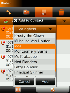
Currently work in progress, implementing “Add to contact” in call log
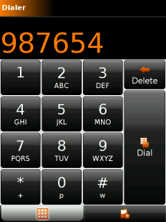
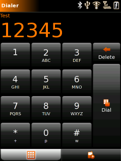
I’m also hoping to get a few theme tweaks in as well. Here’s another game of spot-the-difference (hint, not anything in the number display). And it actually does make it look a lot smarter on the device’s small screen.
 changes to
I need to find an artist to help me improve the GTK+ theme. Firstly the gradients really need to go because not only do they look ugly with the banding from the 16bit display, they also cause significant performance problems. If anyone wants to help me out, please do drop me an e-mail, or discuss on the openmoko-devel list.
I love Linux, gnome, free software and all that stuff..but the interface on openmoko is definitely one of the ugliest things I’ve ever seen
Whatever, I’m totally into it. I can’t wait for this thing to come out.
Great to see that work on the GTK+ part is going on!
Answer to “peer”:
The interface is GTK+ thus like your GNOME desktop fully themeable. But IMHO it looks quite good on the phone – apart from some weaknesses that are still there.
Good improvements on contacts list, but the dialer with a clearer background looks better to me.
Another thing I loved in dialer was the feature that showed the latest number composed as bold. I think it helps.
About Openmoko look itself, I think that the 2007.1 look was very impressive and really cool, but if it caused slowdowns I think it’s better a simpler theme!