New maemo.org community logo
July 31, 2008 1:18 pm maemo, marketingAs part of the judging panel for the maemo.org logo contest (along with Peter Schneider, Tim Samoff and David Greaves) I had the daunting task of choosing the winner from the long list of entries to the maemo.org contest. There were 62 people who submitted logos for consideration, and a total of around 120 logos to choose from (excluding variants of the same logo), we had our work cut out for us.
In the end, we went for this logo from glaolivier:

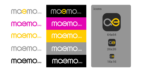
The judges (that includes me!) liked the modernity of it, the clean typeface, the call-out to the current maemo.org colours, and the mixed metaphor of the a and e joined – infinity, a meeting of minds, and openness. And it was pretty. There are a bunch of single-colour and flat variants for things like monochrome print, t-shirts and so on.

We’re very happy with it, and we believe that everyone else will be too.
August 1st, 2008 at 11:30 am
The ‘e’ on its own does look rather like some lady bits, though, and together with the ‘a’ it looks like she’s lying down with her arse facing you.
August 2nd, 2008 at 9:23 am
looks great!