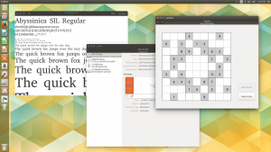
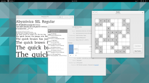
My employer, Igalia, recently purchased a Gazelle Pro from System76 for me to use. So far, it seems like a great laptop, but time will tell. It came with Ubuntu 15.04 preinstalled, so before replacing that with Fedora Workstation, I decided to check out how some of our applications look under Ambiance, the GTK+ theme that Ubuntu uses instead of Adwaita.
For the most part, Ambiance looks great. The overlay scrollbars leave much to be desired compared to upstream’s, but that’s my only real complaint. I found that Ambiance makes better use of space in general, using much less padding than Adwaita to fit significantly more content into application windows. (This is the reason behind complaints that “everything is bigger” in GNOME.) On the whole, that seems like a big advantage over Adwaita to me, though I’m concerned that might make it harder to use a touchscreen.
But I found some of the applications I maintain did not look so great, due to no fault of Ambiance, but to some non-ideal use of GtkHeaderBar.
When we started using GtkHeaderBars to replace system title bars a couple years ago, many GTK+ themes needed some time to catch up, as they were suddenly responsible for themeing title bars to look similar to the window manager’s title bars. One disadvantage of this is that it’s no longer possible to mix-and-match GTK+ themes with different window manager themes and get a good result, but if the GTK+ theme matches the window manager’s theme, there is no problem.
This approach worked well enough for us with most distributions, but Ubuntu, rather than improving their theme (which is not easy work, to be sure) and using the provided settings to put the proper window decorations in the right place, started patching our applications to set the header bars as the title bars only in GNOME. These patches took various forms: in some cases, like Calculator, the header bar was removed and its contents replaced with a menu bar (a strategy I dislike: we’ve been getting rid of menu bars because they are difficult to use), but generally the header bar was kept and simply packed underneath the title bar, instead of replacing the title bar. Since this made things worse in environments with updated themes that used the new window decoration settings, I decided to start accepting these patches upstream (in most cases), but tweaked so that the header bar would be used as the title bar in all desktops except Unity, rather than only in GNOME.
The problem is, Ubuntu’s handling of header bars as title bars has since improved considerably, and it seems applications look better now with the header bars used as title bars than with the header bars underneath the title bars. Compare Font Viewer (which uses a header bar as the title bar) to Disks and Sudoku (which pack the header bar underneath the title bar, but only when running in Unity):

Seems to me that Font Viewer is looking much nicer than Disks and Sudoku. Sudoku is also suffering from redundancy, since the application title is included in both the title bar and the header bar. That’s fixable, but since this is a non-default configuration that developers never test, similar problems are just going to return.

So my inclination is to drop our special handling of Unity. Ubuntu might patch it back in — it is free software, after all — but maybe not, and in any case I’d feel better about the code we have upstream. Which approach looks better to you?