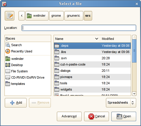
OpenSuSE 11.1 updated the Gnome File Chooser and it now looks like this:
Recall that my premise is that the file chooser’s function is to help the user choose files. By my count, the area used for files is 29% in the above dialog, including header and scroll bar. That simply is not right! Why does the “Places” section (which I rarely use) and its buttons take up that much space? Further, what does the path bar give me that adding the path into the location entry and putting “..” into the file list does not give me?
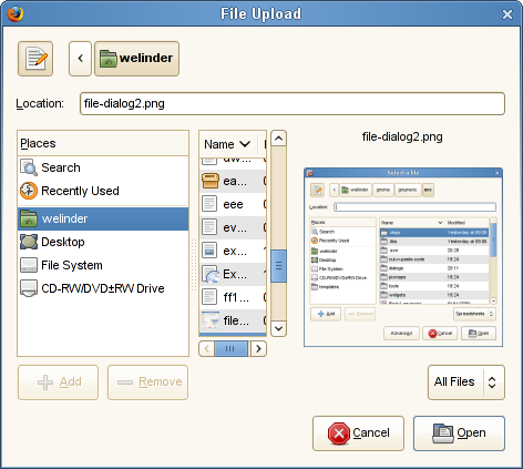
Things get a lot worse if a file preview is added. Here’s how uploading the above image looked in Mozilla:
There is room for an incredible 2-4 letters of the file names! And the full “Places” and path bar sections, of course.
Could someone please defend the Gnome File Chooser so I do not have to suggest taking it out back and having it shot!
(I do not take comments at my blog, but you can probably find an email address somewhere.)

