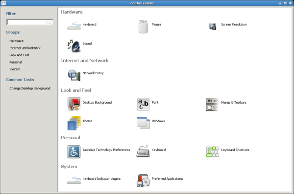
The Control Center patch party went great, with over 50 unreviewed patches reviewed and, some of them applied. The result of that crazy party (it lasted all the weekend) comes to you in the form of the 2.17.5 release of the GNOME control center, the best release ever.
Most notorious thing is the new categories in the control center shell:

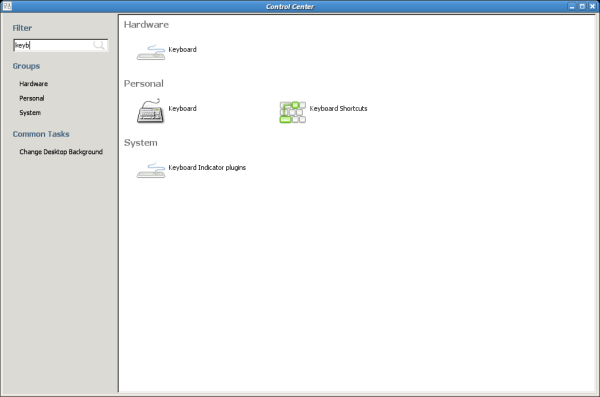
With searching integrated:

And lots of new small features, like new MIME type for theme packages, sound capplet improvements, etc. See the NEWS file for more information.
jikes, four icons to configure the keyboard!
Now I can tell what ‘keyboard shortcuts’ and ‘indicator lights’ do, but how should I be able to tell the difference between the other two? The categories hardware and personal also don’t help me much.
And why are the keyboard indicator plugins in system and not in hardware or personal? Why even a seperate entry, not in one of the other keyboard items?
Great work, great improvement over the old menu which was getting too crowded. Thanks!
Its called, lets make a cheap knock off of Mac Os X’s System Preferences. But I give you credit on trying with a slightly difference UI not to make it obvious (cough, nautilus, cough)
Dear Test, you spelt your email incorrectly so I cannot send you troll-mail
By the way, awesome work control-center team. Both for the new UI and the huge number of bug-fixes!
The two entries named Keyboard are installed by the following files:
$datadir/applications/accessibility-keyboard.desktop
$datadir/applications/keyboard.desktop
Under the current menu, they appear as Preferences -> Keyboard and Preferences -> Accessibility -> Keyboard. The two capplets also overlap some functionality.
I believe the best way to fix this for 2.18 is to have the Accessibility category on the shell as well.
Btw Rodrigo, nice work! I hope the new shell is available by default for GNOME 2.18.
So where is the tarball? Doesn’t seem to be on the GNOME-FTP right now, latest is still 2.17.3 which is quite out of date
Hm. The UI doesn’t feel very GNOME-y, does it?
Cool and impressive!
I must say I’m very disappointed by this evolution. The sole use of this shell is to make access to the configuration more complicated.
As Peter notes, there are way too many capplets and they should be either removed or merged. Moving them from a menu to a shell that takes half of the screen is not going to make them more usable.
We are going to merge capplets for 2.20, so this is the first step in making it more usable.
Are you also planning to apply this design to gnome-applets. Just for consistency sake I think this would be a good idea
IMHO the applet chooser (in ubuntu, at least) is much prettier , so maybe that design should be applied in this app instead..
This would be indeed a very useful UI for choosing applets or desklets, as the number of these things is not going down and the current UI sucks. But a shell for capplets looks, well, so win9^Wretarted…
Very interesting UI, gnome-control-center was horribly unattractive and not useful at all.
Now IMO, it would be able to become something that the user could found very useful and intuitive.
Great Job ( and sorry for my english 🙂 )
Does the search function search within each capplet? This is where the OS X one shines as you can type something that is an option within an applet (i.e., contains terms not in applet name) and it will select the appropriate applet to load.