Mallard cheat sheet:
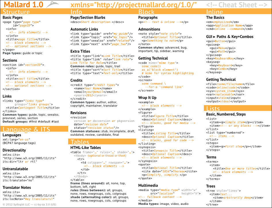
Mallard cheat sheet:
When trying to run ‘make distcheck’ on gnome-user-docs, I got this error:
make[1]: execvp: /bin/sh: Argument list too long
This roughly translates to “You have so much documentation translated into so many languages that your poor build system can’t handle it.” Congratulations to everybody involved in reaching this wonderful error.
Update: I’ve added a custom distdir target to yelp.m4 to fix this problem. If you maintain a package with a large document and a lot of translations (gnome-user-docs, ubuntu-docs), install yelp-tools 3.3.2 before making your next release. You may need to run ‘make distclean’ and rebuild completely to get the new build rules.
Last time, I gave a demo of a Mallard document rendered in a way that adapts to handheld devices like phones. Because Mallard is not a presentational language, most of the formatting can be adjusted automatically, and authors don’t have to worry about anything. But sometimes, you really do want to change the content when viewing on a handheld device.
First, though, let’s look at some specific formatting differences between desktop and mobile. For each of the pages below, click the ‘Desktop’ and ‘Mobile’ links above the iframe to see the difference.
But sometimes we add content that’s visually helpful on large screens, but cumbersome at small sizes. Things like screenshots are often nice to have, as long as they don’t get in the way. This is where conditional processing comes into play. I’ve been busy retooling Mallard conditional processing to allow things like this:
<media src="figures/shell-top-bar.png" if:test="!target:mobile"/>
The result is an image that’s only displayed in non-mobile reading environments. Switch between desktop and mobile on these pages to see it in action:
This isn’t limited to images, of course. You can use conditional processing on any block element or list item. What’s more, Mallard conditional processing allows full branching and fallback, giving you an easy way to display one thing for the desktop, and something else for mobile.
Don’t want to read? Skip to the Mobile Mallard demo.
As people use more and more mobile devices, it’s important that we can deliver help in a way that feels comfortable to users. It’s not just about help for mobile apps. Look at any book on documentation from the 80s or 90s and you’ll see an example about a field technician using documentation differently than an office worker. But now people are increasingy using phones and tablets to read documentation for everything, including devices in the world around them.
Mallard is already a natural choice for creating help to deliver on mobile platforms. Its focus on small, focused topics and its decidedly non-book-like navigation structure fit comfortably on a small screen, and its minimalist structured markup means you can easily adapt it to new needs without carrying a bunch of legacy baggage.
But the design we use for large, mouse-driven screens don’t always feel right on small, finger-driven devices. We use multi-column links that feel scrunched on small screens. We have purely decorative link previews on hover that you can’t even get to with your finger. We have margins and padding that are refreshing on large displays, but they just keep you from seeing more content on your phone. Luckily, Mallard doesn’t specify these kinds of presentation details, so we can make help that adapts to the form factor you’re viewing it on.
Check out the Mobile Mallard demo to see the initial work on making Mallard documents more suitable for mobile devices. This is still very early work, and it needs a lot of real-world testing. The next step is to use Mallard conditional processing to allow you to actually control what content is shown on mobile devices.
