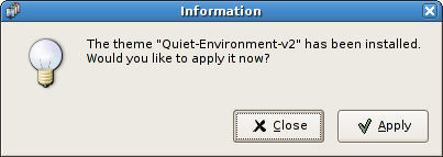
I’ve been working on a patch for bug 167045, and all works well and good, except I cannot decide which buttons to put on my dialog. Here is the dialog so far:

The “Close” button seems a little odd, but an “OK” or “Cancel” button would be even worse. Does any one have any suggestions?
I’d also take
“Apply” / “Don’t Apply”
I’d also take
“Apply” / “Don’t Apply”.
Apply/ Don’t Apply & change the question, so it makes sense. HIG ought to also mandate that the answers to questions are logical.
The theme “xxx” has just been installed.
[Use current theme] [Use new theme]
I am with Murray and Mitja.
What Mitja describes is exactly what I want to be able to to in such a situation. Nothing more.
Another vote for:
“Apply [New] Theme” and “Keep Current Theme”
Just asked 2 people about this mockup:
http://bugzilla.gnome.org/attachment.cgi?id=67332&action=view
They liked it – “does not force to read the question” philosophy is IMHO the best.
+1 for mati’s mockup – keeping it nice and simple 🙂
It’s not my mockup 🙂
The author is Mitja Pagon, I picked it up from the bug’s comments.
Well, while it may seem like a good idea to use “Don’t apply” and “Apply”, speaking in terms of linguists, this question is definitly a “Yes” / “No” question.
Be serious, if someone would ask you, would reply with “Don’t apply” or “Apply” out there on the streets when you’ve been asked by the tattooer to get your new ink applied?