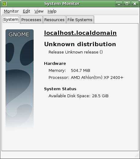
I just noticed this interesting addition to System Monitor

Although not particularly useful on my system it seems (it hasn’t picked up the hostname or distribution), the banner graphic down the side was what took me by surprise. I would link to the GNOME logo guidelines at this point for suggestions, but live.gnome.org appears to be down again.
Update: Here it is: http://live.gnome.org/BrandGuidelines
Although, I suspect most distributions will just replace this graphic anyway?
Update 2: Corey filed a bug about this now. Looks like there are some quite strong opinions.
If you run it under KDE does it should a KDE banner?
“If you run it under KDE does it should a KDE banner?”
Is there any reason why it should?
Don’t you think it looks too much like the Windows XP system tab? Honestly, that’s the very first thought I had when seeing this screen cap.
I know it’s a never ending discussion, should Linux imitate Windows to give beginners an usual feeling? I don’t think it should.
“Although, I suspect most distributions will just replace this graphic anyway?”
I don’t know about others but in ubuntu feisty this banner is used.
Hi,
about the branding : the feature comes from OpenSuse which uses a Novell Logo. There’s a bugzilla entry about it : http://bugzilla.gnome.org/show_bug.cgi?id=377144
about the distro info : you need the LSB tool lsb_release. I’m going to add this ‘dependency’ in the ReadMe.
about the hostname : i’m going to dig about it. code is :
if (gethostname(buf, sizeof buf) == 0)
if (struct hostent *h = gethostbyname(buf))
this->hostname = h->h_name;
What does ‘uname -n’ looks like on your box ?
Thanks.
Benoit: Instead of new tool dependency, can’t you just read /etc/lsb-release ?
GiB, MiB, WTF? What’s going on here, who snuck that in? Gnome applications should use MB, and GB, by default and MiB, and GiB, should only appear as an optional extra for those who really know they want it.
> Although, I suspect most distributions will just replace this graphic anyway?
Please dont put it in at all, the last thing we need is even more inconsistency. Gnome has always been good about keeping the branding subtle and tasteful despite the efforts of distributions to uglify things. Even worse this kind of branding is a pain in the arse to make accessible since it doesn’t change with the theme, and that alone should be reason enough to junk it.
It is beautiful 😉
Gnomer : /etc/lsb-release is not standard AFAIK. lsb_release is just fine and is meant for that. This is just an optional dependency. I’m not going to waste time writing custom code for every linux distro. lsb_release is a nice solution, but you have to get it.
Alan : http://www.bipm.org
i’ve just killed the logo because of angry people. Now the system looks empty.
Benoît, too bad 🙁
With the Gnome logo it was really sweet.
Benoît I understand why you point me to pages claiming GiB is “more correct” but Gnome has never officially accepted these new “standards”. I shouldn’t have to keep saying inconsistency is a bad thing. I might be able to stomach it if it were done throughout all of Gnome but until then individual applications shouldn’t be pushing it anymore than we should be pushing American Gnome users to learn metric, tempting though it might be. If anything we should avoid the abbreviations and clearly say Gigabytes, especially with users facing the prospect of needing to learn about Terabytes (only about E500 for a terabyte of storage now, should be mainstream by year end).
Thanks Thomas for drawing wider attention to this.
This extra tab does tie in well to the new Slab menu. When you click on the hard drive icon, it displays information about the system, as a user might expect.
I don’t care if Slab suffers from NIH.
Alan : i’m not having this conversation again. BIPM rules and the units confusion is a mess in both private and professional computing. System-Monitor is right. If you don’t agree, you’re free to contact your I18N team so they translate SI units into non-SI units, imperial units or potatoes.
Hi, since I liked the idea of the image (and without it the dialog seems “empty”) I’m working on a patch to draw a themed logo. I still have a little issue with refresh, but when fixed I will attach the patch to bug #377144. On my blog you can see the final effect (click the image for a larger view).
http://loopback.wordpress.com/2007/01/21/gnome-logo-guidelines/