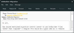
We’ve been discussing the future of the Interface tab in the Appearance capplet, and we’d like to “fix” the default toolbar style before we consider any changes. It seems not many people are aware of what these styles actually look like, so to help I’ve done some screenshots:
Text Beside Icons (the proposed new default)
![]()
Text Below Icons (the current default)
![]()
A trial switch to the text-beside-icons style is underway, so that we can test applications to make sure they work properly with this style. Discussion on any issues can be reported in bug 590143.
Personally, I think there are several advantages to the text-beside-icons mode:
* Increased hit area (fitts law) for important buttons
* Reduced vertical space usage (compared to text-below-icons)
* Reduced horizontal space usage in some applications (as compared to text-below-icons in e.g. Nautilus, Evolution)
* Aesthetically nicer than having text for every item

