During my Outreachy internship with GNOME, Tamnjong Larry Tabeh and I conducted user research exercises under the inspiring mentorship of Allan Day and Aryan Kaushik.
In this blog post, I’ll discuss the usability test we conducted for GNOME’s Files, also known as Nautilus.
This blog post will introduce the study, outline our methodology, and present our key findings from the usability test. I’ve also attached a downloadable report at the end of this blogpost that discusses (in detail) our observations and recommendation(s) for each task performed in the usability test.
Without further ado, let’s jump right in!
1. Introduction
Files is the default file manager of the GNOME desktop. It provides a simple and integrated way of managing files when running a Linux-based OS by supporting all the basic functions of a file manager and more.
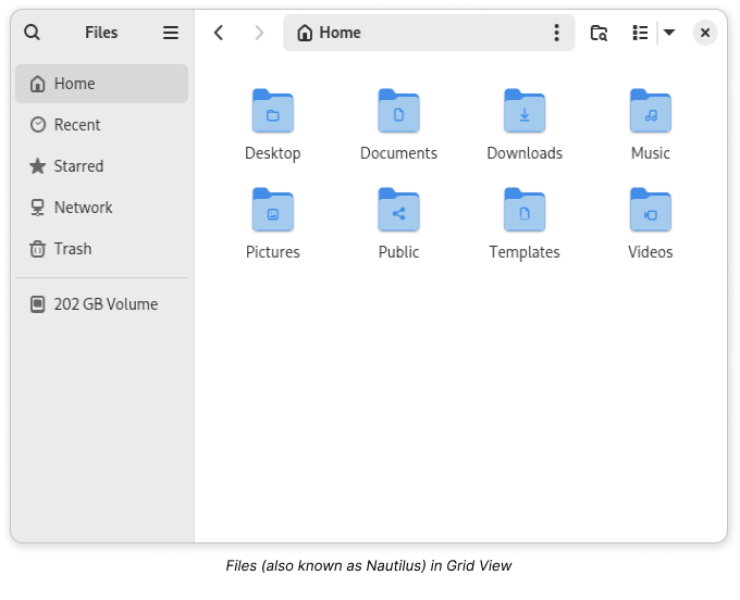 With recent GNOME releases introducing significant changes to the Files user experience, and more improvements planned for subsequent releases, the design team wanted to assess the effectiveness of these updates and learn more about other aspects of the user experience.
To support these efforts, we executed a user research project to identify areas for improvement, and gather actionable insights from observed user behaviours that can inform design decisions when addressing identified issues.
1.1. Research Goals
Our research goals were to:
-
- Assess the effectiveness of the new menu structure and the discoverability of the following menu items:
-
-
- Icon Size editors
- Properties
- Select All
- Undo/Redo
- Sort
- Open Item Location
- Show Hidden Files
- Add To Bookmark
-
-
- Evaluate the ease of use of Files’s Search feature, and the intuitiveness of its Search Filters.
-
- Investigate the extent to which any difficulty experienced when right-clicking an empty space in List View impacts the user experience when accessing a folder context-menu.
1.2. Research Questions
Upon completion of the study, we wanted to be able to answer the following questions:
-
- Menu Structure
-
-
- Is the current organization of the menus effective?
- Can people find the buttons they need for basic tasks when they need them?
-
-
- Search Experience
-
-
- Do people understand how to search in Files?
- Do people understand the search filters and how to use them?
- Are the search filters effective for their context of use?
-
-
- List View Layout
-
-
- Is it challenging for people to access the folder context menu in list view when they have a lot of files?
- Does the current design meet user expectations when accessing folder context menu in list view?
-
2. Study Design
2.1. Approach
To answer our research questions, we opted for a moderated task-based usability test. This approach meant that we could simulate typical usage conditions and observe participants interact with Files. This made it easy for us to identify pain-points and gaps in the specific aspects of the Files user experience that we were interested in, and allowed us to engage participants in discussions that deepened our understanding of the challenges they experienced with Files.
To plan the study, we started by defining the ideal participant for our research goals. Next, we established an optimal sequence for the tasks we wanted participants to perform, then crafted a scenario for each, after which we designed the testing environment. Then concluded preparations with a pilot test to identify weaknesses in the study plan and implement revisions where necessary before testing with recruited participants.
2.2. Recruitment Criteria
To generate the data we needed, we had to observe individuals who were unfamiliar with the Files menu structure. This requirement was crucial, as previous use of Files could influence a participant’s interactions, which would have made it difficult for us to discern valid usability issues from their interactions.
We also needed participants to be able to perform basic computing tasks independently: tasks like navigating software and managing files on their computer. This proficiency was important to ensuring that any challenges observed during the study were specifically related to the Files user experience, rather than stemming from a lack of general computer skills.
Therefore, we defined our recruitment criteria as follows:
-
- Has never used GNOME prior to their usability test session.
- Is able to use a computer moderately well.
2.3. Testing Environment
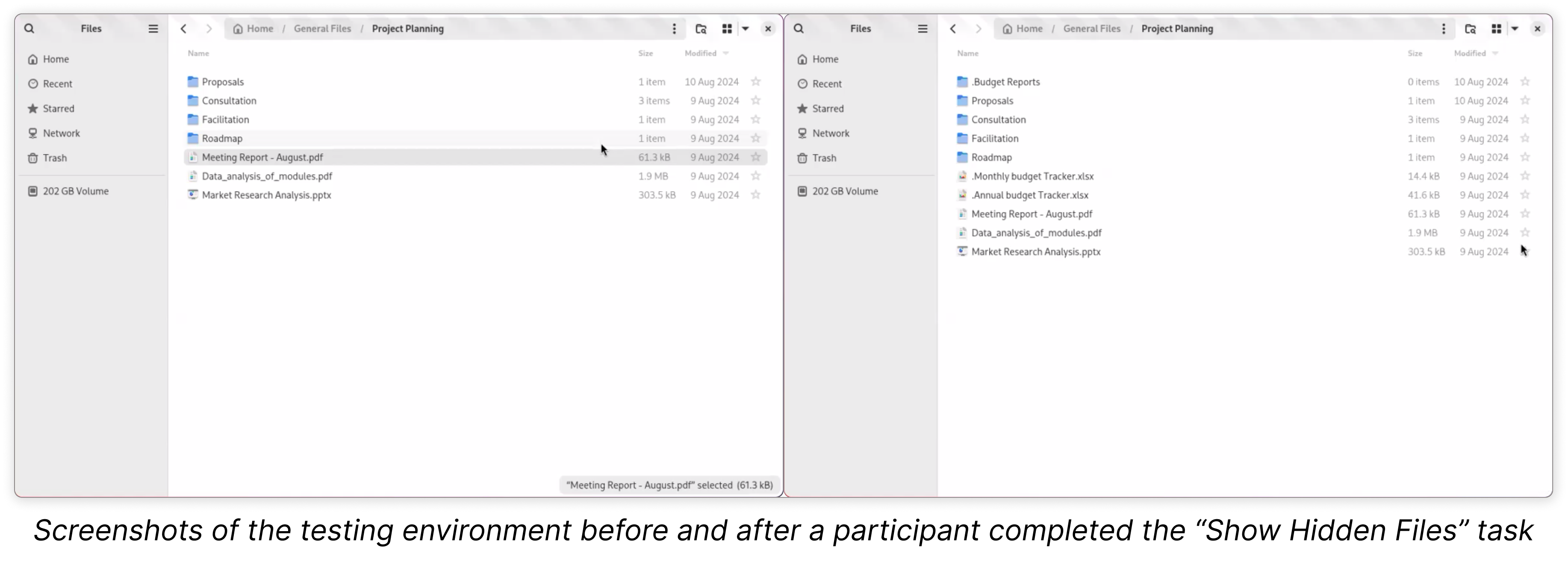
During testing, participants interacted with development versions of Files, specifically, versions 47.rc-7925df1ba and 47.rc-3faeec25e. Both versions were the latest available at the time of testing and had identical implementations of the features we were targeting.
To elicit natural interactions from the participants, we enhanced the testing environment with a selection of files and folders that were strategically organized, named, and hidden, to create states in Files that encouraged and facilitated the tasks we planned to observe.
3. Participant Overview
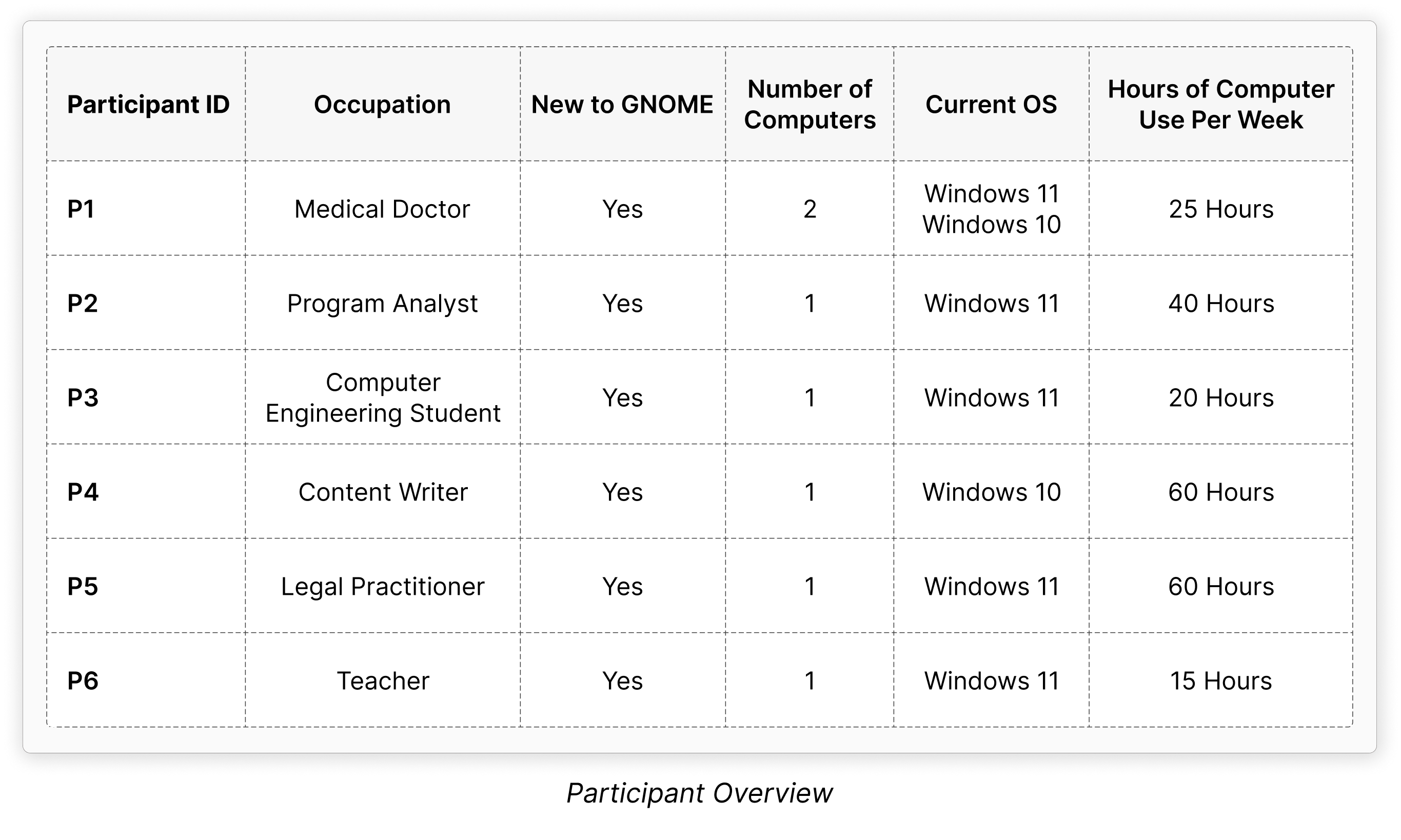
We recruited and tested with six first-time GNOME users, aged twenty-one to forty-seven, from diverse backgrounds, with varying levels of computer expertise. This diversity in the sample helped us keep our findings inclusive by ensuring that we considered a broad range of experiences in the usability test.
Although the majority of the participants reported current use of Windows 11 as shown below, a few also reported previous use of macOS and earlier versions of Windows OS.
4. Methodology
For this usability test:
-
- We conducted in-person usability tests with six computer users who met our selection criteria.
-
- The moderating researcher followed a test script and concluded each session with a brief, semi-structured interview.
-
- Participants attempted eleven tasks in the following order:
-
-
- Change the icon size
- Find the size of a folder with Properties
- Select all files in a folder with “Select All”
- Undo an action with the “Undo” button
- Change the sort order
- Change Files display from grid view to list view
- Create a new folder while in list view
- Find a file using the search feature, with filters
- Go to a file’s location from search results with “Open Item Location”
- Reveal hidden items in a folder with “Show Hidden Files”
- Add a folder to the sidebar with “Add to Bookmarks”
-
-
- Participants were encouraged to continuously think aloud while the performing tasks and each session lasted at least 40 minutes.
-
- All sessions were recorded with participant consent and were later transcribed for analysis.
-
- To analyze the collected data, we summarized the participants’ experiences for each task using Jim Hall’s Heat Map technique and synthesized findings from our session notes through Thematic Analysis.
5. Usability Test Result
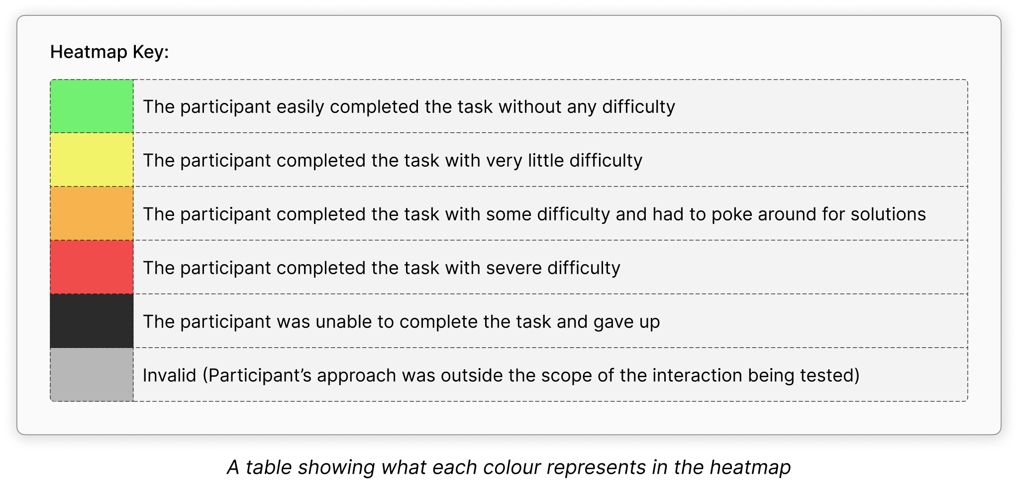
Applying Jim Hall’s Heat Map technique we summarized the observed experience for all tasks performed in the usability test. The heatmap below shows the completion rate for each task and the level of difficulty experienced by participants when performing them.
The tasks are in rows and participants are represented in columns. The cell where a row (Task) intersects with a column (Participant) captures the task outcome and relative difficulty experienced by a participant during their attempt.
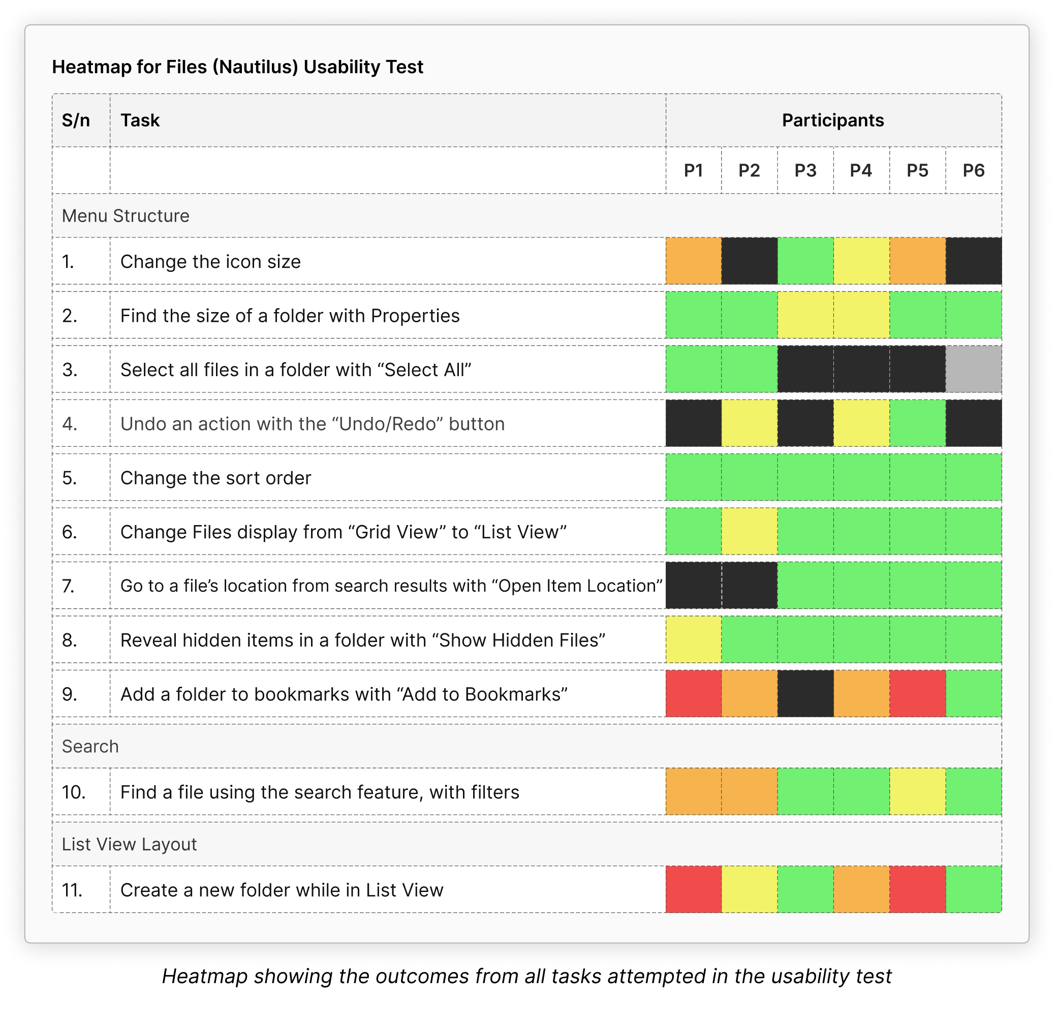
A cell is green if the participant completed the task without any difficulty, yellow if the participant completed the task with very little difficulty, orange if the participant completed the task with moderate difficulty, red if the participant completed the task with severe difficulty, black if the participant was unable to complete the task, and gray if the participant’s approach was outside the scope of the study.
6. Key Insights
1. Menu structure
-
- The menu structure was generally easy for participants to navigate. Despite using GNOME and Files for the first time during their testing sessions, they adapted quickly and were able to locate most of the buttons and menu items required to complete the tasks.
-
- The best performing tasks were “Change the sort order” and “Reveal hidden items in a folder”, and the worst performing tasks were “Change the icon size” and “Add a folder to Bookmark”.
-
- Overall, the participants easily found the following menu items when needed:
-
-
- Sort
- Show Hidden Files
- Properties
- Open Item Location
-
-
- But struggled to find these menu items when needed
-
-
- Icon size editors
- Select All
- Undo/Redo
- Add To Bookmark
-
-
- In situations where participants were familiar with a shortcut or gesture for performing a task, they almost never considered checking the designated menus for a button.
-
- We observed this behavior in every participant, particularly when they performed the following tasks:
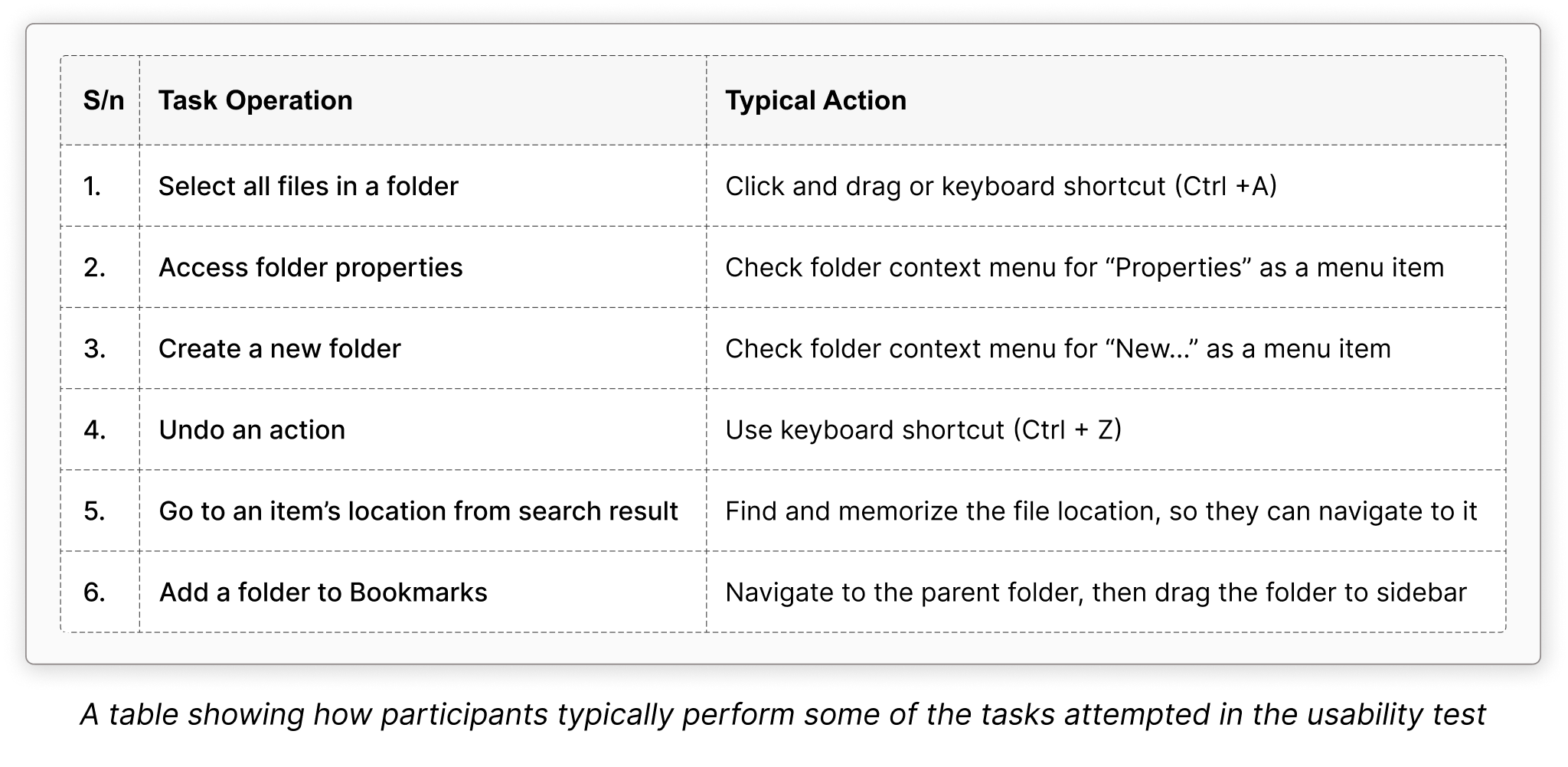
Nonetheless, Files excelled in this area with its remarkable support for widely used shortcuts and cross-platform conventions.
-
- We also observed that when these actions worked as expected it had the following effects on the user’s experience:
-
-
- It reduced feelings of apprehension in participants and encouraged them to engage more confidently with the software.
- It made it possible for the participants to discover Files’s menu structure without sacrificing their efficiency.
-
2. Search
The “Search Current Folder” task flow was very intuitive for all participants. The search filters were also very easy to use and they effectively supported participants during the file search.
However, we found that the clarity of some filter labels could be reasonably improved by tailoring them to the context of a file search.
3. List View Layout
The current List View layout did not effectively support typical user behavior when accessing the folder context menu.
4. General Observation
When the participants engaged in active discovery of Files, we observed behaviour patterns that are linked to the following aspects of the design:
-
- Familiarity:
-
- We observed that when participants attempted familiar tasks, they looked for familiar cues in the UI. We noticed that when a UI component looked familiar to participants, they interacted without hesitation and with the expectation that this interaction would lead to the same outcomes that they’re accustomed to from their prior experience with similar software. Whereas, when a UI component was unfamiliar, participants were more restrained and cautious when they interacted with it.
-
- For example, we noticed participants interact differently with the “Search Current Folder” button compared to the “List/Grid View” and “View Options” buttons.
-
- With the “Search Current Folder” button, participants took longer to identify the icon, and half of the sample checked the tooltip for confirmation before clicking the button, because the icon was unfamiliar.
-
- In contrast, participants reacted a lot quicker during the first task, as they instinctively clicked on the “List/Grid View” or “View Options” icons without checking the tool tip. Some even did so while assuming the two buttons were part of a single control and interacted with them as if they were combined, because they were familiar with the icons and the design pattern.
-
- Tool tips
-
- With a lot of icon buttons in the Files UI, we observed participants relying heavily on tooltips to discover the UI. Mostly as a way to validate their assumptions about the functionality of an icon button as highlighted above.
-
- Clear and effective labels:
-
- We observed that, the more abstract or vague a label was, the more participants struggled to interpret it correctly.
-
- In the “Open Item Location” tasks, we guided the participants who were unable to find the menu item to the file’s context menu, then asked them if they thought there was a button that could have helped them complete the task. Both participants who gave up on this task instantly chose the correct option.
-
- Whereas, in the “Add To Bookmarks” tasks, almost everyone independently found the menu item but the majority of them were hesitant to click on it because of the word “Bookmarks” in the label.
-
- Layout of Files
-
- By the end of most of the sessions, participants had concluded that controls in the white (child) section of the layout affected elements within that section, while controls in the sidebar were relevant to just the elements in the sidebar, even though this wasn’t always the case with how the Files menu structure is actually organized.
-
- Therefore, when participants needed to perform an action they believed would affect elements in the child section of the layout, most of them instinctively checked the same section for an appropriate control.
7. Conclusion, Reflections and Next Steps
If you’d like to learn about our findings and the identified usability issues for each task, here is a detailed report that discusses our how the participants interacted alongside our recommendations: Detailed Report for Files Usability Test
Overall, the usability test effectively supported our research goals and provided qualitative insights that directly addressed our research questions.
Beyond these insights, we also noted that users have preferences for performing certain tasks. Future research efforts can build on this insight by exploring the usage patterns of Files users to inform decisions around the most effective ways to support them.
Reflecting on the study’s limitations, a key aspect that may have influenced our result was the participant sample. We tested with a sample that was predominantly composed of Windows 11 users, although unintended. Ideally, a more diverse group that included current users of different operating systems could have further enriched our findings by providing a broader range of experiences to consider. However, we mitigated this limitation by recognizing that the participants who had previous experience with more operating systems brought their knowledge from those interactions into their use of Files, which likely influenced their behaviors and expectations during the test.
8. Acknowledgements
I gained a lot of valuable skills from my internship with GNOME; I significantly improved my communications skills, learned practical skills for designing and executing user research projects using different qualitative and quantitative user research methods, and developed a sense for the more nuanced but critical considerations necessary for ensuring reliability and validity of research findings through the various phases of a study and how to mitigate them in research planning and execution.
So, I’d like to conclude by expressing my profound gratitude to everyone who made this experience so impactful.
I’d like to appreciate my mentors (Allan day and Aryan Kaushik) for their guidance, insightful feedback, and encouragement, throughout and beyond the internship; the GNOME community, for the warm welcome and support; and Outreachy, for making it possible for me to even have this experience.
I greatly enjoyed working on this project and I expect to make more user research contributions to GNOME.
Thank you!

