I am at the Gran Canaria Desktop Summit thanks to the generous sponsorship from the GNOME Foundation! It’s great to be meeting old and new friends here.
 |
I’ve been working on implementing the new design for the Overview mode for the GNOME Shell based on these mockups by Jeremy in the weeks leading up to the conference. The Overview mode is intended to give the user a quick way to switch activities, organize windows among workspaces, and find and launch new applications and documents. Essentially, this mode is a zoomed out view of all workspaces plus menus for starting new tasks. Some advantages of having such mode are:
- Having an interactive view of all workspaces
- Being able to focus on what needs to be launched when starting a new task
- Plenty of space to easily get details about applications and documents
- Having favorite and recent items one click away, but not cluttering the main desktop view
The recent changes to the view include:
- Adding distinct looking panes to contain the information
- Displaying additional results in the new panes and keeping the content of the main pane on the left constant
- Using slightly transparent panes to display additional results above the workspaces area instead of moving out the workspaces to the right when more results or details are requested (as was the case in the original implementation)
- Adding an area for the user to place their favorite applications in and displaying all running applications, which was done by Colin
These changes make using the Overview mode feel more stable and predictable because different areas no longer shift around.
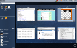
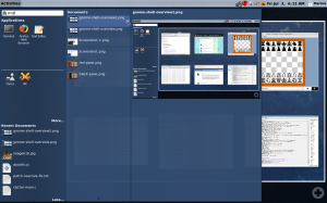
Here are the two screenshots of the Overview mode. The user can get to this mode from the main desktop view by clicking the Activities button in the top left corner, pressing the System key or Alt+F1. The first screenshot shows off a single workspace with open windows, favorite applications, non-favorite running applications, and recent documents. The second screenshot shows off search results along with a details preview for one of the results.


There are still a lot of enhancements based on the mockups that need to be done in this view, such as indicating which applications are running with a glow around the icon, showing more details for an item, including “Places and Devices” section in the left side pane, and adding more polish in general. However, I feel this is a good start that shows off the intended behavior.
We look forward to getting more people involved with the design and development of the GNOME Shell, so be sure to check out Owen’s Introduction to the GNOME Shell talk on Sunday and the GNOME Shell Design BoF Jon and I are hosting on Thursday. Of course you are welcome to come discuss stuff with us any time during the conference and try the GNOME Shell for yourself.

I would love to see some Gnome-Do-like capabilities… in form of plugins if possible. As long as the shortcuts are not likely to be hit by newbies (I’m guessing they’d be confused by the extra oomph), it looks like a good workflow match.
So the search bar is still on the top of the left pane but it’s output is displayed in a new pane? Doesn’t make much sense to me at all.
I also wonder about the displayed applications (fav and running) on the left pane. Does clicking those launch new instances or does it zoom in on the running app?
What I’d love to know is how fast rendering actually is.
I don’t see what Gnome3 offers that others don’t. And from those screenshots. gnome 3 will just be a copy of 2 just with a little different things.
Gus: We have been looking at GNOME Do and will be figuring out how it should interact with the GNOME Shell.
Michael: Search box on the left and results panes on the right actually works out fine. We have explored having the search box on the right, but decided not to go with that option since we want the search to be as central and as easily accessible as possible.
http://live.gnome.org/GnomeShell/DesignerPlayground/SearchToTheRight
http://live.gnome.org/GnomeShell/DesignerPlayground/SearchToTheRight2
Clicking on displayed applications launches a new instance if the application is not yet running or switches to the application if it is already running. We have ideas about highlight windows or offering a selection of tabs for applications that have multiple windows / tabs, but have not implemented that yet.
prokoudine: The rendering is fast. People were running into problems with certain graphics cards initially, but I haven’t heard too many reports of problems lately.
Lenny: There are immediate differences in the experience when using a new graphics toolkit, dedicating a full screen to context switching, and introducing a new notifications system. However, the changes should not be for the sake of making everything different, but for the sake of creating a sleek and easy to use desktop. If you have any ideas you think we need to explore, please feel free to send them to the mailing list.
Marina; you do realize people like Lenny are not into constructive criticism, right?
GNOME 3, I don’t know about. . . GNOME Shell and Zeitgeist are looking awesome.
I’ve been using Shell at work for some days now, it rocks.
At home, I get a weird error message saying META_SCREEN_TYPE is not set when building.
Haven’t dug into the code yet, but any tips will be appreciated =)
Thanks for everything, and I do mean everything !
skaiuoquer:
Thanks :)!
Can you try asking your question on #gnome-shell on irc.gnome.org or by posting it to the GNOME Shell mailing list http://mail.gnome.org/mailman/listinfo/gnome-shell-list ?
Will do.
By the way, that Do thing people were asking about . . . I’ve heard of plans to “doify” the GNOME desktop; Shell is definitely a chance to do this.
Pun half-intended.
Godspeed ^ ^
Just a question. If the most important activity (or somewhere pretty much on the top) people do with desktop is communicating, wouldn’t be possible somehow to integrate roster (probably from Empathy or even pidgin?) to the Activities panel? I would prefer it over Most Recent Documents any moment (using too many non-Gnome apps means this panel is quite useless to me).
I don’t know what people find interesting in Gnome Shell. I only find it useful to some people who like eye-candy and extra components. I would rather love to see Gnome more memory efficient so it can compete with light desktop environments like LXDE, which is very good but not yet as polished as Gnome.
Gnome should use the advantage of being the leader of the classic desktop environments and improve up to a point it can run significantly better even on slower machines – which means even better performance on today’s hardware.
@kneekoo Actually, concerning eye-candy, I find gnome-shell to be much less cluttering the display than plain metacity with gnome-panel. That overview thing (which is the only eyecandy I can see around) … think about gnome-shell as a modal interface in the same manner as you think about vim. There is one mode for working on one workplace and another one for overview. I actually found gnome-shell quite addictive.