We have been discussing about the best way to reduce the overcrowded preferences menu, that is, the number of control center applets. The ideal solution, which we are discussing on the Control Center mailing list, is to have a new control center shell. More news on that soon.
The other things we discussed was about merging some of the applets, since some seem redundant. A good example is the keyboard capplets, which are 3!:
- Keyboard applet, to set basic settings like layout and cursor blinking, and not so basic things, like the typing break.
- Keyboard shortcuts.
- Accessibility keyboard settings.
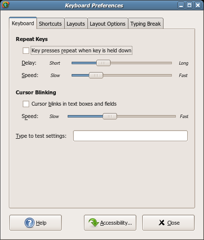
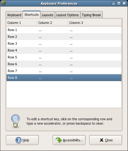
So this looked like the best candidate for the first merge, so after some discussion, two of them have been merged in the mockups below:


The a11y bits were not merged, mainly because the a11y guys seem to think it is better to keep it separated. And merging it with the already crowded keyboard preferences dialog seems a bad idea, given the a11y capplet has its own tabs, which would be inside the keyboard prefs capplet tab.
Any comments, suggestions, etc, please send it to the Control Center mailing list.
Option to “stop blinking after N seconds” hidden in gconf?
Not exactly on topic but I would like to see “Tap Off when typing” feature… (maybe both – keyboard and mouse applet)
It does indeed look not bad, but I have to confess I’d feel more confident if we at least had time to do some sort of card-sorting[1] exercise with some users before such a big change, to get a feel for what they think the most logical groupings are. It may be that just merging together the existing capplets in what we think is an obvious way turns out to be correct, but you can never be quite sure… Users Are Always Surprising ™ 🙂
(I suspect it would also throw up a bunch of “What does that do?” and “I never knew that existed” comments, which might be good candidates for simplifying out of the UI altogether…. e.g. I wonder how many people have ever adjusted their mouse sensitivity, or can even work out what it does compared to the mouse acceleration setting– I certainly have no idea.)
[1] Which could just be a simple online thing, e.g.
http://www.rashmisinha.com/hcimethods/cardsorting.html , although it’s usually nicer to get a bunch of people collaborating in a room for this sort of thing.
Not bad but I still don’t care for such vague descriptions as “long”, “short”, “slow”, “fast”, etc.
Why not at least show an example of the blinking cursor, so you can see for yourself how fast it blinks? Or put tick marks and labels on the extremes of the repeat sliders, like “0.1 sec” and “1.5 sec”?
Another thing that’s slightly weird is that the default value for the checkboxes is to be checked, when usually the default is for things not to be checked, IIRC.
Also, the “Accessibility…” label is weird.
The typing break is one of the best-hidden (but useful) features of GNOME (http://bugzilla.gnome.org/show_bug.cgi?id=169091). I suggest putting it in a more prominent place, if we’re doing a redesign.
Ken: example of blinking cursor is traditionally placed in text area next to “Type to test settings:”.
Calum: As for sensitivity and speed — leave it! I don’t want to go back to putting “xset m magic” invocation in text scripts run on session startup.
Excuse me, but GNOME sucks. Nautilus lacks of features, GNOME isn’t a “graphical environment”, becuase to change many aspects of behaviour you have to open conf file and edit it. Number of options in preferences dialogs makes me laugh.
I like GNOME becuase of GTK and it’s really nice look. But hey, appearance (which you can’t adjust it in a graphical dialog boxes, BTW) is not everything.
Some people making act of grace and developing Xorg and all this stuff I think had something on mind? Not all wants to be a console master and not all aspire to be a developers in OSS world.
But let’s see. Many Open Source Software sucks.
Mozilla Firefox is a crap. Speed of development is so incredibly fast. After months brand-new function without extension – drag and drop support for tabs.
Mozilla Thunderbird sucks. No multiple signatures option without stupid extension.
Evolution can’t import Mozilla Thunderbird address book in .ldif format. Both suck.
CUPS sucks. It prints the images and suddenly… some @DENSITY and other crap in half of a page on HP Printer.
Ubuntu’s network admin sucks. No advanced options and no tool to detect wifi networks “out of box”, you have to download “wifiradar”, but hey… You must have Internet first! So what? You must play with iwconfig first.
To map a SMB share you have to play with stupid mount and umount. No “offline files” support “out of box”.
Thanks for listening and deleting my comment because of censorship in OSS world.
One more thing. You’re really wise, GNOME developers. What a splendid idea to group options in applets. So good ideas after years? Please… You’ve never thought about something like that before?
I have to disappoint you. Such great ideas had people before you. Really. And you know what? They checked that it works and makes better desktop experience. I swear!
I have a problem with this window. I have a USB keyboard that has a different model from the one on my laptop, the problem is that you can change the layout very simply using the applet, but when it comes to layouts you have to open the preference dialog.
I don’t know if this is a problem with the X server, the kernel or anywhere else. Fact is we should be able to configure that keys coming from the USB keyboard uses the XYZ model with the layout ABC and the ones that come from the native keyboard are from XYZ2 with layout ABC2.
Since this is impossible, as far as I know, is it possible to select model/layout from the applet instead of the simple layout selection?
rrffkk: Truly, you have a dizzying intellect.
zdzichu: Yes, but if it’s like most text boxes, you have to click to focus there in order to see it. (Unlike the Mac, *every* widget in Gtk+ can have focus, including the sliders.) So you won’t be able to see the blink rate while you’re changing it. :/
If it were me I’d integrate all the keyboard-related accessibility options into “keyboard”, and keep keyboard shortcuts separate. “Keyboard” is about customizing the way your keyboard behaves as a keyboard, “Keyboard Shortcuts” is about customizing the way Gnome gets its input in order to do various UI actions. If possible, the keyboard-related accessibility options could also appear in a seperate “Accessibility” control panel, along with any non-keyboard options there might be.
Another thing I would do is work to avoid the number of notebook tabs, certainly avoid adding any new ones if at all possible.
Thanks
Reed