Few days ago the new collections dialog for GNOME Documents landed in master. Since the last post the dialog received some improvements:
An empty view
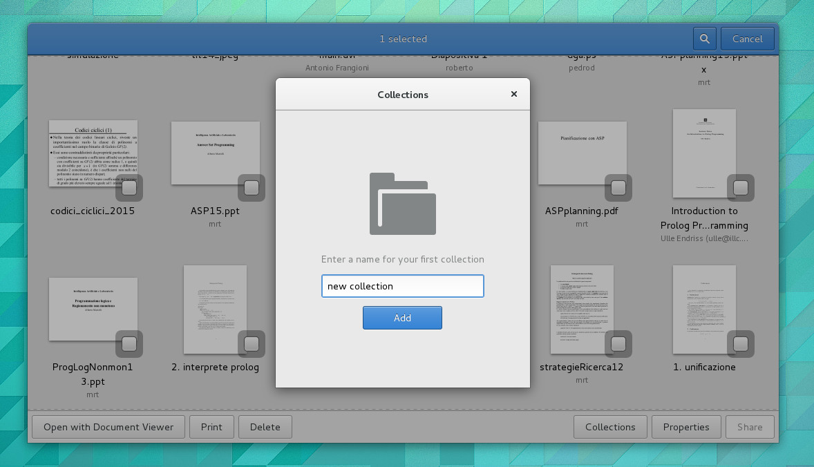
When there are no collections, instead of displaying an empty list we show a special view to add your first collection.
A more polished dialog

The border of the list was removed giving more view to the list’s content. Suggested buttons are indicated, so that the theme can colour them differently to give a hint to the user. Spaces between elements have been changed according to the GNOME HIG and now they are in increments of 6 pixels.
Animations
https://www.youtube.com/watch?v=0-C8ohMZTsE
When deleting a collection, the row now slides on the left to make room for the delete message with the undo button. If the undo button is clicked the collection row slides back.
https://www.youtube.com/watch?v=NlR1weMETHo
When the undo button is showed a timer starts. If it is not clicked in time the collection is deleted and the row disappears.
My work on GNOME Documents as a Google Summer of Code student is over, but I have strong interest in continuing to contribute in this awesome community. I would like to thank again my mentor, Debarshi, for his guidance and help when things didn’t work; the GNOME design team for gave me a good mockup to work on; Lapo for the graphical tips he suggested me after the previous blog post and Emmanuele for his advice on GTK.