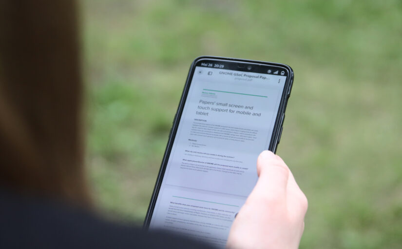
If you only want a document viewer on your phone, get Papers on Flathub. If you are interested in the resulting source code of my GSoC project, check out the repository. If you want to know how we got here, you are reading the right blog post.
Shortly after Evince was forked into Papers, there was already an issue created for supporting touchscreens and making the user interface adaptive (issue #6)—expressed in simple terms: Papers should work on a phone just as well as on a convertible laptop with a touchscreen, or desktop computer with a good old mouse.
This is exactly what I am interested in. I only started contributing to GNOME in early 2023, as I was hooked by the idea of running it not only on my notebook, but also on a mobile device. Later that year, I attended the GNOME 45 release party in Berlin, where I first talked about the opportunity that Google’s Summer of Code presents. Pablo, who overheard that conversation, joked I could look into—then—Evince. I said I would not do that. I was wrong.
Before I applied for the Summer of Code project, I looked into simplifying the search sidebar (MR !75) and porting it to ListView—a modern GTK4 widget—(MR !121), for performance.
I badly wanted a document viewer for my phone, and sought the challenge after having tasted a fraction of what Papers offers in that regard, so I applied, and was accepted into GSoC. And this is my story:
Adaptive from the Start—The Hidden Prequel
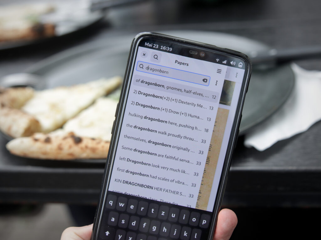
For the first part—to make the interface adaptive, I needed to move quite a few widgets around. While having a large impact, it was not that complicated, because the widgets to be moved were fairly well separated. Or were they?
In fact, not all of them were from the start. First when I worked on search performance, so before my project started, I noticed that the window was receiving a lot of signals whenever one UI component changed, and it notified every other component, that depended on it, about that. I realised—and talked to my mentor, Pablo, about it—that structuring that similar to the model–view–viewmodel pattern would allow us to move widgets around freely. Then there no longer was a need to ensure those widgets staid direct children to the window, or that they were providing the window a reference to them another way.
I used the community bonding period to familiarise myself with the source code and the project—as I was supposed to. So what better way to do that than starting on this code separation? Entering the scene: a search context—before the official coding period. (MR !184)
That way, on the first day of the coding period, I already had finished making Papers fit a 360 pixel wide window—just perfect for a phone screen. After another week of iterating on this, the main window structure followed the current mock-ups: a split view with a split header bar, overlay zoom buttons, and an application’s main menu split from the document specific menu. (MR !196, follow-up: MRs !244, !262, !278, !302)
Also, just because you can open it on a device with an only 360 pixels wide screen, you are not done with your adaptive user interface. That is just the bare minimum.
First, the page thumbnails in the aptly named thumbnail sidebar, for example, had hard-coded widths and aspect ratios leaving weird paddings, and increasing the sidebar’s width when the two-column mode was activated. And it did not use the sidebar selection colour, but the one for the main selection. (MR !197, libadwaita MR !1117)
Secondly, the outline started to show more ellipsis than label due to the changed sidebar widths. (MR !245)
Thirdly, the annotation sidebar did not feature the annotations’ colours, or the highlighted text. In many ways, it looked out of place. (MR !246; split out was MR !275 replacing the use of widgets’ StyleContexts due to unidentified crashes)
Those were not mobile-specific issues. But implementing the current mock-ups was part of my Summer of Code project—after all, improving the interface for everyone also means improving it for mobile users.
Oh, and, then there was this annoying issue: Tapping on a search result, page thumbnail, outline entry, attachment, or bookmark would scroll you to the page in question. Cool. But if you have the sidebar as an overlay on mobile, you did not notice, because the sidebar did not collapse. I excluded that from MR !196, because—again—the window was listening to signals from all those sidebars. Using them was not an option—that is not a clean way to handle it, and it would not have been accepted. (I asked. After having said, I don’t want to do it.) Instead, I added a clean unified API for all sidebar pages to signal this change. That meant more code restructuring was needed. (MR !241)
A Touching Story—The Document Scrolls
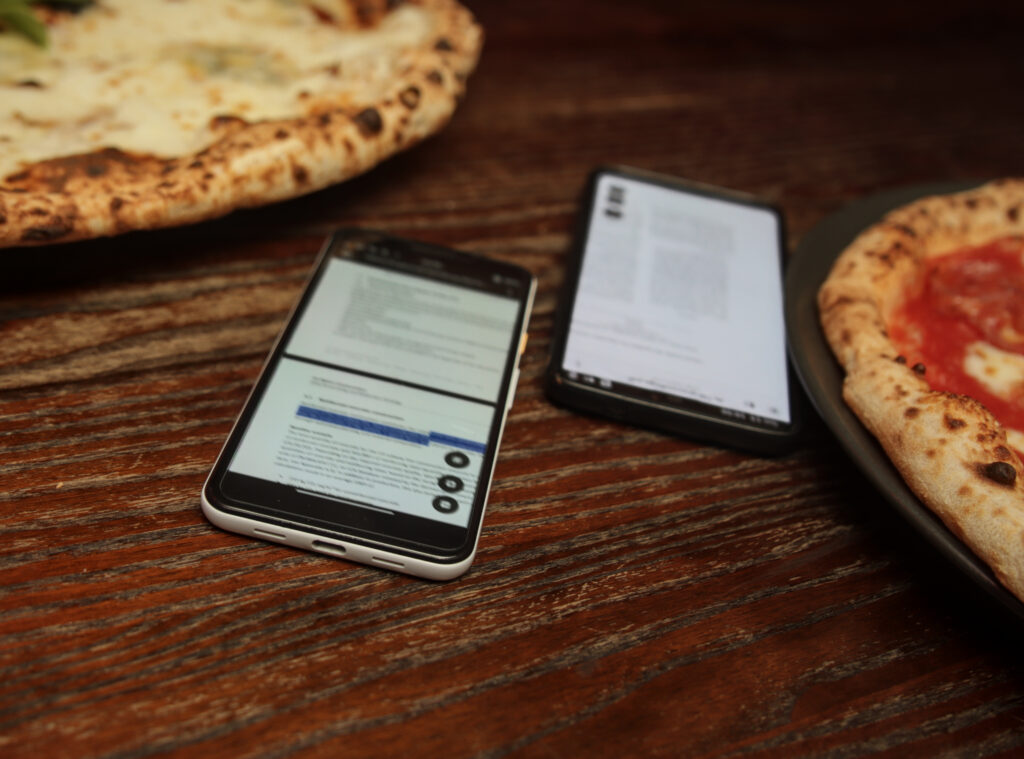
Let’s recap: The window fits our small screen, and everything looks so much better, now. But what does that help you, when the visual part works perfectly, if you cannot properly interact with the document?
Yes, you can scroll the document—that is directly provided by GTK, already, because we put the view in a ScrolledWindow—, and you can zoom in and out, but that’s it. You cannot select text. You cannot open the view’s context menu. And, you cannot swipe up and down in the non-continuous mode (where only one page is shown)—only left and right. And in theory, there is code for it that somewhat works in Evince, but that was not written using GTK’s gesture handling, and stopped doing its job in Papers with the port to GTK 4.
The code for it was manually tracking pointer events (like moving a mouse or a finger), clicking (or touch down), and which of the interaction types are ongoing. That is not how GTK’s gestures work—not today in GTK 4 days, but Evince is old, and event handling in GTK 2 and 3 were different. For that, we needed to split out all the interaction types into their own gesture. Gestures then can be claimed and denied. Claiming one gesture, implicitly denies every other gesture (that is not grouped with the former). What you can do: move an annotation, select text, zoom in and out, middle click to drag (yes, you can connect a mouse to your phone, as well), and swipe to the previous or next page (if you are not in the default continuous mode). And they can all interfere with each other, and with the scrolling of the scrolled window.
While cleaning things up, and making sure gestures were claimed in the correct order—e.g. moving an annotation that happens to be above text, should not result in a text selection—, I also added a long press gesture: That opens the context menu of the main document area. (MR !234)
After this was done, you were able to do everything with the document, you could do with a larger screen, and with mouse and keyboard—except downloading attachments. Albeit, another thing left out were selection handles. (issue #181) Once you have selected text, you would need to restart the selection if you are not happy with the result, because you cannot use the SHFT+click gesture that combines keyboard and pointer. While GtkLabel also does not have those, GtkText and GtkTextView both share a private GtkTextHandle widget. Hopefully, coordinated with the rest of the platform, I want to work on them for Papers as well, but for now Papers does not have them like the rest of the non-editable platform components.
A Moving Story—The Side Quests
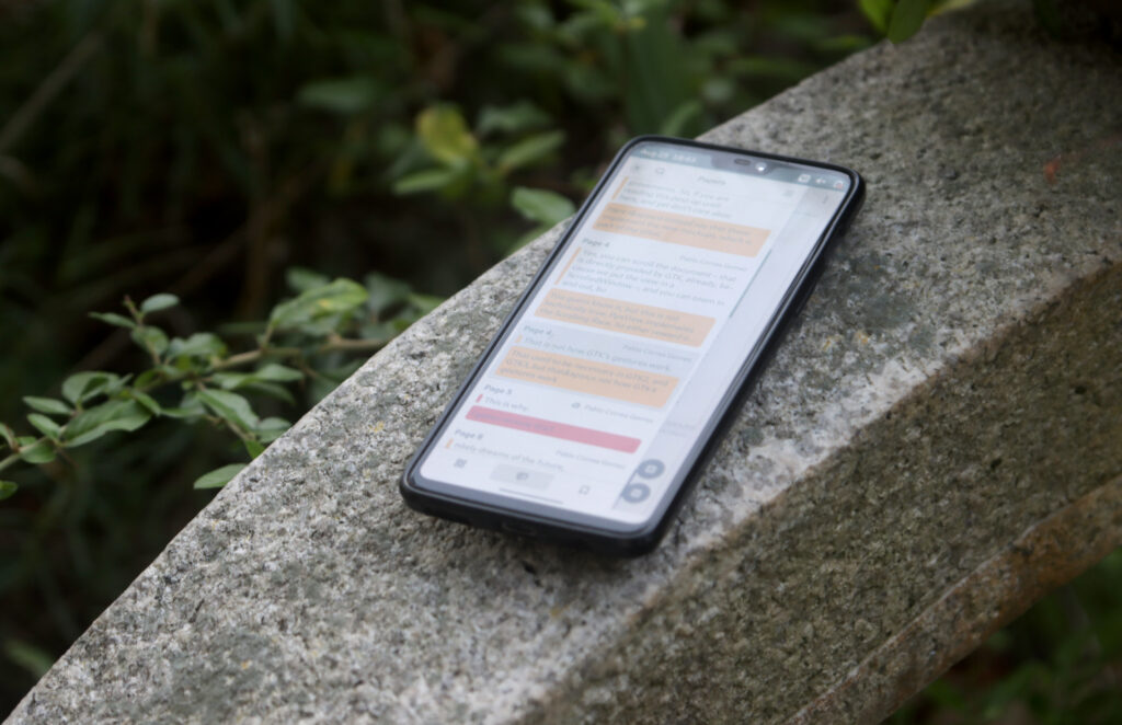
As I said, you can do everything on your phone you can do on your desktop—except downloading attachments. Besides the missing text handles, there is another thing I did not include: a long press gesture for the context menus in the sidebar. (issue #182) So, you cannot reach the download button in the attachment’s context menu.
But why did I exclude them? The context menus, while looking like they would belong to the sidebars, are in fact owned and controlled by the window, again. A cheap band-aid could have been adding those long press gestures and with that adding to the mess. If important features had been unusable, this might have been an option, but that is not the case.
- The outline sidebar lets you collapse the outline tree, but you can already do that with the expander arrows.
- The bookmark sidebar lets you scroll to, edit, and delete a bookmark, but you can already do that with a single tap, double tap, and the remove button at the bottom.
- The annotation sidebar’s context menu is actually pretty essential, and you can already reach it from the main area’s context menu, but enabling this is up on my list of follow-up things to this project.
- And last, but definitely not least, we have the attachment sidebar. Its context menu lets you download attachments. So, this feature is in the equally unfortunate and unique position of being impossible to use on a touch-only device.
Up until now, I always moved things out of the widgets into a separate stateful context, making the widget only react to changes in the respective context, and only updating the contexts on user interaction. This is the direction to go here, as I discussed with my mentor, but Pablo specifically mentioned early on, that at some point that would need to live in libview—the document viewer library provided and used by Papers. So, this time I added my attachment context in addition to moving more stateful non-widgets from the application code to the library. (MR !257) Yes, moving that code was absolutely not necessary for my project, but it was a great side quest that will help Papers in the long run. And after all, my Summer of Code project might be over, but my involvement in Papers, surely, is not.
From there on, I could update both the attachment sidebar and the annotations’ context menu (annotations themselves can also have attachments) relatively straight forward, with an updated interface I talked about with the design team, because the mock-ups did not include them. While this did not land yet, it is basically finished, and I am confident it will land soon. (MR !293, finished up to commit a0b10d5c during coding period)
The Moral of the Story
I enjoyed the ability to allocate a lot of time over a short period to a single project—to concentrate on the fun of improving a piece of software in use by so many people. The knowledge to always have a dedicated mentor around keen to help you succeed moving the project forward, allowed this.
Having a clear vision on a larger project, made me look at the code structure. It turned out to be a good decision to restructure the code into more strictly separated layers. Knowing when and where a codebase is mature and when and where refactoring is good time spent, is invaluable.
Due to the age of the project—it’s history, as GPdf, goes back to at least 1999, and thus is even older than me—, it posed the unique challenge, that things worked, but not the way you would do it nowadays. The fact that one of the central components is a widget—the View—with a custom size allocation, rendering, scrolling, gestures, accessibilty tree, and keyboard navigation forced me to look more often under the hood of GTK—for example how GtkScrolledWindow does gesture handling, how GtkTextHandle works, or how GtkListViews do size allocation. (Sometimes only to find out, what I wanted to know, was in the docs, and I just missed it—still worth it.)
I am grateful for this opportunity, and grateful to everyone that enabled this.
A Story To Be Continued…
Nothing in this section was agreed upon with the Papers maintainers, Qiu Wenbo and Pablo Correa Gómez, who are both great to work with.
You might guess what my next steps could be. (Any answer around text handles is cheating, I already mentioned that.)
Really a next big improvement would be adding an annotation context (issue #137) and that will definitely not be an easy copy-paste kind of improvement, because way more components interact with annotations. This will enable us, of course, to have a context menu in the sidebar, but more importantly, it helps simplify the widget with the name View—it is the one used for the main document area, and it is large and complicated—, and hopefully we can easily get annotation editing in the sidebar to get rid of the ludicrous annotation windows.
The View widget, in fact, is still not fully free of search state, which should be moved to the search context. Further even, it has a lot of state in general and would greatly benefit from splitting off the stateful part. (issue #230) Doing so would enable more easily refactoring the widget and it deserves that—besides the gestures, it also handles keyboard navigation like tabbing, keyboard scrolling and the caret mode, it should have the document’s accessibilty tree (issue #46), as well as handles rendering of all pages.
Having everything stateful in one place, also means having everything that touches the underlying documents themselves in one place. That is a prerequisite for isolating our document backends from the UI. (issue #104) That in turn is a prerequisite for enabling Papers to have a tabbed view with multiple documents open in one window, but you did not hear that from me. (issue #54) That is definitely a dream of the future, because pulling that off is going to be a larger effort that needs more coordination.
