The last stable version of gnumeric, released a few months ago, uses goffice 0.6, which has seen a lot of improvements since goffice 0.2 used previously by gnumeric 1.6.x.
First of all, we have ditched the multi-backend renderer and now we use cairo as our rendering abstraction layer. That means less code on our side, a nice API to use (no more libart…) and we have now a direct support of PDF/PS export.
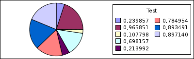
Here’s the output of a sample graph, exported as PNG:
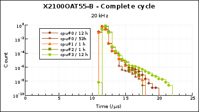
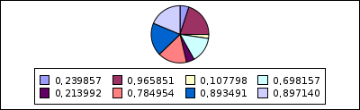
And the same graph as PDF and SVG.
The graph legend has a better layout, and a its swatches are more close to what’s actually drawn in the chart area.
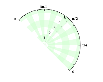
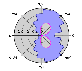
There’s some new number formats for better display of log axis labels and of polar axis labels when using a radian unit. Polar plots can be rotated, and it’s possible to choose the start/end angle. In addition to chart grid, we have now stripes.
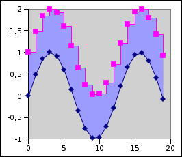
XY and polar plots fully support filled area and the different interpolation types (linear, spline, step).
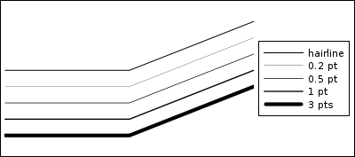
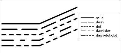
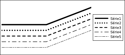
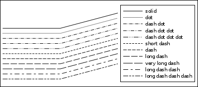
There’s more line styles:
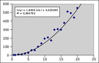
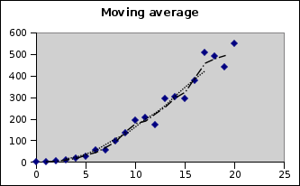
We have a support for regression curves, with a display of the calculated cofficients.


