The next version of NewsFlash is ready. And it comes packed with so much new features and speed improvements + a new look, that the jump to version 3 is more than justified.
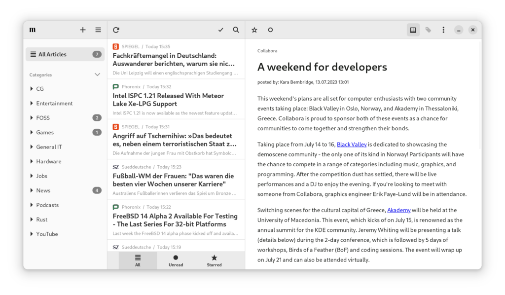
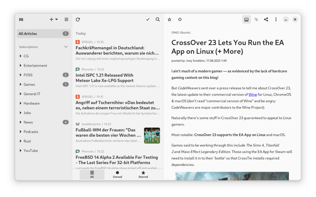
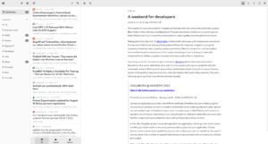
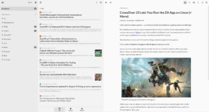
Visual comparison to version 2.3
The most obvious difference is the use of the libadwaita 1.4 split views and toolbar views. The result are 3 columns slightly different in color. Each with boarder-less headerbars.
An awesome perk of using these widgets is nicer sizing behavior of the sidebar and the article list. With NewsFlash 2.3 these two columns stayed the exact same size at all times. All extra space was given to the article. Now additional space is distributed evenly
The article list features the new listview sections added in Gtk 4.12. Articles are grouped by day and the corresponding date is displayed as the section header.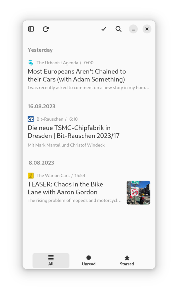
Drag & Drop is back
And better than ever before.
The feature didn’t survive the transition from Gtk3 to Gtk4. Back in the NewsFlash 1.x.x days drag & drop was only usable to move a feed from one category to another. The position of elements in the sidebar would seemingly change at random after the drop happened.
A lot of work went into improving the experience of drag & drop. NewsFlash doesn’t try to keep the positions of items in sync with the backed service. But instead focuses on keeping things consistent locally. Items now move to the exact spot they were dragged to.
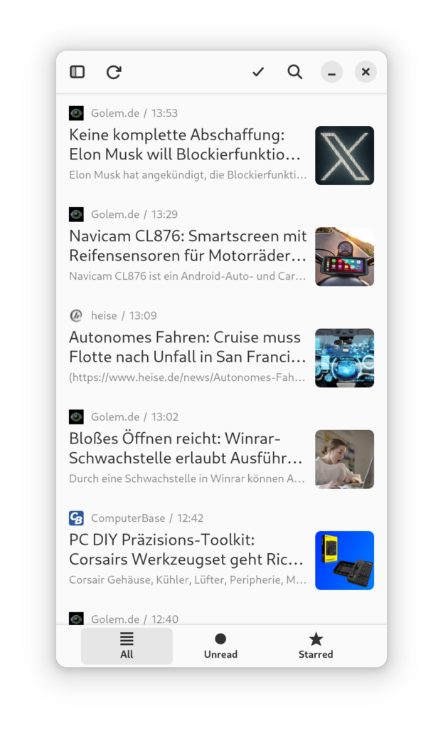
Subscribing to feeds works better on mobile
Clicking the plus icon used to spawn a popover that guided you through the process of adding either feeds, categories or tags.
Unfortunately this didn’t really work on mobile. Interacting with the on-screen-keyboard would close the popover making it impossible to complete the process.
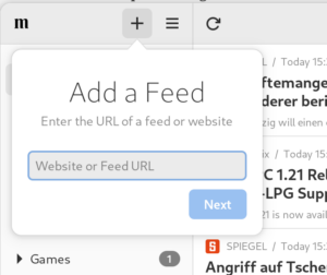
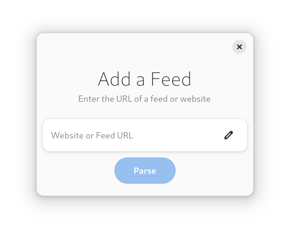
So instead the popover now lets you spawn one of 3 dialogs.
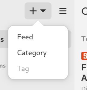
Not only does this change make it possible to add feeds on mobile & other touch devices. But I would argue it is an improvement for desktop as well. No longer can the popover accidentally be closed by switching to another window.
The wizard guiding you through the process also got a facelift.
Speed
NewsFlash 3.0 should be a lot faster.
I went all-in on the tokio runtime and its ecosystem. No more spawning threads manually for a single operation. No more blocking locks. Everything is async and runs on a single tokio runtime which is way smarter about task managing than I ever could be.
At the same time the reqwest client is now reused as much as possible and only rebuild once relevant settings change.
Together these changes mean operations like syncing, marking articles as read and scraping full article content should feel more responsive.
The favicon cache is now based on moka which eliminates the case of starting multiple downloads of the same icon at the same time. Large favicons get scaled down to a reasonable size to improve loading times.
Remember the window state
One of the more often requested features: remember the window state when NewsFlash quits and restore everything on the next launch.
This can mean different things to different people: Some want the app to remember the window size, others if it displays all or only unread articles.
Here is a list of the things that are saved and restored:
- window size (and maximized)
- sidebar selection
- article list mode (all, unread, starred)
- search term
- selected article
- if original or scraped content is shown
- article view zoom
Other things like exact scroll positions of lists are not saved.
View large images
Large images in the article can be clicked and open the image up in a new window. No fancy gestures or anything. But still a welcome feature.
The same dialog is used to display image attachments of articles.
More Thumbnails
Articles get more visual appealing with NewsFlash 3.0!
Thumbnails were supported before. But only if the article had an image attachment. And then only if the back-end supported attachments via their API (e.g. miniflux did not).
Going forward there is a heuristic to gather a “relevant” image from the article HTML and used that as a thumbnail.
Edit dialogs
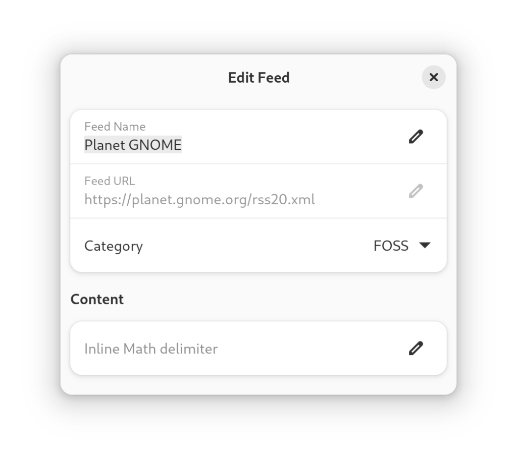
The simple “rename” dialogs of old evolved into “edit” dialogs. The biggest change is the dialog for feeds. The feed can still be renamed, the feed URL is at least visible now (changing is not possible just yet) and it can be moved to another category from here as well (alternative to drag & drop).
Some math focused blogs use “$” as start and end marker for formulas. Always rendering text between “$” with mathjax lead to malformed articles that contained multiple dollar signs in their regular text. This can now be controlled on a feed-by-feed basis.
An idea for the future is to allow a feed-by-feed setting if an attempt to download the full article content right after a sync should be made.
Commafeed

Commafeed is the newest addition to the list of supported services. Its an open source web based feed reader.
The implementation is not as battle tested as the others. So if you hit a roadblock with it please let me know.
More
Above only the more significant features and changes were listed. There are a lot of smaller features and bug fixes. So if you previously had trouble with anything it may be worth to try NewsFlash again.
Features that did not make it: Video player
You can not view video attachments or youtube videos in a new embedded player. Video streaming is hard. GStreamer does a lot of the work for you. But there are still a lot of gaps that an application has to fill to make a nice streaming player.
I was encountering image freezes, stuck videos and outright gstreamer crashes from time to time. Not to mention missing features like switching video streams on the fly, which I left out since it added even more problems to the table.
So its back to the drawing board. But here is how it could have landed in NewsFlash 3.0:
