Just look at the messages that were waiting for me in my Messaging Tray.
GNOME 3 is awesome! We are already thinking ahead too.
Just look at the messages that were waiting for me in my Messaging Tray.
GNOME 3 is awesome! We are already thinking ahead too.

The message tray in GNOME Shell enables persistent notifications. A new notification is first shown as a pop-out for a certain time period. When the pop-out is hidden, the notification is still available to the user in the message tray. The notification is only removed when the user interacts with it or switches to the application that sent it. This default persistent behavior ensures that the notifications are less disruptive to the user because the user is no longer forced to react to them before they time out.
Before the holidays, I finished implementing support for two other types of notification behavior: resident and transient. Resident notifications are available to the user even after the user has interacted with them or with the application that sent them. On the other hand, transient notifications are not kept around for the user at all after they are initially shown.
Jon McCann has updated the Desktop Notification Specification to expose these new features to applications. The “persistence” capability advertised by the notification server means that the notifications are persistent by default and that resident and transient notifications are supported. “resident” and “transient” hints on the notifications are used to mean that the notification should be resident or transient.
Resident notifications often go along with rich controls in notifications. Rhythmbox notifications are a good example. During his GSoC, Matt Novenstern came up with a way of specifying icons to be used as notification’s actions, enabled this feature in GNOME Shell, and wrote a patch for using icons for the playback buttons in Rhythmbox notifications. Jon has updated the Desktop Notification Specification to reflect this feature. When the notification server has the “action-icons” capability and the notification has the “action-icons” hint set, named icons that match the action identifiers are used for the notification’s action buttons.
Putting it all together, Jonathan Matthew has reviewed and pushed Matt’s patch for playback icons and made Rhythmbox notifications resident. Resident behavior of Rhythmbox notifications allows the user to see what’s playing and use the playback controls at any time. Incidentally, Jonathan has also worked on the GNOME Shell side of things, coming up with the initial patch for the resident notifications support.
Empathy chat notifications are also resident in GNOME Shell. Because they allow chatting inline in the text entry field they contain, making them resident enables the user to continue a conversation at any time.
The resident behavior and rich features of Rhythmbox and Empathy notifications help minimize the distraction from intermittent events. They allow the user to react to such events at the user’s own convenience and without switching away from the window the user is working in.
Applications should use resident notifications if they are so heavily notification based that the user would expect to see a notification in the tray most of the time and use the application by interacting with its notification’s rich features. In this case, the user should be able to reliably find the notification and not have to guess if there is one in the tray or not.
The other new type of notifications, transient notifications which don’t stay around in the message tray, are mainly intended for use by the system components that have a permanent representation elsewhere, such as in the system status area in the top panel. For example, non-critical battery information notifications are transient.
Transient notifications can also be used as a feedback for the user’s action within the system. For example, they are used when the user adds or removes a favorite application in the Activities Overview mode and allow undoing the action.
Persistent and resident notifications enable complete interaction between the user and the application using only notifications. In GNOME 2, authors would use GtkStatusIcon to anchor the information shown in the notifications, but this is no longer necessary and the applications should move away from the GtkStatusIcon usage. The suggestions for individual applications and system components can be found in these compatibility guidelines. Please find us on #gnome-shell IRC if you would like to discuss the use of the notifications by your application in GNOME 3 or help out with the message tray features.
I am at the Gran Canaria Desktop Summit thanks to the generous sponsorship from the GNOME Foundation! It’s great to be meeting old and new friends here.
 |
I’ve been working on implementing the new design for the Overview mode for the GNOME Shell based on these mockups by Jeremy in the weeks leading up to the conference. The Overview mode is intended to give the user a quick way to switch activities, organize windows among workspaces, and find and launch new applications and documents. Essentially, this mode is a zoomed out view of all workspaces plus menus for starting new tasks. Some advantages of having such mode are:
The recent changes to the view include:
These changes make using the Overview mode feel more stable and predictable because different areas no longer shift around.
Here are the two screenshots of the Overview mode. The user can get to this mode from the main desktop view by clicking the Activities button in the top left corner, pressing the System key or Alt+F1. The first screenshot shows off a single workspace with open windows, favorite applications, non-favorite running applications, and recent documents. The second screenshot shows off search results along with a details preview for one of the results.
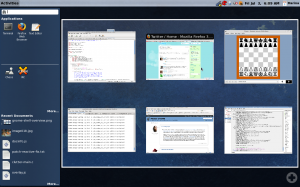
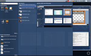
There are still a lot of enhancements based on the mockups that need to be done in this view, such as indicating which applications are running with a glow around the icon, showing more details for an item, including “Places and Devices” section in the left side pane, and adding more polish in general. However, I feel this is a good start that shows off the intended behavior.
We look forward to getting more people involved with the design and development of the GNOME Shell, so be sure to check out Owen’s Introduction to the GNOME Shell talk on Sunday and the GNOME Shell Design BoF Jon and I are hosting on Thursday. Of course you are welcome to come discuss stuff with us any time during the conference and try the GNOME Shell for yourself.