It’s already been a few weeks since the release of GNOME Web 3.14, so it’s a bit late to blog about the changes it brings, but better late than never. Unlike 3.12, this release doesn’t contain big user interface changes, so the value of the upgrade may not be as immediately clear as it was for 3.12. But this release is still a big step forward: the focus this cycle has just been on polish and safety instead of UI changes. Let’s take a look at some of the improvements since 3.12.1.
Safety First
The most important changes help keep you safer when browsing the web.
Safer Handling of TLS Authentication Failures
When you try to connect securely to a web site (via HTTPS), the site presents identification in the form of a chain of digital certificates to prove that your connection has not been maliciously intercepted. If the last certificate in the chain is not signed by one of the certificates your browser has on file, the browser decides that the connection is not secure: this could be a harmless server configuration error, but it could also be an attacker intercepting your connection. (To be precise, your connection would be secure, but it would be a secure connection to an attacker.) Previously, Web would bet on the former, displaying an insecure lock icon next to the address in the header bar, but loading the page anyway. The problem with this approach is that if there really is an attacker, simply loading the page gives the attacker access to secure cookies, most notably the session cookies used to keep you logged in to a particular web site. Once the attacker controls your session, he can trick the web site into thinking he’s you, change your settings, perhaps make purchases with your account if you’re on a shopping site, for example. Moreover, the lock icon is hardly noticeable enough to warn the user of danger. And let’s face it, we all ignore those warnings anyway, right? Web 3.14 is much stricter: once it decides that an attacker may be in control of a secure connection, it blocks access to the page, like all major browsers already do:
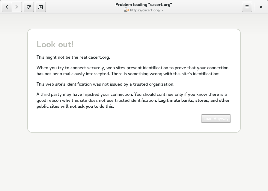
(The white text on the button is probably a recent compatibility issue with GTK+ master: it’s fine in 3.14.)
Safety team members will note that this will obviously break sites with self-signed certificates, and is incompatible with a trust-on-first-use approach to certificate validation. As much as I agree that the certificate authority system is broken and provides only a moderate security guarantee, I’m also very skeptical of trust-on-first-use. We can certainly discuss this further, but it seemed best to start off with an approach similar to what major browsers already do.
The Load Anyway button is non-ideal, since many users will just click it, but this provides good protection for anyone who doesn’t. So, why don’t we get rid of that Load Anyway button? Well, different browsers have different strategies for validating TLS certificates (a good topic for a future blog post), which is why Web sometimes claims a connection is insecure even though Firefox loads the page fine. If you think this may be the case, and you don’t care about the security of your connection (including any passwords you use on the site), then go ahead and click the button. Needless to say, don’t do this if you’re using somebody else’s Wi-Fi access point, or on an email or banking or shopping site… when you use this button, the address in the address bar does not matter: there’s no telling who you’re really connected to.
But all of the above only applies to your main connection to a web site. When you load a web page, your browser actually creates very many connections to grab subresources (like images, CSS, or trackers) needed to display the page. Prior to 3.14, Web would completely ignore TLS errors for subresources. This means that the secure lock icon was basically worthless, since an attacker could control the page by modifying any script loaded by the page without being detected. (Fortunately, this attack is somewhat unlikely, since major browsers would all block this.) Web 3.14 will verify all TLS certificates used to encrypt subresources, and will block those resources if verification fails. This can cause web pages to break unexpectedly, but it’s how all major browsers I’ve tested behave, and it’s certainly the right thing to do. (We may want to experiment with displaying a warning, though, so that it’s clear what’s gone wrong.)
And if you’re a distributor, please read this mail to learn how not to break TLS verification in your distribution. I’m looking at you, Debian and derivatives.
Fewer TLS Authentication Failures
With glib-networking 2.42, corresponding to GNOME 3.14, Web will now accept certificate chains when the certificates are sent out of order. Sites that do this are basically broken, but all major browsers nevertheless support unordered chains. Sending certificates out of order is a harmless configuration mistake, not a security flaw, so the only harm in accepting unordered certificates is that this makes sites even less likely than before to notice their configuration mistake, harming TLS clients that don’t permute the certificates.
This change should greatly reduce the number of TLS verification failures you experience when using Web. Unfortunately, there are still too many differences in how certificate verification is performed for me to be comfortable with removing the Load Anyway button, but that is definitely the long-term goal.
HTTP Authentication
WebKitGTK+ 2.6.1 plugs a serious HTTP authentication vulnerability. Previously, when a secure web page would require a password before the user could load the page, Web would not validate the page’s TLS certificate until after prompting the user for a password and sending it to the server.
Mixed Content Detection
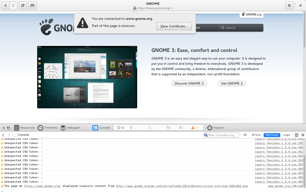
If a secure (HTTPS) web page displays insecure content (usually an image or video) or executes an insecure script, Web now displays a warning icon instead of a lock icon. This means that the lock icon now indicates that your connection is completely private, with the exception that a passive adversary can always know the web site that you are visiting (but not which page you are visiting on the site). If the warning icon is displayed, then an adversary can compromise some (and possibly all) of the page, and has also learned something that might reveal which page of the site you are visiting, or the contents of the page.
If you’re curious where the insecure content is coming from and don’t mind leaving behind Web’s normally simple user interface, you can check using the web inspector:
The focus on safety will continue to drive the development of Web 3.16. Most major browsers, with the notable exception of Safari, take mixed content detection one step further by actively blocking some more dangerous forms of insecure content, such as scripts, on secure pages, and we certainly intend to do so as well. We’re also looking into support for strict transport security (HSTS), to ensure that your connection to HSTS-enabled sites is safe even if you tried to connect via HTTP instead of HTTPS. This is what you normally do when you type an address into the address bar. Many sites will redirect you from an HTTP URL to an HTTPS URL, but an attacker isn’t going to do this kindness for you. Since all HTTP pages are insecure, you get no security warning. This problem is thwarted by strict transport security. We’re currently hoping to have both mixed content blocking and strict transport security complete in time for 3.16.
UI Changes
Of course, security hasn’t been the only thing we’ve been working on.
- The most noticeable user experience change is not actually a change in Web at all, but in GNOME Document Viewer 3.14. The new Document Viewer browser plugin allows you to read PDFs in Web without having to download the file and open it in Document Viewer. (This is similar to the proprietary Adobe Reader browser plugin.) This is made possible by new support in WebKitGTK+ 2.6 for GTK+ 3 browser plugins.
- The refresh button has been moved from the address bar and is now next to the new tab button, where it’s always accessible. Previously, you would need to click to show the address bar before the refresh button would appear.
- The lock icon now opens a little popover to display the security status of the web page, instead of directly presenting the confusing certificate dialog. You can also now click the lock when the title of the page is displayed, without needing to switch to the address bar.
Bugfixes
3.14 also contains some notable bugfixes that will improve your browsing experience.
- We fixed a race condition that caused the ad blocker to accidentally delete its list of filters, so ad block will no longer randomly stop working when enabled (it’s off by default). (We still need one additional fix in order to clean this up automatically if it’s already broken, but in the meantime you can reset your filters by deleting ~/.config/epiphany/adblock if you’re affected.)
- We (probably!) fixed a bug that caused pages to disappear from history after the browser was closed.
- We fixed a bug in Web’s aggressive removal of tracking parameters from URLs when the do not track preference is enabled (it’s off by default), which caused compatibility issues with some web sites.
- We fixed a bug that caused Web to sometimes not offer to remember passwords.
These issues have all been backported to our 3.12 branch, but were never released. We’ll need to consider making more frequent stable releases, to ensure that bugfixes reach users more quickly in the future.
Polish
- There are new context menu entries when right-clicking on an HTML video. Notably, this adds the ability to easily download a copy of the video for watching it offline.
- Better web app support. Recent changes in 3.14.1 make it much harder for a web app to escape application mode, and ensure that links to other sites open in the default browser when in application mode.
- Plus a host of smaller improvements: The subtitle of the header bar now changes at the same time as the title, and the URL in the address bar will now always match the current page when you switch to address bar mode. Opening multiple links in quick succession from an external application is now completely reliable (with WebKitGTK+ 2.6.1); previously, some pages would load twice or not at all. The search provider now exits one minute after you search for something in the GNOME Shell overview, rather than staying alive forever. The new history dialog that was added in 3.12 now allows you to sort history by title and URL, not just date. The image buttons in the new cookies, history, and passwords dialogs now have explanitory tooltips. Saving an image, video, or web page over top of an existing file now works properly (with Web 3.14.1). And of course there are also a few memory usage and crash fixes.
As always, the best place to send feedback is <epiphany-list@gnome.org>, or Bugzilla if you’ve found a bug. Comments on this post work too. Happy browsing!

