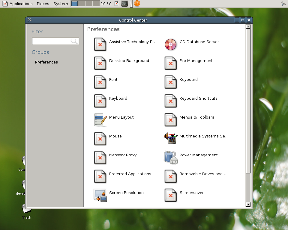
The new control center shell (from Novell’s SLAB) is now on for GNOME 2.17.

As you can see in the dialog, it looks a bit ugly, not only because of the missing icons (my setup’s fault), but because there is only one category (“Preferences”). So, next step, categorize the capplets.
BTW, I couldn’t get CVSROOT/modules from GNOME CVS, so until I fix it, you’ll have to download by hand slab/libslab and put that libslab directory into gnome-control-center source tree.
That’s great. Will it be in the default menu in 2.18? (the current shell isn’t used at all unless you run the command manually).
Good design!
[url=http://tydmbobs.com/bwrq/eeie.html]My homepage[/url] [url=http://ecpepbeu.com/moou/pvse.html]Cool site[/url]
Gotta love GNOME. Spend ages getting rid of the control center shell from 1.x because users hated it, so now we go and put it back.
Is there a good reason why it’s called “control center” (sounds like a scifi movie) instead of “system preferences” (like apple does IIRC), other than windows uses it?
Mockup of the final control center:
http://www.mstdev.org/imatges/vista5270/controlpanel.JPG
How will this change the system menu? As you categorize the applets, will they be placed into submenus in the Preferences and Administration menus as well? That would be a bad idea IMO (too many sub-menus), so either they need to stay uncategorized in the System menu, or maybe they could stay in one menu, and be seperated by category headers.