I posted before about the magic search+location entry I’m working on for Yelp. The general goal is to reduce Yelp’s interface to the smallest number of elements possible. The drop-down is very terse, though, and doesn’t give you a lot of information.
One of the things I really like about Mallard guide pages is that they present topics to you with more verbose text descriptions. This allows readers to scan titles quickly, while still letting them check the description for assurance before committing to a click. I wanted to bring that to the location dropdown.
Another problem is that the search entries in the dropdown gave no indication of where they’re searching. For 3.0, we want to have searches be per-document by default, with a link to search the entire help system instead. This would give you two entries in your history that look exactly alike, but return different search results.
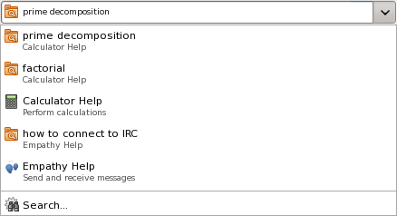
So I played around with using two-line entries in the drop-down. For normal page entries, this is the same title and description you would see if it were on a guide page. For search entries, you see the search terms and where it’s searching.
Obligatory screenshot:


I am really glad that you’re working on this. The help system has long been one of Gnome’s sore points, but at this rate it’ll be the best in no time 🙂
Sorry, I don’t get it. What is the (conceptual) difference in the two types of drop-down entries ? I read your description and looked at the screenshot and I cannot match up one with the other. Does the “Search…” entry open a special search menu ?
Maybe you’ll want a tomboy-like search, where searching an entry globally (possibly in your drop-down, or a search window) and selecting a result opens the page, with the sought-for terms already highlighted. (It could also jump directly to the first occurance, but I think that’s not as important as mallard pages are not that long.)
Also, the icon kinda sucks as I don’t care about “searching a folder”, i just want to search. Showing the document icons is better IMHO.
Keep up the good work, I’m a big fan of all the awesomeness you create, especially around Mallard. I’m actually looking forward to the next time I’ll need to write documentation now. 🙂
Diego Escalante did quite a bit of work on Epiphany’s location bar. This seems very similar!