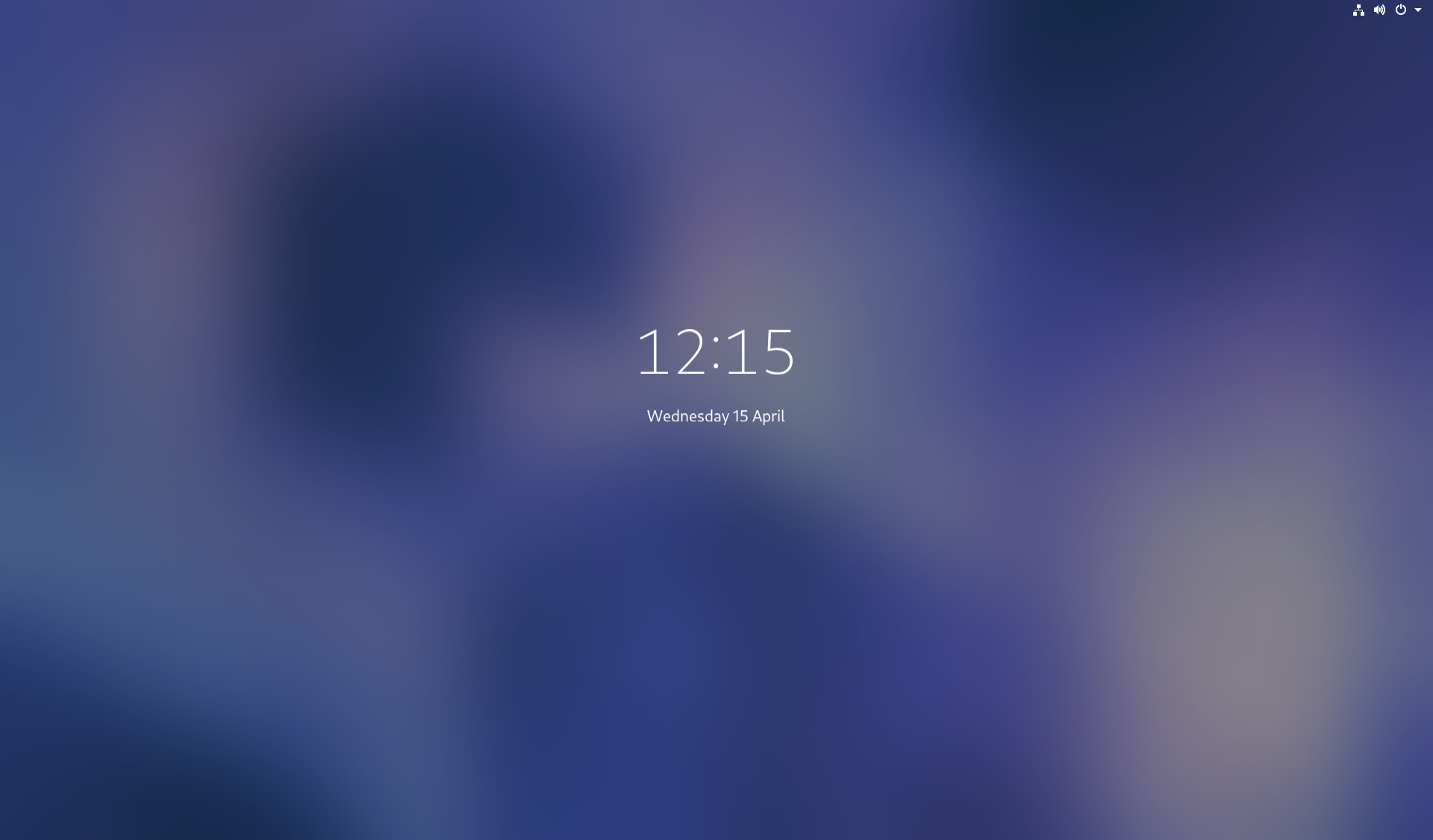
With GNOME 3.36 out the door, it’s time to start thinking about what comes next. Those of us who work on GNOME UX are really proud of the latest GNOME shell release. It includes some major updates, particular the new lock screen and updated visuals, as well as a host of smaller improvements. 3.36 feels really nice to use, and has got a great response.

The lock screen work that we landed in 3.36 was the outcome of a long-running programme of UX work, which we first put together at the GNOME UX hackfest in London, back in 2017. There are still some outstanding pieces of the login/unlock experience that need to be filled in, and this is something that we hope to work on over the coming development cycle. However, we are also turning our attention to other aspects of the shell, which we have wanted to update for some time.
In the rest of this post, I’ll describe some of the areas that we’re hoping to improve, before going on to talk about how we’re going to do it.
Focus areas
The areas that we are looking at mainly relate to the overview, although in places they touch other areas of the experience. They are:
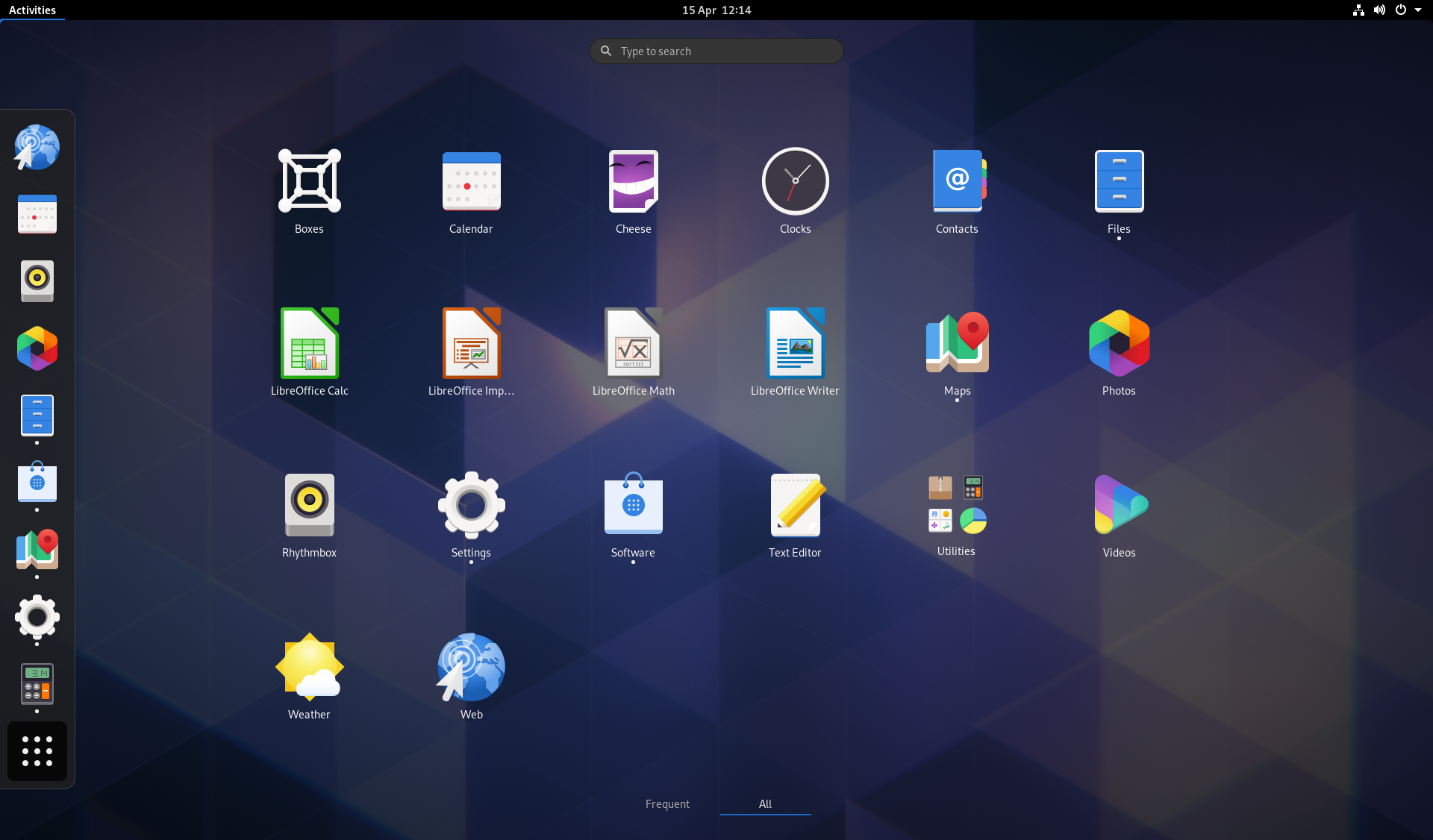
Application launching
One thing we’ve wanted to improve for some time is the reliance on the alphabetical grid of launchers. This alphabetical organisation is mostly useful for finding applications by name, rather than presenting the apps that are most important or most likely to be used. This is something that the grid of frequent apps attempts to compensate for, but the overall experience doesn’t fit together as well as we’d like.

For application launching, the main goal is to make the apps space more useful – it needs to be easier to find the app that you want to launch. However, we also want to make it a more engaging and personal part of the experience, so the apps space feels like it belongs to you.
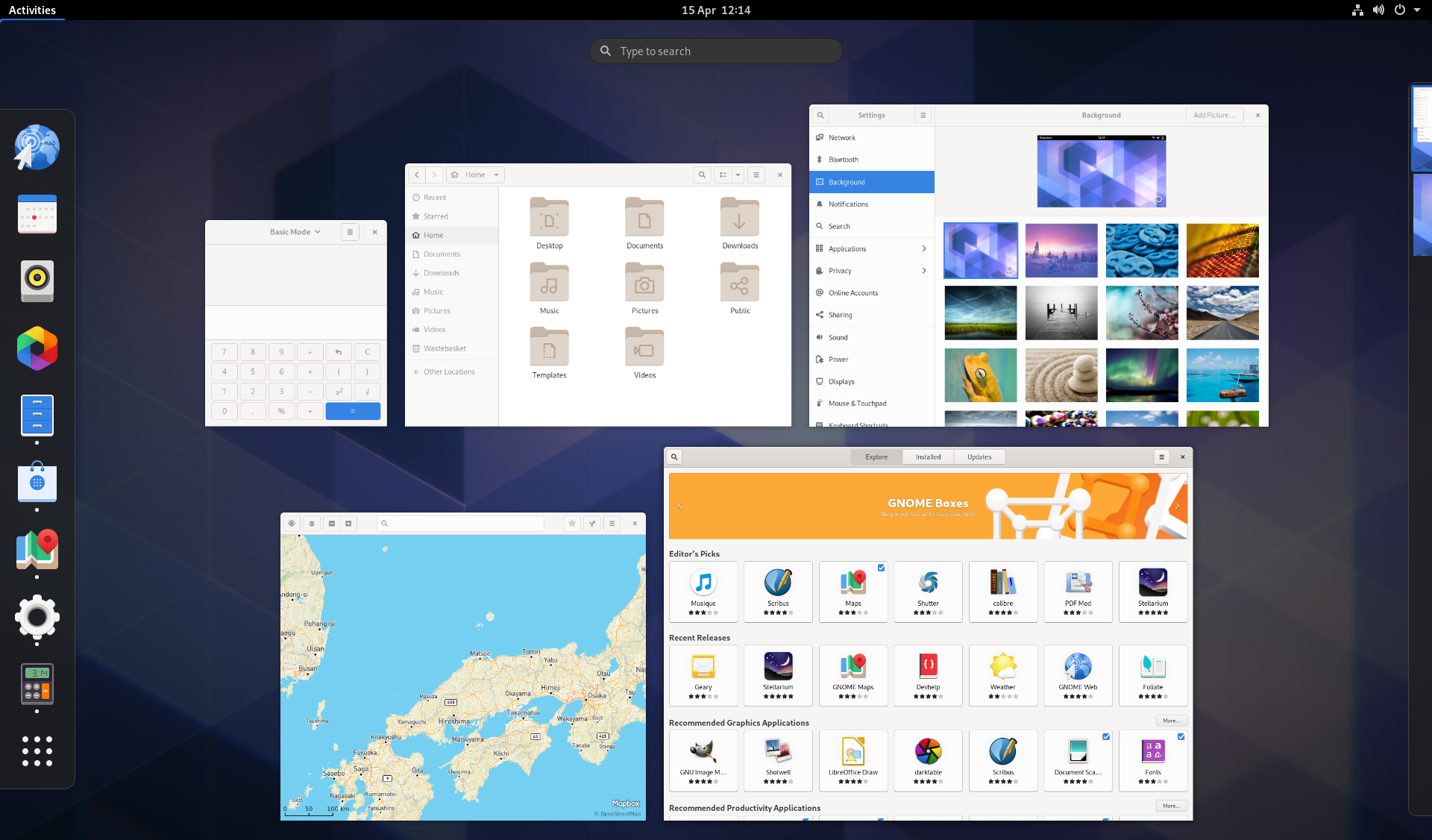
Overview spatial organization
We are all familiar with the organisation of the overview: window thumbnails in the middle, dash on the left, search up top, workspaces on the right. Functionally this works fairly well. However, the layout could be better in terms of how the pieces fit together. In particular, the arrangement of the different elements could do a better job of communicating how they relate to one another, especially in terms of navigation.

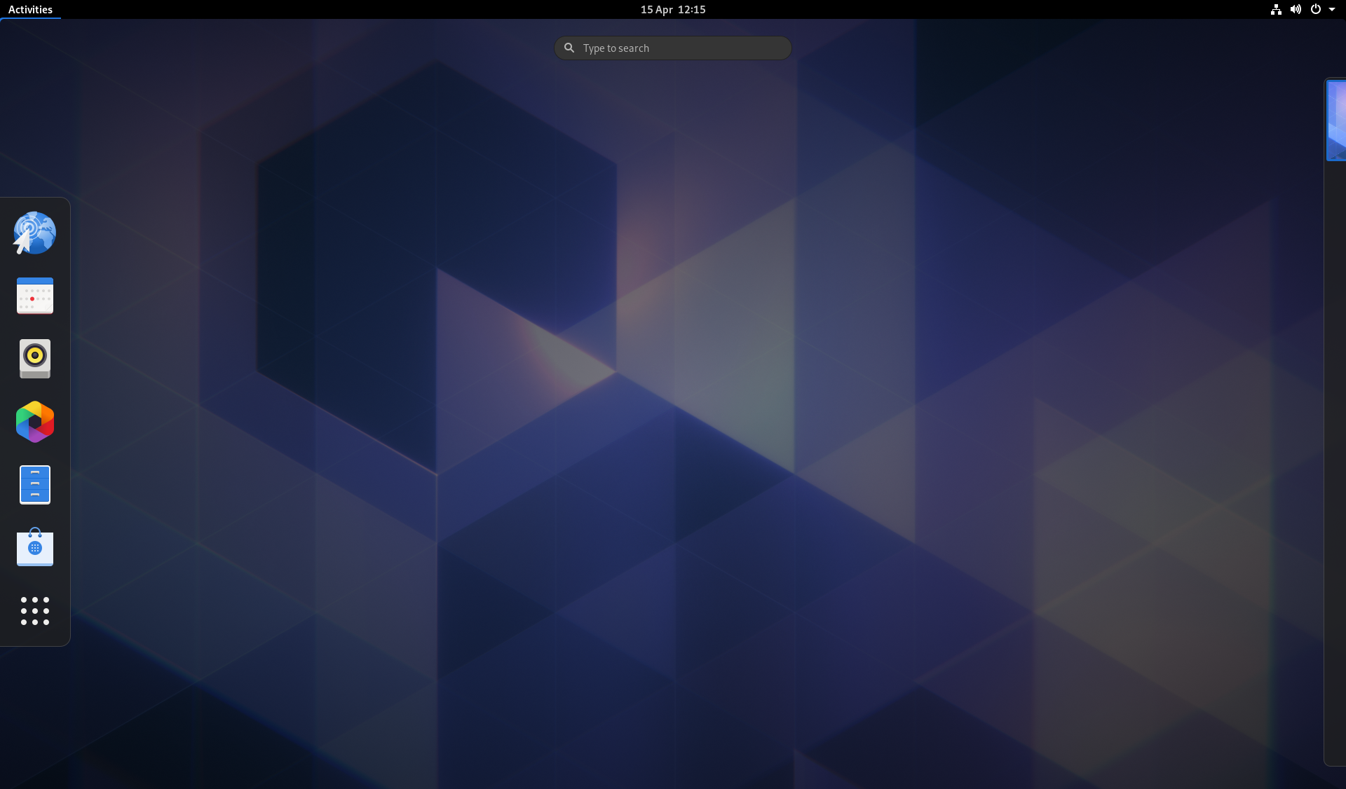
Boot and empty states
Boot into GNOME 3 and you’re presented with an empty desktop. Open the Activities Overview, and you’re again presented with an empty space in the middle of the screen. This experience isn’t particularly helpful, and doesn’t draw or guide the user into the experience.

We’ve been aware of these disadvantages of the current design for almost the entire history of GNOME 3, and we have experimented with a few different solutions, but never managed to get them to a usable state. Now, as we take another look at how the overview is arranged, we’d like to have another attempt at getting this right.
Touchpad navigation
Right now, the touchpad gestures to move between workspaces are fairly straightforward: 4 finger swipe up and down. However, we currently don’t have an easy gesture to go in and out of the overview and, once you’re in it, we don’t have an easy way to navigate between the different areas (app launching and search in particular).
Being able to scoot around different areas of the desktop using a touchpad (or, indeed, a touchscreen) would be a big win and is something we are keen to allow. In order to do this, we need a simple model that people can use to navigate around, rather than having to learn multiple sets of gestures.
How we’re going to do it
Work in this area is already ongoing, and we’ve put a lot of thought into how to organise it in order to achieve a good result.
Research & design
Some of the functionality that is under review is a prominent part of GNOME 3, so it’s important that any changes we make are a genuine improvement. When it’s a core part of the desktop, even a small regression can be a significant issue for some users.
User research is going to be a key part of this process, both in order to ensure that we have a good understanding of user needs and requirements, as well as to test the outcome of design and development work, and modify it as necessary.
We have already done some initial, limited research, to find out how many windows, apps and workspaces are typically in use. The next research phase is currently being planned, and will involve a series of show and tell exercises, combined with semi-structured interviews, to get a better sense of how people use their desktops, and how the design can be improved for them.
Looking further ahead, we’ll conduct testing on any changes that we make, in order to evaluate how successful they are and ensure that users experience them as a genuine improvement over what came before.
At each stage, we hope to share the results of our findings.
Testing and iteration
Wherever possible, we are planning on landing UI changes incrementally, with an emphasis on maintaining a releasable product. This will allow us to pace our work and do testing and refinement throughout the development cycle, rather than just at the end.
When it isn’t possible to compartmentalise UI changes, we are planning on making development builds available early, in order to carry out testing and iteration over a longer period. This is likely to be the case for the bulk of any changes, due to the interconnected nature of the overview.
Watch this space
Design changes to GNOME Shell can generate both speculation and uncertainty. We’d like to mitigate this as much as we can, so that people understand what changes are coming, why they are being made, and why they can be confident that they are a real improvement.
Currently, there are a variety of experimental designs. However, we haven’t settled on a single proposal and don’t want to create false expectations by presenting them at this early stage. Hopefully once we have done more rounds of research we will be in a position to do this, and give a better idea of what UI changes might be coming further down the line. Until then, we ask you to be patient!
We also hope that the research, testing and feedback opportunities that we are planning will provide reassurance that any changes we eventually make will be positive. We are committed to make changes based on these data gathering exercises, if it turns out that the designs don’t perform as well as we’d hoped.
We will endeavour to provide progress reports on this work as it progreses, so watch this space for news!
