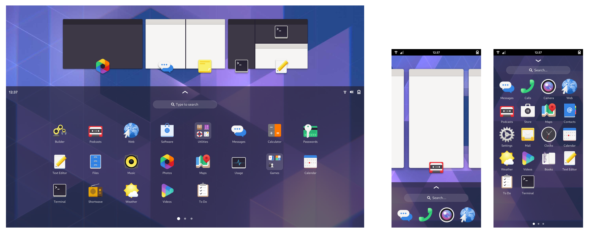
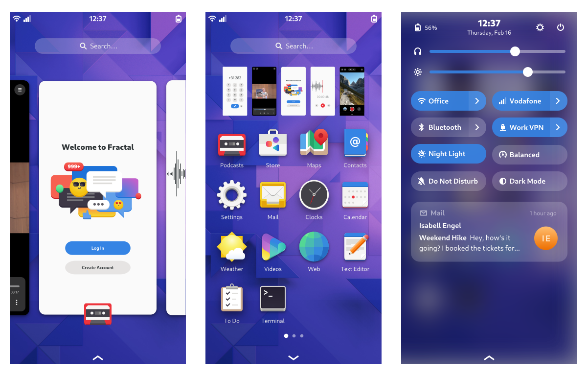
As part of the design process for what ended up becoming GNOME 40 the design team worked on a number of experimental concepts, a few of which were aimed at better support for tablets and other smaller devices. Ever since then, some of us have been thinking about what it would take to fully port GNOME Shell to a phone form factor.

It’s an intriguing question because post-GNOME 40, there’s not that much missing for GNOME Shell to work on phones, even if not perfectly. A few of the most difficult pieces you need for a mobile shell are already in place today:
- Fully customizable app grid with pagination, folders, and drag-and-drop re-ordering
- “Stick-to-finger” horizontal workspace gestures, which are pretty close to what we’d want on mobile for switching apps
- Swipe up gesture for navigating to overview and app grid, which is also pretty close to what we’d want on mobile
On top of that, many of the things we’re currently working towards for desktop are also relevant for mobile, including quick settings, the notifications redesign, and an improved on-screen keyboard.
Possible thanks to the Prototype Fund
Given all of this synergy, we felt this is a great moment to actually give mobile GNOME Shell a try. Thanks to the Prototype Fund, a grant program supporting public interest software by the German Ministry of Education (BMBF), we’ve been working on mobile support for GNOME Shell for the past few months.


Scope
We’re not expecting to complete every aspect of making GNOME Shell a daily driveable phone shell as part of this grant project. That would be a much larger effort because it would mean tackling things like calls on the lock screen, PIN code unlock, emergency calls, a flashlight quick toggle, and other small quality-of-life features.
However, we think the basics of navigating the shell, launching apps, searching, using the on-screen keyboard, etc. are doable in the context of this project, at least at a prototype stage.

Of course, making a detailed roadmap for this kind of effort is hard and we will keep adjusting it as things progress and become more concrete, but these are the areas we plan to work on in roughly the order we want to do them:
- New gesture API: Technical groundwork for the two-dimensional navigation gestures (done)
- Screen size detection: A way to detect the shell is running on a phone and adjust certain parts of the UI (done)
- Panel layout: Using the former, add a separate mobile panel layout, with a different top panel and a new bottom panel for gestures (in progress)
- Workspaces and multitasking: Make every app a fullscreen “workspace” on mobile (in progress)
- App Grid layout: Adapt the app grid to the phone portrait screen size, ideally as part of a larger effort to make the app grid work better at various resolutions (in progress)
- On-screen keyboard: Add a narrow on-screen keyboard mode for mobile portrait
- Quick settings: Implement the new quick settings designs
Current Progress
One of the main things we want to unlock with this project is the fully semantic two-dimensional navigation gestures we’ve been working towards since GNOME 40. This required reworking gesture recognition at a fairly basic level, which is why most of the work so far has been focused around unlocking this. We introduced a new gesture tracker and had to rewrite a fair amount of the input handling fundamentals in Clutter.
Designing a good API around this took a lot of iterations and there’s a lot of interesting details to get into, but we’ll cover that in a separate deep-dive blogpost about touch gesture recognition in the near future.
Based on the gesture tracking rework, we were able to implement two-dimensional gestures and to improve the experience on touchscreens quite a bit in general. For example, the on-screen keyboard now behaves a lot more like you’re used to from your smartphone.
Here’s a look at what this currently looks like on laptops (highly experimental, the second bar would only be visible on phones):
Some other things that already work or are in progress:
- Detecting that we’re running on a phone, and disabling/adjusting UI elements based on that
- A more compact app grid layout that can fit on a mobile portrait screen
- A bottom bar that can act as handle for gesture navigation; we’ll definitely need this for mobile but it’s is also a potentially interesting future direction for larger screens
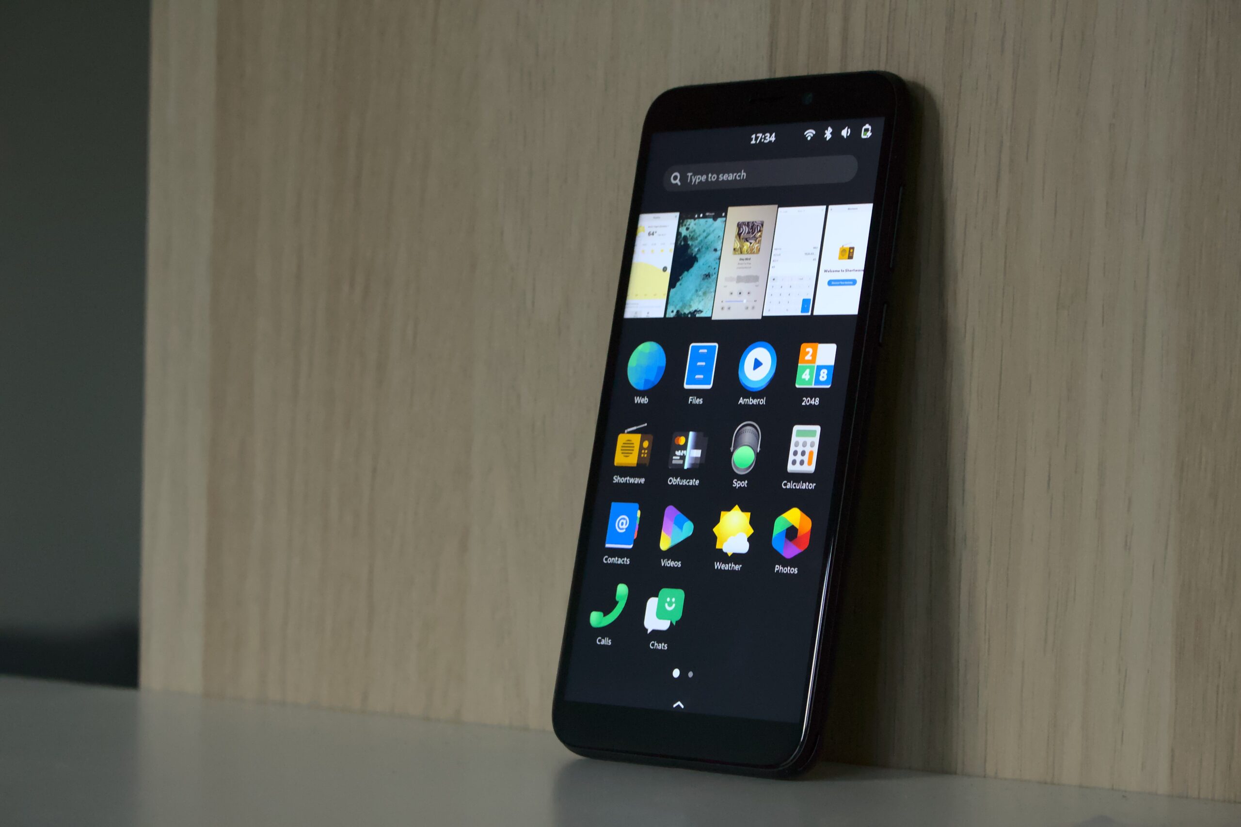
Taken together, here’s what all of this looks like on actual phone hardware right now:
Most of this work is not merged into Mutter and GNOME Shell yet, but there are already a few open MRs in case you’d like to dive into the details:
- https://gitlab.gnome.org/GNOME/mutter/-/merge_requests/2342
- https://gitlab.gnome.org/GNOME/mutter/-/merge_requests/2389
- https://gitlab.gnome.org/GNOME/gnome-shell/-/merge_requests/2303
Next Steps
There’s a lot of work ahead, but going forward progress will be faster and more visible because it will be work on the actual UI, rather than on internal APIs. Now that some of the basics are in place we’re also excited to do more testing and development on actual phone hardware, which is especially important for tweaking things like the on-screen keyboard.

