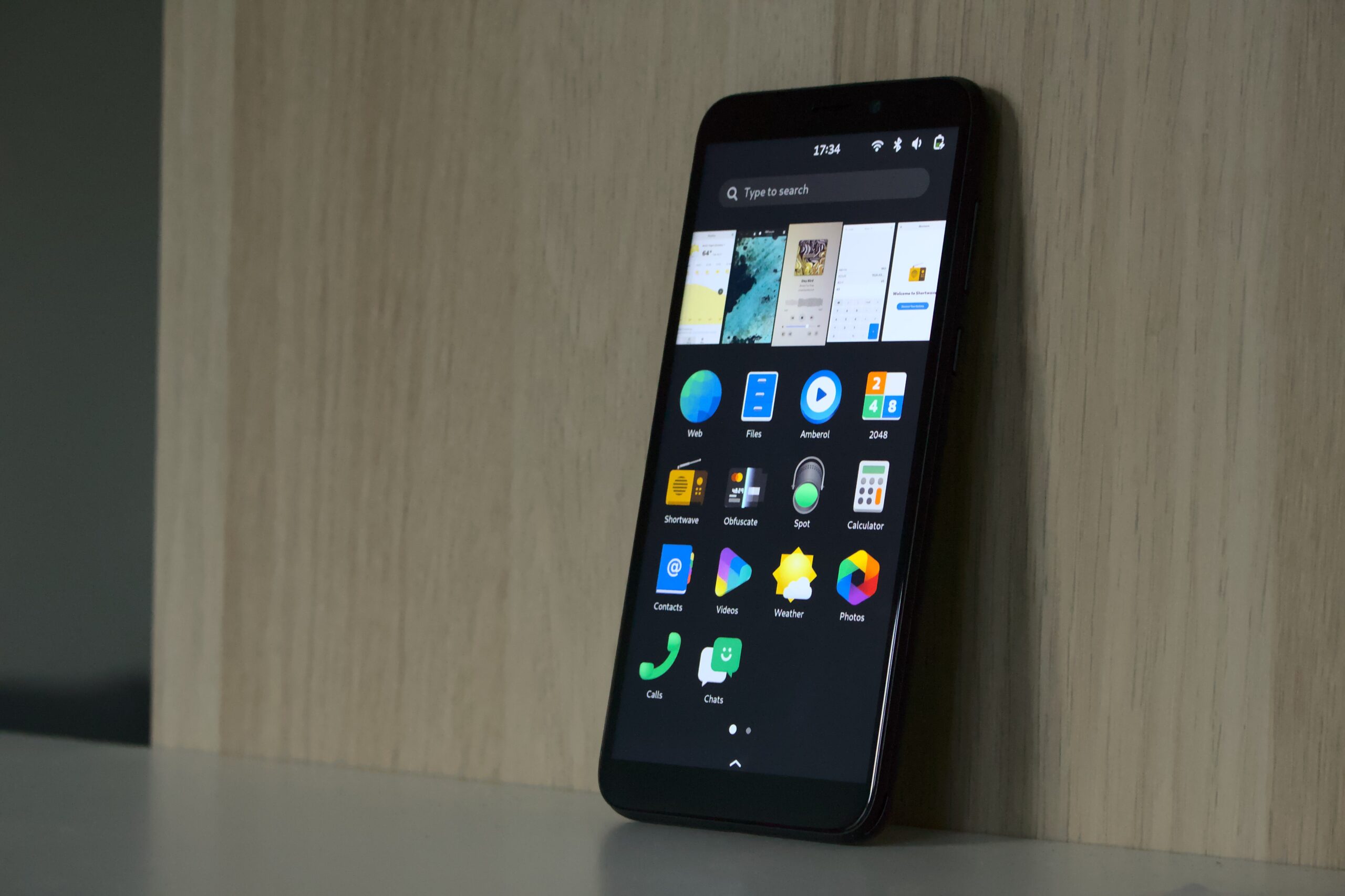
It’s been a while since the last update on GNOME Shell mobile, but there’s been a huge amount of progress during that time, which culminated in a very successful demo at the Prototype Fund Demo Day last week.
The current state of the project is that we have branches with all the individual patches for GNOME Shell and Mutter, which together comprise a pretty complete mobile shell experience. This includes all the basics we set out to cover during the Prototype Fund project (navigation gestures, screen size detection, app grid, on-screen keyboard, etc.) and some additional things we ended up adding along the way.
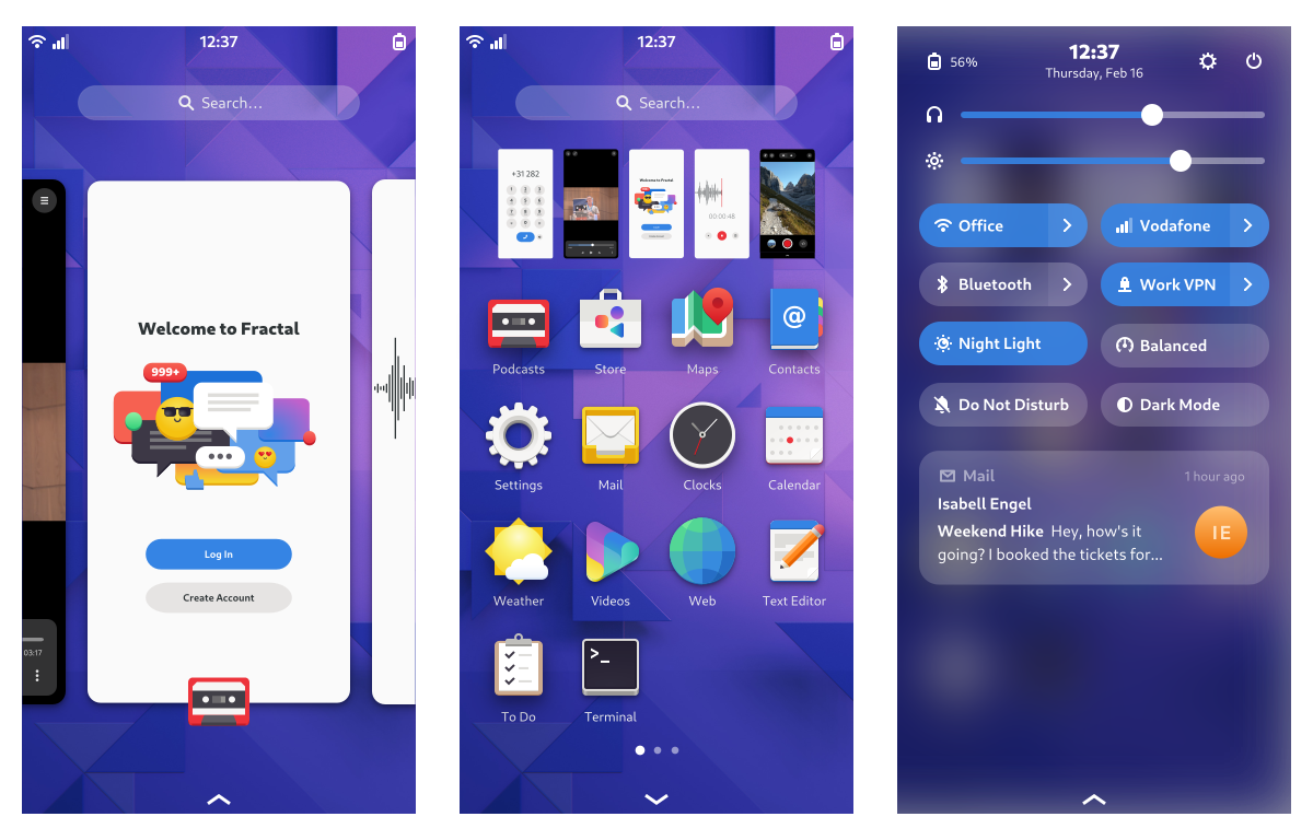
The heart of the mobile shell experience is the sophisticated 2D gesture navigation: The gestures to go to the overview vertically and switch horizontally between apps are fluid, interruptible, and multi-dimensional. This allows for navigation which is not only quick and ergonomic, but also intuitive thanks to an incredibly simple spatial model.
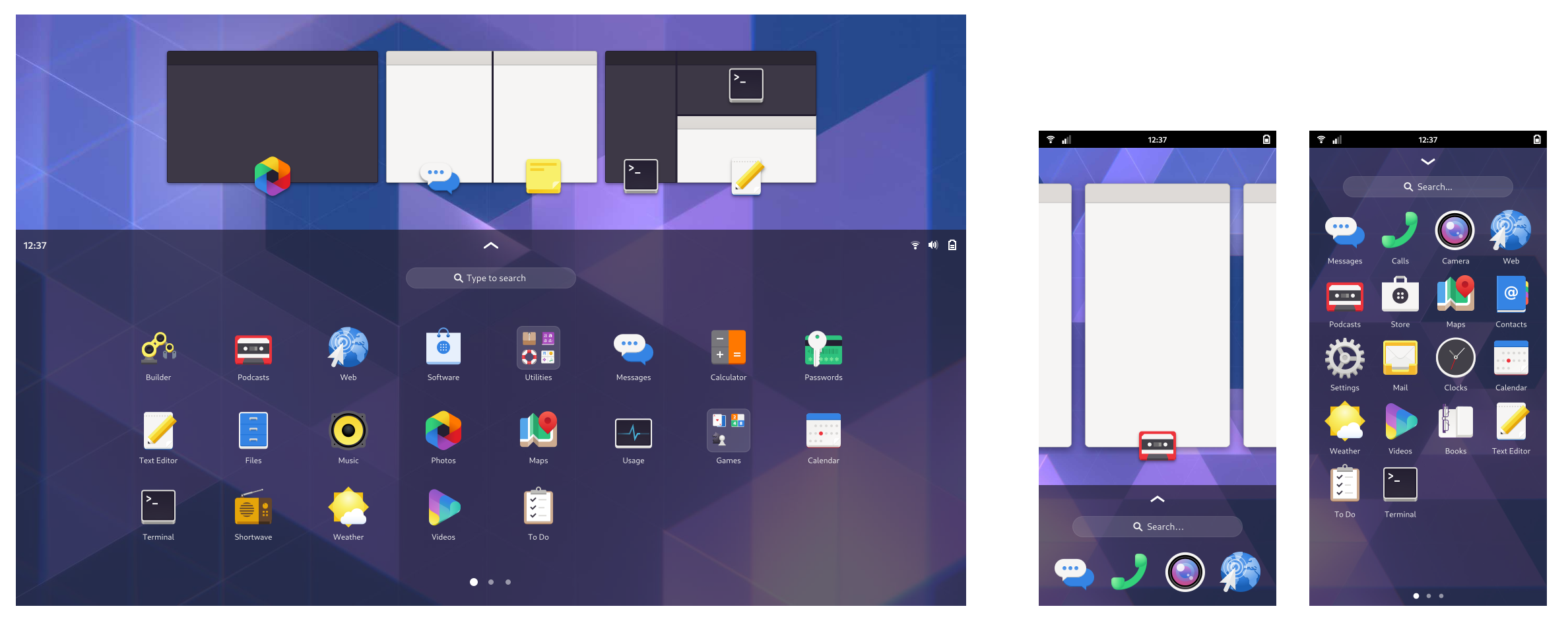
While the overall gesture paradigm we use is quite similar to what iOS and Android have, there’s one important difference: We have a single overview for both launching and switching, instead of two separate screens on iOS (home screen and multitasking) and three separate screens on Android (home screen, app drawer, multitasking).
This allows us to avoid the awkward “swipe, stop, and wait” gesture to go to multitasking that other systems rely on, as well as the confusing spatial model, where apps live both within the app icon and next to the home screen, and sometimes show up from the left when swiping… up?
Our overview is always a single swipe away, and allows instant access to both open apps and the app grid, without having to choose between launching and switching.
In case you’re wondering where the “overview” state with just the multitasking cards (like we had in previous iterations) went – After some experimentation and informal user research we realized that it’s not really adding any value over the row of thumbnails in the app grid state. The smaller thumbnails are more than large enough to interact with, and more useful because you can see more of them at the same time.
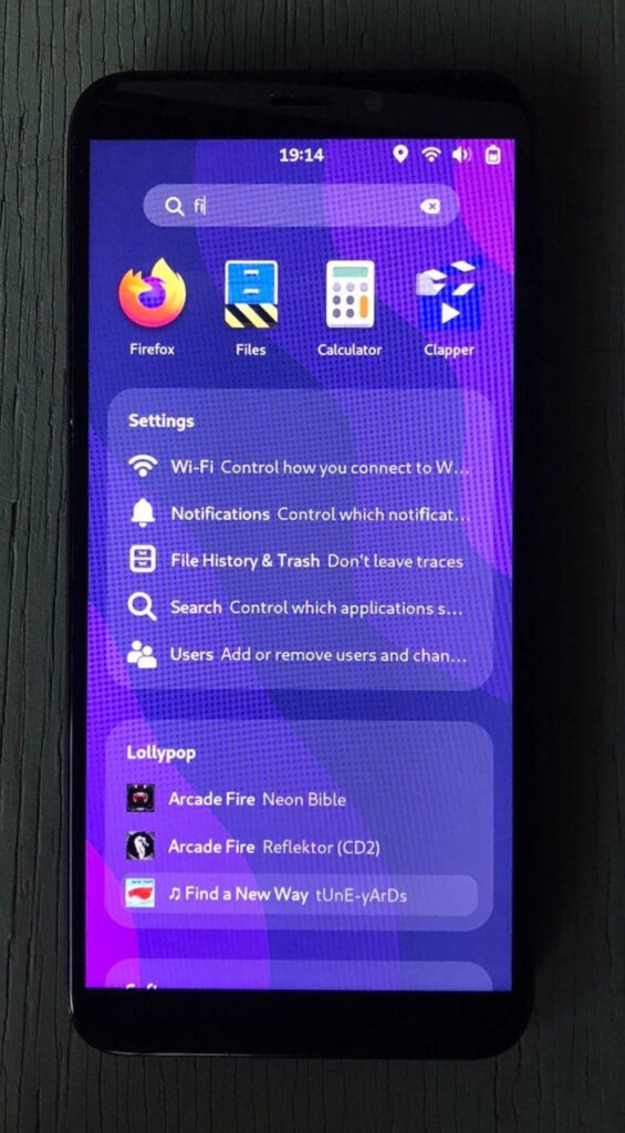
We ported the shell search experience to a single-column layout for the narrower screen, which coincidentally is a direction we’re also exploring for the desktop search layout.
We completely replaced the on-screen keyboard gesture input, applying several tricks that OSKs on other mobile OSes employ, e.g. releasing the currently pressed key when another one is pressed. The heuristics for when the keyboard shows up are a lot more intuitive now and more in line with other mobile OSes.
The keyboard layout was adapted to the narrower size and the emoji keyboard got a redesign. There’s also a very fancy new gesture for hiding the keyboard, and it automatically hides when scrolling the view.
The app grid layout was adapted to portrait sizes, including a new style for folders and lots of spacing and padding tweaks to make it work well for the phone use case. All the advanced re-ordering and organizing features the app grid already had before are of course available.
Luckily for us, Florian independently implemented the new Quick Settings this cycle. These work great on the phone layout, but on top of that we also added notifications to that same menu, to get a unified system menu you can open with a swipe from the top. This is not as mature as other parts of the mobile shell yet and needs further work, which we’ll hopefully get to soon as part of the planned notifications overhaul.
One interesting new feature here is that notifications can be swiped away horizontally to close, and notification bubbles can be swiped up to hide them.
Next steps
From a development perspective the next steps are primarily upstreaming all of the work done so far, starting with the new gesture API, which is used by many different parts of the mobile shell and will bring huge improvements to gestures on desktop as well. This upstreaming effort is going to require many separate merge requests that depend on each other, and will likely take most of the 44 cycle.
Beyond upstreaming what already exists there are many additional things we want or need to work on to make the mobile experience really awesome, including:
- Calls on the lock screen (i.e. an API for apps to draw over the lock screen)
- Emergency calls
- Haptic feedback
- PIN Unlock
- Adapt terminal keyboard layout for mobile, more custom keyboard layouts e.g. for URLs
- Notifications revamp, including grouping and better actions
- Flashlight quick settings toggle
- Workspace reordering in the overview
There are also a few rough edges visually which need lower-level changes to fix:
- Rounded thumbnails in the overview
- Transparent panel
- A way for apps to draw behind the top and bottom bars and the keyboard (to allow for glitch-free keyboard showing/hiding)
Help with any of the above would be highly appreciated!
How to try it
In addition to further development work there’s also the question of getting testing images. While the current version is definitely still work in progress, it’s quite usable overall, so we feel it would make sense to start having experimental GNOME OS Nightly images with it. There’s also postmarketOS, who are working to add builds of the mobile shell to their repositories.
The hardware question
The main question we’re being asked by everyone is “What device do I have to get to start using this?”, which at this stage is especially important for development. Unfortunately there’s not a great answer to this right now.
So far we used a Pinephone Pro sponsored by the GNOME Foundation to allow for testing, but unfortunately it’s nowhere near ready in terms of hardware enablement and it’s unclear when it will be.
The original Pinephone is much further along in hardware enablement, but the hardware is too weak to be realistically usable. The Librem 5 is probably the best option in both hardware support and performance, but it still takes a long time to ship. There are a number of Android phones that sort of work, but there unfortunately isn’t one that’s fully mainlined, performant enough, and easy to buy.
Thanks to the Prototype Fund
All of this work was possible thanks to the Prototype Fund, a grant program supporting public interest software by the German Ministry of Education (BMBF).
