Just for clarification…
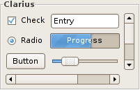
The new “default” theme in GNOME 2.15, called “Clarius”, is exactly the same as Clearlooks, except for the scrollbars.
The Clearlooks theme has glossy blue scrollbars, where as Clarius does not. This was the result of feedback from several members of the community about the new clearlook-cairo additions.
![]()
it’s sad.
Yes it’s sad… I loved so much these pretty blue bars!
i much prefer this clarius variation. the scrollbars are not content, they shouldn’t distract from the content.
Thanks for clearlooking that up… eermm I mean thanks for the clariusfication… whatever
HOORAY!! (Sorry michel and nacho – I’m with emmanuel on this one though.. those scroll bars were distracting.)
so much better! thanks!
Much better this way. I thought the blue scrollbars were a Fedora-only thing.
/me likes clarius a lot more
The purpose of using colors is not to make things pretty, but to draw attention to the important stuff and scrollbars are not important.
The metatheme is still called Clearlooks though.
How about creating a Clarius metacity theme and then updating the Clearlooks metacity theme to the glossy version (version 2); then we’d have two metathemes, Clarius and Clearlooks. Just a thought.
Also, since you seen to be the “art manager” for GNOME :), do you know if the splash screen will be updated before the release, and if so, can the same person design a nice background and GDM theme? SLED 10, for example, has really nice artwork for these, and unlike upstream GNOME it looks like it was all designed by the same team. 😉
Well, OSX has blue scrollbars and nobody complains about that.
Good! Looks much nicer now, and less distracting!
“Well, OSX has blue scrollbars and nobody complains about that.”
Um yes. I think those are horrible, not only colored but sticking out and being rounded, too. Awful as well as awfully distracting! Of course, to each his own, but what the — were they thinking…
Thats an improvement but they could be better. I really like Ubuntu’s scrollbar’s with the little textured grip:
http://www.ubuntu.com/include/img/add-remove.png
Without the color they have no significant differentiation from the background of the scroll area; they blend in and are difficult to find without searching.
Wouldn’t making them a less distracting color be better than removing the color altogether?
Good call with the scrollbars. I had made the same change manually to clearlooks to make programs like eclipse usable. Too many bright scollbars are quite annoying to look at.
Wow thats grrrreat.
Meh… I personally liked the original clearlooks better, but I understand the thinking behind the “toning down” of things.
are there also the animations?
Could you clarify your clarification please? The theme WITH blue scrollbars will be available by default, hopefully? I won’t use the one without.
Thanks for the clarification. I’d noticed the change pop into Ubuntu and the scrollbar seemed to be the only difference. I definitely think Clarius is a good default choice. The scrollbars look really cool in Clearlooks, but they seem too catchy for a UI element that doesn’t really need to draw your eye.
Have you considered to ship a theme based on Ubuntulooks? The name might imply that it’s meant to be something proprietary to Ubuntu, but we really only renamed it so we would be free to make less conservative changes. It is far more polished than Clearlooks at this point and unfortunately it seems like we failed to bring Clearlooks to the same level after Human was complete. It would also be possible to use some, but not all widgets from Ubuntulooks if both engines are shipped.
With regards to the scrollbars, the “plain” view looks a bit ugly to me without the old grip stripes. And yes, the main reason we used color in the first place was to make them stand out from the background and make it easy to recognise scrollbar position on a glance, not because it looks pretty. I fail to see why some people make such a big deal out of this but I have stopped wondering some time ago. 🙂
I’ve got to agree with Daniel; don’t know why some people make such a big deal out of this.
Like i’ve said, OSX has a blue scrollbar and nobody complains about it. Hmm thinking about it, even WinXP has a blue scrollbar and nobody complains about it.
It’s nice to take the color out, however, I’d have put some grip like old clearlooks no-cairo had…
I’ve heard many people complain about both Aqua’s and XP’s scrollbars. Both Apple and Microsoft have alternative themes that tone down the scrollbars, and they seem quite popular. So whether or not it’s a good idea, it’s not true that nobody has a problem with their scrollbars.
That said, I have a problem with these new scrollbars: it’s not as obvious which is the thumb, and which is the trough. In a tiny view like that, you can see that the light part is the thumb, but in a long document, I’d have to look at the whole scrollbar to figure out whether I’m looking at the thumb or not. That’s one thing the blue was good at.
Of course, there are other ways to fix it, e.g., giving the trough a gradient so it looks like it’s an empty cylindrical channel.
I just fell in love with Clarius.
Much much much better! Thank you very much!!