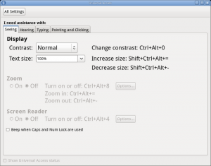
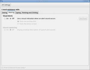
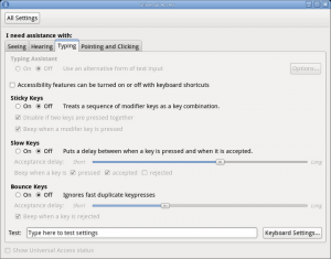
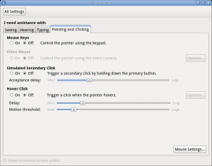
Jon McCann was recently working with the accessibility folks to come up with a new design for accessibility settings in GNOME 3.0. The results of the discussions are linked to on the Settings/Universal Access wiki page.
To help clean up some of the current settings panels, I have been implementing the mockup that Jon worked on. The current state is available in the latest Gnome unstable release, which is available in Rawhide for people running Fedora. Unfortunately Ubuntu have decided not to ship development packages of this Gnome release for people to test, so here are some screenshots of what is available so far:
Some features will need integration with the new Gnome Shell, and these are “grayed out” for now. Clearly there is some work to be done to make sure it conforms to the new Human Interface Guidelines and generally looks visually appealing. Unfortunately, there isn’t a large team of people working on Control Center right now, so it would be great if anyone can help out testing, fixing and improving! If you think you may be able to help out, the best way to get in touch is to pop in to the #control-center channel of irc.gnome.org. If you feel like diving straight in, the UI file for Universal Access is here. Send any changes back to the mail list or pop by IRC!


Please use checkboxes instead of iPhone like on-off radio buttons. Radio buttons should be used for alternatives and checkboxes for simple activation states.
Looking sharp! And what dialog would show up and people click on Mouse Settings..?
I wouldn’t venture into these settings myself but glad to see work on this front for the disabled. I believe, “Access” could be improved by increasing the vertical separation of sections as the last 2 screenshots appear to be way too cluttered.