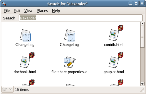
The last two weeks I have been working on the nautilus-search (and now nautilus-search2) branch of Nautilus. The initial code in this branch was written by andersca and was later maintained by joe. It had a pluggable search interface with a beagle implementation that let you easily search for files from Nautilus. Places->Search in the menu would give you a text entry in the toolbar, and when you typed text there the matches was shown in the normal directory view. Here is how it looked:
While pretty cool and useful, this really isn’t state of the art compared to e.g. MacOS X or MS Vista. For one, it doesn’t support what Apple calls “Smart Folders” and MS “Virtual Folders”, nor does it allow you to specify the search other than with text. Furthermore, the search acts as a special type of folder, but I didn’t like the fact that its not obvious that this is not a “normal” folder.
So, after spending some time on the code I now have this:
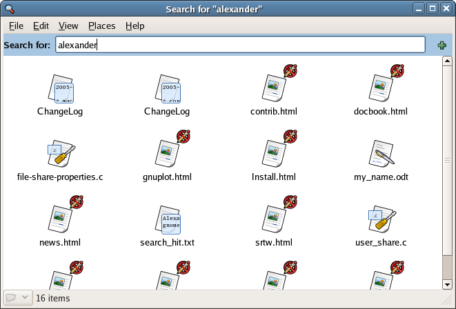
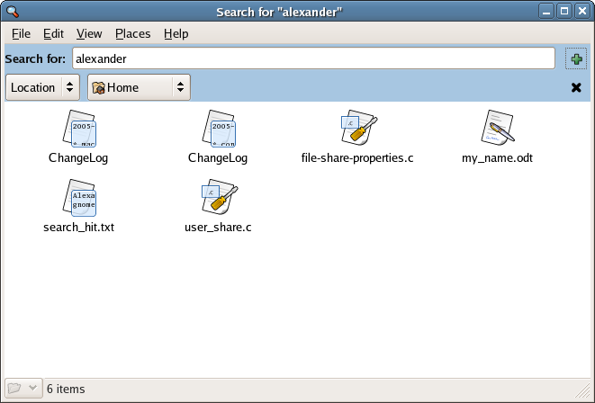
The blue area is a special part of the window I called “extra location widgets” in the code. It can be used to show that this is a special kind of folder, and I think we should use it for folders in burn:/// also. Furthermore, the “+” button lets you add limitations on the search:
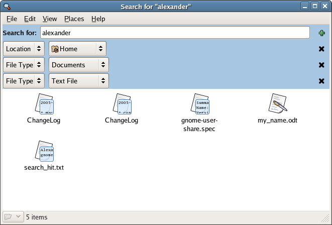
You can also search by type:
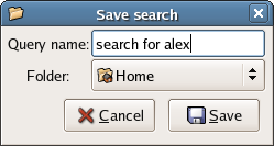
When you are satisfied with your search you can use File -> Save Search As… which gives you this dialog:
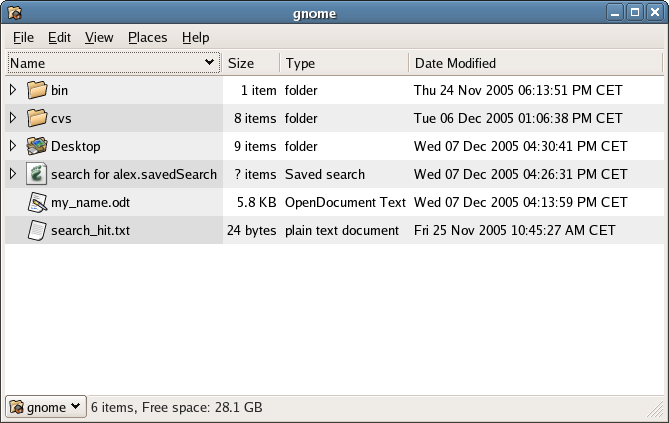
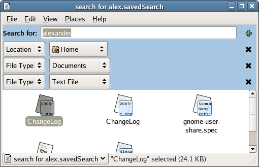
Looking in home, we see the newly saved file “search for alex.savedSearch”. Its really a simple xml file describing the query. However, we can tell by the expander that Nautilus treats it as a folder.
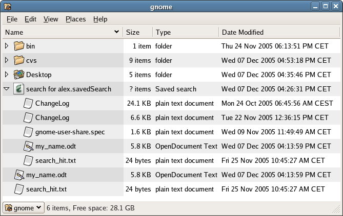
If you expand it, you get the results of the search as if it was a normal folder:
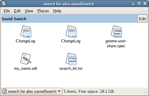
And if you click on it you show the file as a folder:
You can also edit it by clicking on the edit button, giving you back the original query edit widgets. When you’ve changed them to your liking, File -> Save Search updates the search file on disk:
All this code is on the nautilus-search2 branch in cvs. Its mostly working, I just need to fix some bugs and add a simple (non-indexing) search backend and I think its ready to be merged to HEAD.
Interesting!
One oddity of this is that it displays searches in big-icon-mode, which doesn’t make a lot of sense. Big-icon-mode is spatial so you can put things somewhere, and they’ll be there later (stability) — but searches will be adding/removing things automatically. Searches should probably always use a list-view.
And the look of it rubs me the wrong way. Either you can’t see what the search is doing, or it eats up most of your window. I wonder if you could formulate a simple 1-line English sentence, with a control to let you edit it … not sure what the right solution here is. (If Gtk+ had Aqua’s drawers, that would be nice. 🙂
But then, I realize this is not-quite-alpha code, so a couple rough edges are to be expected. Great work! I look forward to using this someday.
Great work, that’s something I was waiting for
Wow, it looks really nice ! One small thing that disturbs me is the icon of the saved search file, it should really be a folder.
And, does that folder updates it’s content when new valid search results exists ?
But this really rocks, i hope it can make it for 2.14
I think the division to a query view (with the plus sign) and to a saved search view (with the Edit button) is a bit artificial. Why not just open the saved searches in the query view? There should also be some immediate way to see any additional limitations that have been placed on the saved search and opening directly into the query view would do that.
This looks great. I hope it will be available for gnome 2.14
When you say “add a simple (non-indexing) search backend” do you mean an alternative to beagle? I’m assuming the screenshots above are showing it using the beagle backend. Do you need a non-beagle backend because Red Hat / Fedora can’t ship beagle because it’s Mono?
Wow! I expected something like this to be quite a ways off, but here it is looking pretty complete. Thanks a million! Very nice.
Impressive.
Just needs some more love for the UI.
Kudos.
Looks promising!
UI-wise it isn’t perfect, but that’s only natural for an alpha preview 🙂
Maybe a nice addition to this ‘Places -> Search’ approach is to have a little search box (a-la firefox) next to the breadcrumb/location bar to search for stuff in the current folder (+subfolders) with a pulldown menu to narrow down the filetype. I don’t know OSX that well, but I think it has something like that too.
Keep up the good work!
This is truly great. A little polish and it will surely take over the world 😉
@Ken: well view is what is says a view of the data so I think it would be totally worng to bind this search to a special view. The other thing is that list-view is not the opposite of spatial, you can have list-view for spatial as well.
@Fred: This is alpha code, so I am pretty sure the icon will change 🙂 And if you use beagle as the backend, yes you will have live queries, i.e. updates of the searches.
I’d be _very_ interested to hear how this relates to RedHats position on Mono. Does this mean RH is backporting all the cool Beagle stuff back to Lucene to make a Lucene search plugin, that RH has changed it’s mind on Mono or simply that you have spent a large amount of time coding stuff that will never be used by RH?
Compiled and ready to run
Thanks Alexander 🙂
Interresting work.
But why do you make these horizontal new widgets ?
I think it would be much better to implement something like this in nautilus side pane. What do you think ?
Like a beagle frontend in side pane, that would be so great.
Can you also search for file names, like the ‘locate’ command?
I was shown an emacs snippet called ‘dired-locate’ which gives you a dired view of locate’s output. Addictive. I’d like to see it in nautilus as well.
The close icon on a toolbar worries me. Any chance you could use something esle like maybe a collapse/disclosure triangle or something please? Looks very promising.
Very Impressive. Very much needed and a very nice feature. Personally I like the difference between a saved search presented ‘solid’ while a search you are building provides more interaction. ^^
Awesome work! Your UI looks very much like the BeOS (talk about a blast from the past), but improves on it. I like the way you let people build queries directly in the result window – BeOS just added a menu item “Modify query…” to search folders that popped up a criteria editor.
Building/modifying a query:
http://www.beatjapan.org/mirror/www.be.com/documentation/user_docs/art/FindAttrib.GIF
A live search folder:
http://www.beatjapan.org/mirror/www.be.com/documentation/user_docs/art/QueryWin.GIF
I’d like to see a simple string input that lets me specify nested criteria, much like an SQL where clause. “(size < 1mb) or (size > 5mb && title startswith “Cool”)”
I hope you present the saved searches as “search folders” with no extension. That’d just rule.
Gabe
@ken
yes, you have to specify a behaviour on placing things in “virtual folders”.
This would be really easy, if some kind of metadata would be supported – you could then simply add the search term to the “keywords” metadata.
but right now, you have to be creative – if a location criteria is give, you can store the file there.
If the file-type collides with the corresponding filter, you could give an error.
this and this and you really will take over the world. great stuff!
Very cool Alex!
I like it a lot, but I would prefer a “virtual folder” metaphor to a “saved search file” one, since I think its more intuitive to understand. Perhaps we can find a folder icon witha special emblem to show thats its not a normal folder (the same way you have used the blue color).
Also, using a color to denote difference may not work so well for those who are [color]blind?
that’s great! however when you have several search criteria, it’s not clear whether nautilus will do a AND or a OR between them. i think you should offer AND or OR choice or make it clear what will happen.
you example is:
“location is home AND (file type is document OR file type is text file)”
maybe it could be more explicit (though then it could become too complicated/frightening GUI). maybe your current system + some good documentation is enough.
I like this too, eventhough I think the UI could be reworked (I actually kinda like beagle’s UI, it just lacks integration in nautilus). One small suggestion : it’s a good idea to try to make the folder look different, but I think this difference should not be in the toolbars of the folder : I find it does not only look ugly, but it is also less obvious that it is a property of the folder itself. I think the folder’s background (and maybe fonts) should be different. The folder’s list could also look different (and be a bit closer to the beagle UI, the folder information (when in left side panel) should definitly be different.
I am looking forwards to the futur of this work !
“Does this mean RH is backporting all the cool Beagle stuff back to Lucene to make a Lucene search plugin, that RH has changed it’s mind on Mono or simply that you have spent a large amount of time coding stuff that will never be used by RH?”
Red Hat has always written tons of code that it doesnt include in its own distribution. Just ask Alan Cox or Al Viro for examples 😉
One thing I’m not sure of, is why it should be done in a similar way to apple. There are better layouts that can be used. Maybe whats really needed is a new infrastructure/paradigm for user interaction with directories/files. Getting Gnome Storage (Seth’s Project), would be nice.
Unfortunately, we really need to start asking ourselves what we can do to seperate ourselves from OSX and Windows
But good job by the way 😉
Andrew: That’s what I was thinking (shamless plug: I’d just started working on a beagle gnome vfs plugin, bit pointless now, dman… :).
Great work all the same, and much more intuitive to use than what I was preparing, I just wonder if a hole new section is really needed.
David
Great job! Together with ability to tag files this will rock the gnome.
Andrew – you are quite destructive here – path to storage is quite steep for now!
Just a little suggestion. As it has been pointed, this looks a bit like BeOS, but as a long term BeOS user, I believe that the “Save as…” window is a bit “artificial”, and even in BeOS it doesn’t follow the BeOS paradigm. Why just not drag and drop the blue part? (or however it is implemented in the final release) The blue part is what defines the search, right? Just move it to wherever you want to get a link to that search and done.
That’s just my idea.
Great job, btw.
Cool, leave it as-is and touch nothing! 🙂
Great stuff!
I would like to underline what ryan said though: I think there should be some kind of visual indication in the tree view expander that “search for foo” is a virtual folder.
Also, in the first result window you have multiple files with the same name (“ChangeLog” for example) and there is no way to distinguish them.
– Sebastian
Good job.. in copying Apple.
Alex, you’re a superhero.
That’s so cool. I love it, especially the “Saved search”. It’s a huge step in the right direction. Now if I only could tag my files in a unified way…
i’m thinking.. maybe it would be good to also be able to display the full path of every match. for instance in your results you have twice ChangeLog. and you’d have to right-click properties to know which one is where.
but this has great applications. for instance if it would work to search for all ChangeLog files then zip that virtual folder… many tasks that were command-line only so far would be become doable in the GUI :o)
Glad to see Beagle integrated into a File Manager finally. I tried to tell the folks over at XFCE to do this with Thunar but was mocked and ridiculed. However, I’ve never had any good experience with Nautilus. It’s always been very unstable for me, adding more features seems to me like it would only add to that instability.
My personal thought would be to start from scratch with the file management side and build something like a “Type Manager” (or iTunes like interface) to manage all the files on the system, giving options to hide or unhide different folders that are system related and putting emphasis on home and application folders. Today’s file managers are no help to a novice computer user who wants to navigate through a linux file structure. They need something that highlights only the files and folders that would interest them. Just my two cents.
This is pretty cool. Will there be a widget or button to refresh the search? Some folk will probably have a search folder open for a long period of time, but will want to refresh the results w/out closing the window and reopening it.
Very nice work, here. I know this is another generic compliment; but features brought to the table by apps like beagle go a long way towards giving Linux an edge on the competition, but it isn’t until these features are presented through a coherent and pleasant environment that will make Joe Average consider GNU/Linux a serious contender in the OS Market.
Does it take hours or just serval minutes to search some easy described files? I compared beagle and Spotlight and i must say, beagle was just too slow ….
just me 2 Cents ….
This looks awesome! I say it’s THE must-have killer-feature of 2.14! Ofcourse, it’s a bit early for that, and I’m sure there will be lots more cool stuff (I hope)!
Hi Alex. Nicely done! Here are some suggestions:
1. File Menu or Right-Click: “New Saved Search”
2. When you create a Saved Search:
(a) in the current Nautilus window, an icon appears as a folder with magnifying glass and its name/tooltip is the search name, and
(b) a side pane appears with the search criteria with the highlight/focus in the search name box; a side pane is the most efficient shape to hold a number of short criteria in a long rectangle
3. The search is automatically saved (ie. no save/load/edit button) and all searches are saved in a .savedsearch folder in the home directory of the user (this allows easy backup of saved searches)
4. Whenever you click on a Saved Search folder, the sidepane appears in the Nautilus window with all the search criteria showing/ready to be edited on the fly
5. The Saved Search expands/opens as a regular folder but with the sidepane
Exciting work!
This type of view definetly breaks the spatial-view metaphor, and will always do – no matter what you do. Why don’t you just create a temporary folder and put links to the found files into it. Then you can skip the save-option at all (the user can move the folder to wherever he likes it to rest with just nautilus). And, one could handle the search result like any other folder of files. Only, the search view should be active, so that not the icons of the links but the icons of the originals are shown and that the search options are at hand.
Great work.
The concept of a ‘new look’ meta folder for searches and burn, and possibly other uses is needed, I am just not keen on your blue. This needs to work with many different desktop themes.
Over to the graphic design dept ?
Good idea.
But… Why use teh folder icon? wouldn’t another icon for saved searches work better for quick identification (Maybe a folder with a spyglass over it, or an eye on the folder). That way you wouldn’t have to do anything special to see at once what it is.
At last ! This looks great.
I agree that the blue color is definitely not “the right way” ™. In browser mode the path for the CD burner is “burn:///”, so “search:///” would differentiate these dialogs, as well as the icon. For spatial, all I could think of would be a header, a big bar with a magnifying glass and “search” in bold. Don’t know if this is any better than the blue, but at least it would not be a problem for [color]blind users.
Could the search restrict by default to the current path (i.e. the place we were when the search button was pressed) ?
I do hope this will also work in browser mode. Better may spatial nautilus be, however I can’t see myself getting used to it any time soon. In browser mode I would expect to be able to change to list view and zoom in, as with any other folder.
I think it is important that the file view look like any other nautilus file view, anything else would be confusing at the very least.
Rather than a refresh button, should this not use gamin, and refresh automatically ?
Whether it be better as is or in a side pane I don’t know. I would however say that the side pane seems very under used to me in nautilus (I have written quite a bit on this in my 2 cents of GNOME improvements, stay tuned to GNOME forums :-).
I’m very happy to see this, it is a great improvement, I would be ecstatic to see this in gnome 2.14.
Love, Karderio
The project itself looks very useful. But I must remember that someday Reiser4 will be released, and search functions are previewed, so it will be interesting if there is any kind of integration with it.
Interview with Hans Reiser on KernelTrap.org:
http://kerneltrap.org/node/5654
Finaly they have done the search function integration to nautilus. What else we could expect from a desktop that is imitating Windows in every aspect. And maybe System7 and OSX in future.
Speaking of seaching. Are there any alternatives to Beagle? Beagle (still in version 0.1.2) seems to be worse program ever when it comes to resource use. After about one day it uses somewhere between 500-900M of memory and starts to slow down my system dramatically. Also the index (1.4G under ~.beagle) is absolutelu huge, .Yes, I know I have a lot of stuff under my home. That’s why a search engine like beagle would come useful, but in it’s current state beagle is completely unusable.
I do hope this uses some sort of plugin/backend system, this is of course always a good idea : a little code now saves a lot of work (for someone else maybe) later.
I don’t think beagle is yet a dependency/part of GNOME, so in order to get this into GNOME 1.14, maybe a find, grep, and locate backend (as in the actual 2.10 find dialog) is in order.
That is absolutely fucking beautiful.
Wow, very cool …
Please the UI needs work… it takes up too much space and waists alot too.
Your current UI looks alot like Mac OSX 10.4 but the main difference is the wigits on Linux are huge. can the dropdown and text boxes be made slim to use less space ?