everything in this post is just talking about ideal concepts of user interaction. technical aspects are not discussed here since they’re actually very easy.
very fortunately, gnome has adopted an auto-apply interaction for all of its preferences dialogs. the familiar dialog style that everyone knows and loves:
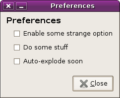
(standard instant-apply preferences dialog)
one of the nicest things about this dialog type is that showing and hiding the dialog has no side-effects. they’re sort of like spatial nautilus windows in a way — something that is conceptually always there, but usually not shown.
unfortunately, instant-apply isn’t for everyone and everything. for example, when settings in gdm change it may result in x servers being started or stopped — you really don’t want this type of thing going on as you click around with checkboxes. for some things we need to have a delayed apply.
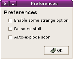
(delayed-apply preferences dialog)
with this sort of dialog, your changes are made all at once when you close the dialog (via the “ok” button).
of course, if we haven’t actually made the changes yet, there must be the ability to revert them. this ability to revert isn’t present in instant-apply (as we know it) but users want it for delayed-apply. the way of doing this for ages, of course, has been the “cancel” button.
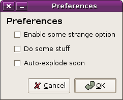
(delayed-apply preferences dialog with cancel button)
and some people seem to think that maybe you want to apply the settings without closing the dialog box. that’s easy enough to do, right?
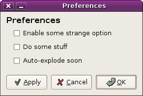
(delayed-apply preferences dialog with cancel and apply)
so now our three buttons do:
- apply changes
- undo changes, close the dialog
- apply changes, close the dialog
but what if we wanted to undo the changes without closing the dialog? sometimes you see this.
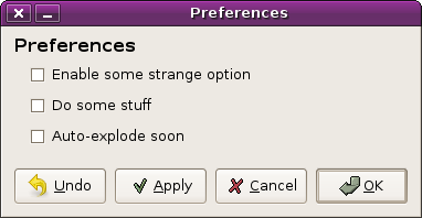
(delayed-apply preferences dialog with cancel, apply, undo)
wow. that’s a lot of buttons. but now our user can do both applies and undos without closing the dialog. nice.
- apply changes
- undo changes, close the dialog
- apply changes, close the dialog
- undo changes
there’s always this sort of implicit assumption, though, that closing the dialog will either apply or destroy your in-progress settings. your “working set” of changes are, for technical reasons, tied to the dialog box. what if the dialog crashed or your computer lost power and you were in the middle of making a rather large set of changes? could we have crash recovery that brought you back to the changes that you were in the middle of when the dialog next opened again?
and if we have crash recovery able to remember the changes that you were working on, why not have this as a normal feature of the dialog? in essence, why not add an option for “close the dialog” that neither applies or undoes your changes?
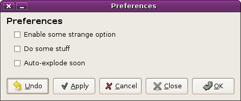
(delayed-apply preferences dialog with pain)
ouch.
but now we have actually gotten somewhere. we support everything that the user could possibly want to do:
- apply changes
- undo changes, close the dialog
- apply changes, close the dialog
- undo changes
- close the dialog (and don’t mess with my working set)
the dialog is absolutely painful, though, in terms of the number of buttons it has. it’s a little bit redundant, too; two of the buttons (“ok” and “cancel”) are now combined actions that can be performed with the other buttons.
what about this?
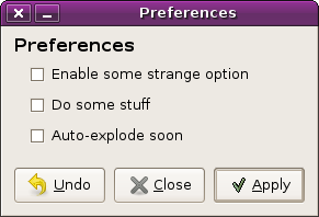
(dialog with apply, close, undo)
here is a neat idea for a delayed-apply dialog. if you make some changes and “close” it, you can come back to your working set of changes later. you can “undo” your working set to be the same as the live (applied) version, and you can “apply” it.
with this sort of model it even makes sense to do things like open a preferences dialog, click “apply”, then click “close” without doing anything else.
the downside is that “ok” and “cancel” are gone. people are familiar with these buttons and they probably like them. they might be annoyed by the fact that they have to press “apply” and then “close” instead of just “ok”.
people might also be confused by the fact that their working set of preferences stick around after closing a dialog and bringing it back.
with the instant-apply preference dialog we have right now in gnome, life is great. your mental model is that a preference dialog box is a thing that can be shown or hidden without these actions having any implicit side effects.
this is something that i want for delayed-apply dialogs too.
is it worth it or is it just too confusing?
Wow. Confuses me, and I’m techie.
Why not just fix the app so that it won’t explode?
This just sounds confusing to me. Clicking “Show Preferences” should show you preferences that are currently active.
It would be weird to have it pop up a set of preferences different from what I am currently running.
I like the parody of extremes in your article. The simplification you have arrived at is very well justified.
agree with above and the points you already made yourself: it’s far too confusing. In most cases (non-exploding) a close and an undo are sufficient. In exploding cases, either:
– [Apply/]Cancel/OK
– Undo/Close with warning dialog upon changing dangerous options
When working sets are useful, they should be made explicit by the use of profiles or so.
http://developer.gnome.org/projects/gup/hig/2.0/windows-utility.html#windows-explicit-apply
Most stuff should be easily doable in instant apply format. That which isn’t is, is probably either for advanced users or is badly designed for normal users. I think that there shouldn’t be any user level dialog boxes that can make your system unbootable or crash X if you make a mistake.
However, for delayed apply approaches…
1. I think that the essential buttons are “OK” and “Cancel”, where “Cancel” closes the dialog without applying changes, and “OK” closes the dialog applying changes. The close button in the window border should be a synonym for “Cancel”.
2. The separation “Close” and “Cancel” seems to be very confusing. Dialog boxes shouldn’t be both big and dangerous at the same time. I think “dangerous” instant apply dialog boxes should be kept to a minimum and be as small as possible to minimize the chance for mistake.
3. Are “Undo” and “Apply” really necessary in most circumstances?
In the cases that it’s better to use “Undo” and “Apply”, I don’t think the dialog should have “OK” or “Cancel”.
“OK” is the same as “Apply”, close the window.
“Cancel” is the same as just closing the window.
4. Maybe if you think you need “Apply” and “Undo” in the same box as “OK” and “Cancel”, then the “OK” and “Cancel” boxes should change to “Apply” and “Undo” respectively when holding the alt button, similar to how lesser used advanced functions are implemented in Mac OS X.
5. If no changes have been applied, maybe it should be required that the “Apply” and “OK” buttons are disabled.
I find the idea that you can choose to not apply your changes but save your state and close the window is sort of worrying, especially as there is no visual indication of what you’ve changed. I don’t recall ever needing this functionality in a well designed dialog box… all I see is it causing confusion.
I think when a delayed apply dialog restores from a crash, it should probably restore to the original settings. No dialog should be big enough that it’s a hard chore to retick the settings.
So in conclusion, I think that delayed apply dialogs should usually just be [Cancel] [OK], changing to [Undo] [Apply] when alt is held down. Not sure if this is recommended GNOME style but I quite liked how alt provides secondary functions in OS X.
I really like the Apply, Cancel, and OK buttons. It supports everything, except crash protection, which is IMHO overkill.
With these three buttons you can apply all changes real time, cancel any non-applied settings, and drop out of the dialog choosing to either apply new changes or not.
It seems that if you can have Apply and Undo without closing the dialog.. then you can just do instant apply.. Otherwise, well you have Ok/Cancel.. I find Apply to be just evil.
Don’t ever take away my OK and Cancel buttons!
Your later examples closely resemble the whole of GNOME 1, or the current state of Windows shareware. I assume that this is intentional.
“Tick a box and hit okay” is an utterly horrible interface. You want a “do this action” button and an “undo” button. You do not ever want to use tick-boxes and apply buttons.
– Chris
I vote for OK and Cancel
I honestly didn’t read every word of your post, I got to about the third level of spiraling insanity and started skimming, all the way to the comment box. With that in mind…
First some assumptions:
Undo buttons are extraneous.
Apply buttons are so extraneous as to be evil.
You only need OK and Cancel.
In the case of “non-instant” settings, the behavior is clear, either save the settings as they are, or throw away my changes, and close the window.
In the case of “instant” settings, they are (arguably) equally clear, either save the settings as they are, or undo the changes I made and close the window.
Simple.
Please God no. Nothing could be more confusing than opening preferences and seeing unapplied changes from before and having to click “Undo” to see what settings actually currently in effect. Talk about a support nightmare.
Hi,
I like your blog, but please can you use caps at the start of sentences. It really helps when reading.
Thanks,
Jon
Can I please have an undo history, like in Office apps? I mean seriously, why can’t I undo anymore after I closed the dialog? Do you know this helpless feeling when you changed your mouse settings, used it and figured “I want my old settings back”?
That’s what I want, for every dialog, be it instant apply or delayed apply or whatever you have. Never ever forget anything I did to this computer. And allow me to revert it.
Hi,
I think it’s worth to look at KDE for this. In Kcontrol, you generally have:
[help] [defaults] [apply] [reset]
Close or OK isn’t needed, you close Kcontrol or go somewhere else.
I think this makes sense. Default brings back the default settings, apply applies it (you always need to do that, or it asks you when you close kcontrol) and reset resets all changes you just did, like undo. Maybe undo sounds better, though.
Try to avoid an ok button at all. it is a bad label. try to replace it with a less generic action label.
cancel provides a clear exit strategy for the user: “whoa, I don’t understand that dialog. luckily there is a cancel button”
don’t mix up the meanings of buttons. the button close has to behave in the same way for instant and explicit apply.
keep it simple. if cancel/ok (one could argue about apply) is not enough, there is perhaps something wrong with your dialog.
gnome-app-install was a default explicit dialog before and now uses a different workflow in gutsy that allows us to only provide two buttons: “cancel” and “apply changes”.
too much confusing
please pleaAAase, I’m just a tiny unix system administrator
I don’t want to check some set of preferencies, or undo them, or explode the computer or even set some preferences
I just want to administrate the network of my enterprise.
_simplify_ Instant where it’s NICE, Ask validation FIRST when we have to Validate FIRST !
Apple is able to do That, you can do That ! you are strong, you are mean, your are Bad Ass ! go go go !
I love you, smouuuuch.
Well, basically you got two strategies where you put your efforts into:
– “Being able to roll back errors”
– “Being able to get what you want without errors”
Now guess which one is saner, closer to the principles of pervasive computing & usability, and more fruitful in the long run?
The point just is that you have to focus slightly more into making the selections more intuitive for users. It is quite doable, and the result is awesome.
Yes, please. One button is enough. It’s the general “Sod off” / “OK” button. Without exceptions.
I don’t see a difference really in setting delayed and instant preferences in a dialog box. What the dialog box shows you is the current selection of options. If you are to enable undo on delayed preferences, why not on instant preferences?
The only real difference is when the changes take effect, and this is in my opinion independent of how you present the setting values. In case of e.g. a dialog for gdm preferences, you might display a notice that the changes will take effect after you log out, or something like that. You might use this same notice area for displaying warnings about invalid settings. The Eclipse IDE has several dialogs with notices, and I have found them very useful.
Still, you’ll probably want to separate immediate and delayed options (groups, tabs, even separate dialogs), so it is apparent what settings the notice concerns.
I really dislike Apply buttons. They seem to optimize for the use case “I want to try out a lot of different settings combinations” (which seems very rare), at the cost of doubling effort/complexity to save changes.
Software which I tangentially support recently went from the Cancel/Save model to Cancel/Save/Apply. I’m really not too thrilled about it, since it confuses me enough (Save used to Apply at the same time – does it still Apply in the new model?) — I’m really afraid of the support issues it will cause for the end-users.
It’s confusing.
Besides, if you’re going to explicitly support a different “working set”, why stop there? I might have two or even ten different sets of edits to these preferences in progress, just to try them out (theme editing, perhaps?). So really the extreme version would be to have Load/Save buttons or similar (or do as the Theme prefs do, require a theme to be selected in a selection dialog before the user can customise a theme, i.e. put another dialog between the starting point and the twiddling of checkboxes.).
You can allow lots of flexibility here, but really most preferences dialogs don’t need it. I don’t want to think about managing multiple sets of preferences for an application, or worrying about if I have unapplied/uncommitted changes in a dialog. I just want a minimal, obvious dialog.
Allowing multiple concurrent sets of preferences that the user somehow has to distinguish between makes it that much harder to understand and use the system. Keep it simple and as immediate as possible (and inform the user what’s happening when it can’t be immediate), or have an explicit list of profiles (like the desktop theme picker does) if you *really* need that.
I bet your middle ground will confuse users. Test it on some real users and see what the result is.
Aw, man. Here I was enjoying this awesome parody of how computer scientists expect usors to share their fetish for building what they actually want out of obtuse combinatorics, and then you turn out to be serious. That’s no fun.
– Chris.
Hmm. We should first aim for “make it just work”, of course, so that most preferences are not even needed, if possible. As we do in Gnome pretty nicely now. In practice there are sometimes cases where this is not possible or easy.
But are these “undo my changes” -cases really that important or common in practice? Most of Gnome apps have fairly simple preferences dialogs nowadays – instead of “undo” one can just toggle the few checkboxes back to what one wants. If you don’t understand what the preferences are for, I wonder if the ability to “undo” helps much – if things were OK in the first place (the idea that you would want to return to that state) – why did you open the preferences in the first place anyway? :)
For complex scenarios or cases where you need to explain more things to the user a wizard -type approach migh work better?
What I am a bit worried about here is that if we come up with such a “undo” thing as a general style, in practice we will end up with cases where the undo just changes the state of that one checkbox you toggled, so it is kind of overkill on 98% of cases..?
I’ll go with comments #2 and #24 … why would you want to undo preferences? They are not a document, and they shouldn’t destroy data, they’re just prefs.
This is one of the Gnome HIG that I actually love, instant preference apply. It just makes sense.
I would just go with OK/Cancel for non-instant-apply dialogs. IF they are not instant apply, the preferences are also usually things that are only noticed later anyway (like changed in gdm settings, which only show up after restarting X). So the two actions:
1. Close without applying, come back and change something, apply and close
2. Apply and close, come back and change something, apply and close
should be, for all that matters, semantically equivalent. A separate Close button could even lead to _inconsistent_ behavior compared to instant-apply dialogs. What about, for instance, changing gdm settings, clicking Close, and restarting X afterwards? Your previous changes would have no effect at all.
I like the BeOS one:
http://prognathous.mail-central.com/prognathous/mozilla/beos/fonts/menu.png
At startup, “Revert” (or “Undo”, if you like) is grayed out. When you change something, it becomes enabled and you can get back to whatever it was.
Then, there’s the default set of settings you can load back if you’ve changed something, closed the dialog box and then open it again and forgot what it /used/ to be.
I’ve always thought preference windows in Gnome should have two buttons: [Revert] [Close]
Revert would revert to the settings when the window was opened, and Close would – well – close the window ;)
[Smiling face][Sad face]
Wouldn’t require translations either :-D
My suggestion is:
Apply
Apply & Close
Close
Bye
Ghisa
Showing settings that are not applied yet when a preferences dialog is shown is a terrible, counterintuitive idea. It directly opposes the instant-apply theory as well as how people expect “delayed apply” to work.
Nice article :)
You can think of a ‘Default’ button as well.
Yes, I think ‘Default’ is a very important option. If you have a complicated dialog you certainly want to back out of any changes you’ve made (Undo/Cancel) but what if you want to go back to the factory defaults. E.g. You’re a new user, you’ve made some changes and things aren’t working right. But you’re not sure which of a myriad of options has caused this. You just want to go back to the nice, warm, safe set of default options.
How about, the caption of ‘Undo’ is ‘Defaults’ when the dialog first appears. Making any changes causes the caption to change to Undo. Want to revert your change? Click ‘Undo’ (caption reverts to ‘Defaults’). If you’ve made no changes (or have undone your changes) and want to revert to Defaults, then click that.
Having more than three buttons with no “OK” or “Cancel” on the dialog is too confusing. No “OK” or “Cancel” buttons violates consistency in the interface. Presenting more than three buttons to the users increases the mental processing deciding which button to press (and thus increasing mistakes!).
Just my two cents, I vote for the dialog having “OK”, “Cancel” and “Apply” buttons. You don’t have to agree with me . Interface designing is an art – there is no absolute right or wrong. ;)