So, what new things happened to our games in GNOME 3.14?
Hitori
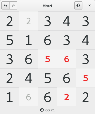
GNOME Hitori has actually been around for a while, but it wasn’t until this cycle that I discovered it. After chatting with Philip Withnall, we agreed that with a minor redesign, the result would be appropriate for GNOME 3. And here it is:
The gameplay is similar to Sudoku, but much faster-paced. The goal is to paint squares such that the same digit appears in each row and column no more than once, without ever painting two horizontally- or vertically-adjacent squares and without ever creating a set of unpainted squares that is disconnected both horizontally and vertically from the rest of the unpainted squares. (This sounds a lot more complicated than it is: think about it for a bit and it’s really quite intuitive.) You can usually win each game in a minute or two, depending on the selected board size.
Mines
For Mines, the screenshots speak for themselves. The new design is by Allan Day, and was implemented by Robert Roth.
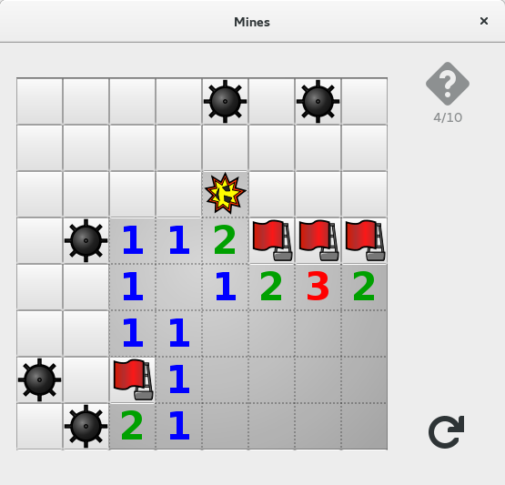
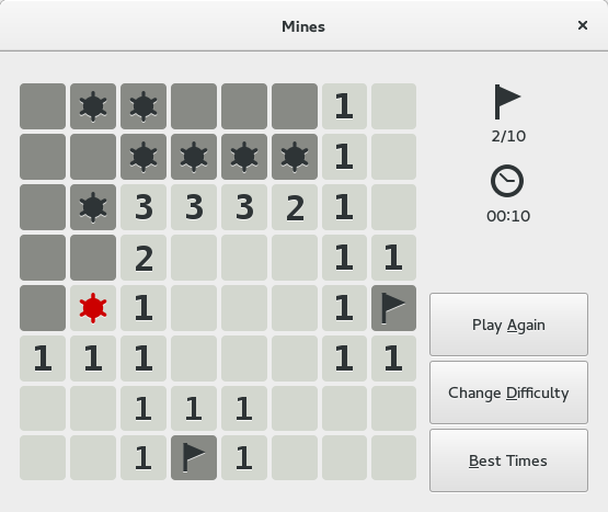
There is only one gameplay change: you can no longer get a hint to help you out of a tough spot at the cost of a small time penalty. You’ll have to actually guess which squares have mines now.
Right now, the buttons on the right disappear when the game is in progress. This may have been a mistake, which we’ll revisit in 3.16. You can comment in Bug #729250 if you want to join our healthy debate on whether or not to use colored numbers.
Sudoku
Sudoku has been rewritten in Vala with the typical GNOME emphasis on simplicity and ease of use. The design is again by Allan Day. Christopher Baines started work on the port for a Google Summer of Code project in 2012, and Parin Porecha completed the work this summer for his own Google Summer of Code project.
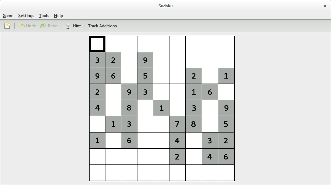
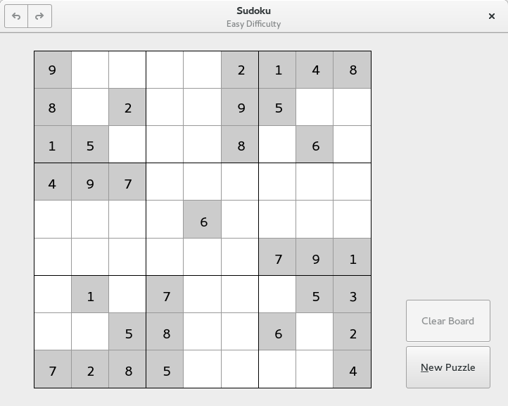
We’re also using a new Sudoku generator, QQwing, for puzzle generation. This allows us to avoid reimplementing bugs in our old Sudoku generator (which is documented to have generated at least one impossible puzzle, and sometimes did a very poor job of determining difficulty), and instead rely on a project completely focused on correct Sudoku generation. Stephen Ostermiller is the author of QQwing, and he worked with us to make sure QQwing met our needs by implementing symmetric puzzle generation and merging changes to make it a shared library. QQwing is fairly fast at generating puzzles, so we’ve dropped the store of pregenerated puzzles that Sudoku 3.12 used and now generate puzzles on the fly instead. This means a small (1-10 second) wait if you’re printing dozens of puzzles at once, but it ensures that you no longer get the same puzzle twice, as sometimes occurred in 3.12.
If you noticed from the screenshot, QQwing often uses more interesting symmetries than our old generator did. For the most part, I think this is exciting — symmetric puzzles are intended to be artistic — but I’m interested in comments from players on whether we should disable some of the symmetry options QQwing provides if they’re too flashy. We also need feedback on whether the difficulty levels are set appropriately; I have a suspicion that QQwing’s difficulty rating may not be as refined as our old one (when it was working properly), but I could be completely wrong: we really need player feedback to be sure.
A few features from Sudoku 3.12 did not survive the redesign, or changed significantly. Highlighter mode is now always active and uses a subtle gray instead of rainbow colors. I’m considering making it a preference in 3.16 and turning it off by default, since it’s primarily helpful for keyboard users and seems to get in the way when playing with a mouse. The old notes are now restricted to digits in the top row of the cell, and you set them by right-clicking in a square. (The Ctrl+digit shortcuts will still work.) This feels a lot better, but we need to figure out how to make notes more discoverable to users. Most notably, the Track Additions feature is completely gone, the victim of our desire to actually ship this update. If you used Track Additions and want it back, we’d really appreciate comments in Bug #731640. Implementation help would be even better. We’d also like to bring back the hint feature, which we removed because the hints in 3.12 were only useful when an easy move exists, and not very helpful in a tough position. Needless to say, we’re definitely open to feedback on all of these changes.
Other Games
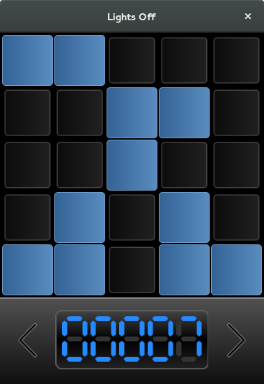
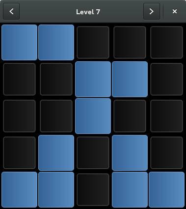
We received a Lights Off bug report that the seven-segment display at the bottom of the screen was difficult to read, and didn’t clearly indicate that it corresponded to the current level. With the magic of GtkHeaderBar, we were able to remove it. The result:
Robots was our final game (from the historical gnome-games package, so discounting Aisleriot) with a GNOME 2 menu bar. No longer:
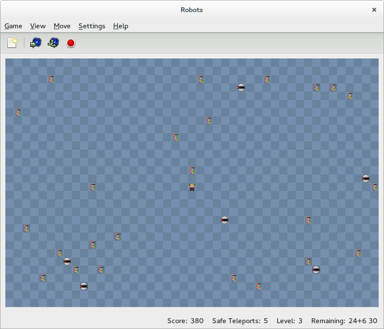
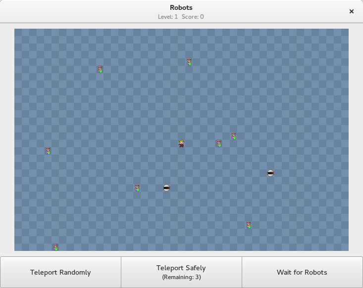
It doesn’t look as slick as Mines or Sudoku, but it’s still a nice modernization.
I think that’s enough screenshots for one blog post, but I’ll also mention that Swell Foop has switched to using the dark theme (which blends in better with its background), Klotski grew a header bar (so now all of the historical gnome-games have a header bar as well), and Chess will now prompt the player at the first opportunity to claim a draw, allowing us to remove the confusing Claim Draw menu item and also the gear menu with it. (It’s been replaced by a Resign button.)
Easier Easy Modes
The computer player in Four-in-a-row used to be pratically impossible to defeat, even on level one. Nikhar Agrawal wrote a new artificial intelligence for this game as part of his Google Summer of Code project, so now it’s actually possible to win at connect four. And beginning with Iagno 3.14.1, the computer player is much easier to beat when set to level one (the default). Our games are supposed to be simple to play, and it’s not fun when the easiest difficulty level is overwhelming.
Teaser
There have also been plenty of smaller improvements to other games. In particular, Arnaud Bonatti has fixed several Iagno and Sudoku bugs, and improved the window layouts for several of our games. He also wrote a new game that will appear in GNOME 3.16. But that has nothing to do with 3.14, so I can’t show you that just yet, now can I? For now, I will just say that it will prominently feature the Internet’s favorite animal.
Happy gaming!
Comments
15 responses to “3.14 Games Updates”
Oh man, the mines changes are a bad idea IMHO, I’ve been playing this since the mid-90s at least (in Windoze) and the loss of the colour cues are really going to throw me. Of course, I could be the only person in the world who still plays this. I guess time will tell whether or not it’s distracting :)
I was originally opposed to removing the colors as well. I thought it would slow me down, but once I tried it I found that it didn’t make any difference for me at all. That said, we’re definitely open-minded about restoring the colors; see https://bugzilla.gnome.org/show_bug.cgi?id=729250 if you want to join or follow that conversation.
Hi,
while I do love the visual updates for most games, I have to disagree with the new Mines design. My problems:
* In a fast-paced game like Mines (if you are playing it for shortest game times, anyway) it was actually much easier for me to look for colours than for the actual numbers. In a see of blue, I immediately see the green and can start to think about what it means. In a see of gray ones I have to search for gray twos. I do not enjoy searching for numbers-which-are-not-one. I enjoy thinking about their meaning. This reduces the gameplay value for me somewhat.
* But worse for me are the new animations when uncovering new tiles. For the 8×8, I consider less than ten seconds a really good time. So the animations just take too much time, they hinder the gameplay.
What I liked about the old Mines was that I could adapt my gameplay to my state of mind. If I just want to relax, I can play it safe and slowly. If I want to actually challenge myself, I can try to chase highscores, which actually means I try to unfocus my vision, take in as much information in small time as possible using lateral colour vision and solve difficult sites while uncovering easier places. With the new design, the second style just became much less appealing: I have to wait for the uncovering of tiles (even though only shortly) and lateral vision does not tell me anything anymore.
So, I’ve just written like totally three paragraphs about minesweeper gaming strategies and whatnot. Maybe it is not all negative that Mines has a new layout, I might discover other games. (-;
Keep up the good work and reconsider colours!
Cheers,
Mika
Ah, so you’ve played it already. The new animation is something I actually hadn’t noticed myself; you’re right of course, it is there, but it is fairly fast. I don’t think most players will notice, but if you’re finishing games in less than 10 seconds, then you’re going so fast that I guess that could make a difference. (Are you a human?)
Regarding color, see https://bugzilla.gnome.org/show_bug.cgi?id=729250
There are some animations indeed, but the animations shouldn’t hinder the gameplay, as the numbers (the information you should need most – well, unless you loved the colored numbers) are the most vital information, and they are displayed instantly, the transition animation only affects the background color change. As a hardcore gminesweeper, could you please suggest a way on how we could have some smooth transitions without hindering the gameplay? Do you think it’s even possible?
Hi Robert,
I played it some more and now I do notice that usually the numbers are visible instantly as you describe. I guess the problem is that my fairly old laptop-hardware (Intel 965 GM Graphics according to Gnome Details) is quite sluggish on the background colour change, so sometimes I get lag there, which also affects the initial display of numbers. I think with hardware a bit more powerful, the animations would feel quite right. Nice work!
I guess it would be totally awesome, if when you uncover a lot of tiles simultaneously (due to empty sites), the tiles far away from the initial site would start the transition a bit later than the tiles right were you clicked, it would give a kind of flow feeling, maybe. But this might just be a crazy useless idea. (-:
Cheers,
Mika
With respect, I really don’t like the Mines changes. Partly it’s the colored numbers, but it’s also that the flat icons are really dull. The flags are colorless, the mines are colorless, the numbers are colorless… and if you click on the wrong square, you get a red version of the mine icon, instead of an explosion.
You’ve taken a fairly dull (if addictive) game, and made it even more dull..
And given the above, I struggle to see why the bugzilla comments talk about the difficulty of keeping the colors while still having the game look good. It looks terrible without them…
One of my favourite paper-pen games was Loop The Loop besides Hitori.
Loop the Loop is a game you should consider developing.
The rules are pretty simple but I couldn’t think of a good AI to generate levels.
There’s a site where you can play it.
Link corrected
One other suggestion – Hitori could use some color as well. In the current versions, you can Ctrl-click to add a little colored dot in the corner, but this doesn’t really do much for me visually. If I was doing them on paper, I’d be using a highlighter to fill the boxes I know are safe – not just putting a little dot in the corner of the square.
It would be better if the Gnome version of the game could apply some background shading for that purpose – essentially, a contrast to the greying out of the “painted” squares.
I was opposed to removing the colors as well. I figured that it would slow down my time, but once I tried it I liked it. It didn’t make any difference for me either.
What do you think about https://plus.google.com/104339053679802118488/posts/Eiax5NDmRF6
Hrmmm. Wondering what the motivations for removing the menubar was?
The menus were not perfect but they were discoverable and consistent and provided a small amount of keyboard control although most of the games were ultimately unplayable without a mouse. (Games like Minesweeper could actually be squeezed onto a very small display in portrait orientation. The smile face in Minesweeper was traditional but not only that it provided feedback and lots of game designs use the psychological importance of putting faces on things.)
Did the games ever become properly fully keyboard accessible?
The new graphics for minesweeper need to be reviewed by an accessibility expert. I notice a black bomb and a red bomb, they only difference is color but there is no shape or texture difference which is potentially a problem for people with impaired vision or color-blindness.
I also strongly encourage developers to consider years of user expectations and keep the number colors (ideally the implementation will allow low color accessible themes to knock out the colors, I think the old versions did).
A lot of the old cruft is actually lots of small gradual improvements, or the best available fix at the time but in any project it is difficult leave behind code that makes clear all the good design decisions or properly expresses the unfortunate compromises. Two steps forward, one step back.
Hi,
I’m testing Gnome 3.14 on Fedora 21 beta. I usually play 99 mines version. The problem with Gnome Mines is that the playing field doesn’t fit to window. If I try to drag the window bigger or change the desktop resolution nothing changes, I still can’t see some of the mine field (I have to use scroll bars). The game should scale the mine cells like “older” versions.