gedit: new look
February 20th, 2014 — pborThis week GNOME released its 3.11.90 version and entered the UI freeze period.
Some time ago nacho unveiled the major changes in the gedit user interface that we have been designing and implementing, but now that the dust is settling I think it is a good time to take another look at the many details we have been polishing since those early screenshots were posted.
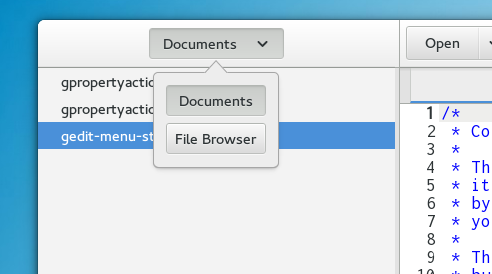
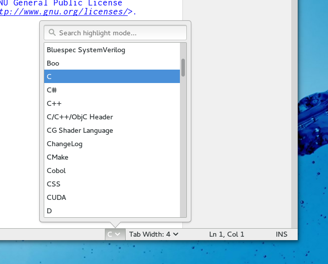
We now use the new GtkPopover widget to select the currrent side panel and to tweak the current view settings
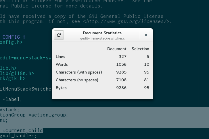
Many dialogs are now taking advantage of header bars
The Gtk tabs design went through more refinements and using the new support for a centered widget in GtkBox, the tab label is properly centered also when showing a warning.
The new user interface aims to be elegant and minimalistic, but this does not mean that is not thought for advanced users, quite the opposite: I think heavy keyboard users will enjoy the no-frills UI that lets you focus on the content, whether it is code, your LaTeX thesis or that tricky apache configuration.
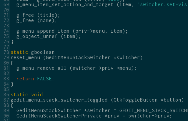
All the usual advanced tools are still there (for instance the Snippets and External Tools dialogs can be reached from the App Menu) and by popular demand we incuded in GtkSourceView the Solarized and Solarized-dark color schemes. Not to mention the new code-assistance framework, but that’s something for another post :-)
Even if not as visible, the same amount of polish and attention to detail happened under the hood.
The use of GMenu / GAction was iterated a few times with the invaluable help of Ryan who has always been ready to answer our many questions, and I am now confident that is properly set to accomodate the need of plugins and the integration on different platforms[1]
Ryan also helped us improve the command line handling, taking advantage of (and actually driving) the new features of GApplication.
Sebastien Lafargue rewrote the document list side pane using GtkListBox and greatly improving the code and reimplemented the the fullscreen mode replacing a ton of custom animation code with GtkRevealer.
[1] help and patches are very much welcome, and I do not mean it in the usual “patches welcome” tone :-)


February 20th, 2014 at 2:47 pm
The first picture looks wrong. Instead of having two buttons next to each other, there’s a drop-down list. Therefore instead of one action to switch (click a button), I need two actions (click the list, click the item). The drop-down list should be displayed only when there’s not enough horizontal space for the buttons to be displayed next to each other (I’m assuming that extensions can add additional buttons).
February 20th, 2014 at 3:01 pm
The main role of the button is to act as a title of the current state so that normally you would see
[ Documents ]
doc 1
doc 2
etc
if there was [ documents | file browser | something else ] it would be confusing and cluttered (and normally you would not have enough space for that anyway)
Switching side pane is not a frequent operations so optimizining “number of clicks” is not a major concern
February 20th, 2014 at 3:32 pm
Is there an option to quickly open a file from path I have in clipboard?
What I’m used to is doing this sequence of keyboard actions: Ctrl+O, Ctrl+V, Enter. But unfortunately that does not work in gedit.
February 20th, 2014 at 3:45 pm
nice and clean design!
however i don’t get the point of using a popover for the side-pane-switching: popovers were built to allow more complex user input to be context-specific.
but in this case, it feels like a simple dropdownlist would have been sufficient (or does the popover provide other actions than just switching the side-pane?). it is important for consistency in gnome/gtk+ that widgets are actually used according to their specified use-cases.
anyways the popover at the status bar looks perfect!
February 20th, 2014 at 4:06 pm
This looks nice… still not convinced about expanding tabs though
February 20th, 2014 at 9:22 pm
Pawel: you could enable the quickopen plugin and then ctrl+alt+O, ctrl+v + enter
February 20th, 2014 at 9:40 pm
Pawel: I just tried that exactly that key sequence, with 3.11.3-1 on Rawhide, and it works fine.
February 21st, 2014 at 1:20 am
I really wondered how a text editor could look in gnome 3. I’m glad you proved that a text-heavy application can look awesome with the new design approach. It is fantastic piece of work!
February 21st, 2014 at 6:54 am
The popover widget (IMHO) is really only suitable for 3 or more choices. When there are only 2 choices, would it not make sense for it to act in more of a toggle button fashion?
For example, 2 choices, just click and it changes to the second option. Click again and it changes back. When 3 or more options are available, then the popover appears to select the required option.
Cheers.
February 21st, 2014 at 8:44 am
I need to port my menu based plugin, are there any examples?
Also, there isnt much room to add menu items, maybe making cut/copy/paste horizontal like chrome could save two lines?
February 21st, 2014 at 11:16 am
You can look at plugins shipped with gedit itself and in the gedit-plugins package. The porting is simple, but we should write a wiki page describing it…
For the menu, yes, keeping its size under control is one of challanges of this design and we are still working on it. One of the things we did is to try to move some of the tools to more contextual places, like the right click menu and the tab menu.
Note that there is no copy/cut/paste at all there, we think the shortcuts for these actions are ubiquitous and familiar and the actions are available when selecting the text as a popover bubble (if enabled in gtk) or in the right click menu
February 21st, 2014 at 2:41 pm
Joining in on the (hopefully constructive) Popover-Critique:
First, this feels way better than the selectors at the bottom in current gedit.
However, a pulldown instead of this pop-over for sidebar-selection would be even better since it better supports
– Keyboard-Navigation: Just use the up and down arrows when the widget is selected. No need to open the popdown.
– Mouse-Navigation: Use scroll-wheel to change the entry (even though Gtk does not seem to support it. I might have encountered this on some custom system)
– Accessibility: Just a guess, but see Keyboard-Navigation
In all those usage cases, the pop-over just adds more klicking, viewing and selecting, whilst I lack to see any advantage.
Just my two cents,
Andreas
February 21st, 2014 at 11:52 pm
I’m currently testing the new gedit in Fedora rawhide and I have a few thoughts to share:
– First of all, using GtkPopover for switch between Documents and File Browser is an overkill. Huge overkill.
– GtkPopover doesn’t behave right. It renders shadow badly (it’s cut… by the way, all windows that uses CSD renders cut shadow, but it isn’t as visible as here); also, I think it should behave a little bit like the old gtk popup menu. Especially, I think it should hide when window losts focus.
– Do you think that putting separators everywhere in every CSD window is right? Especially, I don’t think it’s really necessary in documents statistics window…
Despite that, I think the look of the new GNOME apps is awesome! But anyway, I hope the CSD implementation will be fixed sometime, because at this moment, when comparing to CSD equivalents in Windows or Mac, it looks like the GNOME one just suck… (mostly due to uncountable number of bugs and inconsistencies between decorations rendered by a decorator and CSDs…).
February 24th, 2014 at 3:17 am
> Note that there is no copy/cut/paste at all there, we think the shortcuts for these actions are ubiquitous and familiar and the actions are available when selecting the text as a popover bubble (if enabled in gtk) or in the right click menu
Whoa there, if there’s one thing you should never do with applications for general use, it’s assume that people know keyboard shortcuts. I’m not saying there aren’t enough hints for these actions; just pointing out something about this “ubiquity”.
March 6th, 2014 at 12:26 pm
What about a full screenshot to see what the application looks like?
first one is intriguing. I wonder how it does look like in another window manager. I’m not a gnome 3 user.
March 9th, 2014 at 12:30 am
[…] asegura también que no han implementado cambios sólo en la interfaz gráfica del programa sino también en su código, de tal manera que los usuarios pueden esperar un Gedit mucho más […]
[WORDPRESS HASHCASH] The comment’s server IP (178.255.231.158) doesn’t match the comment’s URL host IP (178.255.231.142) and so is spam.
June 2nd, 2014 at 12:00 pm
Wow that was odd. I just wrote an extremely long comment but after I clicked submit my comment didn’t show up. Grrrr well I’m not writing all that over again. Anyway, just wanted to say superb blog! dedkdkfeeekagked