I’ve blogged before about mobile-friendly Mallard output. The HTML created by Yelp’s universal XSLT automatically adapts to small screen sizes in a number of ways, such as reducing extra borders and padding, dropping the number of columns used for certain link groups, and making links thumb-friendly. None of this is surprising to seasoned web developers, but for some reason we still don’t see a lot of it in technical communications and single-source publishing.
There’s a whole lot we can just do automatically when working with a working with a structured source format like Mallard or DocBook or DITA. Some things we can’t do without knowing the author’s intent, like removing non-essential screenshots. And for that, I’ve blogged before about using Mallard Conditionals to exclude images from mobile.
But what about those pesky code blocks? For decades, old farts have fought to keep lines of code under 80 characters. On common phones now, even 80 characters is too wide. You have more like 30 or 40 before you have to scroll horizontally.
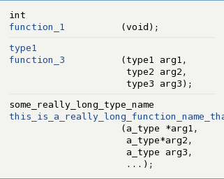
Automatically reformatting code is probably outside the scope of good sense, but when API synopses are created dynamically, as with the API Mallard extension I’ve worked on, we can adjust the rendering fairly easily. Here’s a synopsis in a typical desktop browser:

And here’s the same synopsis with the line breaks and indentation dynamically adjusted for a mobile device through CSS:

Obviously, we can’t do much about a function name that’s just too long. But it’s fairly easy to make a synopsis which is at least somewhat readable on my phone. All of this is built into the tools and requires no extra work from authors.
