Discovery Docs Part 4: Discovery

This is Part 4 in a series about the Discovery Docs initiative, which I will present about in my upcoming GUADEC talk. In Part 1: Discovering Why, I laid the groundwork for why I think we should focus our docs on discovery. In Part 2: Templates and Taxonomies, I talked about how to structure topics differently to emphasize learning. In Part 3: Voice and Style, I proposed using a more casual, direct writing style. In this post, I’ll look at increasing reader engagement.

“Nobody reads the docs.” This is a common complaint, a cliché even. It has some truth to it, but it misses the bigger picture. For this post, the more important point is that people don’t often seek out the docs. So if we’re writing interesting material, as I’ve discussed throughout this blog series, how do we reach interested people?

This post is all about how we encourage people to discover.

Help menus

I have been trying to rethink help menus for over a decade. From the venerable Help ▸ Contents, to the Help item in the deprecated app menu, to the Help item in the hamburger menu, Help has always been a blind target. What’s on the other side of that click? A helpful tutorial? A dusty manual? An anthropomorphic paperclip? Who knows.

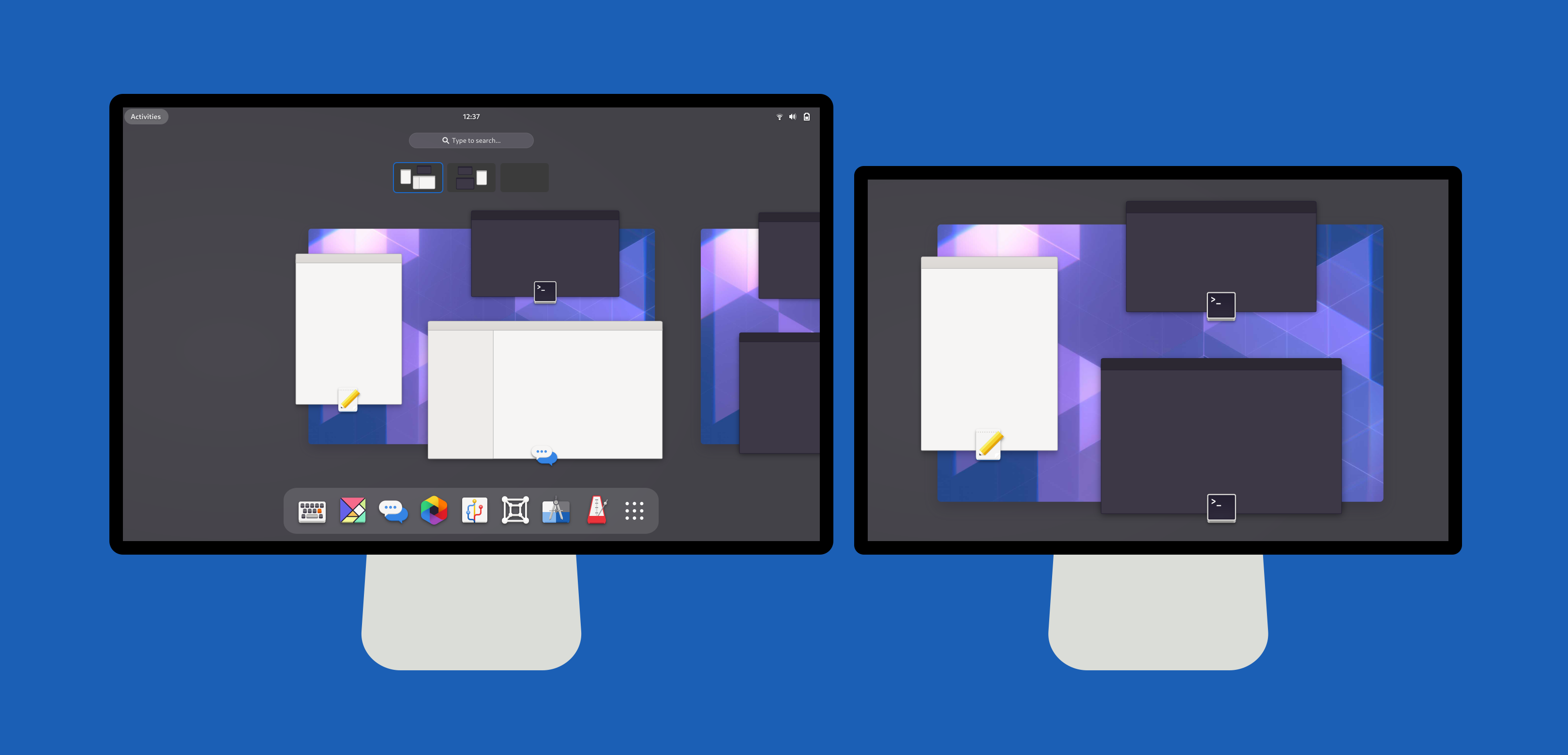
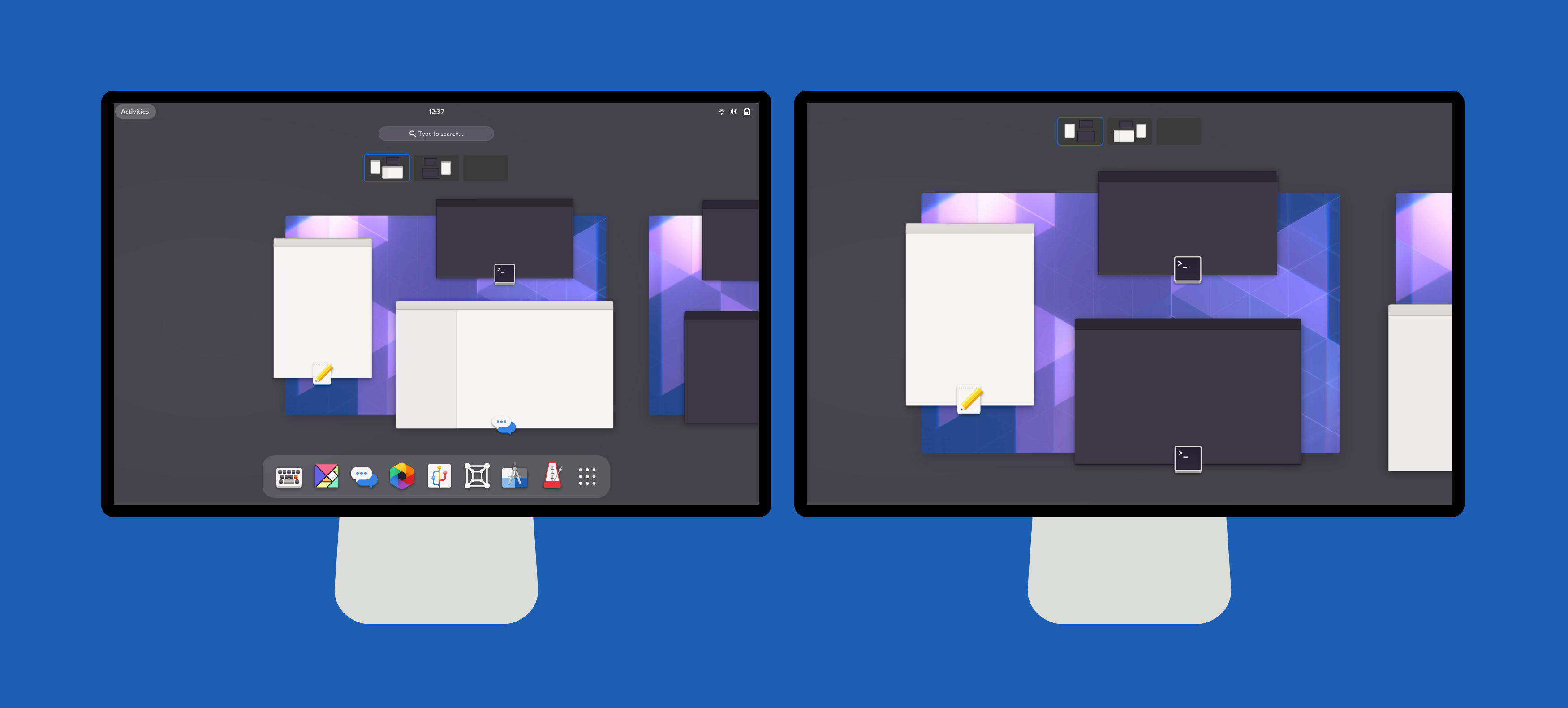
To address this problem, I’ve worked on a design for help menus:

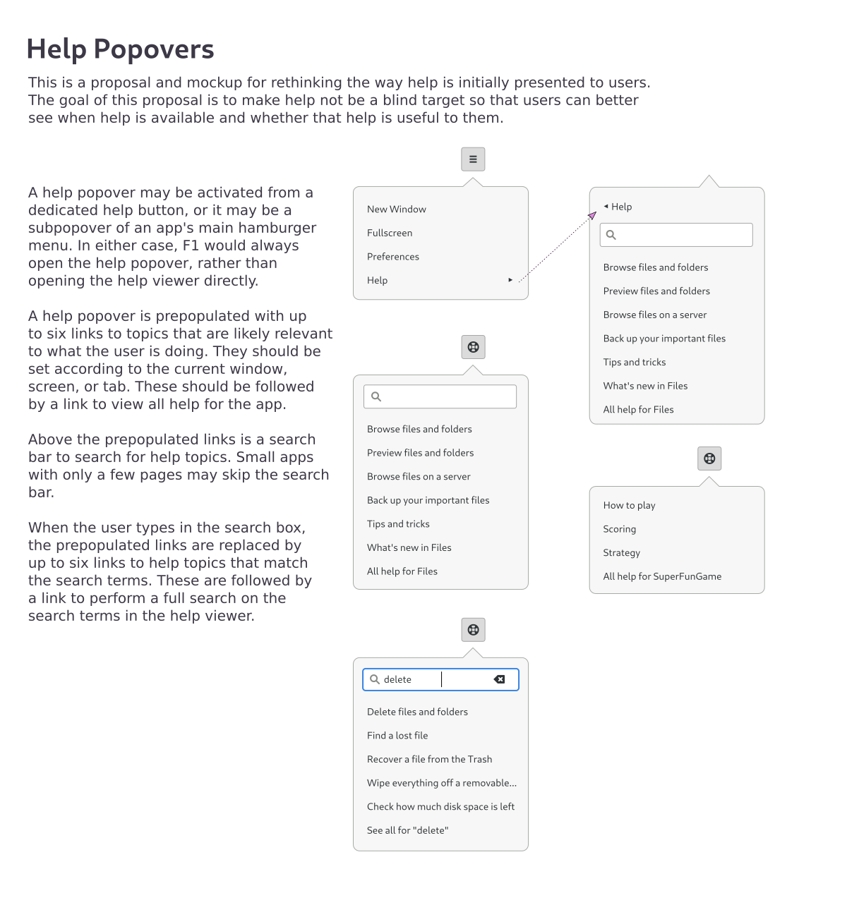
This design presents the users with topics that are relevant to what they’re doing right now. In these mockups, the example topics are mostly simple tasks. As I’ve discussed in this blog series, I want to move away from those. Combining this design with longer learning-based material can encourage people to explore and learn.

Learning

Speaking of learning, is “Help” even the right term anymore? That word is deeply ingrained in UI design. (Remember right-aligned Help menus in Motif applications?) And it fits well with the bite-sized tasks we currently write, probably better than it fit old manuals. But does it fit content focused on learning and discovery? Are people looking for help at all?

As we shift our focus, perhaps we should shift our language toward the word “Learn”. Use “Learn” instead of “Help” whenever it appears in the UI. Change the docs website from help.gnome.org to learn.gnome.org. Rename the app to something like “Help & Learning”.

Side note: I’ve never been a fan of the help buoy icon, and have always preferred the question mark in a blue circle. Somebody smart might be able to think of something even better for learning, although there’s also value in sticking with iconography that people know.

Web design

I mentioned the docs website. It needs more than a new URL. The current site uses an old design and is difficult to maintain. We have a documentation team initiative to redo the site using a documentation build tool designed to do these kinds of things. Here’s what it looks like at the moment:

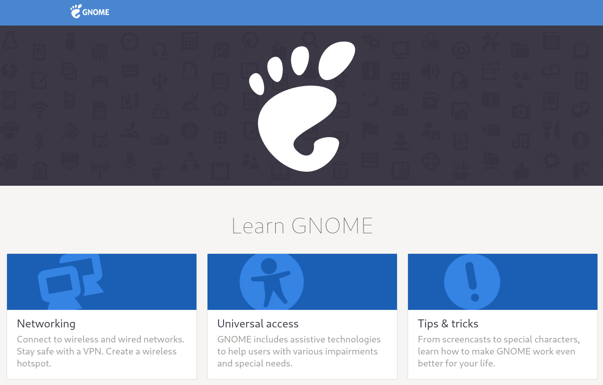
This is extremely important for the docs team, regardless of whether we shift to learning-based content or not.

Visual presentation makes a difference in how people feel about your documentation. For comparison, imagine using GNOME 40 with the same user interaction, but using the boxy beveled aesthetics of GNOME 1. It’s just not as exciting.

To that end, it would be good to open up our designs to more people. I don’t scale when it comes to chasing design trends. The styling has been locked up in XSLT, which not many people are familiar with. One thing I did recently was to move the CSS to separate template files, which helps me at least. For a more radical change, I’ve also spent a bit of time on doing document transforms and styling entirely with JavaScript, Handlebars, and Sass. Unfortunately, I don’t have the bandwidth to finish that kind of overhaul as a free time project.

Social media

Imagine we have interesting and exciting new content that people enjoy reading. Imagine it’s all published on a visually stunning new website. Now what? Do we wait for people to stumble on it? Remember that the focus is on discovery, not stumbling.

Any well-run outreach effort meets people where they are. If you run a large-scale project blog or resource library, you don’t just quietly publish an article and walk away. You promote it. You make noise.

If we have topics we want people to discover, we should do what we can to get them in front of eyeballs. Post to Twitter. Post to Reddit. Set up a schedule of lessons to promote. Have periodic themes. Tie into events that people are paying attention to. Stop waiting for people to find our docs. Start promoting them.

Documentation is outreach.

Discovery Docs Part 3: Voice and Style

This is Part 3 in a series about the Discovery Docs initiative, which I will present about in my upcoming GUADEC talk. In Part 1: Discovering Why, I laid the groundwork for why I think we should focus our docs on discovery. In Part 2: Templates and Taxonomies, I talked about how to structure topics differently to emphasize learning. In this post, I’ll talk about how we should write to be engaging, but still clear.

One of the main goals of Discovery Docs is to be more engaging and to create enthusiasm. It’s hard to create enthusiasm when you sound bored. Just as your speaking voice can either excite or bore people, so too can your writing voice affect how people feel while reading. Boring docs can leave people feeling bored about the software. And in a world of short-form media, boring docs probably won’t even be read.

This post has been the hardest in the series for me to write. I’ve been in the documentation industry for two decades, and I’ve crafted a docs voice that is deliberately boring. It has been a long learning process for me to write for engagement and outreach.

To write for engagement, we need to adopt a more casual voice that addresses the reader directly. This isn’t just a matter of using the second person. We do that already when giving instructions. This is a matter of writing directly to the reader. Think about how blog posts are often written. Think about how I’m writing this blog post. I’m talking to you, as if I’m explaining my thoughts to you over a cup of coffee.

This doesn’t mean our writing should be filled with needless filler words, or that we should use complicated sentences. Our writing should still be direct and concrete. But it can still be friendly and conversational. Let’s look at an example.

  • #1: Some users need to type accented characters that are not available on their keyboards. A number of options are available.
  • #2: You may need to type accented characters that are not available on your keyboard. There are a number of ways you can do this.
  • #3: Maybe you need to type an accented character that’s not on your keyboard. You have a few options.

#1 is stuffy. It talks about hypothetical users in the third person. It is stiff and boring, and it uses too many words. Don’t write like this.

#2 is more direct. It’s how most of our documentation is written right now. There’s nothing wrong with it, but it doesn’t feel exciting.

#3 is more casual. It uses the fewest words. It feels like something I would actually say when talking to you.

Using a more casual and direct voice helps get readers excited about the software they’re learning about. It makes learning feel less like grunt work. A combination of exciting material and an engaging writing style can create docs that people actually want to read.

What’s more, an engaging writing style can create docs that people actually want to write. Most people don’t enjoy writing dry instructions. But many people enjoy writing blogs, articles, and social media posts that excitedly show off their hard work. Let’s excitedly show off our hard work in our docs too.

Discovery Docs Part 2: Templates and Taxonomies

This is Part 2 in a series about the Discovery Docs initiative, which I will present about in my upcoming GUADEC talk. In Part 1: Discovering Why, I gave a brief history of GNOME documentation, and explained our current unabashedly boring task-based approach. I proposed focusing instead on learning and discovery in an attempt to attract and retain enthusiastic users. In this post, I’ll explore what a learning-based topic might look like.

GNOME documentation currently focuses on tasks, concepts, and references, with tasks doing the bulk of the work. This is a common approach across the entire documentation industry, but that doesn’t mean it’s the only approach. Notably, we don’t strictly enforce these taxonomies as some other documentation systems do. Rather, we provide some templates and guidelines, and we trust humans to make good judgment.

To shift to a more engaging approach, I’m exploring a lengthier topic type that I’m hesitantly calling a “lesson”. A lesson incorporates a concept, possibly a task, possibly a quick reference, and further reading for specific use cases or advanced users. It should be readable in about five to seven minutes. Let’s break down an outline of a lesson.

  • Summary: A nicely formatted bullet list that provides a key point and a quick mention of what you are able to do. This acts as a guidepost so readers know they are in the right place, and for certain users, it may be the only thing they need.
  • Splash image: A well designed image can convey a lot of conceptual information. We don’t want to show random screenshots, but rather craft images that engage and explain, and which preferably do not need to be translated.
  • Concept: An explanation of what this thing is and how it has an impact on you. Traditionally, this would be its own concept topic.
  • Main task: A list of steps for a main task, if one exists for this lesson. Traditionally, this would be its own task topic.
  • Quick ref: A short table or list of things, if that applies to this lesson. Larger references should probably still be split into their own topics.
  • More tasks: Sometimes there are further tasks you might be interested in. If they don’t warrant their own lesson, we can put these in a collapsed section.
  • More information: Sometimes there is further conceptual information you might be interested in, but which not everybody cares about. We don’t want to clutter the top of the page. This can go in a collapsed section.
  • Advanced: Finally, sometimes there are concepts or tasks that we would only expect advanced users to mess with. This can go in a collapsed section, clearly marked as advanced.

Let’s explore what this would look like for some real-world documentation.

Compose Key

The compose key saw a lot of work in GNOME 40, from being moved into the main Settings, to getting visual feedback. It’s a great candidate for a lesson, because the task of “Set a compose key” misses the point of what most users are trying to accomplish. What people really want to do is type accented characters that aren’t on their keyboard. It is on us to explain the different ways they might do that, and how those mechanisms work.

A lesson for the compose key would start off with a three-item summary:

  • Use the compose key to enter accents and other special characters with a few easy to remember keystrokes.
  • You can define a compose key in the Keyboard Settings.
  • Advanced users can define their own compose key sequences.

For the average user looking to type “naïveté”, the first bullet point lets them know that this lesson is relevant to them. They know right away whether to read more or back away. For users who already know what a compose key is, the second bullet point might be all the information they need. And if you’re the kind of person who doesn’t mind editing dot files in text editors, we let you know there’s some bonus info at the end.

Then comes the splash image. A visual actually helps to convey the concept of the compose key very well. In his blog post on adding visualizations, Matthias showed three images of text fields as you type a compose sequence. We can pull these together with indications of key presses, as in this poorly done and hastily made prototype image:

Follow this with a conceptual overview of what a compose key is, and how you press mnemonic key sequences in a row, not all at once. Talk about what kinds of characters are best entered with a compose key— generally accented characters and variations of things found on keyboards. Maybe mention other methods of entering special characters. Mention that compose keys aren’t an actual physical thing, and that you have to redefine some key you don’t use.

After the reader understands what a compose key is, we present the main task, which is to define a compose key. This is perhaps a four-step task.

After that, we might have a quick reference of compose key sequences, or it may be worthwhile to have a separate reference topic altogether. This is a judgment call I could only make after starting to write. (Side note: It occurs to me that cases like this might call for partially collapsed tables or lists, where you always see the first handful of rows or items, and you expand for more.)

Finally, since our summary promised it, we finish with a section on defining compose key sequences, collapsed by default, and clearly marked as advanced.

Workspaces

Workspaces are another area that I think would benefit from learning-oriented topics. There’s not really any single task associated with them. In fact, they may not even answer any specific user question. Instead, they’re something you happen to learn about, and then love. A summary of a workspace lesson might look like this:

  • Workspaces allow you to organize your apps and windows into spaces that work for you.
  • You can launch apps on specific workspaces and move windows between workspaces.
  • You can also use convenient keyboard shortcuts and gestures to work with workspaces.

For a splash image, consider this beautifully drawn image from GNOME Tour:

This isn’t a screenshot, and it doesn’t need to be translated. It doesn’t tell you how to do anything specific with workspaces, but it nicely illustrates what they are and why you might want to use them. There’s a workspace for multimedia (with cassettes, lol). There’s one for pictures and drawing. To the left, we see a document being worked on. And to the right, we presumably see me getting frustrated with my taxes.

There’s no primary task with workspaces, at least not the sort that we can list steps for. They’re always there, on demand, just waiting to be used. But we can provide a quick reference of things you can do, and easy ways to do them. Things like moving windows between workspaces, or quickly switching workspaces with keyboard shortcuts and gestures.

Then there’s further information, like using workspaces on multiple monitors. This is an interesting case, because it could be further information within the workspaces lesson, or it could be its own lesson. It likely has enough material for its own lesson. I could write a summary and a conceptual overview, and there’s a primary task in changing whether workspaces show on secondary displays. There’s even excellent imagery that helps explain the concept. Consider this pair of images from the GNOME Shell blog:

These images nicely illustrate how the default configuration treats workspaces as something contained by the primary display, where secondary displays are sort of extra always-visible workspaces. But you can change to a model where workspaces effectively contain the displays. The images contain a small amount of translatable text, but that can be fixed or ignored with no real loss of information. And we could easily provide an RTL variant without burdening translators.

More lessons

I’ve already gone past my recommended max seven minute reading time, so I won’t dive into other topics in detail. But I will make a few notes:

  • The wireless hotspot functionality shows a QR code you can scan to connect quickly. There’s a proposal to add instructions on how to use this on common devices. We don’t want individual task topics for these, but they would fit nicely under “more tasks” in a lesson on hotspots.
  • The current topics on using speakers and using microphones already start with some conceptual information, and issues 107 and 116 list other things they could discuss. Most of this doesn’t fit well in tasks, and nobody will read a dozen tiny topics.

Lessons may not work for everything. They may not replace standalone references or concepts, although even those topic types might benefit from summaries and visual appeal. Lessons can be more engaging than tasks, which can make them more fun to read and to write.

In the next part of this series, I will discuss voice and style. Join me.


Discovery Docs Part 1: Discovering Why

This is Part 1 in a series about the Discovery Docs initiative, which I will present about in my upcoming GUADEC talk.

A long time ago, in the days of bonobos and fishes, GNOME documentation was  written as long, monolithic manuals. We split these beasts into digestible pages as best we could (which is to say, poorly) and hoped for the best. Then we had an idea. What if we actually controlled the granularity at which information was presented? What if, instead of writing books, we wrote topics?

And so we did. We weren’t the first software project to make this shift, but we were early on the curve, and we did it radically. While many help systems still try to shoehorn topics into a linear structure, our help focuses on creating a navigable web of information.

The question of how big the topics are — how big the chunks on the web are — is entirely up to us. For the most part, we have chosen small topics with the least amount of information we could get away with. The reasoning is that users can find quick answers to questions, and if they want to learn more, we have extensive cross linking. Our topics have mostly followed the familiar trichotomy of tasks, concepts, and references. Our documentation is deliberately excruciatingly boring.

Fast forward. For the last six years, I’ve had the privilege of getting paid to peek inside various open source documentation efforts. I’ve advised people on forming a basic content plan, and even made an attempt at templatizing content plans. Aside from the obvious user goals and user stories, one of the things I ask is to define the project goals. What do you want to happen as a result of your hard work on your documentation? Yes, of course you want users to accomplish their own goals, but what else? Here’s what keeps coming up:

  • Attract new users.
  • Create experienced users.
  • Create enthusiastic users.

We want users. Even when there isn’t a profit motive, users are a project’s lifeblood. And we want those users to be experienced — not necessarily experts, but experienced — because you retain people better when they feel invested. And we want those users to be enthusiastic, to love our software, because enthusiastic users help us attract even more users, but also, enthusiastic users are where we find future contributors. Enthusiasm is critical for the long-term success of open source software.

Boring documentation fails these goals. It succeeds elsewhere, but not here. So instead of focusing on quickly answering simple questions, I propose we focus our documentation on learning, exposition, and discovery.

In this series, I will explore ideas on how we can write differently, how we can present information differently, and how we can better position our documentation to help users discover and enjoy the software that we make, use, and love.

Creative Commons Attribution 3.0 United States
This work by Shaun McCance is licensed under a Creative Commons Attribution 3.0 United States.