
The upcoming GNOME 3.36 release includes a major update to the system login and unlock experience. The new design has been anticipated for a long time, and we’re excited that it has finally arrived!
Some history
GNOME’s existing login and unlock design has been largely unaltered since it was first introduced in GNOME 3.6, back in September 2012. That’s seven and a half years ago! It’s therefore no surprise that we’ve wanted to update the design for some time.
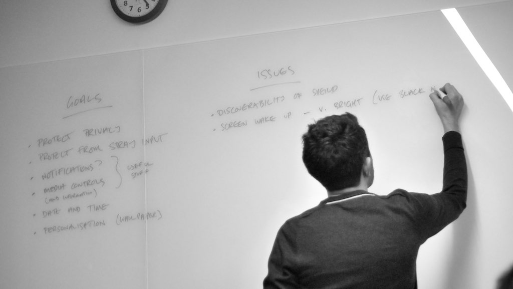
The initial round of design work for the new lock screen took place in 2017, at the GNOME UX hackfest in London. There, the GNOME design team, along with GNOME Shell developers, reviewed the goals and requirements, as well as the issues with the existing design, including the main areas of feedback that we’ve had.
The design concept that we came up with during that event has undergone significant refinement since 2017, but the basic principles and goals remain the same. These can be summarised in three words: smooth, beautiful and personal.
Reducing friction
Unlocking the system is something that people do over and over, so it’s important that it doesn’t feel frustrating, and it needs to get you from A to B as quickly as possible. One of the goals of the design update was therefore to reduce the amount of friction involved in unlocking (or logging in for that matter).
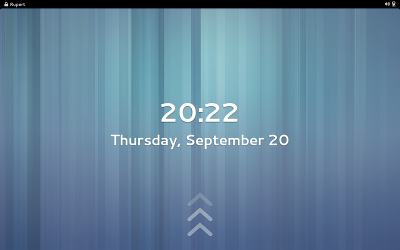
From this perspective, the most obvious change in the lock screen is that the grey login screen is now gone. Rather than removing the “shield” to show the password field, the password field is shown right on the lock screen itself. This doesn’t necessarily change how many keystrokes or clicks are required to unlock, but it does reduce how many distinct visual steps are involved, and makes the whole experience feel faster and more direct.
We’ve also incorporated other changes which are intended to make it quicker and easier to unlock. There are more methods to show the password field than before: you can click with a mouse or touchpad button. You can also scroll with a mouse, or swipe with a touchpad or touchscreen. Small changes like this add an extra degree of convenience in many situations.
Other changes in this area are planned for the future. One of the biggest is to jump straight to the last-logged in user after boot, rather than requiring a user account to be selected every time. In most situations, this will take an extra step out of logging in: all you’ll have to do is boot, then enter your password, and off you’ll go.
More happy times
If getting to your work more easily is one of the big themes for the updated design, then the other is having a more joyful experience along the way. Unlocking is a chore, but it shouldn’t have to feel like one. It can and should be pleasurable.
With the new design, we wanted unlocking to be beautiful, and we’ve put a lot of work into visuals. The most obvious change is the use of the blurred background, which we love. Not only does it look great, but it also serves as an effective background for legible, light-weight typography, so it’s possible to have elegant text, without the need for heavy type or drop-shadows.
There’s also been lots attention to detail throughout design and development process, which we hope will make the login and unlock experience feel delightful to use. This includes things like the updated layout of the authentication elements, the subtle use of animation to communicate incorrect authentication attempts, and the transition from the clock to the password field.
Making it personal
A final, and perhaps more subtle, aspect of the updated design is the effort to make it feel personal. We want to connect the login and unlock with the user’s desktop experience, so the user gets a hint of their session even when they are logged out or the system is locked. The main way we’re doing this is the use of the blurred wallpaper, which is intended to communicate what lies on the other side of login/unlock.
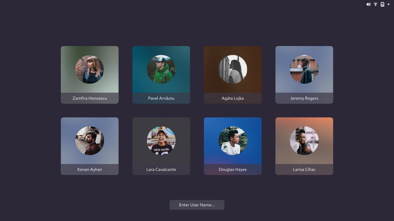
The use of strong personal elements, like the user avatar and blurred background image, is also something that we intend to build on in future versions, by bringing them into the user selection screen itself. The goal here is to bring user selection alive: to make it more expressive and indicative of the person to which each account belongs.
Getting to this point
On the development side, the login/unlock redesign has primarily been carried forward by Georges Stavracas, with significant assistance from Umang Jain and Florian Müllner. It has been a significant amount of work and we owe them a lot of gratitude for the time and effort they have invested in this project.
Next steps
The login/unlock redesign was merged slightly late in the GNOME development cycle. To compensate for this, it is undergoing an intensive testing and bug fixing effort. Help is needed with this, and there is a test plan available for those who would like to try the new design and report any issues they find.
As mentioned above, looking beyond GNOME 3.36, there are a number of aspects of the design which are yet to be implemented and which we hope to have for the next release, version 3.38, so there is hopefully plenty more to look forward to in this area.