
If you’ve been following this blog, you’ll know that a team has been working on updated designs for the Activities Overview. (Previous posts on this topic covered our initial motivations and design goals, as well as the results from some early exploratory research that we conducted.) This initiative has been the subject of significant activity over recent months, and we’re now at a point where we can share more details about what we’ve been doing.
Where we’re at
Following months of design exploration and 6 separate user research exercises, which included a study by a user research firm, the GNOME Shell team has an updated design for the Activities Overview, which it hopes to land in time for GNOME 40 (scheduled for release in March 2021).
All the user research has given us confidence in the design. The core aspects of the latest design all performed well, and we’ve observed a general preference for the new design in our latest internal research exercise. That said, we’ll be continuing to review the design as feedback comes in.
During the design and testing process, the designs have been in state of steady evolution. Now that they are more stable, we’re excited to share them and invite contributors to help us get the new design over the finish line!
In the rest of this post, I’ll briefly describe the design in its current form, before going on to outline the roadmap for what’s going to happen between now and GNOME 40. In subsequent posts, members of the team will provide more detail on the design itself and the research that has been conducted.
Goals revisited
We’ve discussed the goals for this initiative a couple of times in the past (see here and here), but let’s refresh our memories. The things we wanted to achieve with this effort include:
- Better overview spatial organisation
- Helpful boot and empty states
- Improved touchpad navigation
- More engaging app browsing and launching
We feel that the current iteration of the design delivers on these goals, while retaining the core features of the existing GNOME Shell design that users enjoy today, including a distraction-free desktop, super key to enter the overview, and type to search.
A reimagined Activities Overview
The new design reimagines the Activities Overview using a strong spatial metaphor. Workspaces are arranged horizontally, and have a physical quality to them. (In tests, participants found this easier to understand, as well as being more engaging.)
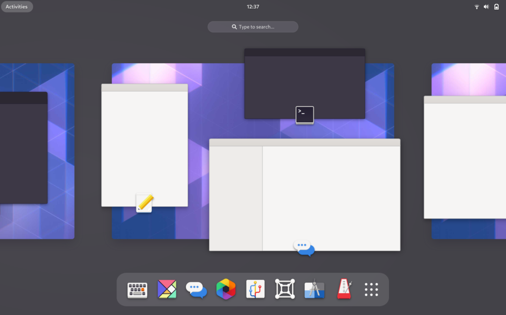
Workspaces appear in a continuous sequence, from left to right. This sequence can be panned and scrolled. Windows have app icons on them to help with identification, with the window title being shown on hover.
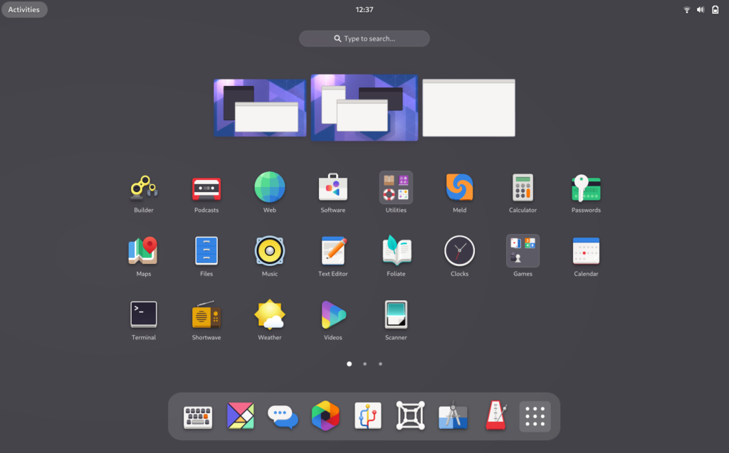
App grid
A good deal of work has already gone into the app grid, so that the new design is fairly similar to what is already in the last GNOME release (3.38).
The key feature of the new grid is its customizability. Launchers can be re-arranged at will, both within multiple pages as well as using folders. This interaction was immediately intuitive to testers.
The main difference between the new design and current GNOME is the orientation of the app grid pages, which are now horizontal rather than vertical, as part of the general spatial reorganisation of the overview.
Navigation
By using a strong spatial model, the design aims to support intuitive navigation and orientation. This is the primary motivation for changing the orientation of workspaces from vertical to horizontal: with the workspaces laid out horizontally, the vertical axis can be used to control movement in and out of the overview and app grid.
This spatial arrangement allows navigation to operate as if in two dimensional space: left and right moves between workspaces, up and down enters the overview and shows the app grid. This is particularly powerful when navigating with touchpad gestures (four finger swipes, up/down/left/right) or keyboard shortcuts (Super+Alt+↑/↓/←/→).
Roadmap
Work is ongoing to implement the design and work through outstanding design issues. Implementation is planned to take place as a series a separate branches which will land in gnome-shell master. Thankfully, much work has been done to make the overview code more flexible, which will make this process easier.
Mockups for the designs can be found in the os-mockups repository. We also have an issue for tracking the initiative in the gnome-shell project. These should both be good places for contributors to get involved.
Ensuring excellent quality is a high priority for us. Therefore, we plan on making development builds of the changes available to test as early on in the process as possible. The more people we can have running the code and providing feedback, the better. If you’d be interested in testing development builds, look out for follow-up posts.
It is hoped that these changes will be the start of a series of improvements to the design of the shell that will arrive in subsequent releases. Certainly, the research work that has been done so far has given is a vast amount of insight that can’t all be addressed in a single release.
Onwards and upwards!