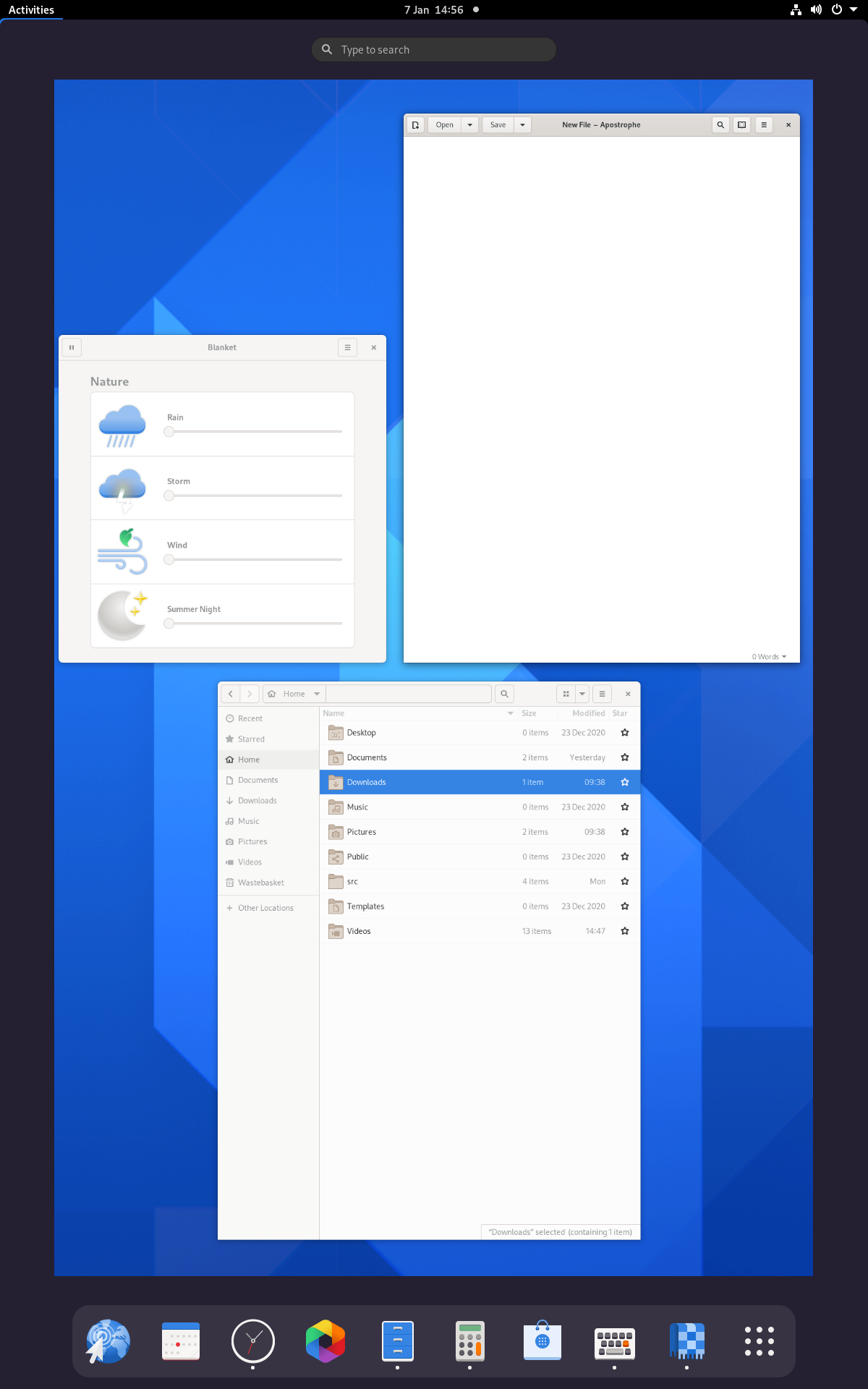
Last month I shared an updated activities overview design, which is planned for the next GNOME release, version 40.
The new design has prompted a lot of interest and comment, which we’re all really thrilled about. In this post I wanted to provide an update of where the initiative is at. I also want to take the opportunity to answer some of the common questions that have come up.
Where we’re at
Development work has moved rapidly since I blogged last, thanks mostly to a big effort by Georges. As a result, a lot of the basic elements of the design are now in place in a development branch. The following is a short screencast of the development branch (running in a VM), to give an idea of where the development effort has got to:
There are still work items remaining and the branch has noticeable polish issues. Anyone testing it should bear this in mind – as it stands, it isn’t a complete reflection of the actual design.
On the design side, we’ve been reviewing the feedback that has been provided on the design so far, and are tracking the main points as they’ve emerged. This is all really valuable, but we’d also suggest that people wait to try the new design before jumping to conclusions about it. We plan on making it easier to test the development version, and will provide details about how to do so in the near future.
The roadmap from here is to develop the branch with the new design, open it up to testing, and have an intensive period of bug fixing and evaluation prior to the UI freeze in about a month’s time. As we progress it will become easier for people to get involved both in terms of design and development.
What the design means for users
In the rest of this post, I’m going to address some of the common questions and concerns that we’ve heard from people about the new design. My main goal here is to clear up any confusion or uncertainty that people might have.
Argh, change!
A good portion of the comments that we’ve had about the design reflect various concerns about existing workflows being disrupted by the design changes. We understand these concerns and an effort has been made to limit the scale and disruptiveness of the updated design. As a result, the changes that are being introduced are actually quite limited.
Everything about the shell remains the same except for the overview, and even that is structurally the same as the previous version. The overview contains the same key elements – windows overview, search, the dash, the app grid – which are accessed in the same sequence as before. The old features that are tied to muscle memory will work just as before: the super key will open the overview, search will function as before, and the existing shortcuts for workspaces will continue to be supported.
One piece of feedback that we got from initial testing is that testers often didn’t notice a massive difference with the new design. If you’re concerned about potential disruption, we’d encourage you to wait to try the design, and see how it behaves in practice. You might be surprised at how seamless the transition is.
Advantages of the new design
A few users have asked me: “so how is the new design better for me?” Which is a fair question! I’ll run through what I see as the main advantages here. Users should bear in mind that some of the improvements are particularly relevant to new rather than existing users – there are some positive impacts which you might not personally benefit from.
Boot experience
The boot experience is something that we’ve struggled with throughout GNOME 3, and with the new design we think we’ve cracked it. Instead of being greeted by a blank desktop (and then, a blank overview), when you boot into the new design, you’ll be presented with the overview and your favourite apps that you can launch. Overall, it’s a more welcoming experience, and is less work to use.
I have been asked why this change isn’t possible with the existing shell UI. Couldn’t we just show the overview on boot, without making these other changes? Theoretically we could, but the new overview design is much better suited to being shown after boot: the layout provides a focus for action and places app launching more centrally. In contrast, the old shell design places launching on the periphery and does not guide the user into their session as effectively.
Touchpad gestures
Effective touchpad gestures can be incredibly effective for navigation, yet our gestures for navigating the shell have historically been difficult to use and lacking a clear schema. The new design changes that, by providing a simple, easy and coherent set of touchpad gestures for moving around the system. Up and down moves in and out of the overview and app grid. Left and right moves between workspaces. If you’re primarily using the touchpad, this is going to be a huge win and it’s a very easy way to move around.
Easy workspaces
In our user testing, the new workspace design demonstrated itself to be more engaging and easier to get to grips with than the old one. New users could easily understand workspaces as “screens” and found it easier to get started with them, compared to the current design which wasn’t as accessible.
Feel and organisation
Designers often talk about mental and spatial models, and the new design is stronger in both regards. What does this translate to for users? Mostly, that the new design will generall feel better. Everything fits together better, and is more coherent. Moving around the system should be more natural and intuitive.
Other advantages
Other than those other main advantages, there are other more minor plus points to the new design:
- Personalised app grid – you can now fully rearrange the app grid to your liking, using drag and drop. This is something that we’ve been working on independently to the other changes, but has continued to evolve and improve this cycle, and it fits very nicely with the other overview changes.
- App icons in the window overview – the window overview now shows the app icon for each window, to help with identification.
- Improved app titles – we have a new behaviour for GNOME 40, which shows the full title of the application when hovering its launcher.
Q & A
The following are some of the other questions that have come up in comments about the designs. Many of these have been answered in place, and it seemed worthwhile to share the answers more widely.
How will window drag and drop between workspaces work?
The current design works by zooming out the view to show all workspaces when a window is dragged:
Will I be able to search from the overview after pressing super?
Yes, that won’t change.
Will there be an option to restore the old design?
We don’t plan on supporting this option, largely because of the work involved. However, there could of course be community extensions which restore some aspects of the old design (say, having a vertical dash along the side). We’re happy to work with extension developers to help this to happen.
Please keep the hot corner!
OK. 🙂 (We weren’t planning on removing it.)
How will the new design affect multi-display setups?
It should have very little impact on multi-monitor. The same behaviour with regards to workspaces will be supported that we currently have: by default, only the primary display has workspaces and secondary displays are standalone. We don’t anticipate any major regressions and have some ideas for how to improve multi-monitor support, but that might need to wait until a future release.
Will the new design work OK with vertical displays?
Yes, it will work just fine.

End
That’s it for now. With this initiative proceeding quickly, we hope to have more updates soon. We also aim to provide another post with details on our user research in the not too distant future.
