GNOME Shell Design Dreams

The GNOME Shell user interface has mostly seen minor refinements and quality of life updates in recent cycles, but on the design side we’ve explored a lot of longer-term things we’d like to do. Some of these we have relatively complete plans for, others are more vague ideas that need more research and prototyping. As always, getting things like these implemented depends on developer capacity and interest (and sometimes funding).

While each of these ideas may require additional discussion, prototyping, and testing, we (the design team) have collected them all together here to share our longer-term vision and to give each idea more visibility.

The coherent and fluid spatial model was one of our proudest achievements with GNOME 40. When you navigate GNOME Shell, interface elements always come from somewhere, and exit to somewhere else, in a way that’s semantic and predictable over time.

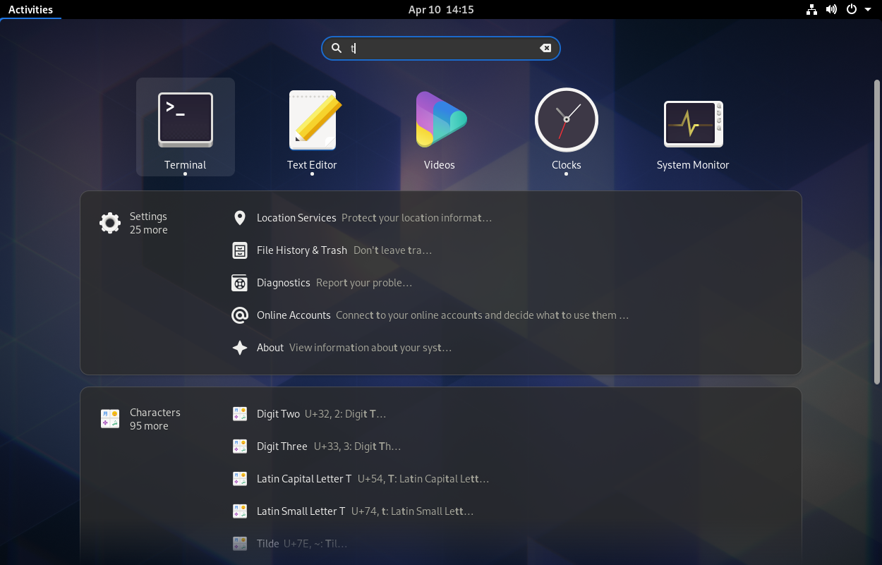
However, there are a few areas we’ve never been able to fully extend this ethos to. This includes GNOME Shell search, which just replaces the entire overview with search results when you start typing, with no animation or spatial model. We’ve long had the idea to switch to a more semantic layout for this, namely a search results overlay which spawns out of the search entry, above the rest of the overview. Very recently there has been some movement towards implementing this, and it’s likely that it will ship in 51 this fall.

In addition to the layout change, we’d also like to update the search results with richer types of content and actions. Other OSes and various third-party apps (Alfred, Raycast, etc.) have search with built-in file previews, multiple actions per search results, search filters, and more.

Some of this would probably require new APIs and apps to be ported to them, but there is a lot we could do here by just redesigning the existing UI.

Overlay Search Results Mockups

Editable Quick Settings

The Quick Settings pattern has seen wide adoption across all OS interfaces over the past decade, for obvious reasons: It puts a few essential pieces of information at your fingertips, and makes it easy to toggle some frequently needed system settings without going to the Settings app.

We’re quite happy with our implementation, but as we’ve added more features (dark style, night light, power modes, keyboard backlight, etc.) the quick settings menu has grown larger and larger. And there’s more: There are a number of additional, even more niche things people would like in this area, such as a way to stop the computer from sleeping (the “Caffeine” extension adds a toggle for this).
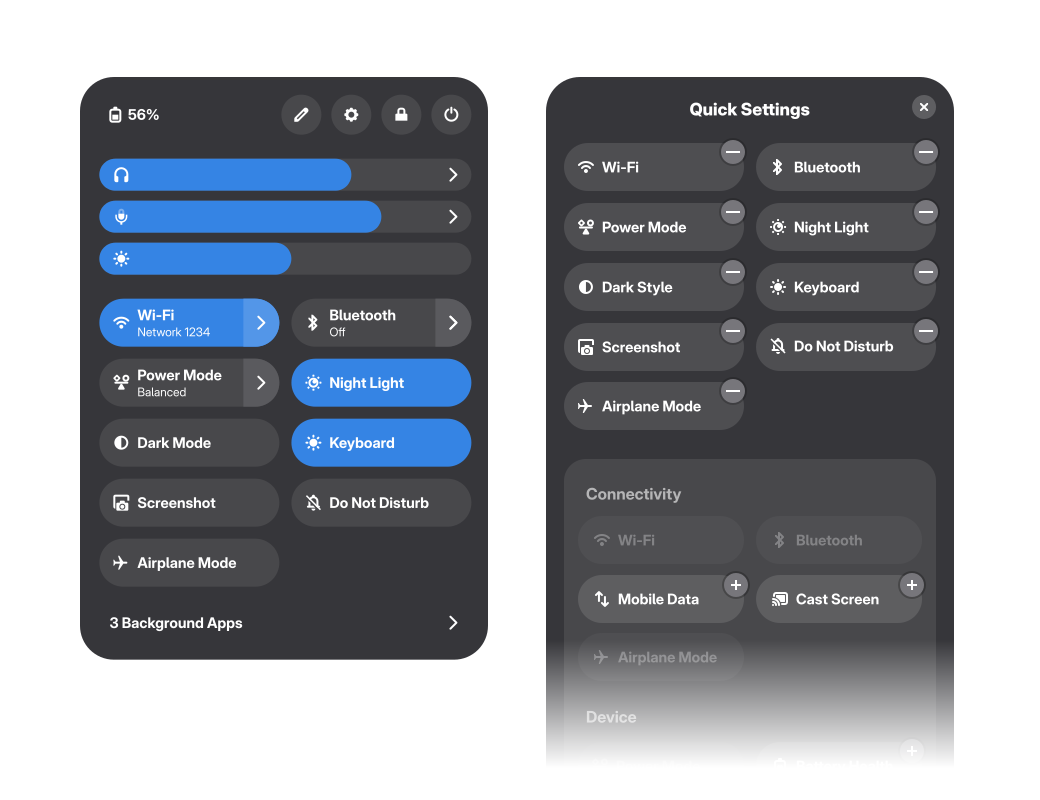
In order to accommodate all these cases, Android and iOS allow customizing this menu, allowing people to add or remove the more niche quick toggles depending on personal use. We would like to do something similar, with an inline editor as part of the menu in GNOME Shell.

Editable Quick Settings Mockups

Simplified Calendar Popover

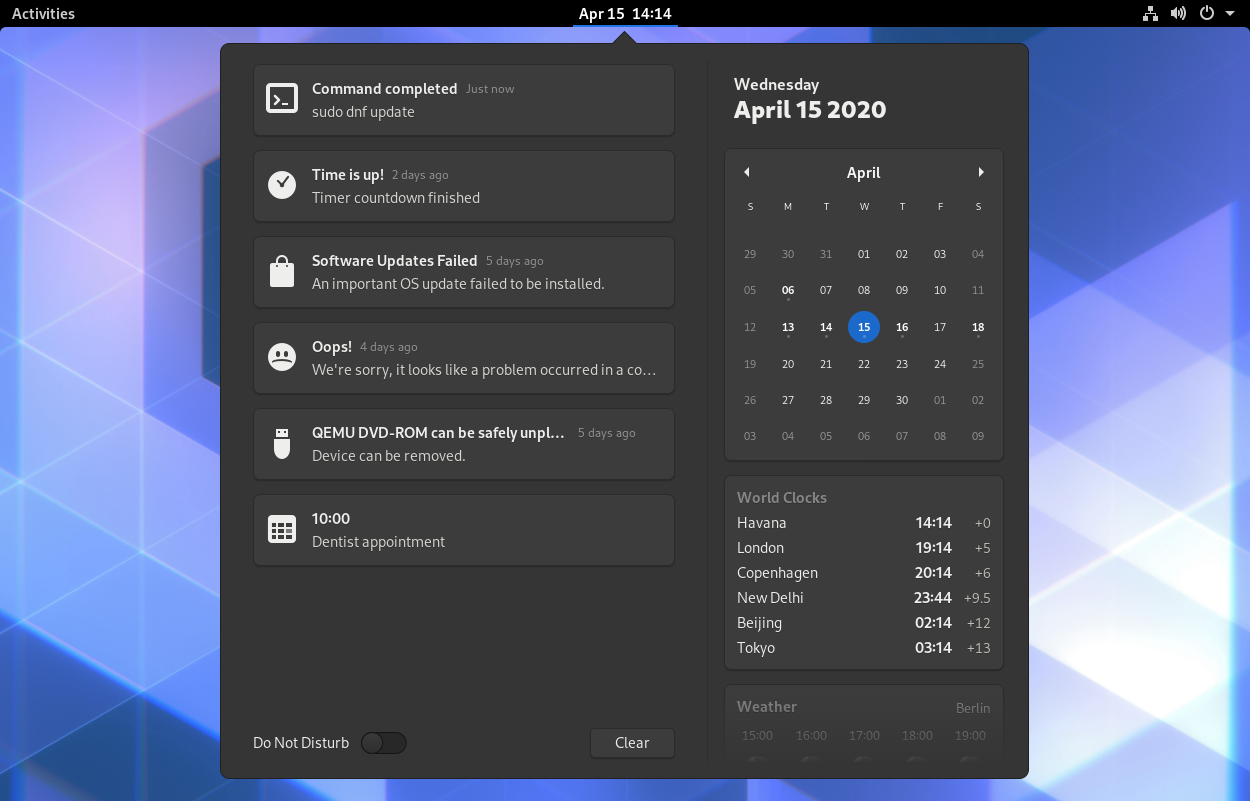
The calendar popover in the top center has always been a bit of an odd mix of things. It contains several loosely related elements that can each have wildly different amounts of content: Sometimes there are lots of notifications, but no calendar events or clocks. Some people have lots of world clocks but don’t get many notifications. Until a few releases ago we even had the Do Not Disturb switch in this popover, despite functionally being a quick setting.

Other systems (e.g. Android, Chrome OS) solve this by having the most important part of this menu (notifications) grouped with quick settings. This leaves only smaller, and less important items, which are also thematically better aligned: Calendar, events, world clocks, and weather.

This move would also group the most frequently accessed systems status items (notifications and quick settings) in a single location, rather than having them spread across two separate ones.

Notifications in Quick Settings Mockups

Simplified Calendar Popover Mockups

Drag & Drop Window Organization

During the process of experimentation and user testing leading up to GNOME 40 we also played with alternatives to the mini-workspaces in the overview. One particularly interesting concept revolved around drag & drop: Instead of having to target one of the tiny workspaces at the top, the real workspaces would scale down when you start dragging a window, allowing for larger, richer drop targets and simplifying the spatial model to a single set of representations for windows in the overview.

The specific interactions would need some refinements, but the testing we did leading up to GNOME 40 was promising, so we feel it would be worth giving this another try. In recent weeks, Cleo Menezes Jr. put together an extension testing this idea. We’re hoping to iterate on the design in the extension, and see where things go from there.

Window Drag & Drop Mockup

Mosaic & Tiling

More powerful tiling is something we’ve long wanted, but which has never quite materialized for technical reasons. More generally we’re interested in improving window management as a whole though, making it a lot less manual and fiddly. A while back we designed a concept called “Mosaic”, which auto-resizes windows to fit new windows, negotiating space between different windows’ optimal sizes. This blog post describes the concept in more detail.

There have been a number of extensions trying to implement parts of this concept over the years, but fundamentally the problem is that this would need better support in the compositor, so it can’t be cleanly done in an extension.

That said, Cleo Menezes Jr’s MosaicWM extension is currently actively maintained and implements most of the concept. As the design team we’re in touch with them, and want to continue collaborating to evaluate and refine the design further. At the same time, there is groundwork that could be laid that doesn’t depend on design (e.g. better tiling support in Mutter, richer min/max window size metadata).

Mosaic Blog Post

Window Switching

The Super+Tab / Alt+Tab switcher has long been an area we’ve wanted to improve. There is a tension between wanting to keep the list of items manageable (this is why windows are grouped by app), and the ability to switch to the last few windows quickly, regardless of what app they belong to. Most other systems either have our current app grouping approach (Apple platforms), or just expose all windows in one gigantic multi-row spread (Windows).

Our hypothesis is that there are two separate types of use cases for this UI: Quickly switching to one of the most recent windows, and switching to any arbitrary window easily with the keyboard. If this is the case, perhaps these could both be better addressed by mixing separate windows (for the most recent few windows) and grouping (for all older windows).
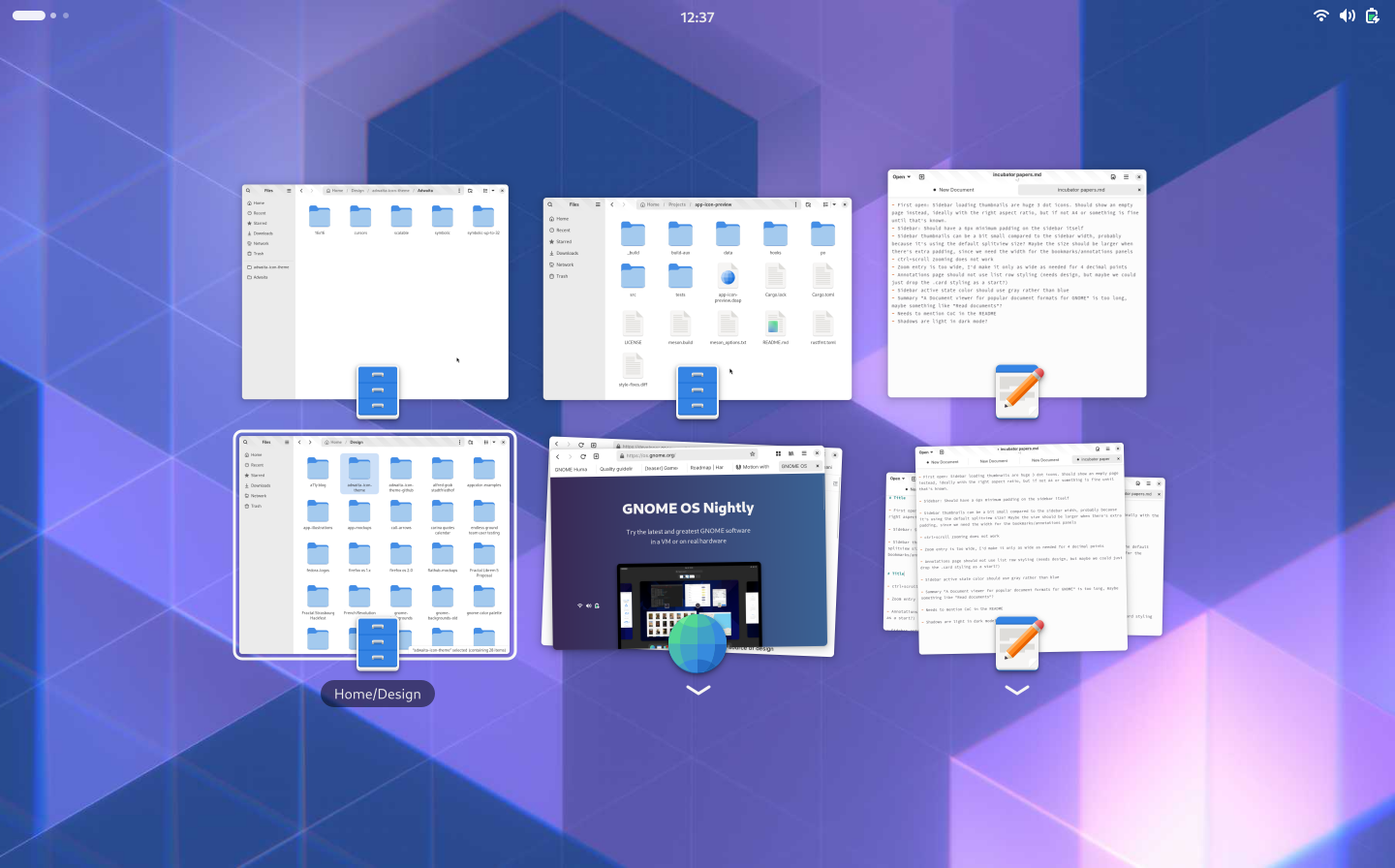
We have high level concepts for this, but it would need further refinements and iteration before we can say that this would be a clear improvement over the status quo. It’s potentially something that could be prototyped in an extension though, so if you’re interested in that please let us know!

Window Switcher Mockups

Login Screen Grid

This is almost a meme at this point, because it keeps almost happening every few cycles, but we still really want a more visual treatment for the login screen. The current list is not terribly ugly or problematic but it is a bit boring, and given that this is the first thing you get when booting up your computer we could do a better job welcoming people.
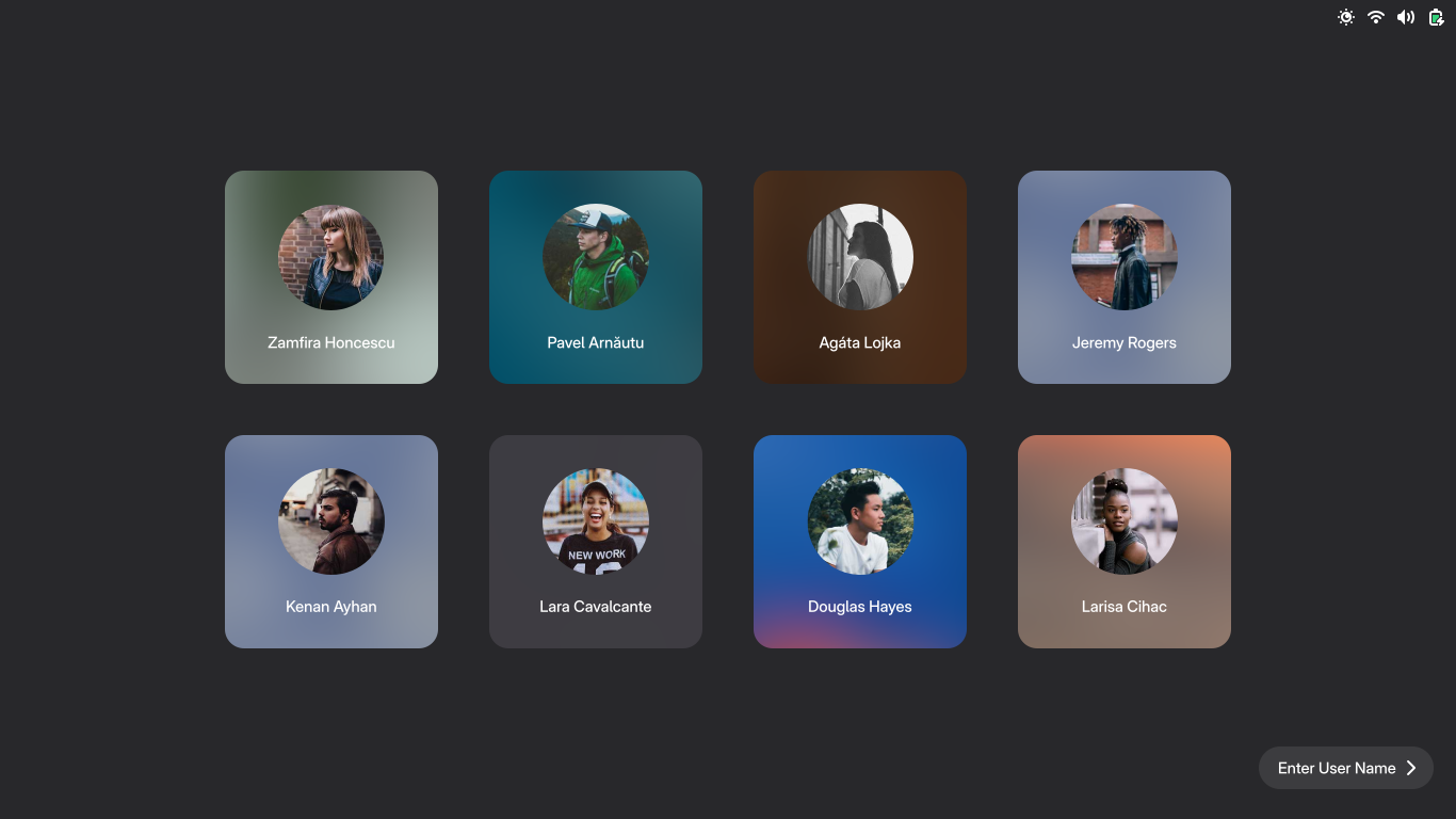
Login Screen Mockups

Dynamic Battery Icon

Over the years we’ve had many discussions on how to make the battery icon more expressive, and make it easier to read the status at a glance. Android and iOS both moved to a larger battery indicator that is wider than the standard square status icons. We’d like to do the same, both to be able to give people a clearer idea how much battery the device has, but also to e.g. be able to better integrate the percentage. This would be great on desktop, but especially also on GNOME Shell Mobile, where battery status is even more important and panel space is at a premium.

Dynamic Battery Mockups

Transparent Panel

Another long-awaited and discussed feature that never quite made it across the finish line is the transparent panel. The idea is simple, and most other OSes (particularly mobile ones) already do this: When the wallpaper is low-contrast and a single color, just don’t show the panel background and let the wallpaper shine through. It’s a small thing, but with the right wallpaper it’s delightful 🙂
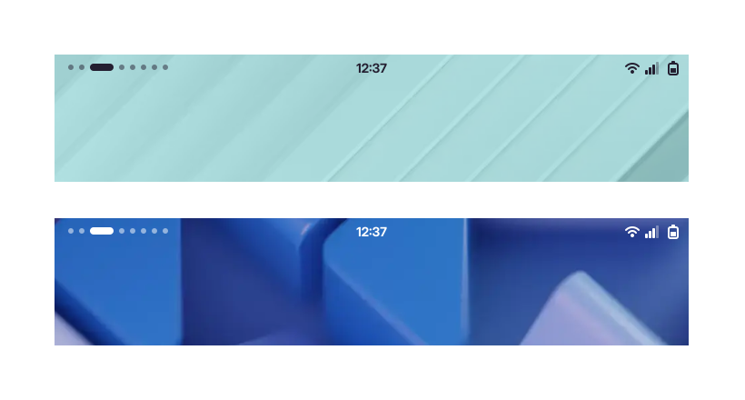
There is a relatively complete implementation from a few years ago by Jonas DreĂźler, but it needs testing, polish, and review.

Transparent Panel Mockups

How do we get there?

Some of these concepts are small and self-contained, others are huge and have been evolving for years, but they all share one thing in common: They need your help to come to life!

In some cases that’s mostly a matter of implementation. In others we’ll need more experimentation, iteration, and discussions with various stakeholders. For complex interaction changes it’s probably good to start with a rough prototype so people can try the behavior early and we can iterate on it. In other cases it would be good to first remove technical blockers to make the new designs implementable in the first place (looking at you, rounded clipping!).

In the past, GNOME Shell was significantly harder to contribute to and test than apps since you needed to use tools like jhbuild. This has changed in the past year: You can now easily build and test your branch in a nested session from Builder using Mutter Devkit. If you use GNOME OS, you can even build a sysext to install your branch on your host system. This allows daily driving experimental branches easily, which is super helpful for evaluating changes to everyday workflows.

As the design team we can only propose ideas and work with developers to make them happen. If you’re interested in helping with implementation, we’d be happy to point you to the right maintainers to talk to, and iterate on concepts together. In some cases we definitely also need to do more user research, so any help with that would also be very welcome. For any of the above, feel free to reach out in the #gnome-design channel on Matrix.
GNOME Shell UX Plans: The Bigger Picture

This is the second of a series of posts on the design of GNOME Shell, as part of an ongoing initiative to improve the core shell experience. In the previous post of the series, Allan gave a general introduction to that initiative. This post is meant to provide some more context and touch on longer-term ideas we’re thinking about. It’s worth noting that many of these are still at an early stage, and subject to change.

It’s hard to believe, but we’re coming up on 10 years of GNOME Shell. Though GNOME 3.0 wasn’t released until April of 2011, design and development were in full swing in mid-2010, and had been for some time.

Of course, the shell has not been standing still since then. Many important areas have been refined and iterated on since those early days, including the notifications, the app grid, and the system status area.

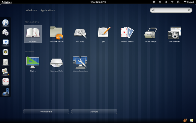
A lot has changed since 3.0. Did you remember the search bar used to be on the right? (Screenshot from Wikimedia Commons)

However, other parts of the interface haven’t changed much since the early days, and we know that some aspects of these old designs could be improved. There are a number of core elements of the shell that we’ve wanted to refresh for some time now, and as the previous blog post discussed we’re hoping to move forward with some of it in the near future.

Given that background, this post is meant to provide an overview of where we see the strengths and weaknesses of the existing design, as well as areas that we’re interested in improving. This includes the areas highlighted in Allan’s post, but also expands the list to cover other initiatives that are either ongoing, or which we would like to see happen.

Strong Points

Distraction Free

One of the core ideas behind the original design of the shell was getting out of your way, and reducing distractions as much as possible. While you’re using apps there are no colorful icons, applets, or other clutter on the screen: It’s just you and the thing you’re working on.

Long before big tech started talking about giving people back control over their attention, “digital wellbeing”, and “time well spent”, GNOME Shell was built around helping people deal with distractions and focus on what really matters. Needless to say, this is more relevant than ever, and something we want to continue to focus on.

If you’re curious, here’s some further reading on the thinking behind the initial 3.0 shell design:

Single Entry Point

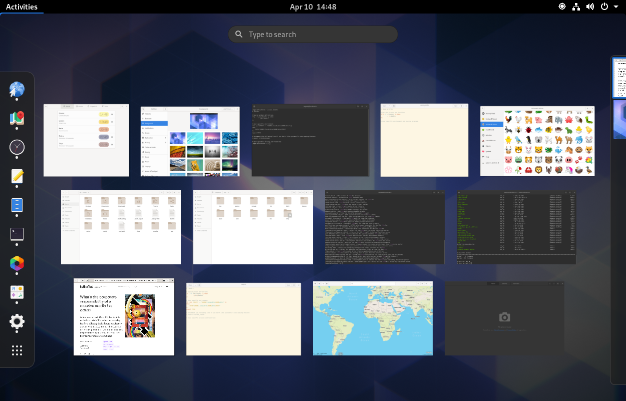
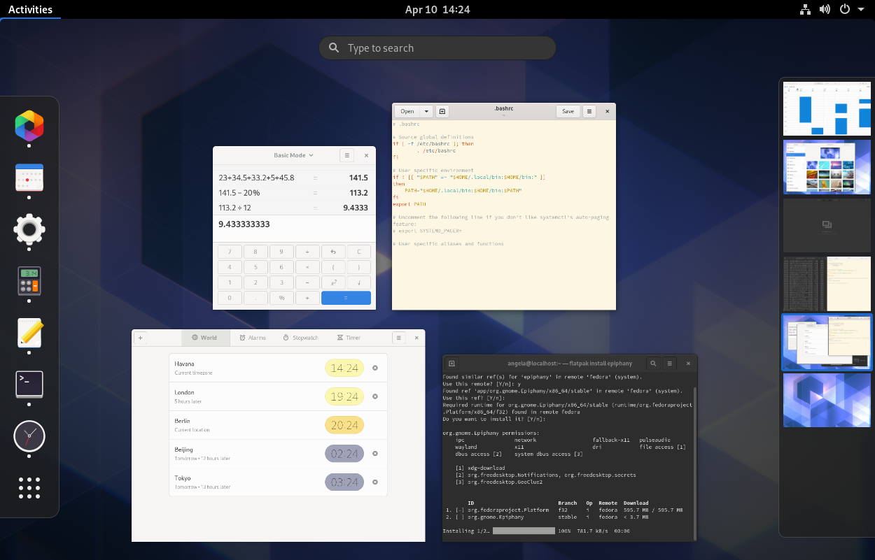
The GNOME Shell overview is a single place to go for app launching and switching, window management, and system-wide search. It’s the center of the shell experience, the place to see what’s happening on the system at a glance, switch activities, or start new ones.

The overview in 3.36

No other desktop OS has a core workflow this simple and straightforward, and many people really really love it. This is another core strength we want to build on.

Most operating systems have some kind of system-wide unified search nowadays, but the GNOME Shell one is especially great because it’s seamlessly integrated with the “single entry point” workflow. This means there’s no extra button to click, or separate keyboard shortcut to learn. Just hit Super and type.

Search results in 3.36

Switching > Launching

Most of the time when leaving the current activity you don’t start a new one (e.g. by opening a new app), but switch to another running activity. GNOME Shell optimizes for this by putting multitasking front and center in the overview, ahead of launching new apps.

Ergonomics

A key reason for the success of the “single entry point” workflow is how easy it is to open the overview across input devices (most of them anyway, but more on that later).

With a mouse you just flick your cursor up to the top left corner. This is very ergonomic because you don’t have to aim, you just move the mouse in that general direction.

If your hands are on the keyboard you can hit a single key, conveniently located in the bottom left of the keyboard, to enter the overview.

These methods quickly become second nature, so much so that people report feeling a visceral lack of control when using other systems. Windows and macOS have equivalents to many of GNOME Shell’s individual features, but there’s no way to do it all from one place in such an ergonomic way.

Areas for Improvement

While there’s a lot to like about the status quo, we’re aware that there are also a number of issues with it, both structurally and usability-wise, and there are a lot of things that work well today, but we think could be even better.

Launching & Initial State

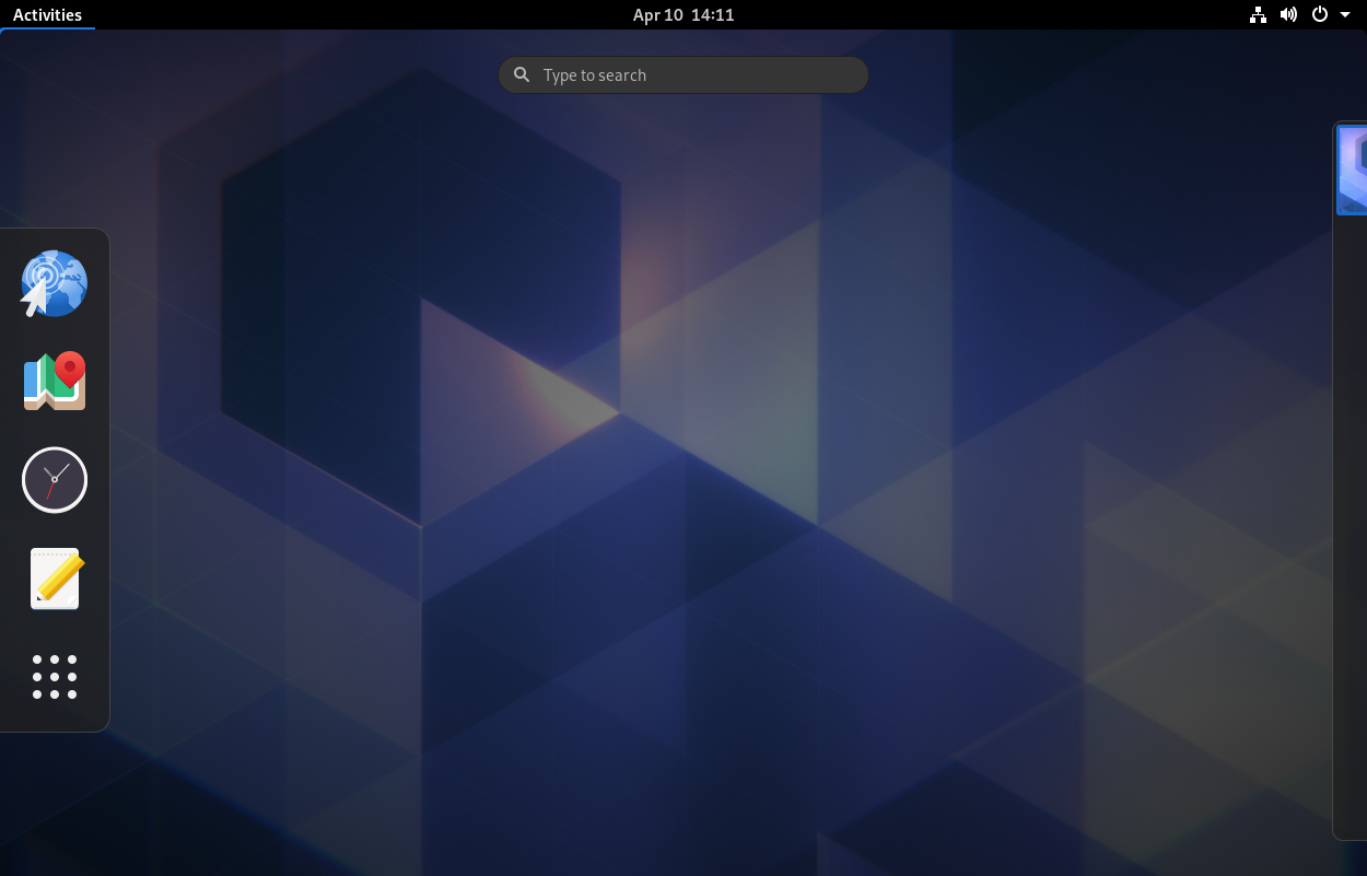
One of the most visible shortcomings of the current shell layout is the bootup experience. After login you’re greeted by an empty desktop, and when you open the overview it’s also empty, since there are no open windows. Though this is not something you encounter very often, it’s definitely not a good first impression.

Overview empty state in 3.36

There are also issues with launching apps from the app grid more generally: It’s not very prominent or easy to get to, and it’s split into two separate views, each with its own problems. Apps don’t have fixed positions in either view, because the All view is alphabetical, so things move around when you install or remove apps, and the Frequent view constantly changes depending on usage.

In improving the app grid, we’d like to move towards something that allows people to develop spatial memory for where certain apps are, and organize them in a semantic way.

Multitasking Workflow

Our current multitasking model consists of two levels: workspaces, which are laid out next to each other in a vertical row, and windows, which are stacked behind one another. This two-level system can be quite powerful, but there’s no automatic onramp to the workflow. By default, if you launch apps they all just pile up on the same workspace.

It’s possible to use GNOME Shell with just a single workspace, but it can be awkward, e.g when there are too many windows for the overview to be an effective way of switching because the thumbnails are so small. All windows stacking up behind one another also makes it hard to do things that involve multiple windows at the same time, such as keeping two windows side by side.

The overview with many windows on a single workspace

People often mention that once they were shown the workspace feature (e.g. by a friend or coworker), it “clicked” for them and they started using and loving it. Of course, this kind of discovery doesn’t scale, and there’s clearly a gap in the learning curve.

This issue isn’t new for workspaces (across all implementations, not just ours): You need to know about the feature, actively decide to use it, and put in some manual work. In our case this is made worse by the fact that the system isn’t able to “remember” open windows and workspaces across reboots.

Ideally we’d like to make multitasking and window management feel more organic than the current two-level system, and reduce the amount of work people have to do to keep things organized and easy to navigate.

Gestures & Spatial Model

Some parts of GNOME Shell have a clear, simple spatial model which makes  navigation feel effortless. For example, workspaces are arranged in a vertical row, which you can cycle through via touchpad gestures or directional keyboard shortcuts.

However, this isn’t the case for everything, which is why parts of the shell can feel disconnected and difficult to navigate. A good example of this is the app grid: The first page opens with a “swarm” animation from the app grid icon, but then additional pages appear from outside the viewport.

Ideally the shell should have a clear, unified spatial model, so you always instinctively know where things are (even when they’re off-screen), and how to get to them, across input methods and form factors.

In order to enable that we need a more comprehensive set of gestures for navigating the core parts of the shell, as well as more intuitive and discoverable keyboard shortcuts. The same thing largely applies to touchscreens as well. Some gestures there are quite nice, but others are not “stick-to-finger”, or physically difficult to perform (e.g. pinch to open the overview).

One of the nice things about having a simpler spatial model and directional gestures to navigate the shell is that it also helps keyboard navigation. This is because it allows for directional shortcuts (e.g. Super + PgUp to move to the workspace above) which are more intuitive than non-directional ones (e.g. Super + M to open the notification popover).

Notifications & Agenda

The calendar popover contains a lot of different features (notifications, calendar, world clocks, weather). This can result in it feeling a bit large and unwieldy. Seeing as not everyone uses all the features in the popover we’re interested in giving people a way to customize which ones they want.

Ideally we’d like the features in this popover to be grouped in a more semantic way and easier to navigate to, especially with touchpads and touchscreens.

Notifications & Agenda popover in 3.36

In addition to structural changes, we also want to make the notifications themselves better, for example by making notification actions accessible in the popover and grouping notifications by app. Mariana PĂ­colo is working on some of this as part of this year’s GSoC.

System Status Area

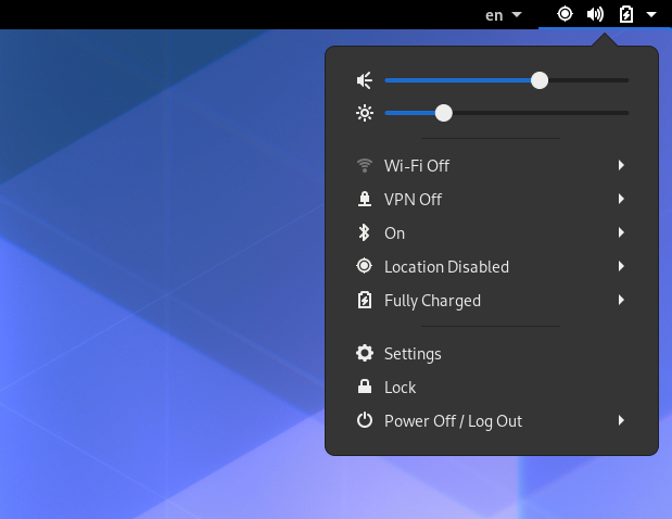
The system status area works well for the most part, but there are some parts we’d like to improve. For example, taking actions on individual items (e.g. toggling Bluetooth) always requires expanding the item’s sub-menu. Other items (e.g. Night Light) are only available in the menu when they’re enabled, which can feel unpredictable.

System status popover in 3.36

Search

Our current search works well overall, but there are still areas where we think it could be better.

For the most part, search is currently just a portal to things inside apps (e.g. files, settings panels, contacts). However, we’ve found that search is often most interesting when it gives you something directly–launching an app, performing a calculation, looking up the weather, etc.

Having more such integrations and richer ways to interact with content from search is something we’re interested in exploring, along with generally expanding the kinds of things you can search for, e.g. your currently open windows.

Goals

Based on the above analysis, here are some tentative high-level goals for where we want to take the shell over the next few years:

  • Distraction free
  • Single entry point
  • Feels quick & easy to navigate
  • Structurally and visually elegant
  • Self-teaching

In order to achieve these goals, these are some more concrete things we want to focus over the next few cycles (the previous blog post discusses these plans in more detail):

  • Better onboarding and bootup experience
  • Easier app launching
  • Simpler, unified spatial model
  • Better touchpad and touchscreen gestures
  • Richer notifications

More medium-term, we’d also like to look at these:

  • More organic workspace workflows
  • Streamlined window management
  • Remember open apps across reboots
  • Improved system status area and search

Of course, some of these goals are much easier to achieve than others. Some of them may take years of work and multiple iterations to get right. That said, we think it’s important not to think about these ideas in isolation, but as part of a more comprehensive vision for the future.

Next steps

The previous blog post lays out a fairly clear roadmap for the first few things we want to address. As that work becomes more concrete, we look forward to sharing and discussing it with the wider community. We hope this post will help provide context to that discussion.

These are exciting times, and we can’t wait to share more. Stay tuned!