GNOME Shell 40 and multi-monitor

Multi-monitor has come up a fair bit in conversations about the GNOME Shell UX updates that are coming in GNOME 40. There’s been some uncertainty and anxiety in this area, so we wanted to provide more detail on what the multi-monitor experience will exactly be like, so people know what to expect. We also wanted to provide background on the decisions that have been made.

Newsflash

Before we get into multi-monitor, a short status update! As you would expect for this stage in the development cycle, the main bulk of the UI changes are now in the GNOME Shell master branch. This was the result of a really hard push by Georges and Florian, so huge thanks to them! Anyone who is interested in following this work should ensure that they are running the master branch, and not the now redundant development branch.

There are still a few relatively minor UI changes that we are hoping to land this cycle, but overall the emphasis is now on stabilisation and bug fixing, so if you are testing and have spotted any issues, now’s the time to report them.

Multi-monitor

OK, back to multi-monitor!

In many key respects, multi-monitor handling in GNOME 40 will be identical to how it is in 3.38. GNOME 40 still defaults to workspaces only on the primary display, as we have since 3.0. The top bar and overview will only be shown on the primary display, and the number of workspaces will still be dynamic. In many respects, GNOME 40 should feel very similar to previous GNOME versions, therefore.

That still leaves a lot of unanswered questions, of course, so let’s run through the GNOME 40 multi-monitor experience in more detail. Much of this concerns how workspaces will work in combination with multi-monitor setups.

Default configuration

As mentioned already, GNOME 40 will continue to default to only showing workspaces on the primary display. With a dual display setup, the overview will therefore look like this by default:

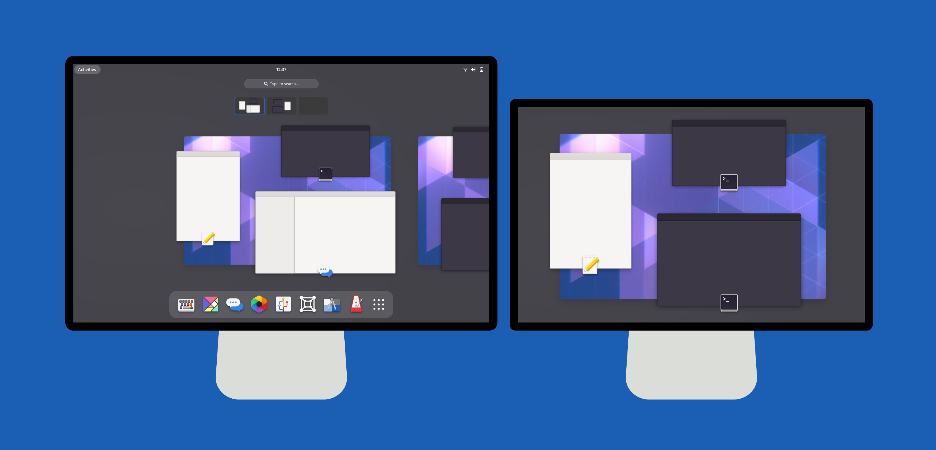
One detail to notice is how we’re scaling down the background on the secondary display, to communicate that it’s a single workspace like those on the primary display. We feel that this presentation helps to make the logic of the multiple displays clearer, and helps to unify the different screens.

To get an idea of what this will look like in use, Jakub Steiner has kindly created some motion mockups. These are intended to communicate how each part fits together and what the transitions will be like, rather than being a 100% accurate rendering of the final product (in particular, the transitions have been slowed down).

Here you can get an idea of what it will look like opening the overview and moving between workspaces. Just like the current default configuration, workspace switching only happens on the primary display.

Workspaces on all displays

While workspaces only being on the primary display is the default behaviour, GNOME also supports having workspaces on all displays, using the workspaces-only-on-primary settings key. The following static mockup shows what the overview will look like in GNOME 40 with this configuration.

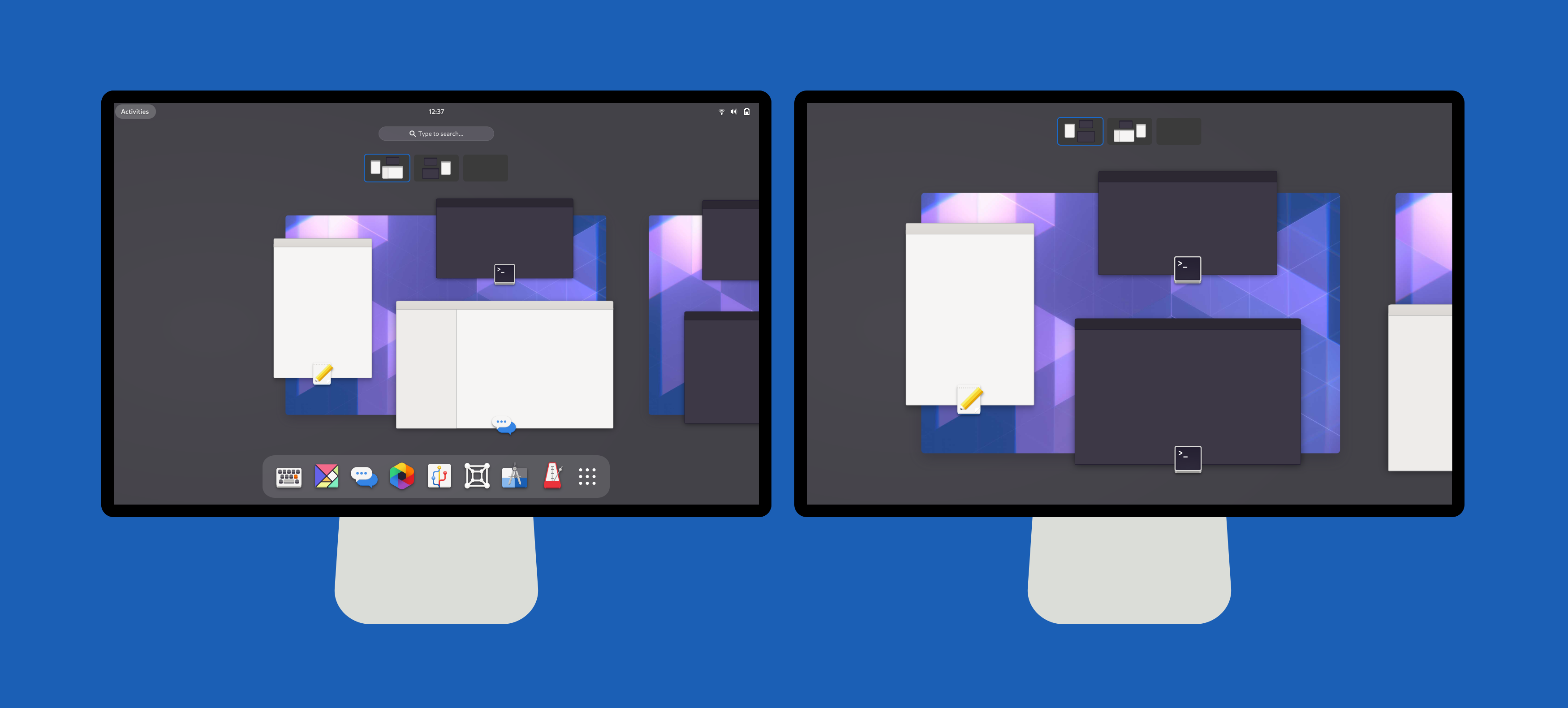
As you can see, this is very similar to the workspaces only on primary configuration. The main difference is that you can see the additional workspaces extending to the right on the secondary display. It’s also possible to see that the workspace navigator (the small set of thumbnails at the top) is visible on both displays. The introduction of the workspace navigator on secondary displays is a new change for GNOME 40, which is intended to improve the experience for users who opt to have workspaces on all displays. We know from our user research that this is something that many users will welcome.

Like in other GNOME versions, when workspaces are on all displays, they are switched in unison. For example, all displays show workspace 2 at the same time. This can be seen in the motion mockups:

Keyboard shortcuts

The existing workspace shortcuts will continue to work in GNOME 40. Super+PgUp/PgDown will continue to switch workspace. Adding Shift will continue to move windows between workspaces.

We are also introducing additional shortcuts which align with the horizontal layout. The new shortcut to switch workspace will be Super+Alt+←/→. Moving windows between workspaces will be Super+Alt+Shift+←/→. Super+Alt+↑ will also open the overview and then app grid, and Super+Alt+↓ will close them.

These directional keyboard shortcuts have matching touchpad gestures: three-finger swipes left and right will switch workspaces, and three-finger swipes up and down will open the overview and app grid.

Why horizontal?

A few people have pointed out that horizontal workspaces aren’t as clean with horizontal multi-monitor setups. The concern is that, when multiple displays are horizontal, they end up clashing with the layout of the workspaces. There is some truth in that, and we recognise that some users might need to adjust to this aspect of the design.

However, it’s worth pointing out that horizontal workspaces are a feature of every other desktop out there. Not only is it how every other desktop does it, but it is also how GNOME used to do it prior to 3.0, and how GNOME’s classic mode continues to do it. Therefore, we feel that horizontal workspaces and horizontally-arranged displays can get along just fine. If anyone is concerned about this, we’d suggest that you give it a try and see how it goes.

Some people have also asked why we are making the switch to horizontal workspaces at all, which is fair! Here I think that it needs to be understood that horizontal workspaces are fundamental to the the design we’re pursuing for 40: the film-strip of workspaces (which proved effective in testing), the clearer organisation of the overview, the coherent touchpad gestures, a dash that can more comfortably scale to include more items, and so on. This is all facilitated by the workspace orientation change, and would not be possible without it.

GNOME ❤️ multi-monitor

In case there’s any doubt: multi-monitor is absolutely a priority for us in the shell design and development team. We know that the multi-monitor experience is important to many GNOME users (including many of us who work on GNOME!), and it is something that we’re committed to improving. This applies to both the default workspaces behaviour as well as the workspaces on all displays option.

Multi-monitor considerations regularly featured in the design planning for GNOME 40. They were also a research theme, both in our early discovery interviews and survey, as well as in the diary study that we ran. As a result of this, we are confident that GNOME 40 will provide an excellent multi-monitor experience.

We actually have a few plans for multi-monitor improvements in the future. Some of these pre-date the GNOME 40 work that is currently happening, and we hope to get back to them during the next development cycle. Our ambition is for the multi-monitor story to keep on getting better.

Thanks for reading!

Shell UX Changes: The Research

This post is part of an ongoing series about the overview design changes which are being worked on for GNOME 40. (For previous posts, see here.)

Ongoing user research has been a major feature of this design initiative, and I would say that it is by far the best researched project that I have worked on. Our research has informed the design as it has proceeded, resulting in particular design choices and changes, which have improved the overall design and will make it a better experience for users. As a result of this, we have a much greater degree of confidence in the designs.

This post is intended as a general overview of the research that we’ve been doing. I’m excited to share this, as a way of explaining how the design came about, as well as sharing some of the insights that we’ve found along the way.

What we did

In total, we conducted six separate research exercises as part of this initiative. These ran alongside the design and development effort, in order to answer the questions we had at each stage of the process.

Many of the research exercises were small and limited. This reflected our ambition to use a lean approach, which suited the limited resources we had available. These smaller exercises were supplemented with a larger piece of paid research, which was conducted for us by an external research company. In what follows I’ll go through each exercise in order, and give a brief description of what was done and what we found out.

So far the data from our research isn’t publicly available, largely because it contains personal information about test participants which can’t be shared. However, we do plan on making a version of the data available, with any identifying information removed.

1. Exploratory interviews

I already blogged about this exercise back in September. A summary: the initial interviews were an exploratory, sensitising, exercise, to find out how existing users used and felt about GNOME Shell. We spoke to seven GNOME users who had a range of roles and technical expertise. Each participant showed us their desktop setup and how they used it, and we asked them questions to find out how the existing shell design was working for them.

We found out a bunch of valuable things from those early interviews. A good portion of the people we spoke to really liked the shell, particularly its minimalism and the lack of distractions. We also discovered a number of interesting behaviours and user types around window and workspace usage.

2. Initial behavioural survey

The initial survey exercise was also covered in my September blog post. It was intended to provide some numbers on app, window and workspace usage, in order to provide some insight into the range of behaviours that any design changes needed to accommodate.

The survey was a deliberately quick exercise. We found out that most people had around 8 open windows, and that the number of people with a substantially higher number of open windows was low. We also found that most people were only using a single workspace, and that high numbers of workspaces in use (say, above six) was quite rare.

3. Running apps experiment

During the early design phase, the design team was interested in the role of the running apps in the dash. To explore this, I ran a little experiment: I got colleagues to install an extension which removes running apps from the dash, and asked them to record any issues that they experienced.

We found that most people got along just fine without running apps in the dash. Despite this, in the end we decided to keep the running apps, based on other anecdotal reports we’d seen.

4. External user testing

Thanks to support by Endless, we were lucky to have the opportunity to contract out some research work. This was carried out by Insights and Experimentation Agency Brooks Bell and was contracted under the umbrella of the GNOME Foundation.

The research occurred at a point in the process where we were weighing up key design decisions, which the research was designed to help us answer in an informed manner.

Methodology

The research itself consisted of 20 moderated user testing sessions, which were conducted remotely. Each participant tested GNOME 3.38 and then either a prototype of the new design or Endless OS. This provided us with a means to compare how each of the three desktops performed, with a view to identifying the strengths and weaknesses of each.

Each session involved a combination of exploration and evaluation. Participants were interviewed about their typical desktop usage, and were invited to recreate a typical desktop session within the test environment. They were then asked to perform some basic tasks. After testing both environments, they were required to fill in a post-test survey to give feedback on the two desktops they had tried.

Research participants included both existing GNOME users, as well as users who had never used GNOME before. The sample included a range of technical abilities and experience levels. It also included a mix of professional and personal computer users. The study was structured in such a way that we could analyse the differences between different user groups, so we could get a sense of how each desktop performed with different user groups. Participants were recruited from six countries: Brazil, Canada, Germany, Italy, United Kingdom and the USA.

Brooks Bell were a great firm to work with. Our own design and development team were able to have detailed planning conversations with them, as well as lengthy sessions to discuss the research findings. We were also given access to all the research data, to enable us to do our own analysis work.

Findings

The external research provided a wealth of useful information and analysis. It addressed the specific research questions that we had for the study, but also went further to address general questions about how and why the participants responded to the designs in the way that they did, as well as identifying a number of unrelated design issues which we hope to address in future releases.

One of the themes in the research was the degree to which users positively responded to UI conventions with which they were already familiar. This was reflected in both how respondents responded to the designs in general, as well as how successfully they were able to use specific aspects of them. For example, interactions with the app grid and dash were typically informed by the participants’ experiences with similar UIs from other platforms.

This might seem like an obvious finding, however the utility of the research was in demonstrating how this general principle played out in the specific context of our designs. It was also very interesting to see how conventions from both mobile and desktop informed user behaviour.

In terms of specific findings, there wasn’t a single clear story from the tests, but rather multiple overlapping findings.

Existing GNOME users generally felt comfortable with the desktop they already use. They often found the new design to be exciting and liked the look and feel, and some displayed a negative reaction to Endless, due to its similarity with Windows.

“I like the workspaces moving sideways, it feels more comfortable to switch between them.”
—Comment on the prototype by an existing GNOME user

All users seemed to find the new workspace design to be more engaging and intuitive, in comparison with the workspaces in GNOME 3.38. This was one particular area where the new design seemed to perform better than existing GNOME Shell.

“[It feels] quicker to navigate through. It [has a] screen where I can view my desktop at the top and the apps at the bottom, this makes it quicker to navigate.”
—Comment on the prototype by a non-GNOME user

On the other hand, new users generally got up to speed more quickly with Endless OS, often due to its similarity to Windows. Many of these testers found the bottom panel to be an easy way to switch applications. They also made use of the minimize button. In comparison, both GNOME 3.38 and the prototype generally took more adjustment for these users.

“I really liked that it’s similar to the Windows display that I have.”
—Comment on Endless OS by a non-GNOME user

5. Endless user testing

The final two research exercises we conducted were used to fill in specific gaps in our existing knowledge, largely as a validation exercise for the design we were working towards. The first of these consisted of 10 remote user testing sessions, conducted by Endless with participants from Guatemala, Kenya and the USA. These participants were picked from particular demographics that are of importance to Endless, particularly young users with limited computing experience.

Each test involved the participant running through a series of basic desktop tasks. Like the tests run by Brooks Bell, these sessions had a comparative element, with participants trying both Endless OS and the prototype of the new design. In many respects, these sessions confirmed what we’d already found through the Brooks Bell study, with participants both responding well to the workspace design in the prototype, and having to adjust to designs that were unfamiliar to them.

“Everything happens naturally after you go to Activities. The computer is working for you, you’re not working for it”
—Tester commenting on the new design

6. Diary study

The diary study was intended to identify any issues that might be encountered with long-term usage, which might have been missed in the previous user tests. Workspaces and multi-monitor usage were a particular focus for this exercise, and participants were selected based on whether they use these features.

The five diary study participants installed the prototype implementation and used it for a week. I interviewed them before the test to find out their existing usage patterns, then twice more over the test period, to see how they were finding the new design. The participant also kept a record of their experiences with the new design, which we referred back to during the interviews.

This exercise didn’t turn up any specific issues with multi-monitor or workspace usage, despite including participants who used those features. In all the participants generally had a positive response to the new design and preferred it over the existing GNOME shell they were using. It should be mentioned that this wasn’t universal however.

7. Community testing and feedback

While community testing isn’t strictly a research exercise, it has nevertheless been an important part of our data-driven approach for this initiative. One thing that we’ve managed to do relatively successfully is have a range of easy ways to test the new design. This was a priority for us from the start and has resulted in us being able to have a good round of feedback and design adjustment.

It should be noted that those of us on the design side have had detailed follow-up conversations with those who have provided feedback, in order to ensure that we have a complete understanding of the issues as described. (This often requires having background knowledge about users setup and usage patterns.) I have personally found this to be an effective way of developing empathy and understanding. It is also a good example of how our previous research has helped, by providing a framework within which to understand feedback.

The main thing that we have got from this stage of the process is testing with a wider variety of setups, which in particular has informed the multi-monitor and workspace aspects of the design.

Reflection

As I wrote in the introduction to this post, GNOME has never had a design initiative that has been so heavily accompanied by research work. The research we’ve done has undoubtedly improved the design that we’re pursuing for GNOME 40. It has also enabled us to proceed with a greater degree of confidence than we would have otherwise had.

We’re not claiming that every aspect of the research we’ve done has been perfect or couldn’t have been improved. There are gaps which, if were able to do it all again, we would have liked to have filled. But perfect is the enemy of good and doing some research – irrespective of its issues – is certainly better than doing none at all. Add to this the fact that we have been doing research in the context of an upstream open source project with limited resources, and I think we can be proud of what we’ve achieved.

When you put together the lessons from each of the research exercises we’ve done, the result is a picture of different user segments having somewhat different interests and requirements. On the one hand, we have the large number of people who have never used GNOME or an open source desktop, to whom a familiar design is one that is generally preferable. On the other hand, there are users who don’t want a carbon copy of the proprietary desktops, and there are (probably more technical) users who are particularly interested in a more minimal, pared back experience which doesn’t distract them from their work.

The best way for the GNOME project to navigate this landscape is a tricky question, and it involves a difficult balancing act. However, with the changes that are coming in GNOME 40, we hope that we are starting out on that path, with an approach that both adopts some familiar conventions from other platforms, while developing and refining GNOME’s unique strengths.

Another Shell UX Update

Another update on the UX changes that are being worked on for GNOME 40! (See previous posts here, here, here…)

A status update

First off, a summary of where we are. Development work has been proceeding apace, and the main batch of changes are currently in the process of being merged into master. Other polish changes are being queued up alongside this, ready to be merged.

This work has primarily been undertaken by Georges Stravacas, with assistance from Florian Müllner. Georges has even been doing live coding sessions, where you can see him do the work in real time!

We currently have about two weeks until UI freeze. This means that, once the major changes have been merged, we will have a short, intense period of polishing and bug fixing work. (If we discover issues after the freeze, there’s also the possibility of getting exceptions to land changes.)

There has been plenty of activity on the design side, too. The design team has been busy testing the development branch and dealing with issues as they have come up. We have a fairly long list of issues that we’re tracking, which we will be turning into a more accessible roadmap very shortly.

We have also been busy discussing solutions to the issues that have come up in feedback. One of the major changes to come out of that is a new workspace navigator, which has been added to the “window picker” in the Activities Overview.

Testing testing testing

We have a variety of methods available for people to test the new design, and invite everyone who is interested to try it out. Once the changes have landed in master will be a great time to file issues.

Current testing methods include:

Run a prebuilt VM image in Boxes

Felipe Borges has done a great job creating a VM image containing the changes, which can be downloaded and run in Boxes. To do this:

  • Download the image
  • Extract the downloaded .qcow2.gz file (from Files, right click on the file and click Extract Here)
  • Open Boxes
  • Press the add (+) button, then select Create a virtual machine…
  • Scroll down to Operating System Image File – press that, then select the .qcow2 file that was extracted
  • At the next step, click the Template entry and select Fedora 33. Then click Next.
  • At the next Review and Create step, click Create to make the VM
  • When the VM has finished installing and has booted, log in to the gnome user account. The password is “gnome”.

These images are based on Fedora using a COPR repository. They can be updated using DNF to get the latest design and development changes.

Use the testing COPR from Fedora 33

The main development branches for the changes have been made available as a COPR repository for Fedora 33. This can be used with an existing Fedora 33 install, either in a VM or on bare metal.

The obvious warning applies here – this is development software with limited testing, and you will be swapping out key desktop components. You should be prepared for your system to break and have an idea of how to recover should this happen. This is definitely a case of proceeding at your own risk.

Using the COPR is simply a matter of adding it and updating with the following commands:

  • sudo dnf copr enable haeckerfelix/gnome-shell-40
  • sudo dnf update

Then reboot.

Build the branch in a virtual machine

If you want to track the latest changes in real time, or want to help with development, this could be a good option for you, and doesn’t take a huge amount of work. Instructions can be found here.

What next?

Everyone is welcome to test the design using the methods described above. Note that, at the moment, all of these involve using the development branch which will not be identical to the final implementation. The branch is primarily useful for testing the general design and giving general feedback to the design team. Once more work has landed in master, that will be the time to file specific bugs.

If other testing methods become available, please let us know and we’ll add references to them in the blog post.

A shell UX update

Last month I shared an updated activities overview design, which is planned for the next GNOME release, version 40.

The new design has prompted a lot of interest and comment, which we’re all really thrilled about. In this post I wanted to provide an update of where the initiative is at. I also want to take the opportunity to answer some of the common questions that have come up.

Where we’re at

Development work has moved rapidly since I blogged last, thanks mostly to a big effort by Georges. As a result, a lot of the basic elements of the design are now in place in a development branch. The following is a short screencast of the development branch (running in a VM), to give an idea of where the development effort has got to:

There are still work items remaining and the branch has noticeable polish issues. Anyone testing it should bear this in mind – as it stands, it isn’t a complete reflection of the actual design.

On the design side, we’ve been reviewing the feedback that has been provided on the design so far, and are tracking the main points as they’ve emerged. This is all really valuable, but we’d also suggest that people wait to try the new design before jumping to conclusions about it. We plan on making it easier to test the development version, and will provide details about how to do so in the near future.

The roadmap from here is to develop the branch with the new design, open it up to testing, and have an intensive period of bug fixing and evaluation prior to the UI freeze in about a month’s time. As we progress it will become easier for people to get involved both in terms of design and development.

What the design means for users

In the rest of this post, I’m going to address some of the common questions and concerns that we’ve heard from people about the new design. My main goal here is to clear up any confusion or uncertainty that people might have.

Argh, change!

A good portion of the comments that we’ve had about the design reflect various concerns about existing workflows being disrupted by the design changes. We understand these concerns and an effort has been made to limit the scale and disruptiveness of the updated design. As a result, the changes that are being introduced are actually quite limited.

Everything about the shell remains the same except for the overview, and even that is structurally the same as the previous version. The overview contains the same key elements – windows overview, search, the dash, the app grid – which are accessed in the same sequence as before. The old features that are tied to muscle memory will work just as before: the super key will open the overview, search will function as before, and the existing shortcuts for workspaces will continue to be supported.

One piece of feedback that we got from initial testing is that testers often didn’t notice a massive difference with the new design. If you’re concerned about potential disruption, we’d encourage you to wait to try the design, and see how it behaves in practice. You might be surprised at how seamless the transition is.

Advantages of the new design

A few users have asked me: “so how is the new design better for me?” Which is a fair question! I’ll run through what I see as the main advantages here. Users should bear in mind that some of the improvements are particularly relevant to new rather than existing users – there are some positive impacts which you might not personally benefit from.

Boot experience

The boot experience is something that we’ve struggled with throughout GNOME 3, and with the new design we think we’ve cracked it. Instead of being greeted by a blank desktop (and then, a blank overview), when you boot into the new design, you’ll be presented with the overview and your favourite apps that you can launch. Overall, it’s a more welcoming experience, and is less work to use.

I have been asked why this change isn’t possible with the existing shell UI. Couldn’t we just show the overview on boot, without making these other changes? Theoretically we could, but the new overview design is much better suited to being shown after boot: the layout provides a focus for action and places app launching more centrally. In contrast, the old shell design places launching on the periphery and does not guide the user into their session as effectively.

Touchpad gestures

Effective touchpad gestures can be incredibly effective for navigation, yet our gestures for navigating the shell have historically been difficult to use and lacking a clear schema. The new design changes that, by providing a simple, easy and coherent set of touchpad gestures for moving around the system. Up and down moves in and out of the overview and app grid. Left and right moves between workspaces. If you’re primarily using the touchpad, this is going to be a huge win and it’s a very easy way to move around.

Easy workspaces

In our user testing, the new workspace design demonstrated itself to be more engaging and easier to get to grips with than the old one. New users could easily understand workspaces as “screens” and found it easier to get started with them, compared to the current design which wasn’t as accessible.

Feel and organisation

Designers often talk about mental and spatial models, and the new design is stronger in both regards. What does this translate to for users? Mostly, that the new design will generall feel better. Everything fits together better, and is more coherent. Moving around the system should be more natural and intuitive.

Other advantages

Other than those other main advantages, there are other more minor plus points to the new design:

  • Personalised app grid – you can now fully rearrange the app grid to your liking, using drag and drop. This is something that we’ve been working on independently to the other changes, but has continued to evolve and improve this cycle, and it fits very nicely with the other overview changes.
  • App icons in the window overview – the window overview now shows the app icon for each window, to help with identification.
  • Improved app titles – we have a new behaviour for GNOME 40, which shows the full title of the application when hovering its launcher.

Q & A

The following are some of the other questions that have come up in comments about the designs. Many of these have been answered in place, and it seemed worthwhile to share the answers more widely.

How will window drag and drop between workspaces work?

The current design works by zooming out the view to show all workspaces when a window is dragged:

Will I be able to search from the overview after pressing super?

Yes, that won’t change.

Will there be an option to restore the old design?

We don’t plan on supporting this option, largely because of the work involved. However, there could of course be community extensions which restore some aspects of the old design (say, having a vertical dash along the side). We’re happy to work with extension developers to help this to happen.

Please keep the hot corner!

OK. 🙂 (We weren’t planning on removing it.)

How will the new design affect multi-display setups?

It should have very little impact on multi-monitor. The same behaviour with regards to workspaces will be supported that we currently have: by default, only the primary display has workspaces and secondary displays are standalone. We don’t anticipate any major regressions and have some ideas for how to improve multi-monitor support, but that might need to wait until a future release.

Will the new design work OK with vertical displays?

Yes, it will work just fine.

End

That’s it for now. With this initiative proceeding quickly, we hope to have more updates soon. We also aim to provide another post with details on our user research in the not too distant future.

GNOME Shell UX plans for GNOME 40

If you’ve been following this blog, you’ll know that a team has been working on updated designs for the Activities Overview. (Previous posts on this topic covered our initial motivations and design goals, as well as the results from some early exploratory research that we conducted.) This initiative has been the subject of significant activity over recent months, and we’re now at a point where we can share more details about what we’ve been doing.

Where we’re at

Following months of design exploration and 6 separate user research exercises, which included a study by a user research firm, the GNOME Shell team has an updated design for the Activities Overview, which it hopes to land in time for GNOME 40 (scheduled for release in March 2021).

All the user research has given us confidence in the design. The core aspects of the latest design all performed well, and we’ve observed a general preference for the new design in our latest internal research exercise. That said, we’ll be continuing to review the design as feedback comes in.

During the design and testing process, the designs have been in state of steady evolution. Now that they are more stable, we’re excited to share them and invite contributors to help us get the new design over the finish line!

In the rest of this post, I’ll briefly describe the design in its current form, before going on to outline the roadmap for what’s going to happen between now and GNOME 40. In subsequent posts, members of the team will provide more detail on the design itself and the research that has been conducted.

Goals revisited

We’ve discussed the goals for this initiative a couple of times in the past (see here and here), but let’s refresh our memories. The things we wanted to achieve with this effort include:

  • Better overview spatial organisation
  • Helpful boot and empty states
  • Improved touchpad navigation
  • More engaging app browsing and launching

We feel that the current iteration of the design delivers on these goals, while retaining the core features of the existing GNOME Shell design that users enjoy today, including a distraction-free desktop, super key to enter the overview, and type to search.

A reimagined Activities Overview

The new design reimagines the Activities Overview using a strong spatial metaphor. Workspaces are arranged horizontally, and have a physical quality to them. (In tests, participants found this easier to understand, as well as being more engaging.)

Workspaces appear in a continuous sequence, from left to right. This sequence can be panned and scrolled. Windows have app icons on them to help with identification, with the window title being shown on hover.

App grid

A good deal of work has already gone into the app grid, so that the new design is fairly similar to what is already in the last GNOME release (3.38).

The key feature of the new grid is its customizability. Launchers can be re-arranged at will, both within multiple pages as well as using folders. This interaction was immediately intuitive to testers.

The main difference between the new design and current GNOME is the orientation of the app grid pages, which are now horizontal rather than vertical, as part of the general spatial reorganisation of the overview.

Navigation

By using a strong spatial model, the design aims to support intuitive navigation and orientation. This is the primary motivation for changing the orientation of workspaces from vertical to horizontal: with the workspaces laid out horizontally, the vertical axis can be used to control movement in and out of the overview and app grid.

This spatial arrangement allows navigation to operate as if in two dimensional space: left and right moves between workspaces, up and down enters the overview and shows the app grid. This is particularly powerful when navigating with touchpad gestures (four finger swipes, up/down/left/right) or keyboard shortcuts (Super+Alt+↑/↓/←/→).

Roadmap

Work is ongoing to implement the design and work through outstanding design issues. Implementation is planned to take place as a series a separate branches which will land in gnome-shell master. Thankfully, much work has been done to make the overview code more flexible, which will make this process easier.

Mockups for the designs can be found in the os-mockups repository. We also have an issue for tracking the initiative in the gnome-shell project. These should both be good places for contributors to get involved.

Ensuring excellent quality is a high priority for us. Therefore, we plan on making development builds of the changes available to test as early on in the process as possible. The more people we can have running the code and providing feedback, the better. If you’d be interested in testing development builds, look out for follow-up posts.

It is hoped that these changes will be the start of a series of improvements to the design of the shell that will arrive in subsequent releases. Certainly, the research work that has been done so far has given is a vast amount of insight that can’t all be addressed in a single release.

Onwards and upwards!

GNOME Shell user research goings on

It’s been a while since we last blogged about the GNOME Shell design work that’s been happening. While we might not have blogged in a bit, there’s been a lot going on behind the scenes, particularly on the research side, and it’s about time that we told everyone about what we’ve been up to.

As a side note: a great team has developed around this initiative. The existing design team of Jakub, Tobias and myself has been joined by Maria Komarova from System76. Maria has a particularly strong research background and was immensely helpful in running interviews. The development side has also been fully engaged with the process, particularly through Georges and Florian.

Research and goals

In addition to thinking and discussing the design goals that we outlined previously (here and here), the design team has conducted two research exercises over the past six months. The main research exercise was a series of interviews with existing GNOME users. We also ran a small survey, to get some baseline numbers on user behaviour. I’ll mostly be talking about the interviews here.

The goals of the interviews was to a) get general information on how the shell gets used, b) evaluate how the existing shell design is performing, and c) identify ways in which the shell could be improved for our users. In addition to these fairly specific goals, we also wanted to develop a deeper understanding of our users: how they use their computers, their concerns, predispositions, interests and attitudes.

Interview-based research is a classic research approach for answering these kinds of questions, which are particularly appropriate to ask early on in a design process, when the emphasis is on exploration, insight and understanding. (Some readers might be more familiar with usability testing as the means through which data-driven design gets done, and that is a useful approach, but it typically happens later in the process.)

The survey

The survey element of our research was a smaller exercise than the interviews, so I won’t go into it in much detail. It was solely conducted within the confines of Red Hat’s Desktop Team, purely for convenience’s sake, and was able to provide some initial numbers for use by the design team.

The survey was an opportunity to ask users about their number of running apps, open windows, workspace usage, and a number of other behavioural factors. The key goal of the exercise was to identify typical workloads as well as the extremes, in order to inform our design requirements around the shell and the overview.

For example, through this exercise, we found out that the modal number of open windows was 8, and the highest number was 28. We also found that most people (63%) were using a single workspace, and that the largest number of workspaces in use was 10.

Clearly, such a limited exercise has to be treated with a high degree of caution, but some quick preliminary numbers were a useful frame of reference and are something that we hope to build upon in the future.

The interviews

The rest of this post will be devoted to the interview exercise that we conducted. Here’s what we did…

We conducted seven interviews in total, each conducted remotely. Interviewees were recruited from through the team’s professional contacts. We avoided talking to anyone who is directly involved in desktop development, and we tried to recruit research participants with a range of roles and technical backgrounds. We had some developers, but we also had people who work in sales, marketing and support.

During each interview, we got general background information about the interviewee and their computing activities. Then we conducted a screen sharing exercise in which the interviewee showed us how their desktop was set up. Then we ran through some exercises to see how they performed basic tasks.

We also used the interviews to ask evaluative questions, to see what the interviewee thought about the current shell design, and how it compares to other desktops.

We took notes on each interview. We mapped out the responses we got. We identified themes and patterns.

Research results

Let’s start by talking about the user behaviours that we observed. A quick summary:

  • The number of apps in use was generally low, 3-5 being the common range, both in the interviews and the survey.
  • Search was prominent as a way of launching apps, but we also observed occasional pointer-driven app launching (curiously, this seemed common when launching some apps and not others).
  • Engagement with the app grid was very low.
  • About half the interviewees had customised the favourites in the dash.
  • Workspace usage was quite mixed: some used workspaces extensively, while others never touched them [1, 2].

These findings have direct relevance to the design areas that the team are investigating. For example, they imply that our designs need to cater both to users who use workspaces extensively, and those who don’t.

The results also posed some conundrums. For instance, is lack of engagement with the current app grid an indication that its design needs to be improved, or that the feature should be demoted or relegated, somehow?

Likes and dislikes

While much of the research findings related to observed behaviours, the interviews also allowed us to ask evaluative research questions. We wanted to know how the existing GNOME Shell design is performing, and how it can be improved.

The main thing that came across here is that overall, the existing design appeared to be working well for the users we spoke to. With one exception, all the interviewees thought that the design compared favourably with other desktops they’d used. (Of course, this insight needs to be taken with a touch of salt [3].)

Most of the interviewees identified things that they like about the current shell design. They seemed to really like the search feature, in particular its speed, but also that it’s just a single keystroke away. The overview also received regular praise (one interviewee described it as “fantastic”).

The other thing that repeatedly came up as a positive aspect of the existing design is its none-distracting nature. Interviewees paid the shell compliments by saying things like “it’s not cluttered” and “it gets out of my way”.

The main issues with the current design that came out of the research was the frequent lack of engagement with the dash and app grid. We also got a hint that onboarding might be a struggle for some, and we got a clear message that touchpad gestures need to be improved (confirming one of our initial hypotheses).

What’s next?

We are already planning additional rounds of research (which we will endeavour to blog about in a more timely fashion!) Some of these will be open to wider participation so, if you are interested, we would love to have you involved!

The design team is also exploring various concepts for the shell, which we hope to present in the not too distant future. Indeed, one of the reasons for all this research work is to help us be confident about the designs before we present them to the world! Watch this space.

Footnotes

[1] There was also behavioural variation within the group of workspace users: some had developed systems for themselves, with certain workspaces dedicated to particular activities, while others allowed their workspace usage to evolve organically as they worked.

[2] Workspace usage did not appear to be positively related to technical expertise. If anything, the opposite was true, with the less technically-expert making more use of workspaces rather than less.

[3] Some notes on: representativeness and generalisability. How can only seven users provide useful results? Won’t we have missed critical user types? Won’t the sample be unrepresentative?

The first thing to say here is that small-N studies (those with a small number of participants) are valuable and can deliver significant insights, and have important advantages over large-N surveys. In particular, they allow accurate observations to be made, without making assumptions about what’s going to be seen.

Second, small-N studies like this allow relationships to be identified, and these can be used to infer qualities of a wider population. For example, if you observe that technically expert users tend to use the keyboard more, and you know that you have a lot of technically expert users, you can make a guess that keyboard use is important for the population as a whole.

Third and finally, experience tells us that small research studies can and do pick up on general trends and behaviours with remarkable speed (such as with the rule of five in user testing).

That said, we certainly do need to acknowledge the non-representative nature of our interview sample. We did include some relatively non-technical users, but the sample as a whole was skewed towards the more technical/professional end of the spectrum, and was taken from organisations that are invested in the Linux/GNOME desktop to varying degrees.

This doesn’t mean that the results we got are invalid. We are confident that our research findings are accurate with regards to the people we spoke to, and that those people are indicative of a larger section of the GNOME user population. The only question is is whether there are other types of user who we didn’t include.

GNOME Shell UX Plans: The Bigger Picture

This is the second of a series of posts on the design of GNOME Shell, as part of an ongoing initiative to improve the core shell experience. In the previous post of the series, Allan gave a general introduction to that initiative. This post is meant to provide some more context and touch on longer-term ideas we’re thinking about. It’s worth noting that many of these are still at an early stage, and subject to change.

It’s hard to believe, but we’re coming up on 10 years of GNOME Shell. Though GNOME 3.0 wasn’t released until April of 2011, design and development were in full swing in mid-2010, and had been for some time.

Of course, the shell has not been standing still since then. Many important areas have been refined and iterated on since those early days, including the notifications, the app grid, and the system status area.

A lot has changed since 3.0. Did you remember the search bar used to be on the right? (Screenshot from Wikimedia Commons)

However, other parts of the interface haven’t changed much since the early days, and we know that some aspects of these old designs could be improved. There are a number of core elements of the shell that we’ve wanted to refresh for some time now, and as the previous blog post discussed we’re hoping to move forward with some of it in the near future.

Given that background, this post is meant to provide an overview of where we see the strengths and weaknesses of the existing design, as well as areas that we’re interested in improving. This includes the areas highlighted in Allan’s post, but also expands the list to cover other initiatives that are either ongoing, or which we would like to see happen.

Strong Points

Distraction Free

One of the core ideas behind the original design of the shell was getting out of your way, and reducing distractions as much as possible. While you’re using apps there are no colorful icons, applets, or other clutter on the screen: It’s just you and the thing you’re working on.

Long before big tech started talking about giving people back control over their attention, “digital wellbeing”, and “time well spent”, GNOME Shell was built around helping people deal with distractions and focus on what really matters. Needless to say, this is more relevant than ever, and something we want to continue to focus on.

If you’re curious, here’s some further reading on the thinking behind the initial 3.0 shell design:

Single Entry Point

The GNOME Shell overview is a single place to go for app launching and switching, window management, and system-wide search. It’s the center of the shell experience, the place to see what’s happening on the system at a glance, switch activities, or start new ones.

The overview in 3.36

No other desktop OS has a core workflow this simple and straightforward, and many people really really love it. This is another core strength we want to build on.

Most operating systems have some kind of system-wide unified search nowadays, but the GNOME Shell one is especially great because it’s seamlessly integrated with the “single entry point” workflow. This means there’s no extra button to click, or separate keyboard shortcut to learn. Just hit Super and type.

Search results in 3.36

Switching > Launching

Most of the time when leaving the current activity you don’t start a new one (e.g. by opening a new app), but switch to another running activity. GNOME Shell optimizes for this by putting multitasking front and center in the overview, ahead of launching new apps.

Ergonomics

A key reason for the success of the “single entry point” workflow is how easy it is to open the overview across input devices (most of them anyway, but more on that later).

With a mouse you just flick your cursor up to the top left corner. This is very ergonomic because you don’t have to aim, you just move the mouse in that general direction.

If your hands are on the keyboard you can hit a single key, conveniently located in the bottom left of the keyboard, to enter the overview.

These methods quickly become second nature, so much so that people report feeling a visceral lack of control when using other systems. Windows and macOS have equivalents to many of GNOME Shell’s individual features, but there’s no way to do it all from one place in such an ergonomic way.

Areas for Improvement

While there’s a lot to like about the status quo, we’re aware that there are also a number of issues with it, both structurally and usability-wise, and there are a lot of things that work well today, but we think could be even better.

Launching & Initial State

One of the most visible shortcomings of the current shell layout is the bootup experience. After login you’re greeted by an empty desktop, and when you open the overview it’s also empty, since there are no open windows. Though this is not something you encounter very often, it’s definitely not a good first impression.

Overview empty state in 3.36

There are also issues with launching apps from the app grid more generally: It’s not very prominent or easy to get to, and it’s split into two separate views, each with its own problems. Apps don’t have fixed positions in either view, because the All view is alphabetical, so things move around when you install or remove apps, and the Frequent view constantly changes depending on usage.

In improving the app grid, we’d like to move towards something that allows people to develop spatial memory for where certain apps are, and organize them in a semantic way.

Multitasking Workflow

Our current multitasking model consists of two levels: workspaces, which are laid out next to each other in a vertical row, and windows, which are stacked behind one another. This two-level system can be quite powerful, but there’s no automatic onramp to the workflow. By default, if you launch apps they all just pile up on the same workspace.

It’s possible to use GNOME Shell with just a single workspace, but it can be awkward, e.g when there are too many windows for the overview to be an effective way of switching because the thumbnails are so small. All windows stacking up behind one another also makes it hard to do things that involve multiple windows at the same time, such as keeping two windows side by side.

The overview with many windows on a single workspace

People often mention that once they were shown the workspace feature (e.g. by a friend or coworker), it “clicked” for them and they started using and loving it. Of course, this kind of discovery doesn’t scale, and there’s clearly a gap in the learning curve.

This issue isn’t new for workspaces (across all implementations, not just ours): You need to know about the feature, actively decide to use it, and put in some manual work. In our case this is made worse by the fact that the system isn’t able to “remember” open windows and workspaces across reboots.

Ideally we’d like to make multitasking and window management feel more organic than the current two-level system, and reduce the amount of work people have to do to keep things organized and easy to navigate.

Gestures & Spatial Model

Some parts of GNOME Shell have a clear, simple spatial model which makes  navigation feel effortless. For example, workspaces are arranged in a vertical row, which you can cycle through via touchpad gestures or directional keyboard shortcuts.

However, this isn’t the case for everything, which is why parts of the shell can feel disconnected and difficult to navigate. A good example of this is the app grid: The first page opens with a “swarm” animation from the app grid icon, but then additional pages appear from outside the viewport.

Ideally the shell should have a clear, unified spatial model, so you always instinctively know where things are (even when they’re off-screen), and how to get to them, across input methods and form factors.

In order to enable that we need a more comprehensive set of gestures for navigating the core parts of the shell, as well as more intuitive and discoverable keyboard shortcuts. The same thing largely applies to touchscreens as well. Some gestures there are quite nice, but others are not “stick-to-finger”, or physically difficult to perform (e.g. pinch to open the overview).

One of the nice things about having a simpler spatial model and directional gestures to navigate the shell is that it also helps keyboard navigation. This is because it allows for directional shortcuts (e.g. Super + PgUp to move to the workspace above) which are more intuitive than non-directional ones (e.g. Super + M to open the notification popover).

Notifications & Agenda

The calendar popover contains a lot of different features (notifications, calendar, world clocks, weather). This can result in it feeling a bit large and unwieldy. Seeing as not everyone uses all the features in the popover we’re interested in giving people a way to customize which ones they want.

Ideally we’d like the features in this popover to be grouped in a more semantic way and easier to navigate to, especially with touchpads and touchscreens.

Notifications & Agenda popover in 3.36

In addition to structural changes, we also want to make the notifications themselves better, for example by making notification actions accessible in the popover and grouping notifications by app. Mariana Pícolo is working on some of this as part of this year’s GSoC.

System Status Area

The system status area works well for the most part, but there are some parts we’d like to improve. For example, taking actions on individual items (e.g. toggling Bluetooth) always requires expanding the item’s sub-menu. Other items (e.g. Night Light) are only available in the menu when they’re enabled, which can feel unpredictable.

System status popover in 3.36

Search

Our current search works well overall, but there are still areas where we think it could be better.

For the most part, search is currently just a portal to things inside apps (e.g. files, settings panels, contacts). However, we’ve found that search is often most interesting when it gives you something directly–launching an app, performing a calculation, looking up the weather, etc.

Having more such integrations and richer ways to interact with content from search is something we’re interested in exploring, along with generally expanding the kinds of things you can search for, e.g. your currently open windows.

Goals

Based on the above analysis, here are some tentative high-level goals for where we want to take the shell over the next few years:

  • Distraction free
  • Single entry point
  • Feels quick & easy to navigate
  • Structurally and visually elegant
  • Self-teaching

In order to achieve these goals, these are some more concrete things we want to focus over the next few cycles (the previous blog post discusses these plans in more detail):

  • Better onboarding and bootup experience
  • Easier app launching
  • Simpler, unified spatial model
  • Better touchpad and touchscreen gestures
  • Richer notifications

More medium-term, we’d also like to look at these:

  • More organic workspace workflows
  • Streamlined window management
  • Remember open apps across reboots
  • Improved system status area and search

Of course, some of these goals are much easier to achieve than others. Some of them may take years of work and multiple iterations to get right. That said, we think it’s important not to think about these ideas in isolation, but as part of a more comprehensive vision for the future.

Next steps

The previous blog post lays out a fairly clear roadmap for the first few things we want to address. As that work becomes more concrete, we look forward to sharing and discussing it with the wider community. We hope this post will help provide context to that discussion.

These are exciting times, and we can’t wait to share more. Stay tuned!

GNOME Shell UX Plans

With GNOME 3.36 out the door, it’s time to start thinking about what comes next. Those of us who work on GNOME UX are really proud of the latest GNOME shell release. It includes some major updates, particular the new lock screen and updated visuals, as well as a host of smaller improvements. 3.36 feels really nice to use, and has got a great response.

The new lock screen in GNOME 3.36

The lock screen work that we landed in 3.36 was the outcome of a long-running programme of UX work, which we first put together at the GNOME UX hackfest in London, back in 2017. There are still some outstanding pieces of the login/unlock experience that need to be filled in, and this is something that we hope to work on over the coming development cycle. However, we are also turning our attention to other aspects of the shell, which we have wanted to update for some time.

In the rest of this post, I’ll describe some of the areas that we’re hoping to improve, before going on to talk about how we’re going to do it.

Focus areas

The areas that we are looking at mainly relate to the overview, although in places they touch other areas of the experience. They are:

Application launching

One thing we’ve wanted to improve for some time is the reliance on the alphabetical grid of launchers. This alphabetical organisation is mostly useful for finding applications by name, rather than presenting the apps that are most important or most likely to be used. This is something that the grid of frequent apps attempts to compensate for, but the overall experience doesn’t fit together as well as we’d like.

The application grid

For application launching, the main goal is to make the apps space more useful – it needs to be easier to find the app that you want to launch. However, we also want to make it a more engaging and personal part of the experience, so the apps space feels like it belongs to you.

Overview spatial organization

We are all familiar with the organisation of the overview: window thumbnails in the middle, dash on the left, search up top, workspaces on the right. Functionally this works fairly well. However, the layout could be better in terms of how the pieces fit together. In particular, the arrangement of the different elements could do a better job of communicating how they relate to one another, especially in terms of navigation.

The Activities Overview

Boot and empty states

Boot into GNOME 3 and you’re presented with an empty desktop. Open the Activities Overview, and you’re again presented with an empty space in the middle of the screen. This experience isn’t particularly helpful, and doesn’t draw or guide the user into the experience.

Overview initial state

We’ve been aware of these disadvantages of the current design for almost the entire history of GNOME 3, and we have experimented with a few different solutions, but never managed to get them to a usable state. Now, as we take another look at how the overview is arranged, we’d like to have another attempt at getting this right.

Touchpad navigation

Right now, the touchpad gestures to move between workspaces are fairly straightforward: 4 finger swipe up and down. However, we currently don’t have an easy gesture to go in and out of the overview and, once you’re in it, we don’t have an easy way to navigate between the different areas (app launching and search in particular).

Being able to scoot around different areas of the desktop using a touchpad (or, indeed, a touchscreen) would be a big win and is something we are keen to allow. In order to do this, we need a simple model that people can use to navigate around, rather than having to learn multiple sets of gestures.

How we’re going to do it

Work in this area is already ongoing, and we’ve put a lot of thought into how to organise it in order to achieve a good result.

Research & design

Some of the functionality that is under review is a prominent part of GNOME 3, so it’s important that any changes we make are a genuine improvement. When it’s a core part of the desktop, even a small regression can be a significant issue for some users.

User research is going to be a key part of this process, both in order to ensure that we have a good understanding of user needs and requirements, as well as to test the outcome of design and development work, and modify it as necessary.

We have already done some initial, limited research, to find out how many windows, apps and workspaces are typically in use. The next research phase is currently being planned, and will involve a series of show and tell exercises, combined with semi-structured interviews, to get a better sense of how people use their desktops, and how the design can be improved for them.

Looking further ahead, we’ll conduct testing on any changes that we make, in order to evaluate how successful they are and ensure that users experience them as a genuine improvement over what came before.

At each stage, we hope to share the results of our findings.

Testing and iteration

Wherever possible, we are planning on landing UI changes incrementally, with an emphasis on maintaining a releasable product. This will allow us to pace our work and do testing and refinement throughout the development cycle, rather than just at the end.

When it isn’t possible to compartmentalise UI changes, we are planning on making development builds available early, in order to carry out testing and iteration over a longer period. This is likely to be the case for the bulk of any changes, due to the interconnected nature of the overview.

Watch this space

Design changes to GNOME Shell can generate both speculation and uncertainty. We’d like to mitigate this as much as we can, so that people understand what changes are coming, why they are being made, and why they can be confident that they are a real improvement.

Currently, there are a variety of experimental designs. However, we haven’t settled on a single proposal and don’t want to create false expectations by presenting them at this early stage. Hopefully once we have done more rounds of research we will be in a position to do this, and give a better idea of what UI changes might be coming further down the line. Until then, we ask you to be patient!

We also hope that the research, testing and feedback opportunities that we are planning will provide reassurance that any changes we eventually make will be positive. We are committed to make changes based on these data gathering exercises, if it turns out that the designs don’t perform as well as we’d hoped.

We will endeavour to provide progress reports on this work as it progreses, so watch this space for news!