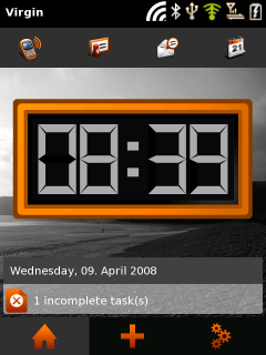
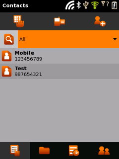
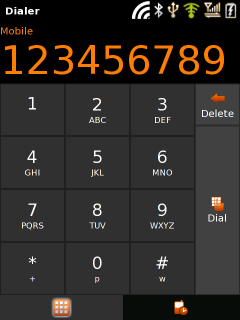
Spurred on by the positive comments in my last little theme experiment for the OpenMoko, I have made a few adjustments based on some of the comments. It’s also now available in OpenMoko svn.
If you have a OpenMoko build set up, you can try it out. Firstly you need to build the package and then rebuild the package index:
bitbake moko-gtk-engine && bitbake package-index
You may have issues if you have built this before, because I did made some changes to the repository that svn can’t handle very cleanly, so if you have problems, wipe your svn checkout and start again.
Then you need to ssh into your neo and run the following commands:
- opkg upgrade
- opkg install moko-gtk-engine
- dbus-launch gconftool-2 –t string -s /desktop/poky/interface/theme “Moko”
- /etc/init.d/xserver-nodm restart
Here are some more screenshots of the theme running on the device. There are still some bugs with colours in a few places, so testing would be much appreciated.


I think the GPS icon is green because the GPS chip was on when I took the screenshots. I’ve been testing a couple of the peripherals on my GTA02 lately and I’m happy to report so far Wifi, GPS, accellerometers and the LEDs all seem to be working correctly. I got a fix from the GPS today which according to Google maps, was within 1 meter of my actual location.
can you take a photo of the leds?
i googled around, but nowhere photos of them. would be interesting how they look like.
Seems like the button numbers on Dialer are excessively small — is that a theme element? Less than 1/3 the height of the dialing-in-progress-display, and there is certainly plenty of space within the buttons.
So the third status icon from the right is GPS, the second is cell tower, sixth is wifi? I know there are a lot of antenna strengths to report; I’m not sure if I’d have known the GPS one without the comment about it being green. If it’s just an on/off indicator, maybe a globe or sat icon would be more distinctive?
Looking really good, though. Like the action icons, the contrast is great, and the hierarchy-of-what-is-more-important-than-what is very clear, which is a good thing.
Looking forward to trying this great looking theme out on my GTA02 (When it arrives ;)). One thing. The icons on the topmost picture ( in the top ) seems to be quite out of place, since they are not the same stylised simplicity as the others. Keep up the great work!
Not that Halloween colors aren’t cool, but any chance on a less dark theme just from an aesthetic perspective? Also, don’t LCDs actually use more electricity with a dark theme rather than a light colored one? Since the back light is always on and the LCD applies voltage to the crystal to change the color of the back light passing through? Seems like a lighter colored theme would be a power saver.
Good work though, I like it’s clean look over all, but I would change that GPS icon to a globe or a compass type icon.
I really like how this theme is shaping up. Is the performance noticeably better?
Testing, you ask? Don’t mind if I do! 🙂
The hands on the home screen’s analog clock are gone! Wait, they’re not quite gone — but they are white against a very-nearly-white clock face.
In normal GTK+ applications (not the menuless OM ones), grayed-out menu options appear to be bold, as they are white with an additional white shadow on a dark gray background.
Further, with regard to regular GTK+ applications, most of them will be stylus-operated so (as a matter of preference) I would greatly reduce the spacing between menu items, both horizontally and vertically. People making finger-operated applications should use finger-specific widgets, I would think.
The theme’s dark gray doesn’t contrast very well against the black, for example on the tabs at the bottom of the home screen. It’s sometimes difficult to see the highlighting on the tab (e.g. on the application launcher where the tab matches the fingerscroll list background).
Another preference: vertical scrollbars have the up/down arrows at both the top and bottom, and similarly horizontal scrollbars have extra arrows. The normal (e.g. Windows) paradigm of up-arrow at the top + down-arrow at the bottom makes better use of the very limited screen space.
Media Player needs theme elements (icons, etc.) — by default it’s unusable.
That’s all for now. I do like the theme, though, and its quick redraws.
One more that I forgot — popups (like the network registration popup message) appear to be empty. It’s probably just white-on-white text.
Quicksand: Thanks for the comments! I’ll look into these soon.
How are colors defined? So people can create different color sheme