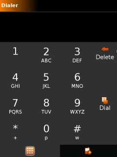
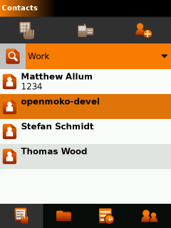
Inspired by ScaredyCat’s discovery that the default GTK+ theme was much faster on the Neo1973 than the current pixbuf based theme (well, no real suprises there…), I set to work stealing his colour scheme and completely redesigning my Moko theme engine. This time totally optimised for speed and simplicity. It’s still a work in progress, but here are some screenshots to give a general idea:


Lines and other visual distractions are kept to a complete minimum. Although it doesn’t look that great on a desktop display, when it is on a 2.8″ 285dpi touch screen, it feels a lot better.
Not bad for an hacker! 🙂
I’m all for avoiding visual noise, but I think the division lines in the dial pad are usefull, try making them really subtle there.
Well, I have been thinking about this…
The division lines are only helpful on the dial pad if you are using a mouse and cursor. On the phone, all you have is your finger. By the time you’ve got your finger over a button you can’t see it, so borders are no help as guides. If you could “feel” the devisions, that would be another matter. Here, I think the presence of devisions actually gives the illusion of a more restricted target space, and therefore makes the user more nervous about the where he or she is tapping. Of course, this really only applies to finger input.
WINNER!
Awesome, awesome awesome. Less fake-3D and more simplicity. Go Tom!
Simple and clean ROCKS!
A lot more appealing than the “nice but a bit classical” official theme.
The top top header (Dialer/Cotacts) needs a little work though. The gradient color doesn’t fit well with your theme.
I wonder if one could not skip completely the gradient in the header bar.
Anyway, looks great. Is it somewhere publicly available?
Yeah, this looks excellent. Avoiding UI sluggishness is the single most important element of mobile interface design, so it’s great this this looks cool too.
– Chris
I don’t know if this is possible on a normal tactile screen or needs one special, but I will love this:
Once you press a key (and hold it pressed) a circle appears surrounding the key, with the different sub-options. For example:
(B)
(A) [ 2 ] (C)
So just by moving the pointer/finger to left/top/right you could get the right letter (and it can be improved with more options in the circle.
You avoid having to click several times on a key, it works on small displays (full querty is not an option) and it’s easy to remember. The spatial positions are easy for our brains, so we will learn to write very fast with this kind of keyboard.
The (B) is supposed to be on top of [ 2 ]. The spaces I’va added got crushed, blogs doesn’t like ascii art.
Looks VERY sexy, much more beautiful than the old one. And if it’s also faster, even better. Please make that the default.
This looks really nice and clean.. I must agree with Marcus, it could be even better if the gradient in the top bare was dropped.
I thought the line separation for the keypad in ScaredyCat’s theme was much better, I don’t like this one as much.