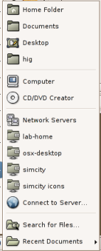
While working on a proposal for desktop defaults for our next version of the Java Desktop System, I’ve been somewhat perturbed by the mess that our concept of “Places” is in.
These screenshots are from Ubuntu Dapper as I’m on my Powerbook at the moment, but IIRC the vanilla community version isn’t significantly different (except for the Documents ‘place’ that Ubuntu has– but we have that in JDS too so that’s part of my problem as well). I have one bookmark and a few network places set up– this is one of my everyday, working desktops, so my experiences are presumably fairly typical.
The user’s first encounter is most likely on the Places menu on the panel:

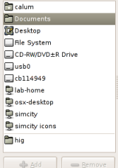
Then when they open a file, they get this collection of Places instead– now their bookmarks are at the bottom, and they can choose from devices that weren’t available on the Places menu:

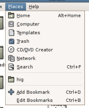
Using nautilus in spatial mode, we get this different content and ordering again– and a third different term for the home folder:

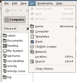
And using nautilus in Browse mode, the Places sidebar and Go menu don’t even agree with each other, let alone anything else:

Now, obviously a wee bit of context sensitivity is appropriate… in the file selector, you’re unlikely to want to open files from the CD Burner or Trash locations for example (although I’d be quite happy to allow opening from Trash– I always get annoyed at OSes that force you to drag things out the trash before you can look at them again). But surely we can do a better job of consistency here overall? My Places are my Places wherever I’m accessing them, and in general I’d expect to see the same ones in the same order.
Or is it just me…?
and it would be cool if the “network servers” part was in a submenu. when you have more than 3-4 it makes that menu very long and messy. if they were in a submenu there would just be an arrow next to “network servers” and it would be much clearer IMHO.
It’s not just you. I have been meaning to file a bug about this for ages. I don’t even have the CD burner in my Places menu!
Yeah, you’re totally right about it being a mess. There’s a number of bugs filed on the subject already, but apparently nobody wants to handle the issue.
emmanuel: If you have more than [somewhere around] six network places, they do get a submenu. Perhaps an option for you would be to add two network places just for the sake of the submenu 😉
Places has been a mess for a while, consistency, simplicity and globalisation needs to be the mantra. Context sensitivity is important also, but some GTK2 apps have some places others have different sets, network places a prime example, some still use the old file chooser and don’t count, nautilus has a fairly whacked out view of places too.
How about the nautilus sidebar operating places as a tree? So I can expand and browse the places and their sub folders, maybe even organise these places into a tree and completely disrespect the file system heirarchy. It would probably be a good idea to run a survey of what people want to be able to access through places, how they would like them organised and what coolness they can think of to make it better and easier to use. How about beagle places (like spotlight search folders), I’d suggest calling that a kennel but I’m sure the KDE guys would kick off at gnome using a K. Also I was thinking of merged folders as places, where the items of two or more different folders can be merged into a single ‘place’ which allows you to keep the file system organised but pull in different resources from various locations, I suppose this could cause issues when saving to that place however so ignore that insane rambling.
Nautilus’s half-assed compromise concerning making the Unix file system friendly combined with the lack of consensus on how and where to mount additional drives and sprinkled with a bash of pointless showing off-of the capabilities of the VFS make it almost impossible to navigate anywhere efficiently or maintain a sensible mental model of one’s desktop. Film at eleven.
Given that “computer” is just a virtual folder containing links to some or all of those other locations anyway, putting it in any of those menus is pointless. Same for “documents”. Not having home as desktop but still treating the desktop as a file-able directory is yet another mess-up. Including empty CD drives in the file system chooser too. In fact basically every unnecessary complication that Windows XP puts into its file system presentation (including about five different access points to network shares) is duplicated glessfully in Nautilus.
– Chris
“although I’d be quite happy to allow opening from Trash– I always get annoyed at OSes that force you to drag things out the trash before you can look at them again”
But letting you work on things in the Trash is, well, it defeats much of the purpose of the trash. The point of the trash is to make deletion a 2-step process. If you can edit something, and then by selecting a menuitem in a different program delete (it in a single step), bang, you’ve just lost your work.
It might be a little annoying to have to move something out of the trash to open it, but it’s a little annoying to have to use the 2-step trash to delete things in the first place. The point is not to make every possible action easy (which would be dumb, even if it was possible), but to make it hard to lose data.
@Tim: I totally agree it would be potentially dangerous to allow users to edit things in the Trash, but I’d at least like to be able to open them read-only. Many’s the time I’ve wanted to double-check that I’m about to trash the right thing, or retrieve one of many similar items from the trash without wanting to take /all/ of them back out again to check which one it is I wanted to save.
I guess this would need some sort of gnome-vfs magic or something though, as you obviously couldn’t have your trash folder both writeable and non-writeable at the same time 🙂
And while you are talking about the Places menu. It hate that there isn’t a context menu on items in the Places menu.
It makes unmounting my iPod/CD’s harder as I have to open the Computer place first.
Hi Calum
I posted a bugzilla bug about this exact problem a while back. I’d appreciate it if you could chirp in. Arse, GNOME Bugzilla is down right now. Will post back with the Bug ID later.