One of the most useful features of GNOME 3 is the awesome “just type” search system. Being a heavy keyboard user myself, I just love the ability to hit and type what I’m looking for.
The results returned by the system are not limited to what GNOME Shell handles internally; since GNOME 3.4 third-party applications have been able to have the search string be forwarded to them and provide additional results, by implementing the org.gnome.Shell.SearchProvider DBus API. The Shell then uses the provided information and displays results in a grid view, which I’m sure you’re familiar with if you used GNOME 3.
In GNOME 3.8, scheduled for March, we want to make a step forward in making search even more useful, and add some missing features and bling in the process.
Search Settings
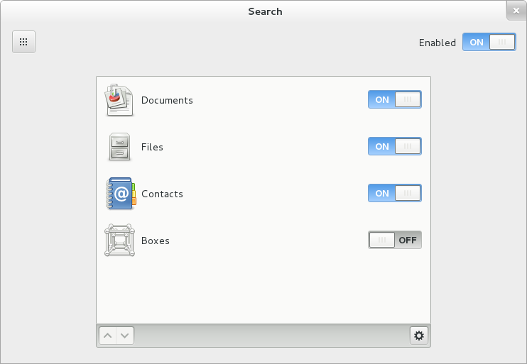
As presented already by Allan, Matthias and Bastien, the first piece of news is we now have a settings panel to configure search options.
The panel allows to control the presence of each application individually among the returned results, as well as toggling on and off application results from the Shell entirely; it also makes it possible to configure the order in which they are presented by the Shell.
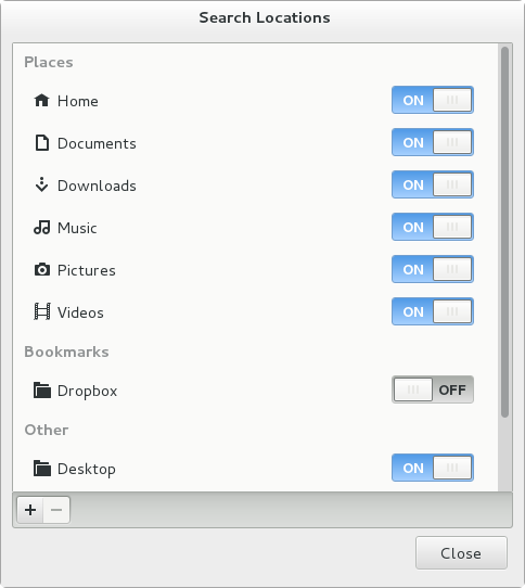
The little gear icon in the toolbar would ideally pop up a search configuration dialog provided by the application itself, but since the infrastructure to make that possible is not there yet, right now it displays the dialog above. The locations there are those that will be indexed by Tracker, and you can add and remove them individually.
Shell Search Layout
The panel is not the only new feature; last summer Tanner Doshier worked on a relayout of how results are displayed in the Shell, based on these awesome mockups from our design team. Unfortunately his work didn’t make it in time for the 3.6 release, so this cycle I picked up his patches and brought them up to speed for inclusion in git master.
As you can see from the design page, changes are both visual and functional:
- search provider results are now displayed in a list, for a better distinction between them and the application launchers.
- the icon of the application is now displayed close to its result section: this is useful to immediately identify it in the list. Clicking it will launch a full search in the application itself, if what you’re looking for is not amongst the top results.
- there’s now space for the search provider to show a descriptive string for each result, which can give more context as to why a result matters for the search string.
Most of this design is already implemented in 3.7.4, including the infrastructure to make it possible, but there’s still a lot of visual details to figure out and polish before the final release. In order to support the new search features, we introduced an org.gnome.Shell.SearchProvider2 DBus API. The Shell still supports launching providers implementing the previous interface, but of course those won’t get to use the new features (e.g. passing the search down to the application).
Some work also still needs to be done to nicely support highlighting the search terms in descriptive texts returned from search results. If you’re interested to help, feel free to get in touch!
Finally, I made a short video to showcase this feature – that is all code already in GNOME git. Enjoy!


24 comments ↓
This might be clear for developer, but newcomers might find some dialogs confusing:
1. Picture #1 – search in Documents vs search in Files. That’s confusing. Documents _are_ files. Or do you mean online documents? Please note that there are two types of “documents” in GNOME – one is an application called Documents and second is a folder Documents in Nautilus. It’s a bit schizophrenic here. And it’s going to be even more schizophrenic, because you’re working on “Music” and similar “apps”, right?
2. Picture #2 – search in Home vs search in Music. That’s confusing. The Music folder is located in my Home directory. So does “Home” mean just the top-level directory, no recursion? Or does it mean I can search in whole Home (and all subdirectories) _except_ Music, provided I disable that one?
If I keep everything ON, but don’t add ~/Work specifically, will GS search in ~/Work by default or not?
Could it be that the fade-out effect in the overview’s result list is a bit overdone? The screen cast gives me a massive tunnel vision effect.
I’ve never been a fan of mixing application results with documents.
While it makes sense to show applications and settings at once, the use case of searching for a document is totally different, as the user knows when is he searching for an app or other kind of result. Having a filter at hand and not having to go through settings windows would be a plus.
Hey! I am really liking the progress. Looks neat and tidy and very functional at the same time.
Hi,
it seems, that when more than 7 applications are returned in results there is no way to see all of them. I don’t see any plus button or something like that.
Also, most of providers give only small piece of information as a result. For example in 0:22 of your movie System Settings provider gives three one-word elements. There is a ton of screen real estate lost because of this. Maybe on higher resolution devices like desktop monitor, the results could divided in e.g. two columns. I have a huge FullHD 24” monitor. With this approach, and absurdly large icons I will see only handful of results, where in reality I could see much more.
[…] (direct video link)These new features are already available in the latest GNOME 3.8 development releases (3.7.x). GNOME 3.8 is scheduled to be released on March 27. via / more info @ Cosimo’s blog […]
Are you going to make type ahead search in Nautilus faster, in F18, it’s just annoyingly just a bit too slow (ie, not as fast as it was before)
[…] wrote a post with all the new search stuff in GNOME 3.8! Tweet […]
[…] (direct video link)These new features are already available in the latest GNOME 3.8 development releases (3.7.x). GNOME 3.8 is scheduled to be released on March 27. via / more info @ Cosimo’s blog […]
[WORDPRESS HASHCASH] The comment’s server IP (184.172.185.6) doesn’t match the comment’s URL host IP (216.172.170.11) and so is spam.
It takes too much more vertical space and the entire horizontal space is wasted. They should have it aligned horizontally (but then again I am not sure how to show the complete names of files if aligned horizontally – may be as tooltips?). I hope someone makes an extension.
This looks really good, excellent work! Just a question: I tried the original re-search branch and it had smooth animations where the search was sort of “maximized”.
Since you’re typing, you’re certainly looking for an application hence it makes sense to focus on that, and I really thought it was nice. Did you decice not to keep it because it was too distracting?
@Stiph: no, that’s something that is still missing. We plan to reintroduce it before 3.8.
[…] Cosimo’s Blog Esta entrada fue publicada en Escritorios y etiquetada GNOME por Willy Klew. Guarda enlace […]
[…] información – GNOME 3.8 tendrá un modo clásico Fuente – Blog de Cosimo, Web Upd8 if (typeof(addthis_share) == "undefined"){ addthis_share = […]
[WORDPRESS HASHCASH] The comment’s server IP (178.255.225.139) doesn’t match the comment’s URL host IP (213.162.217.198) and so is spam.
We do need privacy! Hiding contacts when searching is great!
Thanks. I am looking forward this feature!
Once the search returns I can use the keyboard to navigate/select results right? I don’t have to use a pointing device to access all of the results or make a selection, right? btw, do you know keyboard shortcut to open the User Menu – can’t find it anywhere. Gnome3 is coming around nicely, looking forward to 3.8 – thx
Nice work, however the results shown in the shell take really a lot of vertical space, causing a lot of scrolling.
I hope they can be compacted a little bit more, and maybe the Nautilus-like “Grid” and “List” buttons added to the shell, to show results in these two modes. Different people have different tastes here.
[…] Изменено оформление вывода результатов поиска в обзорном режиме. Для выполнения специфичного поиска добавлена возможность подключения сторонних поисковых обработчиков (провайдеров поиска). Над результатами теперь выводятся пиктограммы приложений для обработки встретившихся при поиске типов контента, нажав на которые можно выполнить быструю фильтрацию результатов. Порядок вывода результатов в общем списке и задействованные при поиске провайдеры определяются настройками в панели управления средствами поиска. […]
[…] results in the GNOME shell overview and the order in which they appear. there. Cosimo recently explained the various search improvements in GNOME 3.8 in great […]
[WORDPRESS HASHCASH] The comment’s server IP (216.151.210.46) doesn’t match the comment’s URL host IP (66.155.11.238) and so is spam.
We really need to be able to toggle search providers on/off in the dash rather than having to delve into the control center. As more search providers are introduced it is more likely that we will want to pick and choose between searches, rather than have a static list of search providers enabled all the time.
Is there any information how to upgrade an extension which implements a SearchProvider from 3.6 to 3.7/3.8?
Please provide a short blog post or some documentation. At the moment I can’t find any SearchProvider extension which works in 3.7 and I would like to upgrade my extension for the upcoming release
It’s a good work, but remember…
Always listen to the community!, the community finally will use it and the community will have to be satisfied and happy with the work done.
Never forget the community, the GNOME community!
[…] Изменено оформление вывода результатов поиска в обзорном режиме. Для выполнения специфичного поиска добавлена возможность подключения сторонних поисковых обработчиков (провайдеров поиска). Над результатами теперь выводятся пиктограммы приложений для обработки встретившихся при поиске типов контента, нажав на которые можно выполнить быструю фильтрацию результатов. Порядок вывода результатов в общем списке и задействованные при поиске провайдеры определяются настройками в панели управления средствами поиска. […]
[…] Изменено оформление вывода результатов поиска в обзорном режиме. Для выполнения специфичного поиска добавлена возможность подключения сторонних поисковых обработчиков (провайдеров поиска). Над результатами теперь выводятся пиктограммы приложений для обработки встретившихся при поиске типов контента, нажав на которые можно выполнить быструю фильтрацию результатов. Порядок вывода результатов в общем списке и задействованные при поиске провайдеры определяются настройками в панели управления средствами поиска. […]
Leave a Comment