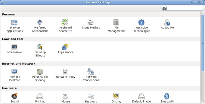
I’ve been looking recently at what can be done to improve the GNOME Control Center shell for both GNOME 3.0 and for Moblin. In Moblin, we wanted a single window approach, so that finding a setting and opening a preference pane could be done within a single environment. After some discussion on IRC and on the control center mailing list, it seems people within the Gnome community were also interested in this idea. I’ve been having a go at prototyping this behaviour to see how it would turn out. We’ve now gone through a couple of iterations of refining the design into something that is more promising. Here are some screenshots of how it looks right now:
Displaying all settings categories:

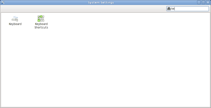
Searching for a setting:

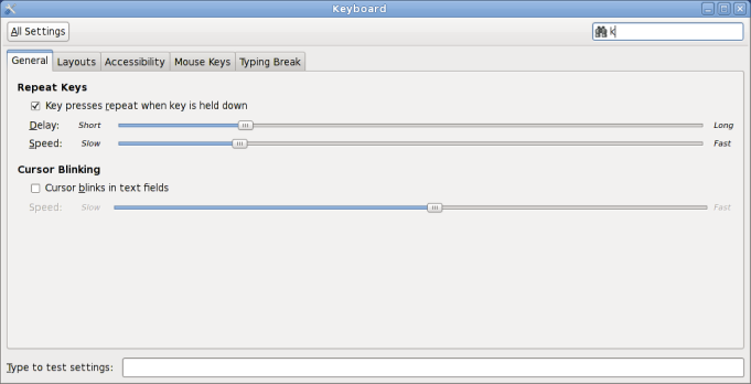
Opening up the keyboard preferences:

The work is all available in the single-window-shell branch of gnome-control-center. At the moment, the single window behaviour is implemented using the XEmbed protocol via GtkPlug and GtkSocket. This allowed us to quickly prototype and experiment with the behaviour while making minimal changes to the existing capplets, although any capplets without the added functionality will open in a new window as before. Jon McCann of RedHat is also looking at using GIO Extension Point based approach, but this requires a more significant re-write of the capplets.
At the upcoming GNOME Usability hackfest I hope to gather more feedback on the design and possibly start working on refining the UI for many of the individual preference panes as well.
add back/forward buttons and you have mac os x system preferences panel; which is not really a bad thing.
http://switchtoamac.com/guides/images/syspref_01.jpg
Rockin’!
Ah, that’s great!
Adding tabs would be nice addition 🙂 as well as the back/forward buttuns.
Anyway, nice work so far 🙂
@semon: we deliberately avoided the back/forward buttons!
Nice so far, but I think we could better organize all the settings (merge some capplets) so that the initial scroll bar is unnecessary and the window is less wide.
Some candidates:
– “Printing” and “Default printer”
– “Keyboard shortcuts” and “Keyboard” and possibly “Input methods”
lol @ “Adding tabs would be nice addition”
I really hope this was meant as a joke
yeah, who neeeds back/forward?
there are probably only 2 steps anyway (main and then the specifig setting dialog), so I don’t get the point.
way to go!
Looks very nice, would love to see this instead of the plethora of menu items right now!
As I can remeber there was post on gnome planet about refactoring gnome control center. It was realy nice study made by people from Sun. There were included some flash prototypes. Have you seen it?
Some links:
http://live.gnome.org/UsabilityProject/Whiteboard/ControlCenter/Sun/FrontPage
http://blogs.gnome.org/calum/2009/08/17/control-center-refresh-redux/
@Stanislav: yes, we were aware about Sun’s mockups and they formed part of the initial research. I asked Calum but unfortunately they haven’t been able to revisit it recently.
I hope searching will be implemented correctly.
= search on “desktop” or “background” will give appearance as result, or “browser” will give default applications.
Further: good job (but back/forward will be nice addition)
Just to inform you, but KDE already uses the name “System Settings” in their control center, since KDE 4.0.
I would recommend finding another name.
I love it 🙂
Always thought Gnome’s control center was too ‘weak’ and hidden. I think this is even better than KDE’s 4 which has basic/advance tabs and viewing settings which I think are lame and complicate things just for the sake of it.
Really looking forward to Gnome 3 🙂
And btw, fuck tabs and back/forward buttons!
If you could implement the search so that it highlights the appropriate settings object instead of creating a list of matching settings objects, it might make use of the system settings easier, as it would maintain the spatial relationship between the objects. Screenshots at http://bit.ly/8VSS1B
@Ben Cooksley: It seems to me that “System Settings” is deliberately descriptive and generic enough that the fact that KDE uses the same terminology should not matter, and maybe should even be encouraged for that very reason.
I like, except for the label of the “All settings” button. It’s too less obvious that it gets you back to the main list.
If a single window controls everything (not yet sold on that idea, personally), make SURE that it remembers its size (dimensions). There’s nothing more infuriating than having to resize a window everytime you spawn it.
Another step to make gnome look more like mac so x
just add “Back/Forward” button now (like someone sugested) and you’ll be ready! :/
Not sure if I agree, anyways thank u for the info 😉 By the way, can I contact you about your blog?
Great !
But what about changing “All settings” to “Go back to settings list”, i think Michael is true, people may understand “All settings” as “show advanced users settings”.