Libadwaita 1.0 has been released, just at the end of the year.
Libadwaita is a GTK 4 library implementing the GNOME HIG, complementing GTK. For GTK 3 this role has increasingly been played by Libhandy, and so Libadwaita is a direct Libhandy successor.
You can read more in Adrien’s announcement.
What’s New
Since Libadwaita is a Libhandy successor, it includes most features from it in one form or another, so the changes are presented compared to it.
If you’ve been following This Week in GNOME, you may have already seen a large part of changes.
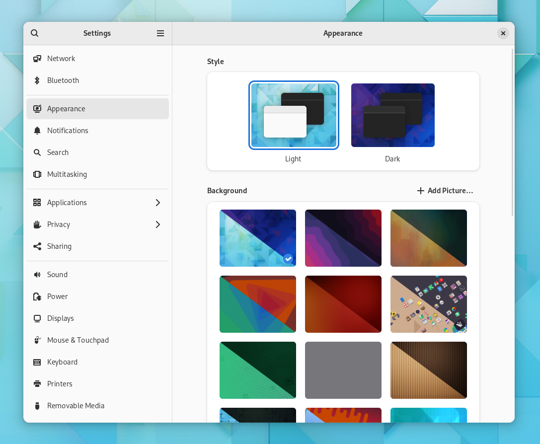
Updated Stylesheet
Probably the most noticeable change is the reworked stylesheet.
For the past 7 years, the Adwaita style has been a part of GTK. Now it’s a part of Libadwaita instead, while the GTK style has been renamed to Default.
Since we have this opportunity, the stylesheet has been completely redesigned with several goals in mind:
Modernizing the style
GNOME designers have long wanted to do this, and the GTK 4 Default style contains a few changes in that direction compared to the GTK 3 version of Adwaita, and GNOME Shell has been using a similar style as well. Libadwaita takes it much further. You can read more about it Allan Day’s blog post.
The changes are not fully compatible with GTK Default and may require changes on the application side when porting. I’ve also blogged in detail about the biggest breaking change: the updated header bar style.
Runtime recoloring
Ever since Adwaita started using SCSS, it couldn’t really be recolored at all without recompiling it. This created big problems for applications that wanted to do that.
For example, GNOME Web makes its header bar blue in incognito mode. This may sound simple, but involves copy-pasting large chunks of Adwaita into the app itself and making many small changes everywhere to adjust it, as well as using SCSS for it because the original style is SCSS. More recently, GNOME Console and Apostrophe started doing the same thing – copy-pasted from Web, as a matter of fact. This approach means the style is messy and extremely hard to keep up to date with Adwaita changes – I have updated this style for the 3.32 style refresh and never want to do this again.
Another approach applications like Contrast are using (were using with GTK 3, anyway), is copying the whole stylesheet from GTK, and using libsass to recompile it in runtime. This worked – it’s much more maintainable than the first approach, but fell apart when libsass got deprecated.
Meanwhile, the elementary OS stylesheet has been doing recoloring just fine with nothing but @define-color – and so Libadwaita does exactly that, it exposes all of the colors it uses (31 as of the moment of writing) as named colors. The new colors are also documented and will be treated as a proper API.
It also drops all of the formerly used PNG assets, so the colors can affect the elements that used them.
It also reworks the high contrast variant to use the same colors when possible to make sure that changing color for the regular style also works with high contrast.
Another thing the new stylesheet does is simplifying how it handles colors in general. The new simplified style comes in very handy here.
For example, many parts of the UI are now derived from the text color and change with it automatically, and widgets that don’t absolutely need to define their own text color don’t do that anymore, so it can propagate. Where possible, transparency is used instead of mixing or hardcoding colors.
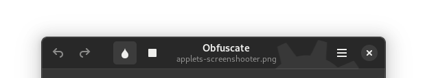
All in all it means that simple custom styles like this one:
/* Solarized popovers */
popover > arrow,
popover > contents {
  background-color: #fdf6e3;
  color: #586e75;
}
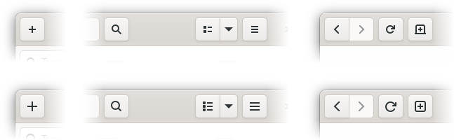
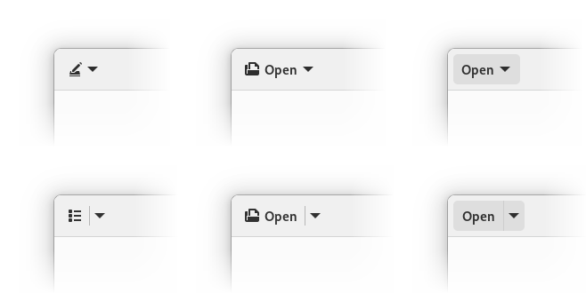
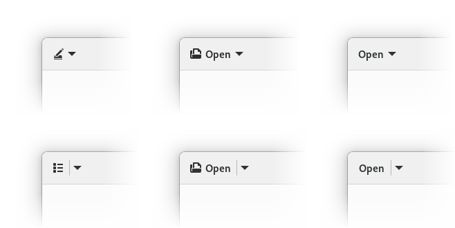
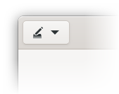
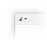
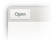
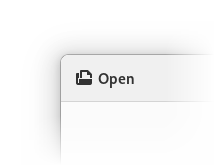
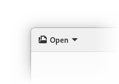
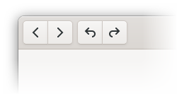
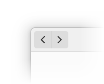
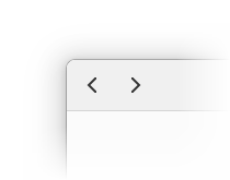
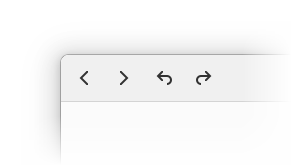
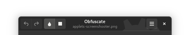
actually work correctly and with no glitches, in both light and dark variants, as well as high contrast style. Try doing that with GTK 4 Default and compare the results:
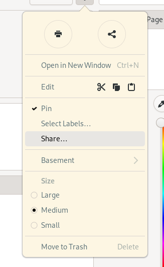
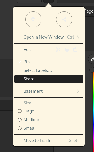
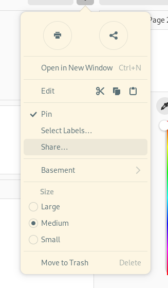
Dark Variant Contrast
The dark variant of Adwaita has historically been intended to be used as a lights-out, low distraction appearance for media apps – video players, image viewers, games – and not as a general purpose dark style. As such, it has pretty low contrast and can be hard to see at times.
A primary example is the accent color – historically, Adwaita has never really had a proper accent color as a named color – and many applications have been using @theme_selected_bg_color – a background color used for selected text and list items – as an accent color for text and icons. Not only does it not have a good enough contrast to be used as text color, the dark variant dims it even further, to make this background color less distracting – so while it’s not too bad in the light variant, it falls apart with dark.
Libadwaita fixes that – it makes the accent brighter (made possible by not using it in contexts where it can be distracting), and introduces a second color to be used for cases like this. This second color does vary between the light and dark variants, and this allows it to be much brighter in dark variant, and darker in light variant, so it’s suitable for text.


It also changes many other things. The window background is now darker, while elements like buttons and boxed lists are lighter, GtkSwitch and GtkScale sliders are light, etc.
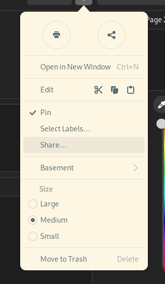
Style Classes
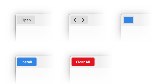
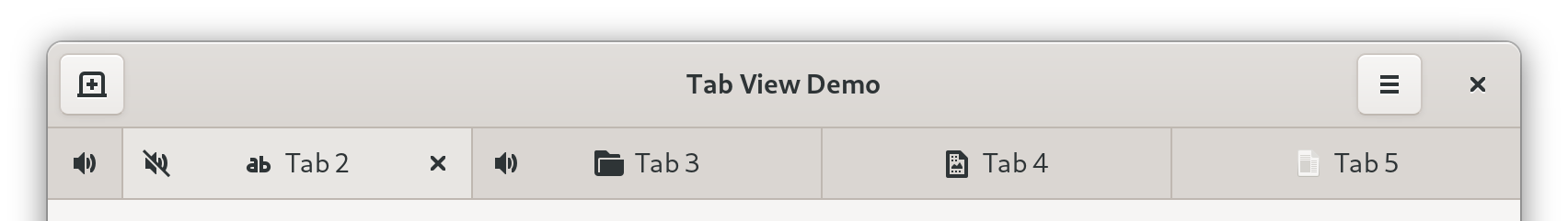
The updated stylesheet includes many new style classes for app developers to use, in a lot of cases codifying existing patterns that applications have been using via custom styles, but also adding new things.
Some highlights:
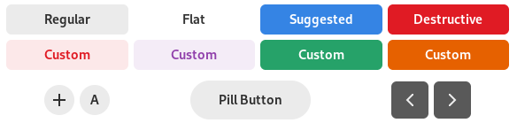
.pillmakes a button large and rounded – in other words, makes it a pill button.flatcan now be used withGtkHeaderBar.accentcolors a label into the accent color (using the correct color as per the above section).numericmakes a label use tabular figures.cardmakes a widget have the same background and shadow as a boxed list.
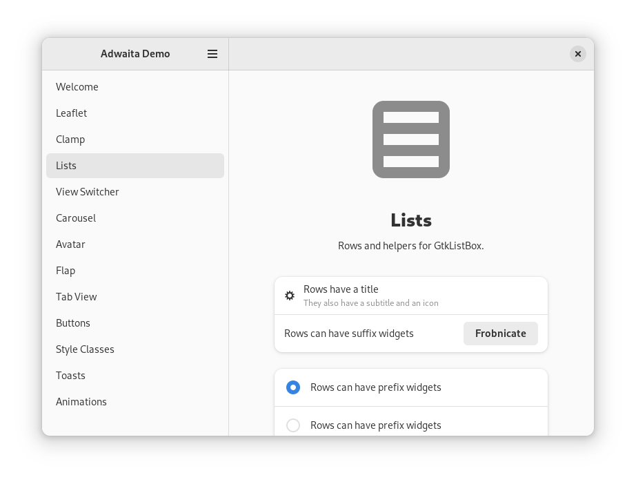
And speaking of boxed lists, the old .content style class from Libhandy has finally been renamed to .boxed-list, matching the HIG name.
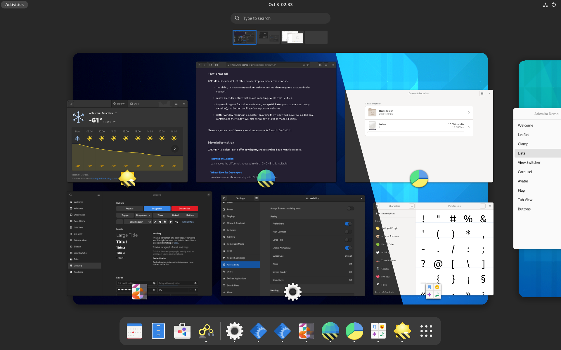
The available style classes (both existing and new) are now documented, and Libadwaita demo now includes a sample of each of them.
Refactoring and cleanups
Adwaita has historically been a big SCSS file containing most styles, another file containing complex mixins for drawing buttons, entries and other widgets, and a few more files for colors.
Libadwaita splits all of that into small manageable files. It removes the complicated mixins, because the new style is simple enough that they aren’t needed. It removes tons of unused and redundant styles, some of which were leftovers from early GTK 3 days, and so on. And, of course, the new style itself allows making styles significantly simpler.
The end result is a much more maintainable and less arcane stylesheet.
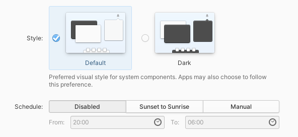
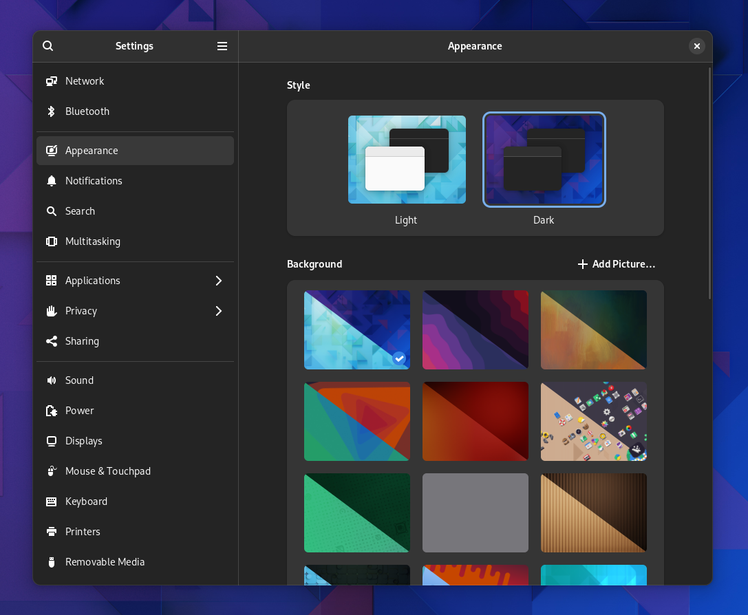
Dark Preference
I’ve blogged about this in much more detail a few months ago, but in short, Libadwaita includes API to support the new cross-desktop dark style preference, as well as streamline the high contrast mode handling.
This has also been backported to Libhandy and will be available in the next release.
While the Libhandy version is strictly opt-in, Libadwaita flips the switch and follows the preference by default, unless the application opts out. This means that any new applications will support the preference by default – and that supporting it is an expected step when porting an application from GTK3 and Libhandy. The documentation now also includes a guide on how to handle application styles.
Many third party applications have already adopted it by now, and there has been good progress on supporting it in the core GNOME applications – though at the moment it’s unlikely that all of the core applications will support it in GNOME 42. If you maintain a core app, it’s a perfect time to start supporting it in order to avoid that ?️.
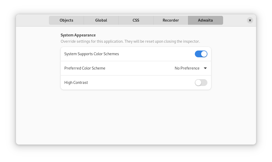
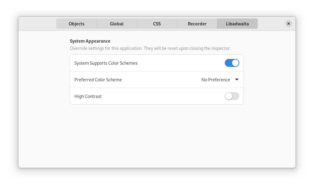
A new GtkInspector page is also available to help testing the style and high contrast preferences.
Documentation
Like GTK 4 itself, Libadwaita features new documentation using the awesome gi-docgen generator by Emmanuele Bassi.
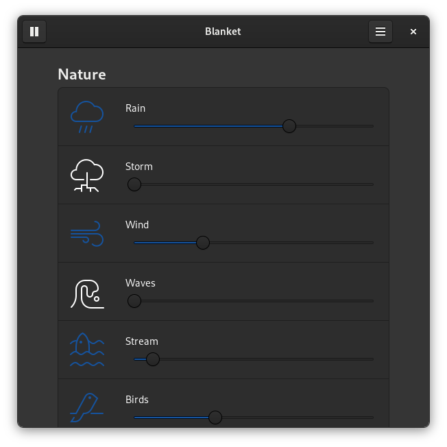
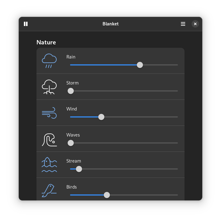
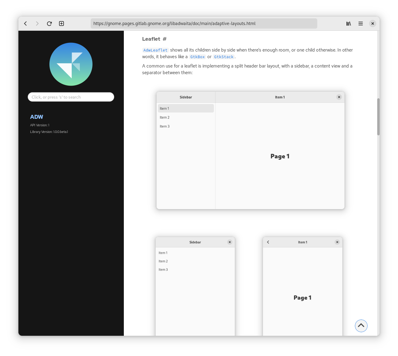
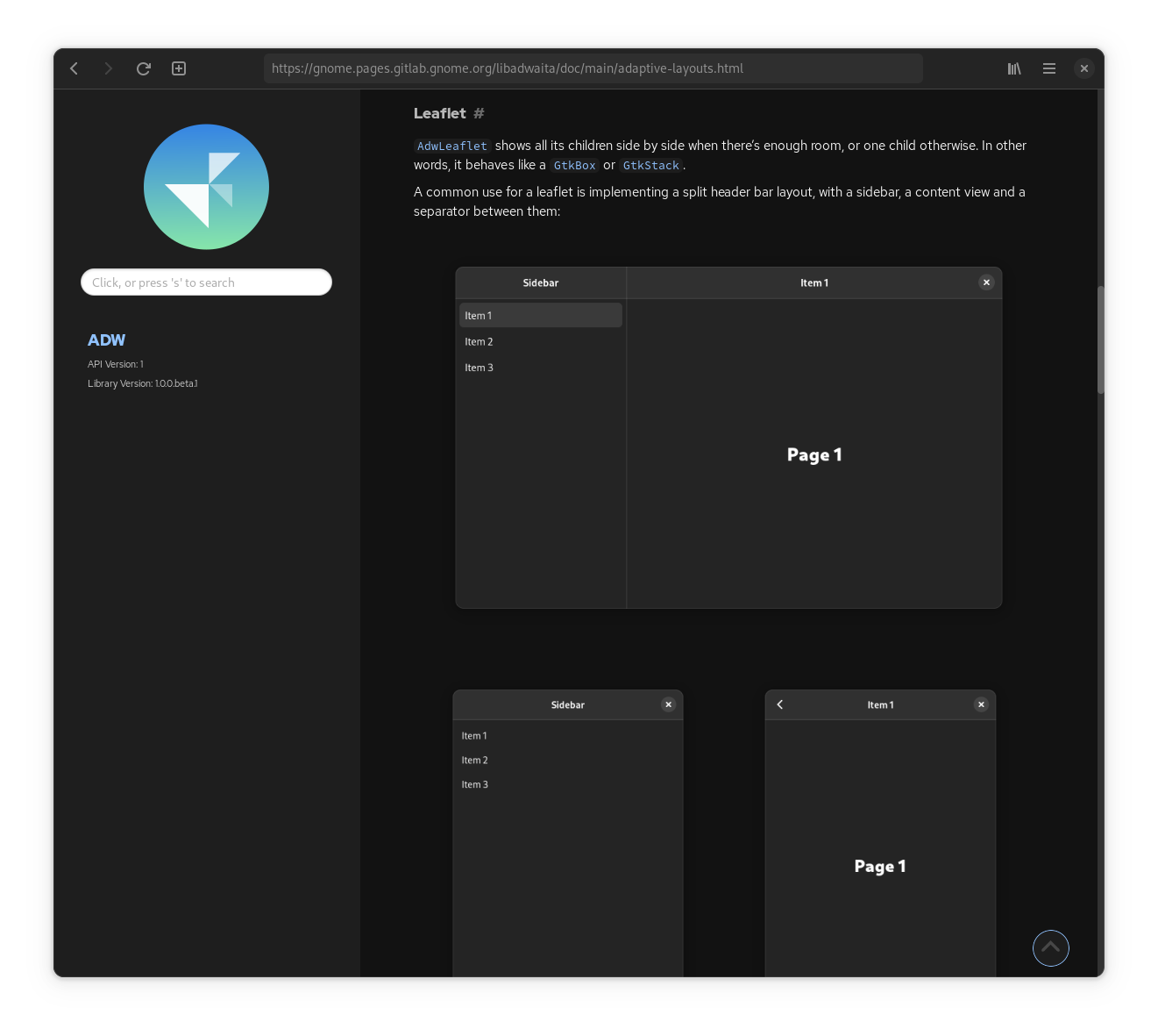
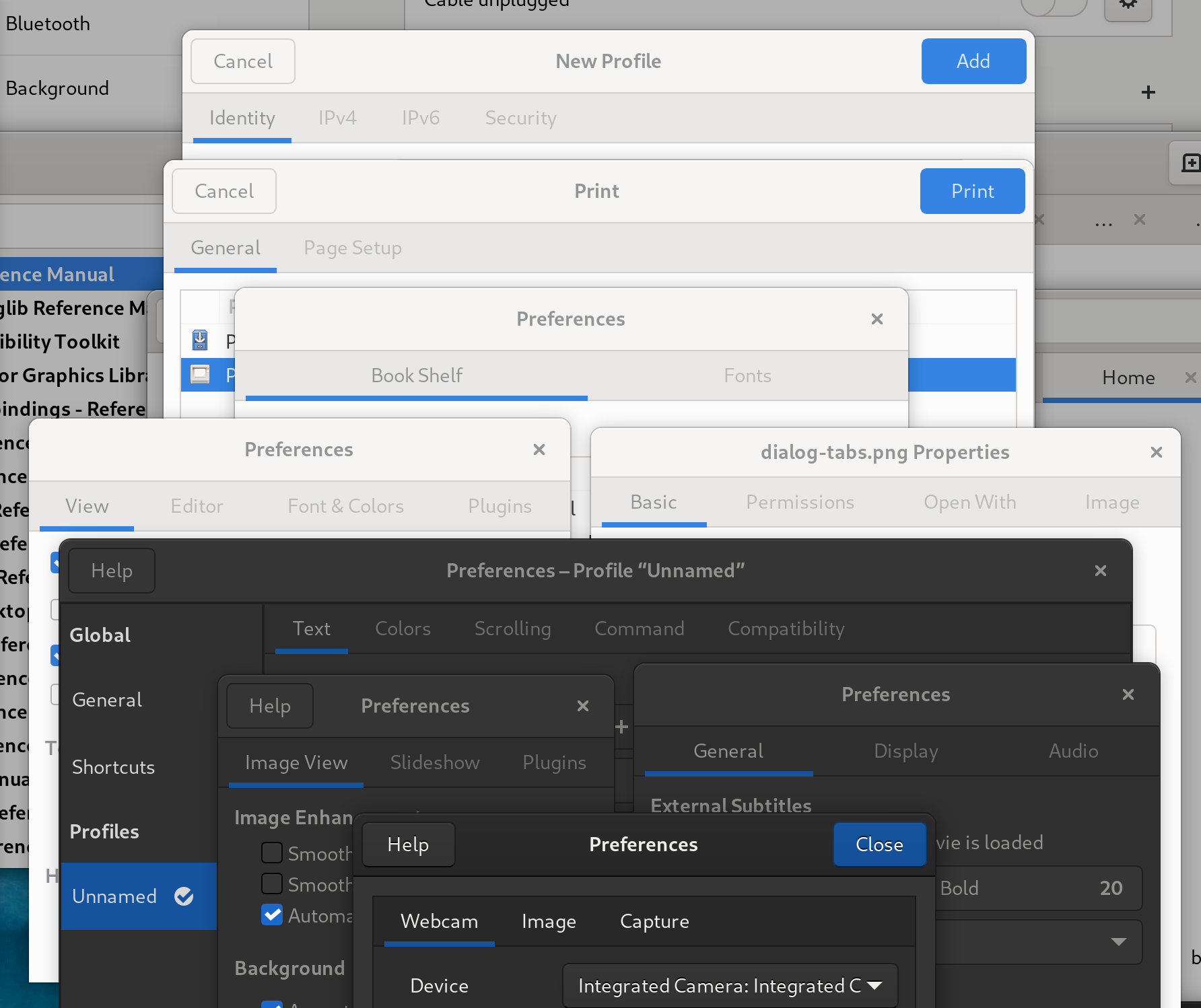
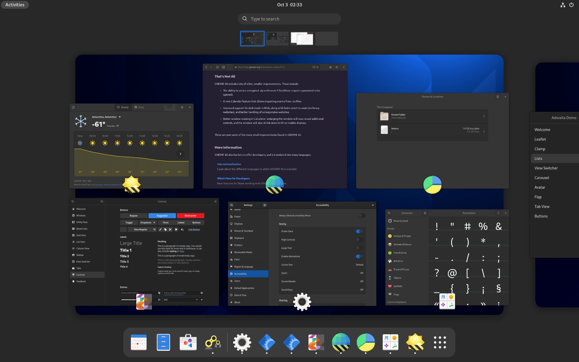
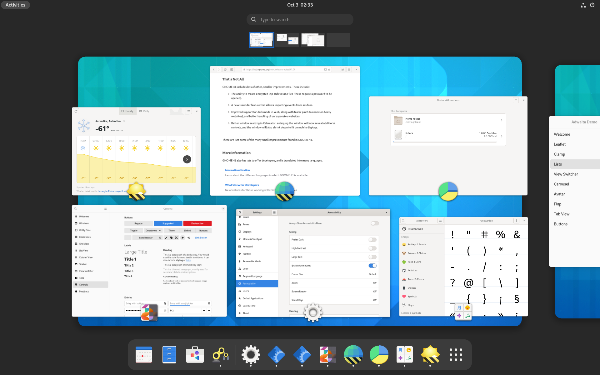
The docs themselves have been reworked and expanded, and feature new generated screenshots, which all come in light and dark versions to match the documentation pages:
Toasts

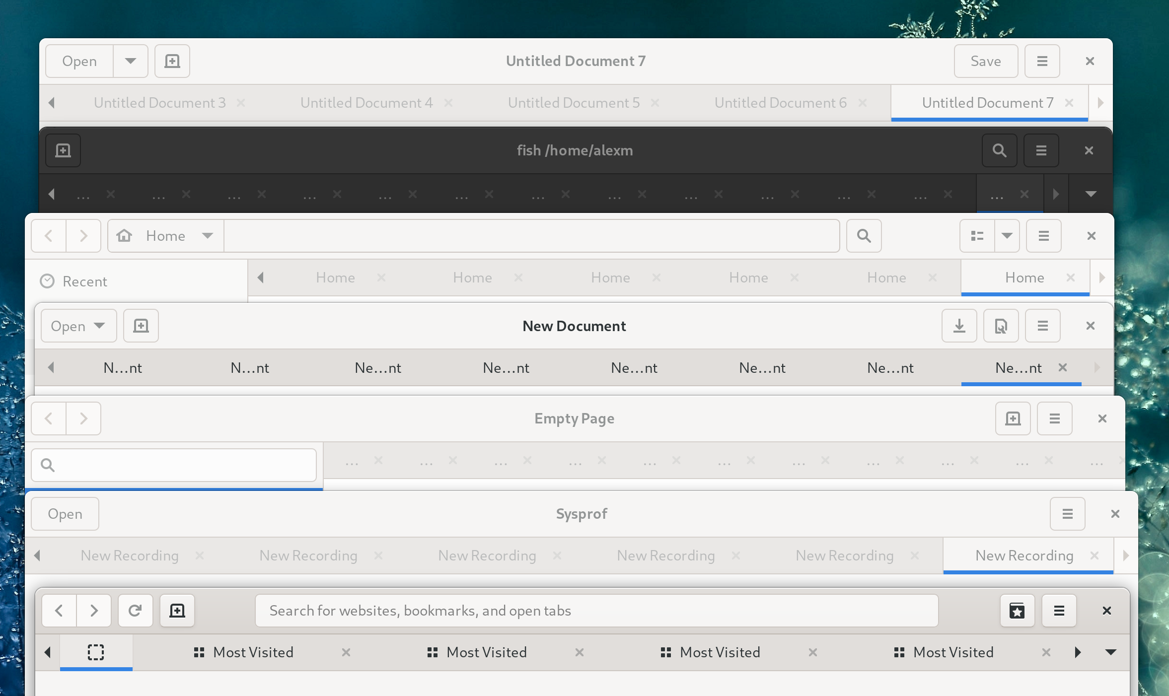
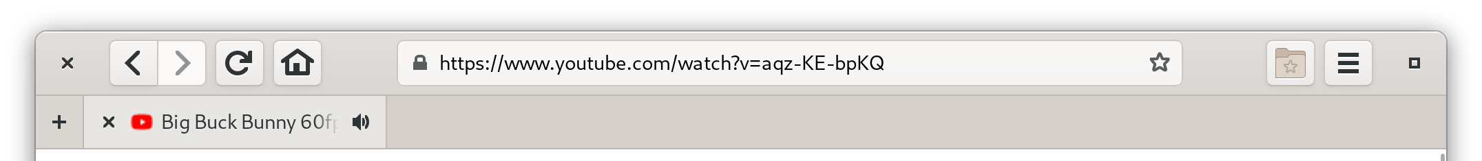
While in-app notifications aren’t a new pattern by any means, we’ve never really had a ready to use widget. Sure, GdNotification exists, but it leaves a lot of decisions to applications, e.g how to deal with multiple notifications at once, or even what notifications should contain – essentially it only provides the notification style, a close button and a timeout.
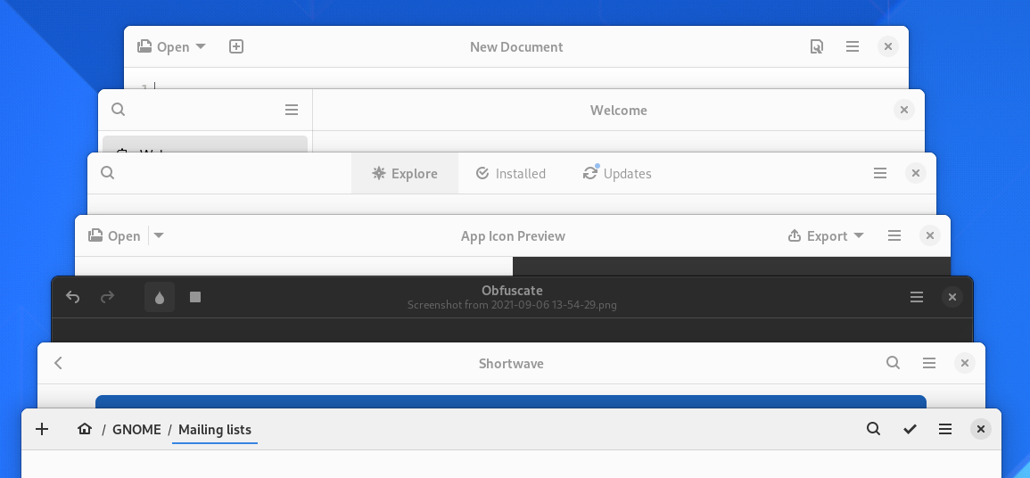
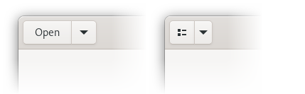
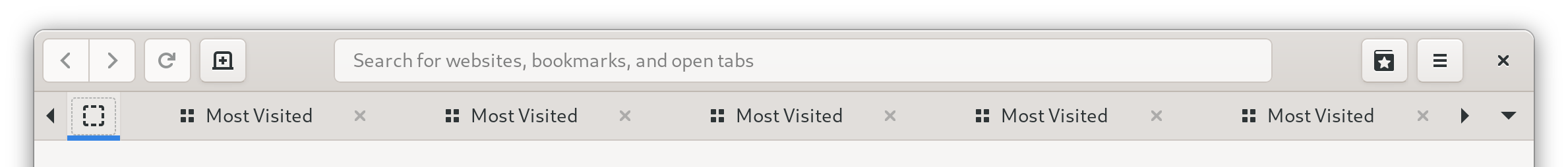
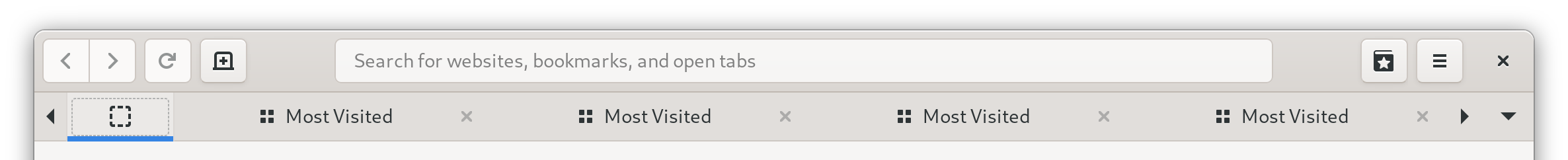
A big feature that made GdNotification attractive was the ability to animate its visibility before GTK had a widget for that purpose. Now GtkRevealer exists (which our new widget ironically doesn’t use), and most apps currently use that to re-implement in-app notifications from scratch. This has lead to major inconsistencies between apps, and situations like this:
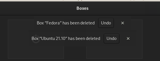
To help fixing this, Maximiliano has implemented a new widget to replace them. Its API is very streamlined, and is modeled after notifications. The widget part is not a notification, but rather a notification area that toasts (which are just generic objects and not widgets) are added into. If multiple toasts are added in a quick succession, they are queued based on their priority.
A big difference from GNotification though is that toasts are mutable – and can be changed after they have been shown. This is useful when using toasts as undo bars, for example.
Animations
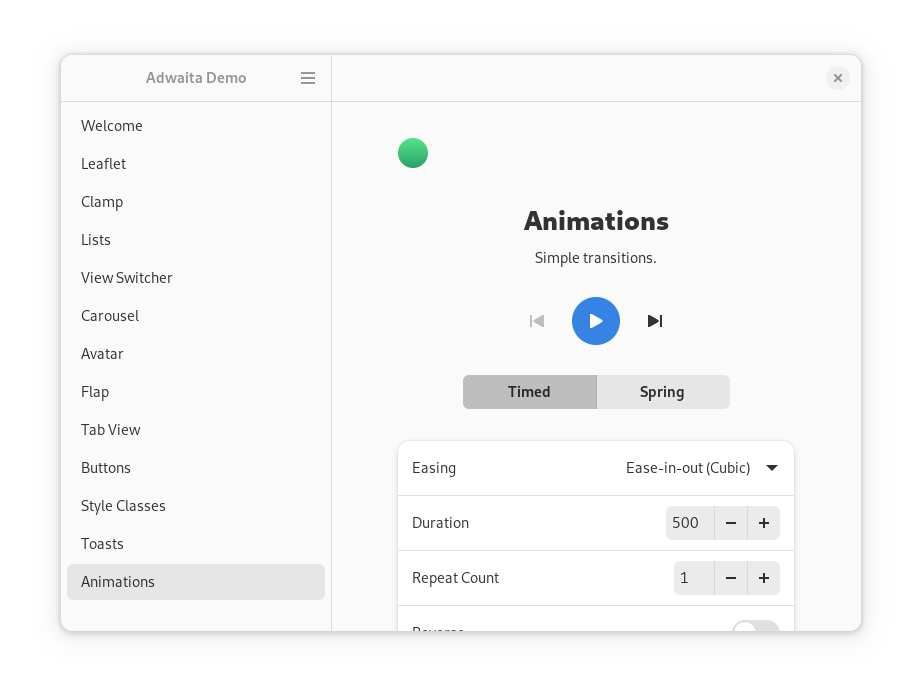
Manuel Genovés has implemented an animation API as part of his GSoC project. Unfortunately not everything that was planned has been implemented, but we have basic timed animations and spring animations.
Timed animations provide simple transitions from one value to another one in a given time and with a given curve. They can repeat, reverse their direction, and alternate with each iteration.
Spring animations don’t have a fixed duration, and instead use physical properties to describe their curve: damping ratio (or optionally just damping), mass, stiffness, an initial velocity and an epsilon to determine when to stop it. The fact they have a variable initial velocity makes them perfect to animate deceleration after performing a gesture:
AdwLeaflet, AdwFlap and AdwCarousel all use spring animations now, and AdwSwipeTracker provides the final velocity after a swipe is finished, instead of pre-calculated duration.
Unfortunately, due to time constraints, none of the above widgets support overshoot when animating. Since they use a critically damped spring by default (meaning it takes the shortest possible time to reach the end and doesn’t overshoot unless the velocity is very high), it’s not really visible unless you swipe really hard, and it can be fixed after the initial release without any API changes.
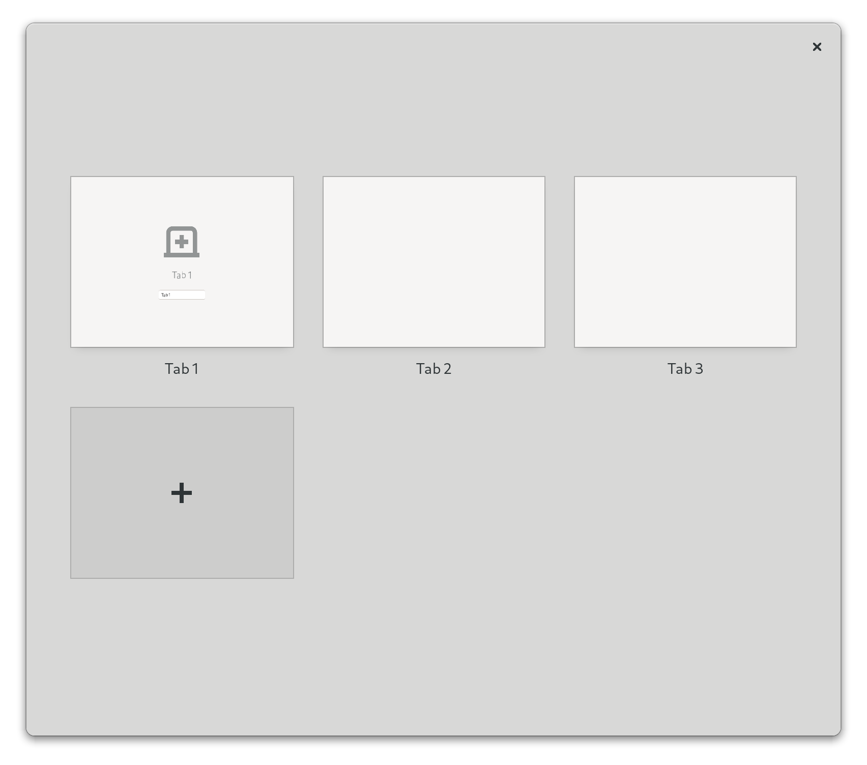
Unread Badges
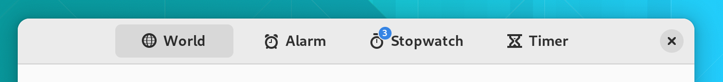
AdwViewSwitcher and related widgets now can display unread badges and not just needs-attention dots. This means they don’t use GtkStack anymore, but a new widget called AdwViewStack. For the most part, it’s a drop-in replacement, although it does trim down the API not necessary for this use case.
Thanks to Frederick Schenk for implementing this!
Application
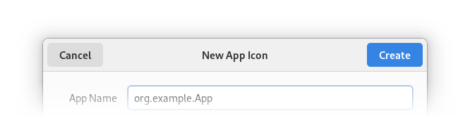
Naiara has implemented AdwApplication – a GtkApplication subclass that automatically initializes Libadwaita when used. It also automatically loads styles from GResource relative to the application base path. For example, if your application has org.example.App application ID, it will automatically load /org/example/App/style.css. It also loads style-dark.css, style-hc.css, and style-hc-dark.css, allowing to add styles for dark or high contrast styles only.
Helper Widgets
Libadwaita provides a few widgets to simplify common tasks:
-
GtkHeaderBarin GTK4 does not provide a direct way to set a title and a subtitle, and just shows the window title by default. If you want to have a subtitle or to simply display a title that’s different from the window title – for example, for split header bars – the recommended way to do that is to construct two labels manually. That can be tedious and easy to get wrong.AdwWindowTitleaims to help with that. It can be used as follows:<object class="GtkHeaderBar"> <property name="title-widget"> <object class="AdwWindowTitle"> <property name="title">Title</property> <property name="subtitle">Subtitle</property> </object> </property> </object>> -
AdwBinis a widget that usesGtkBinLayout, has one child, provides API to manage it, implementsGtkBuildableaccordingly, implementsGtkWidget.compute_expand(), and unparents the child inGObject.dispose(). Applications can subclass it instead ofGtkWidgetwithout worrying about those things. It can also be used directly without subclassing it. -
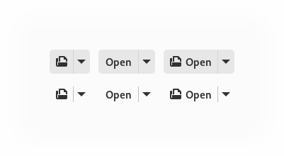
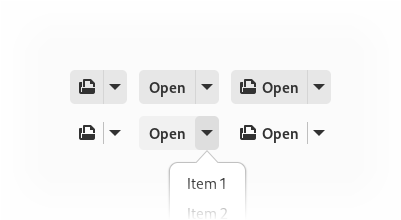
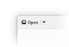
AdwSplitButtonprovides an easy way to create a, well, split button that will use the correct appearance in a header bar or a toolbar. -
AdwButtonContentcan be used to create a button with an icon and a label without needing to manually set up the button mnemonic:<object class="GtkButton"> <property name="child"> <object class="AdwButtonContent"> <property name="label">_Open</property> <property name="icon-name">document-open-symbolic</property> <property name="use-underline">True</property> </object> </property> </object>
API Cleanups
Large parts of the API have been streamlined. Check out the migration guide for more details.
Some highlights:
-
AdwHeaderBarprovides separate properties for controlling window buttons at the 2 ends of the header bar, instead of one controlling both sides. This can be used to implement split header bar layouts and removes the need forHdyHeaderGroup. -
Ever since
HdyWindowwe’ve had an easy way to support leaflet swipes spanning both the window and the titlebar withoutHdyHeaderGroup. All of the featuresHdyWindowandHdyWindowHandleprovided have been added into GTK itself, and have been available since 4.0. In acknowledgement of that, Libadwaita doesn’t include aHdySwipeGroupequivalent.It still includes
AdwWindowandAdwApplicationWindowas helpers, but it’s very easy to achieve the same result with aGtkWindow.<object class="GtkWindow"> <property name="titlebar"> <object class="GtkBox"> <property name="visible">False</property> </object> </property> <property name="child"> <!-- ... --> </property> </object> -
AdwComboRowhas been completely overhauled and is now basically aGtkDropDownclone. This means it uses the same list item factories, allows setting the models from UI files, etc. One thing it doesn’t provide is binding enums – to replace that, Libadwaita includesAdwEnumListModel. -
AdwAvatarremoves the old complicated image loading API and instead just allows setting aGdkPaintableas a custom image. -
AdwLeafletnow supports the back/forward mouse buttons and keyboard keys, as well as Alt+arrow shortcuts, in addition to swipe gestures, and the properties controlling that have been renamed to reflect the addition.
What hasn’t made it
About Window
Even though it was featured in Allan Day’s blog post a few months ago, the new About window Adrien has been working on hasn’t made it into Libadwaita 1.0. There were still unresolved design and API questions, and we decided to wait until the next release to have time to polish it instead of rushing it.
Color API
While overriding colors via @define-color is far simpler than it was before (essentially, copying the entire style of the widgets you want to change, with different colors), it’s still not as easy as it could be.
For example, if an application wants to override its accent color, it needs to override 3 colors. One of them (@accent_color) exists pretty much only for contrast, and also differs between light and dark variants. In an ideal world, this color would be calculated automatically based on @accent_bg_color.
Chris has been working on a programmatic API to manage colors, and that should improve this situation a lot. As with the about window, though, it wasn’t ready in time for 1.0.
Touchpad Swipes
A known regression compared to Libhandy is that swipes in widgets such as AdwLeaflet only work on touchscreen, but not touchpad, if the pointer is above a scrolling view. This is something I really hoped to fix before 1.0, but it’s a surprisingly complex issue. It needs extensive GTK changes in order to be fixable, involving essentially replacing and deprecating the existing API for dealing with scrolling, and it’s not something that should be rushed.
Thanks To
- Adrien Plazas, Christopher Davis, Frederick Schenk, Manuel Genovés, Maximiliano
- GNOME design team
- GTK developers
- Frederik Feichtmeier, nana-4 and other members of the community
I also want to thank my employer, Purism, for letting me and others work on Libadwaita and GTK to make this happen.
Happy holidays and happy hacking!


